
Color psychology is a frequently discussed and often debated aspect of marketing.
And why wouldn’t it be?
With humans being innately visual by nature, it only makes sense that color would play a key role in consumer purchasing and overall decision making.
But there’s a problem. It’s easy to digest slick-looking charts, but miss the real point of color psychology, neglecting the power that color psychology can contribute to our marketing.

What We Get Wrong About Color Psychology
We have a collective tendency to wrap it up into a neat little package where we believe that a particular color always triggers certain emotions.
…or this…
You get this gist. I’ve seen more of these color charts than I can count.
But they can be misleading.
We humans are incredibly complex creatures, and the emotions we feel toward a particular color can be influenced by a myriad of factors like personal experience, upbringing, cultural differences or simply how we’re feeling at the moment.
Therefore, it’s not realistic to assume that simply using yellow instead of green on your homepage will lead to instant results and send conversions through the roof.
There’s just so much more to it than that.
But at the same time, it would be foolish to think that color doesn’t play a role.
Of course, it does.
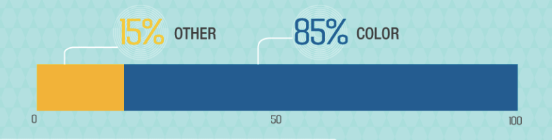
In fact, “62 to 90 percent of consumers’ product assessment is based on colors alone.”
According to Emerald Insight, “Colors can contribute not only to differentiating products from competitors but also to influencing moods and feelings—positively or negatively—and therefore, to attitude towards certain products.”
Neil Patel concurs and says that “85 percent of shoppers place colors as their primary reason for why they buy a particular product.”
So there’s obviously something to it.
It’s just that getting results tends to require a multifaceted approach and one that’s based on sound scientific principles.
On that note, let’s take a look at some concrete data from research to provide some actionable insights on color psychology so you can turn your homepage into a conversion making machine.
Demographics
Perhaps the most vital factor that determines the color scheme you should use is your demographic.
Using one color scheme for site A may work flawlessly. However, using the same color scheme for site B may result in lackluster performance.
For this reason, it’s essential that you know precisely who you’re trying to reach and build your color scheme around them.
To begin, let’s start by discussing color preference based on gender.
A 2003 study by Joe Hallock investigated color assignment with “the goal of discovering cultural similarities (and differences) based on color association, preference and Internet activities.”
One of his key findings was the disparity in color preferences between males and females.
Here are the specifics of what he found:
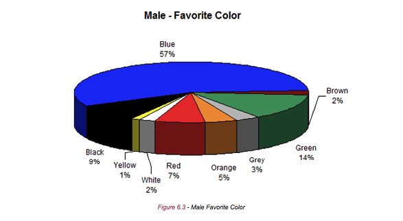
As you can see here, blue is far and away the favorite color of men. Green is a distant second, and black is an even more distant third.
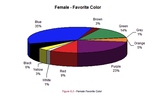
As for women, blue was also their favorite. But purple was also quite popular, and green was a distant third.
When it comes to favorite color as a whole regardless of gender and other factors, here’s what Hallock found:
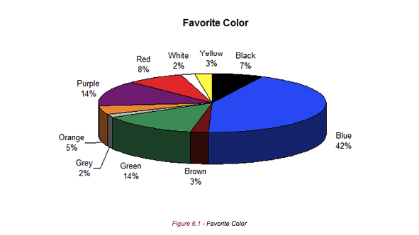
By looking at this pie chart, there’s no denying the preference that most people (42 percent) have for the color blue.
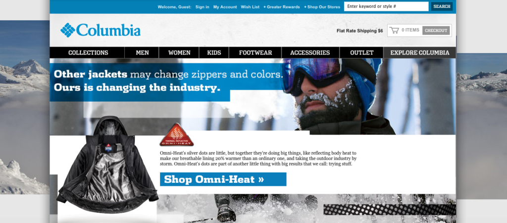
Maybe this is why you see so many homepages using blue as their primary color.
Here are just a few examples:
There’s Columbia…
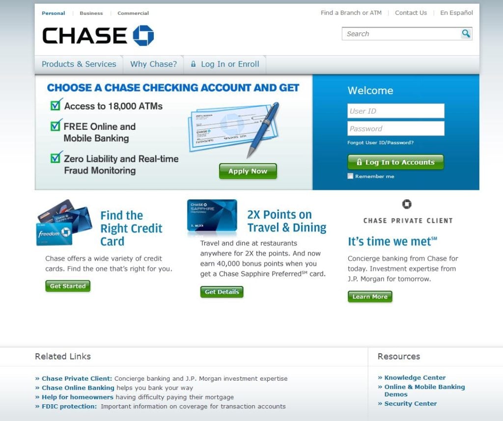
…and Chase…
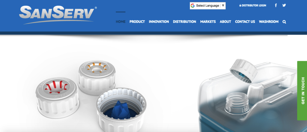
…and SanServ just to name a few.
But what about people’s least favorite colors?
Here were the findings:
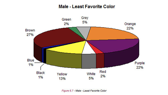
It’s clear that you would want to stay away from brown, purple and orange if your primary demographic is male.
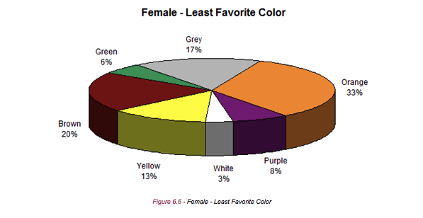
For women, you would want to avoid orange, brown and grey.
Now let’s talk about age group.
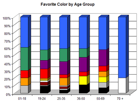
Again, blue wins out regardless of the age group with green and purple being fairly popular as well.
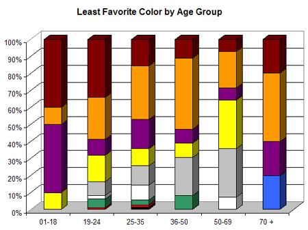
As for the least favorite colors, it’s clear that it’s brown and orange. There’s just something inherently undesirable about these colors for people across the board.
So, this is definitely something to keep in mind when determining which colors to use on your homepage.
If you’re looking for a safe bet, then blue is almost always the best option regardless of your demographic.
On the other hand, orange and brown probably aren’t a good idea and could potentially hurt your conversions.
Shades, Tints, and Hues
Now let’s take it one step further.
Separate research discovered the following:
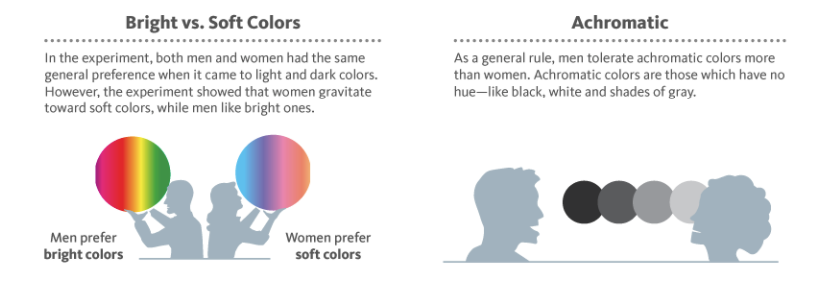
This data suggests that incorporating bright colors into your homepage would be beneficial if you’re targeting a male demographic, and soft colors would be better if it’s a largely female demographic.
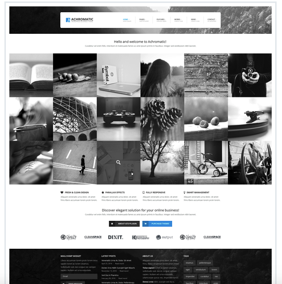
When it comes to achromatic colors, it’s probably something to avoid if your primary audience is female.
This WordPress theme is a good example of design using achromatic colors:
Now let’s discuss tints and shades.
Here’s what the data found:
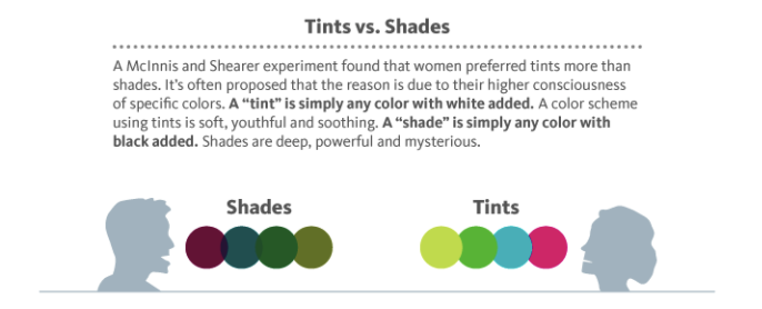
There you have it. Shades tend to work well with men, while women naturally prefer tints.
Triggering the Right Emotion
Another big part of a well-crafted homepage is building rapport with your audience right off the bat and getting them to feel a certain emotion.
If you can get them in the right headspace, they’re more likely to convert.
For instance, banks and lending institutions would want to create trust.
Or a cosmetics company would want to convey a sense of femininity.
Therefore, it’s important to be aware of the correlation between certain colors and different emotions.
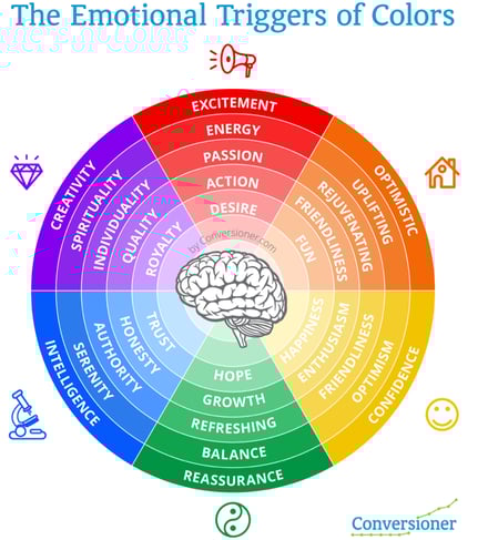
Kissmetrics offers a nice breakdown of how various colors affect North American shoppers:
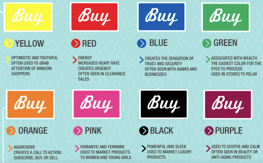
Keep in mind that these colors are geared specifically around a North American demographic and aren’t necessarily applicable to shoppers from other areas of the world.
With that being said, the correlation between these colors and emotions is pretty spot on when you examine homepages from various brands.
Allow me to provide you with a few examples:
Here’s Merrill Lynch using blue to build trust:

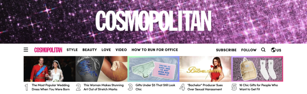
Here’s Cosmopolitan using pink to market to young women and girls:
And here’s JustLuxe using black to cater to an audience that’s interested in luxury goods.

So, as you can see, there’s definitely some truth to the guide provided by Kissmetrics.
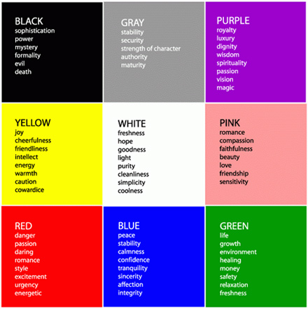
By following this line of logic, you’ll want to use blue as your main color if your goal is to quickly gain trust and get prospects comfortable with your brand.
According to 99Designs, “Seeing the color blue causes the body to create chemicals that are calming.” The color is often associated with creativity and peace, according to research from ScienceDaily.
You’ll want to use orange or red when you’re looking to be aggressive and get people to take action right away.
Although you should practice discretion with these colors, they tend to be ideal for sales and limited time promotions.
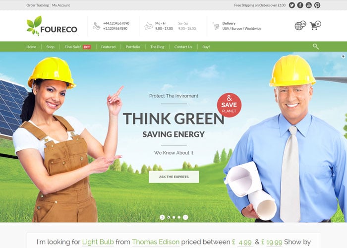
Although green is typically used to convey wealth, it’s also perfect if you’re going for eco-friendly, natural or anything pertaining to the environment.
As I mentioned before, black and luxury go hand and hand.
So this is usually your best bet if you’re catering to a high-end customer base with discerning tastes.
What About Your Call-to-Action?
Your call-to-action (CTA) is one of the most important elements of your homepage.
Even the most seemingly minute details can affect the percentage of visitors who ultimately click on your CTA and complete your intended goal.
So you obviously want to get it right.
Now there are multiple factors that contribute to a CTAs overall effectiveness such as size, positioning and of course color.
When it comes to choosing color, conventional logic would suggest that you should go with something bold like red.
After all, it naturally captures visitors’ attention.
You may even be familiar with this classic experiment by HubSpot where they tested the number of clicks between a green CTA and a red one.
Here were the two variables:
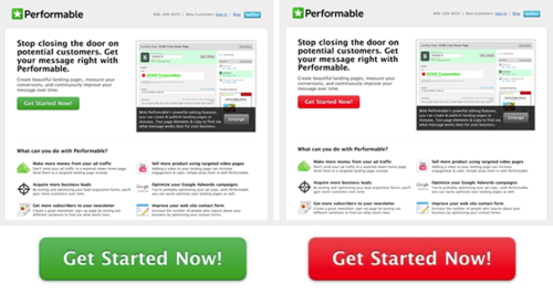
As you might imagine, the red CTA received more clicks (21 percent more to be exact).
So by analyzing these findings, it would naturally make sense to always use a red CTA. Right?
Not necessarily.
What’s most important is to create contrast. When you really boil it all down, that’s really what you’re trying to achieve.
Therefore, red might not always be the best move. It really just depends on the rest of your color scheme.
There’s even an article on Smashing Magazine that discusses using multivariate testing to increase conversion rates.
In it, they mention one specific test to determine which type of CTA would result in the highest conversion rate.
There were 12 different CTAs that asked visitors to download a PDFProducer.

What were the results?
Here’s what they found:
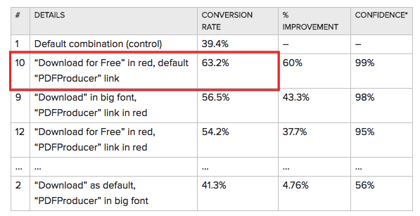
If you’ll notice, the winning CTA (#10) has a lot of contrast.
In this CTA, the “Download for Free” text has a high level of contrast with the background as well as the “PDFProducer” link at the bottom.
So the key word in the color psychology of CTAs is contrast.
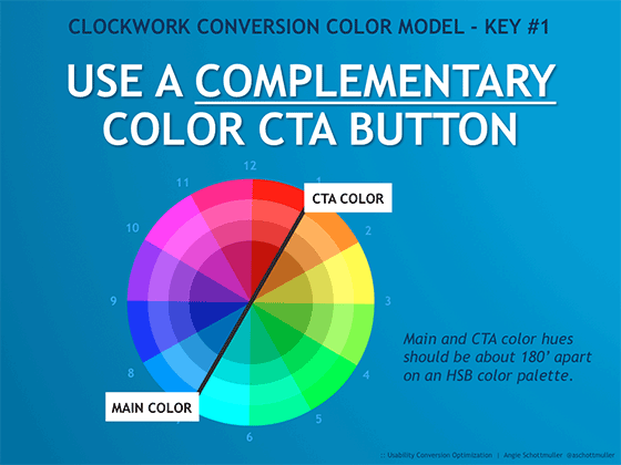
Using a Complementary Color
The most straightforward way to create contrast between your CTA and the rest of the page is to use a complementary color.
Here’s what that looks like according to Three Deep Marketing:
And here are some examples of complementary color combinations:
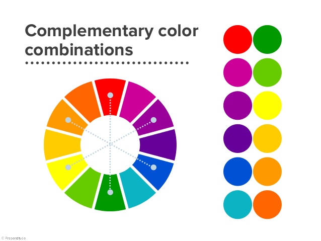
Red and green, purple and yellow, blue and orange. These are all viable color combinations.
This is a good rule to keep in mind when choosing a CTA color and should give your CTAs the “pop” they need to grab visitors’ attention.
Don’t Forget About Negative Space
There’s one last aspect of color psychology that I feel warrants mention—negative space.
Creative Bloq defines negative space as, “The space that surrounds an object in an image. Just as important as that object itself, negative space helps to define the boundaries of positive space and brings balance to a composition.”
Here’s a great example from Oculus Rift:
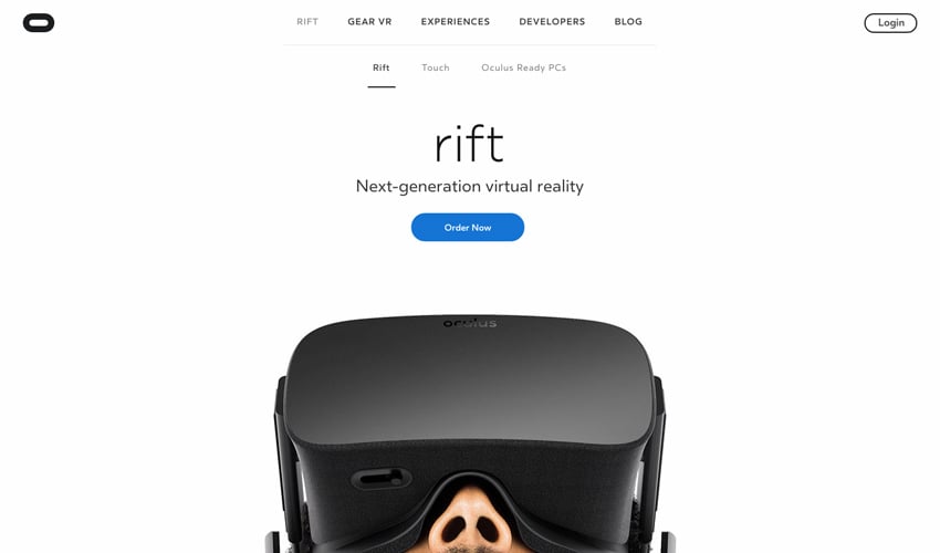
Homepages with a lot of negative space tend to have a clean, crisp and even minimalist feel to them.
They’re fairly Spartan and don’t appear as being “too busy.”
This is important because you don’t want your prospects to feel bogged down from a cognitive standpoint.
Using ample negative space helps balance the overall design out and should prevent it from overwhelming your visitors.
In turn, they’re more likely to have a positive experience and stay on the page for longer.
Which Colors Will You Use?
Color psychology is a wide umbrella that encompasses several different factors and variables.
I’ve covered a lot of information here, so let me put it all together.
Regardless of gender, age and other demographics, most people tend to like blue. If you want to play it safe and appeal to the widest possible audience, it would be smart to use blue as your main color.
If you’re aiming for a primarily male demographic, blue, green and black tend to work well. However, you’ll usually want to stay away from brown, orange and purple.
If your primary demographic is female, blue, purple and green are good colors to use. However, you should generally stay away from orange, brown and grey.
In terms of color preference based on age, blue is always your best bet, which is followed by green and purple (which is contingent upon gender).
There is some definitive data that shows how various colors trigger different emotions in North American consumers.
Examining the correlation between color and emotion should give you a pretty good idea of the optimal path to take when choosing the overall color scheme for your ecommerce homepage.
For your CTA, you’ll want to use plenty of contrast and a complementary color for best results.
Also, don’t overlook the importance of negative space because it definitely factors into the overall user experience.
Remember that the color that you don’t use can be just as important as the color that you do use.

