You probably know how big of an issue shopping cart abandonment is. It’s just under 70 percent across all industries to be exact.
This makes it something e-commerce brands need to take seriously and look for creative ways to take a chunk out of.
One of the more underutilized, but wildly effective techniques, is to offer shoppers an e-commerce wishlist.
When done correctly and by following best practices, this can dramatically lower cart abandonment, while at the same time improving the overall customer experience.
Here’s an overview of how it works, along with several e-commerce wishlist examples so you can see it in action.

What Is an E-Commerce Wishlist?
Just so we’re clear, an e-commerce wishlist lets shoppers save a collection of items in a user account that they can come back to later and purchase.
Having a wishlist option can be huge for lowering cart abandonment because it doesn’t require shoppers to make an immediate purchase.
Instead, your visitors can add the products they’re interested in, think about it for a while, and return to their wishlist when they feel comfortable pulling the trigger.
With nearly 59 percent of online shoppers having abandoned a cart within the last three months because they were “just browsing/not ready to buy,” this can be an excellent solution to this ongoing problem.
I know it’s a feature I personally enjoy, as I like not having to make a commitment right away. Research indicates that many other e-commerce shoppers feel the same. A study by Google found “44 percent want a wishlist where they can save items they’re interested in.”
Beyond lowering shopping cart abandonment and creating an enhanced customer experience, having an e-commerce wishlist offers several other key benefits including:
- Setting the stage for remarketing opportunities through search and social media;
- Gaining valuable data on buying trends so you can anticipate stocking needs, how much inventory to order, and when;
- Providing insights on shopping behavior; and
- Informing you which product recommendations to make for returning visitors.
Put all of this together, and it’s clear that creating an e-commerce wishlist is the ultimate win-win for your brand and your customers.
E-Commerce Wishlist Best Practices
One last thing to mention before I dive into the meat of this post is best practices when creating a wishlist. Here the most important ones:
- Place it in a conspicuous location toward the top of your site (the top right-hand corner is used by nearly all brands);
- Make it easy and intuitive to use;
- Confirm that an item has been added to a wishlist;
- Don’t gate it and require signup; and
- Make it easy to remove items shoppers no longer want.
Now that we know what an e-commerce wishlist is, the benefits of using one, and best practices, here are some of the most notable examples I’ve seen.
1. West Elm
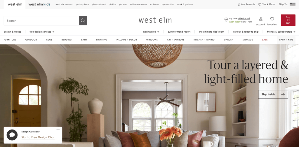
West Elm “offers modern furniture and home decor featuring inspiring designs and colors” and has an amazing wishlist experience.
When shoppers look at the top right-hand corner of their site, they see a “favorites” option, which is the wishlist.
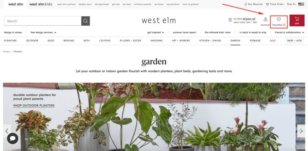
It’s conspicuously located in a logical position right between “account” and “cart.” This is smart because shoppers can easily navigate their way from their wishlist to their shopping cart, which increases the odds of a conversion.
Adding an item to a wishlist is super easy. Whenever a shopper finds an item they’re interested in, all they have to do is click the heart icon in the top left-hand corner of the product image.
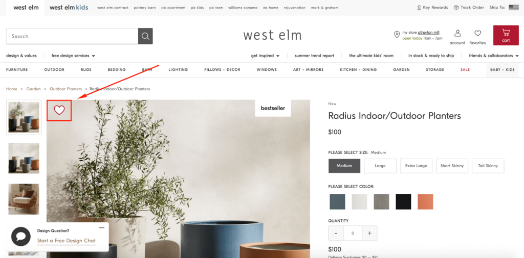
Then, the heart icon turns from white to red, indicating it’s been added to the wishlist…

…and the favorites icon goes from being empty to showing there’s now an item in it.
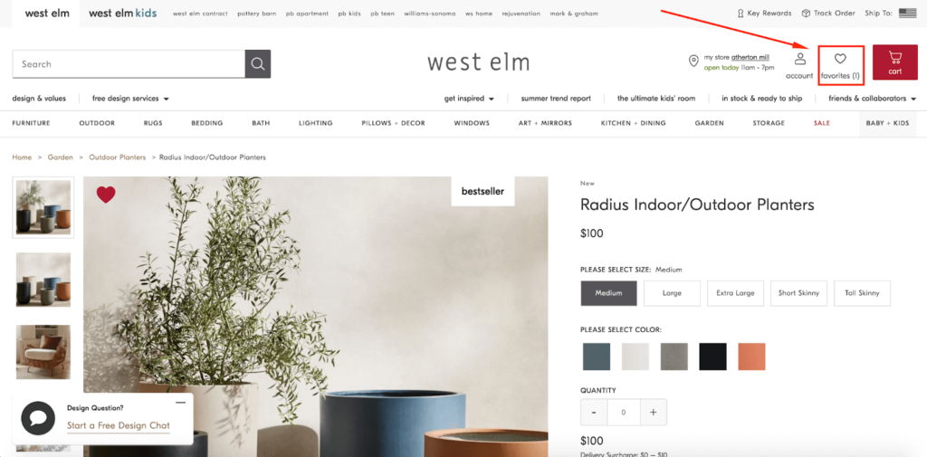
It’s very intuitive and doesn’t require any heavy cognitive lifting to figure out.
Whenever a shopper wants to check out their wishlist, all they have to do is click on favorites from anywhere on the site…

…and they can find the products they’ve saved.
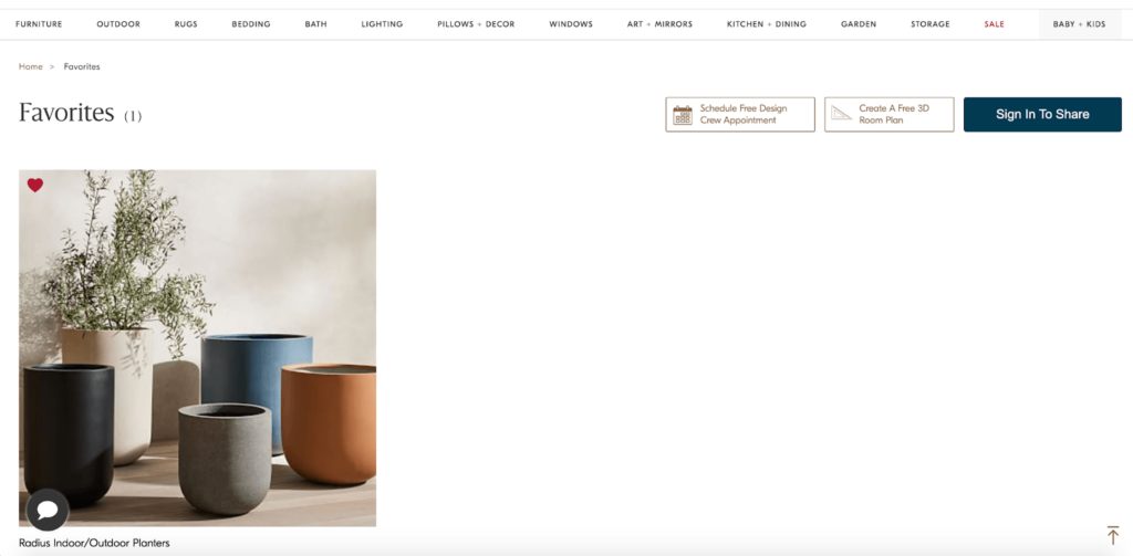
From there, it’s a matter of clicking on the product, and they can review the product description and add it to their cart.
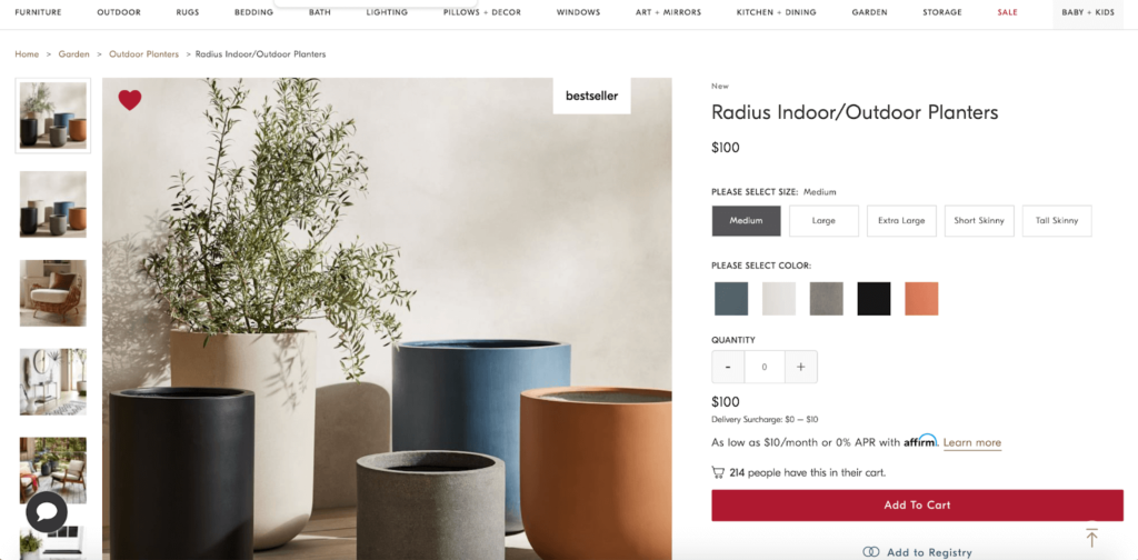
No sweat.
Notice how this e-commerce wishlist example wasn’t gated. While requiring shoppers to make an account can be tempting because you can send them targeted emails and other promotions later on, most experts suggest avoiding that.
In fact, Associate E-Commerce Analyst at Yotpo, Nikita Vidhyalankar says, “We see a significant increase in customer engagement on sites that don’t hide features behind a login.”
I know I personally find it frustrating when I’m hit with a gate. It’s a huge turnoff.
And remember, if a shopper buys (which they’re more likely to eventually do with a wishlist), you can always send them targeted offers once you have their email address after ordering.
2. H&M
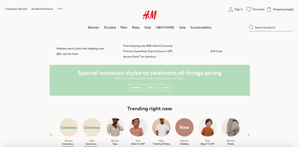
Here’s a well-known fashion brand with a reputation for being innovative and creating a stellar customer experience.
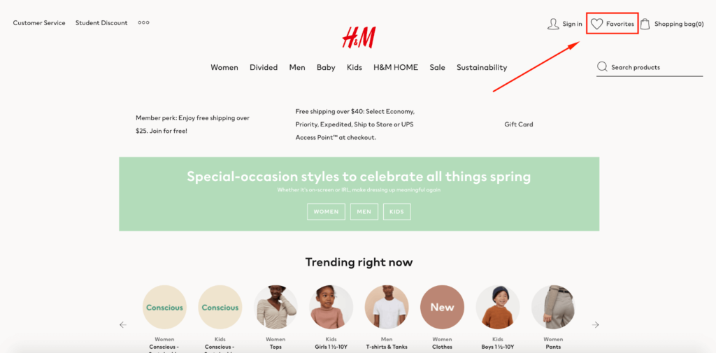
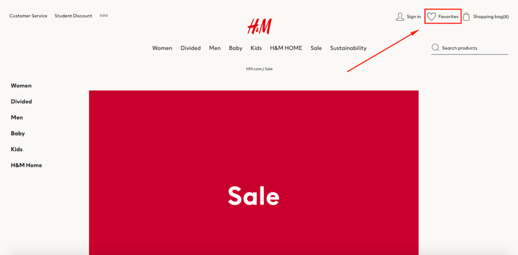
H&M has absolutely nailed its e-commerce wishlist. The company places it front and center right here via its “Favorites” feature.
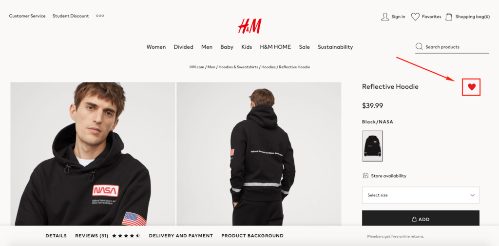
Here’s what the process of adding items to the wishlist looks like for shoppers. After finding an item they’re interested in, they click the heart icon here, and voila, it’s added to this wishlist.

The heart icon goes from being white to red, letting them know the product has successfully been added.
Then, whenever they want to review their favorites, they can conveniently do so from whatever page of H&M’s site they happen to be on.
They can easily find the products they saved, check them out again, and make a purchase when they’re ready.
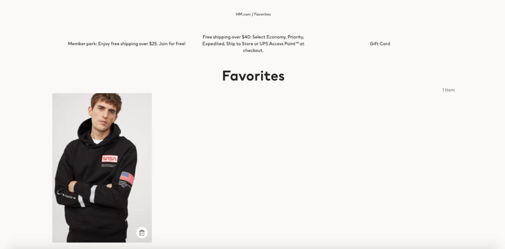
It’s all very streamlined and allows shoppers to save what they want without having to make an immediate commitment.
One other thing I like about H&M’s e-commerce wishlist is that they make it easy to remove an item. A shopper simply clicks the trash can icon in the bottom right-hand corner…
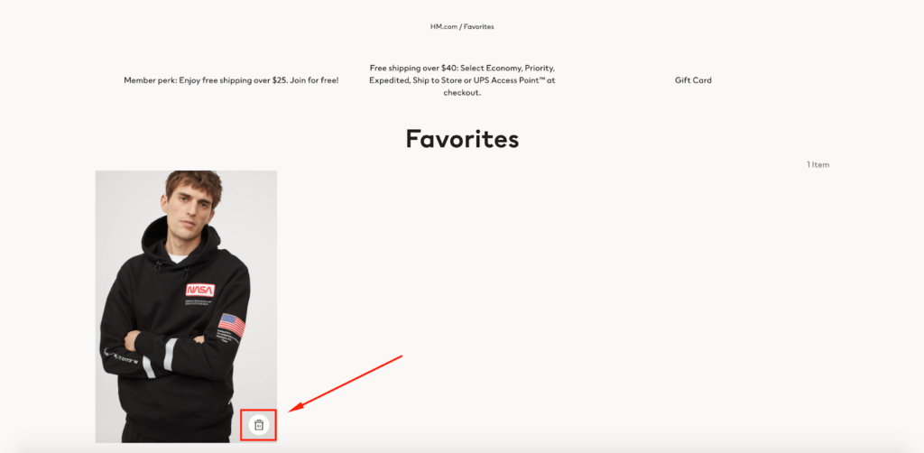
…and they’re all set.
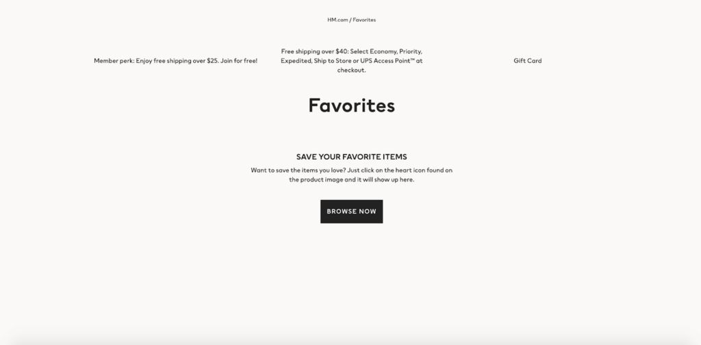
Not making shoppers jump through a bunch of hoops to remove items they’re no longer interested in makes for an even better experience and should keep them more engaged.
3. Swarovski
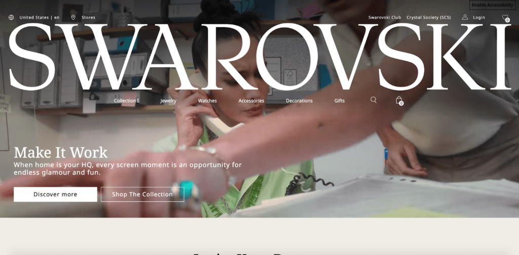
Next up is jewelry, watch, and crystal decoration brand Swarovski.
They follow the same formula as my two previous examples but include a couple of other brilliant features, which I’ll discuss a bit later.
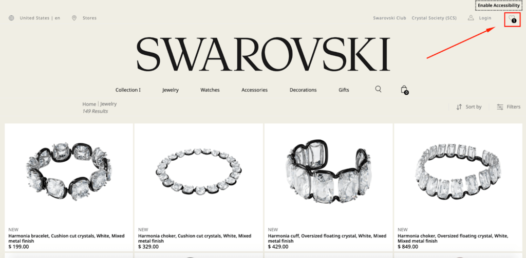
Again, the e-commerce wishlist is located in the top right-hand corner, where most shoppers expect it to be.
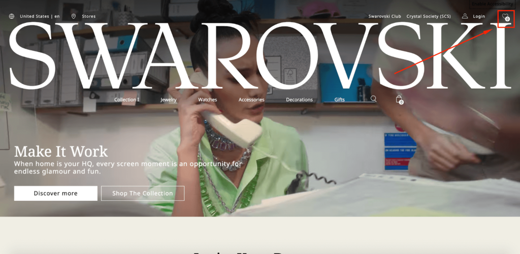
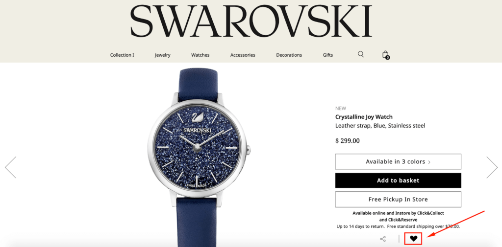
And here’s what the sequence of adding items to the wishlist looks like step-by-step. First, a shopper finds something they’re interested in and clicks the heart icon on the product page here.
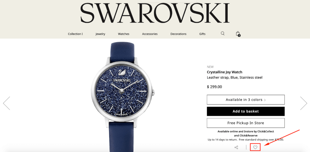
The heart changes from white to black, letting a shopper know it’s been successfully added.
When they want to go back and check out what they’ve put in their wishlist, they simply click the heart icon from anywhere on Swarovski’s site.
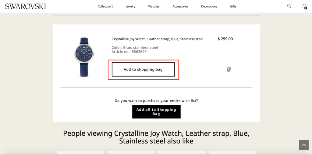
Then, they can conveniently transfer a product from their wishlist to their shopping cart here.
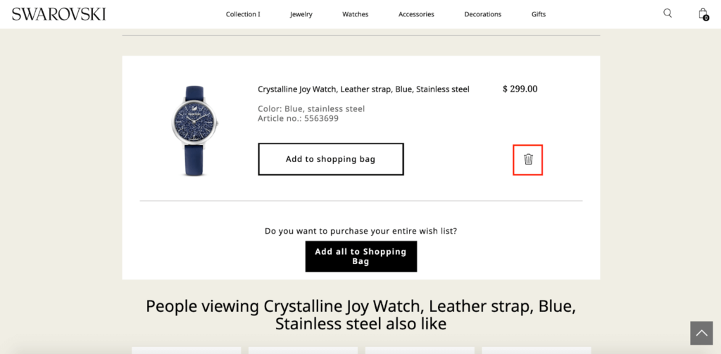
Or, if they’ve had second thoughts and are no longer interested, they can remove the item by clicking on the trash can icon.
Let me highlight a couple of innovative features that I really love. Say a shopper has added multiple items to their wishlist and wants to instantly move them to their shopping cart without having to manually do it one by one.
For this purpose, Swarovski has a button at the bottom of the wishlist that lets shoppers add everything to their shopping cart with one single click.
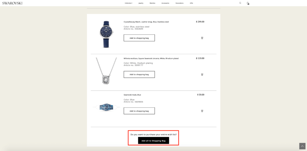
Not only does this spare shoppers from unnecessary friction, but it also helps Swarovski increase their average order value (AOV).
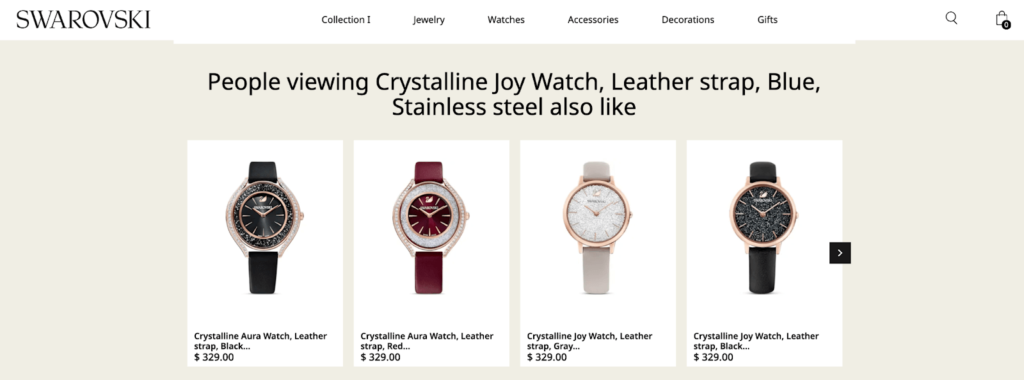
Next, there are two other sections below that you’ll be interested in. One features similar items that people are viewing based on the products a shopper added to their wishlist.
The other is personalized product recommendations.
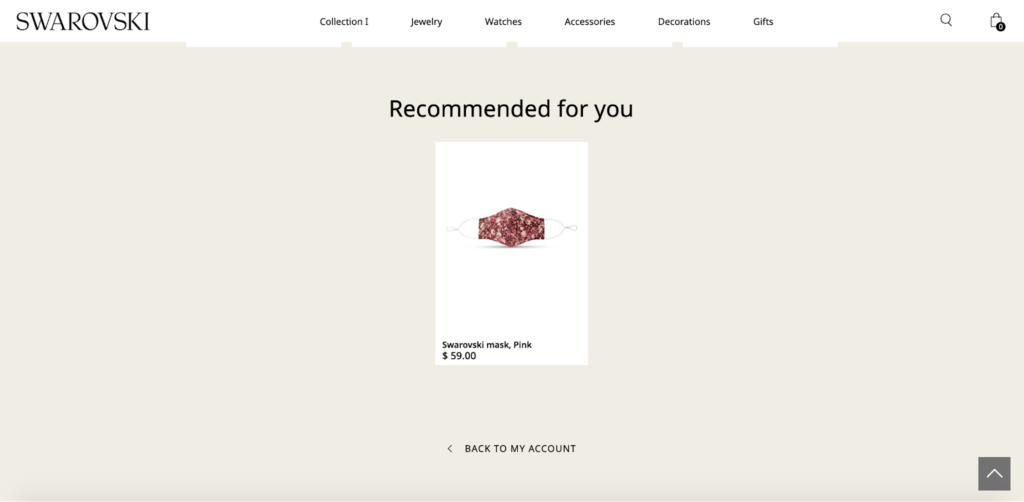
Without being annoyingly salesy, this gives Swarovski a chance to cross-sell and raise its AOV yet again, while at the same time letting shoppers know about additional products they may be interested in.
4. Fendi
Fendi is an Italian luxury fashion brand known for its high-end clothing, bags, and shoes.
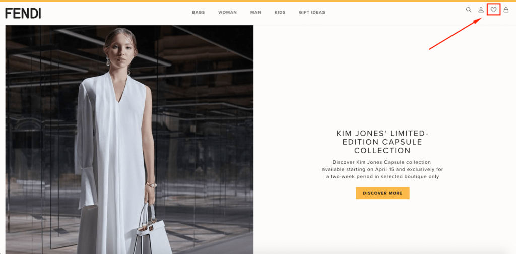
When it comes to e-commerce wishlist examples, this one is silky smooth, allowing shoppers to effortlessly add products that they can come back and purchase later on.
Once again, it’s conspicuously placed in the top right-hand corner where shoppers can easily find it.
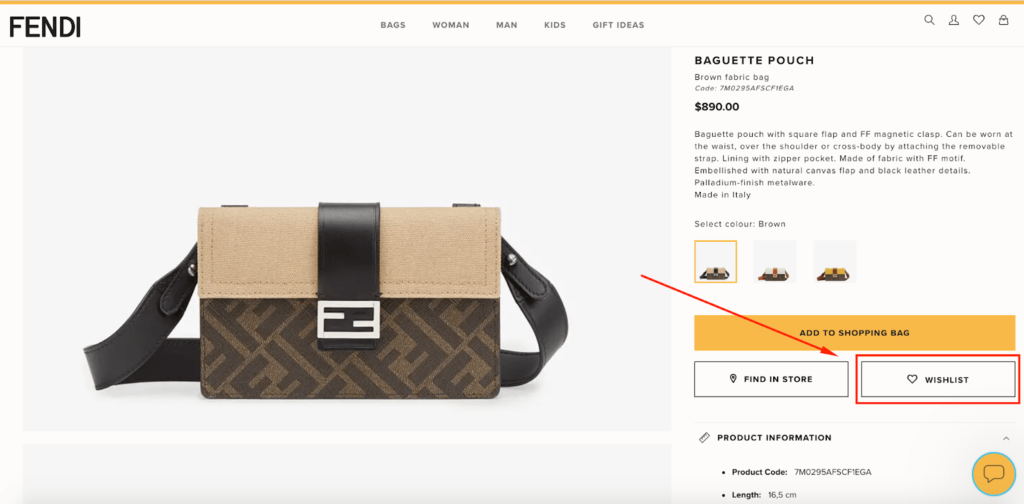
Adding items is dead simple. Each product page on Fendi’s site has a “Wishlist” button directly below the “Add to Shopping Bag” call to action (CTA.)
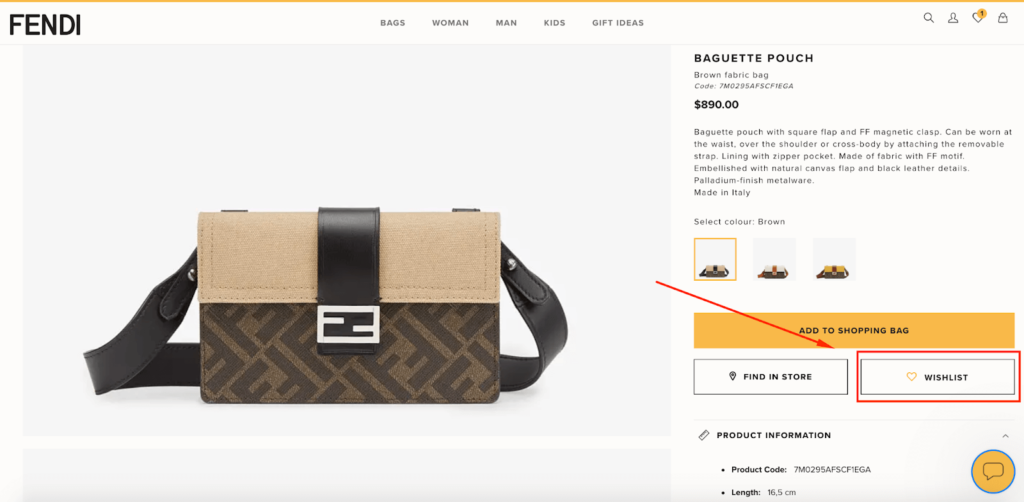
Click it, and the heart icon changes from a black outline to a gold outline, which means the item has been added.
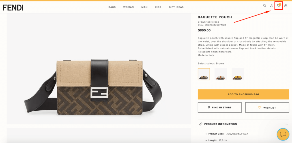
And they can also see that the heart icon at the top of the page has been updated, including the number of items they’ve added (in this case just the one handbag).
Now, let’s say a shopper has returned to Fendi’s site and wants to review their wishlist. They simply click on the heart icon from anywhere on the site…
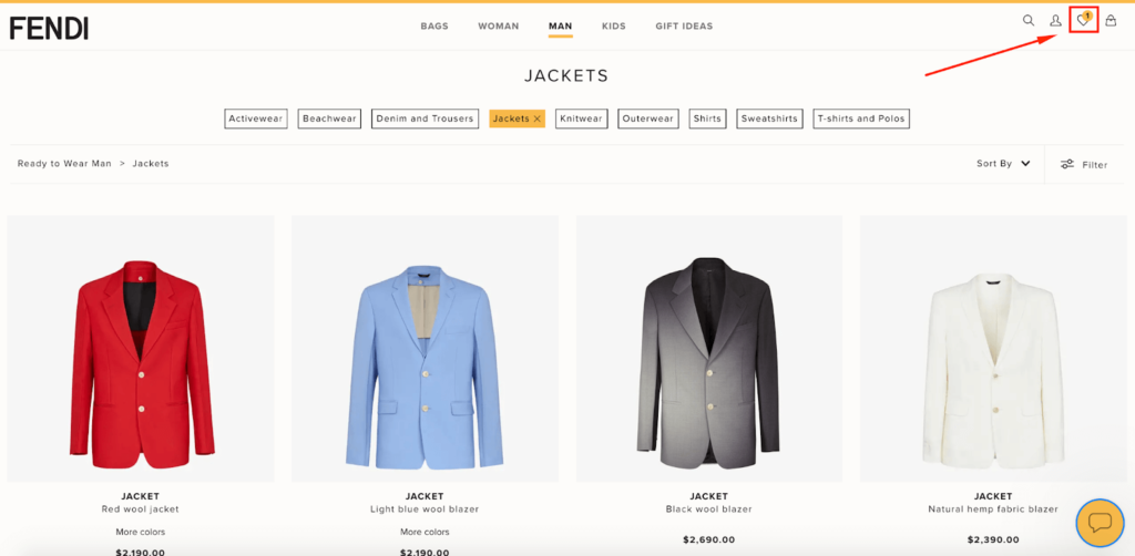
…and they wind up here.
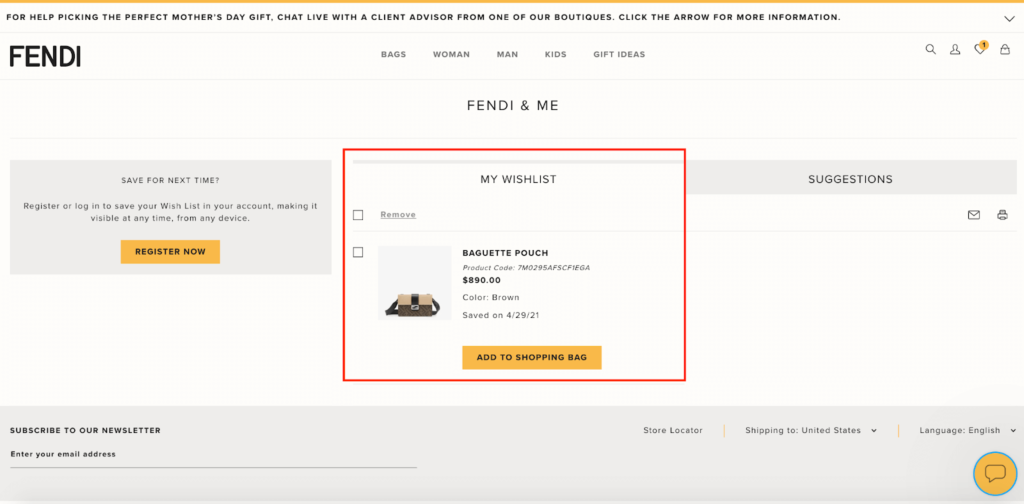
From there, they can go over the product details again and even see when they saved it. Or if they’re ready to buy, they can add it to their shopping bag and be on their way.
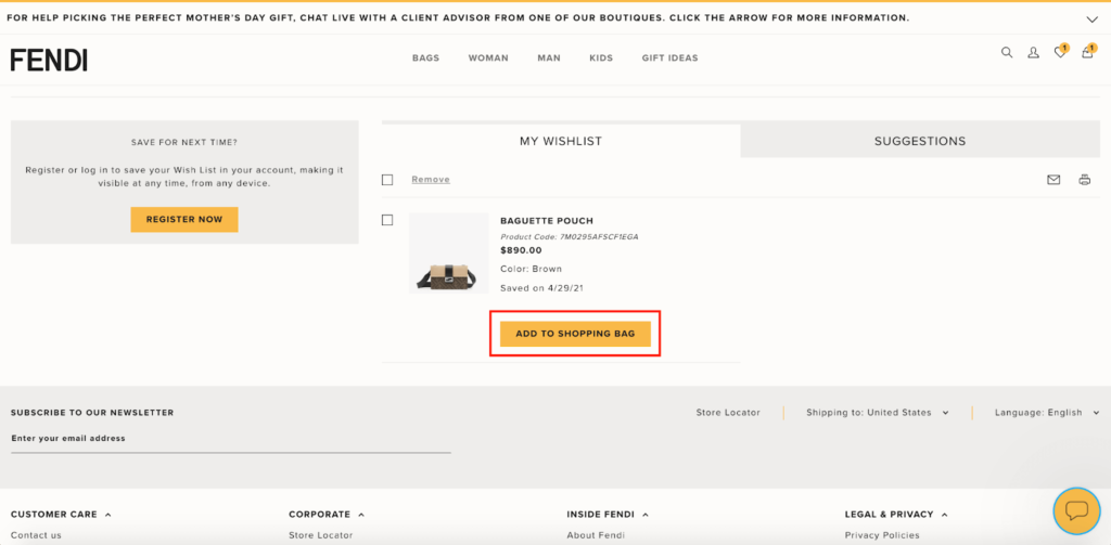
Once they do that, this area appears, allowing the shopper to review pricing information and check out.
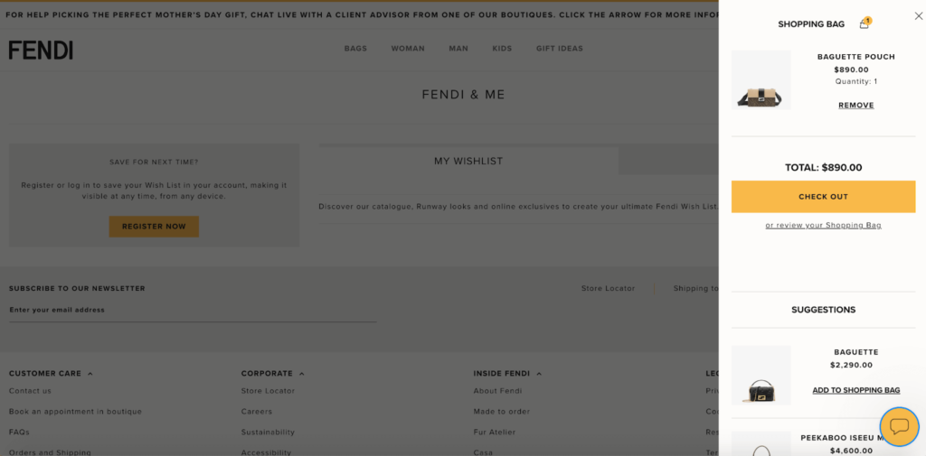
I love how seamlessly shoppers can get from Point A to Point B to Point C without any hassle. I also like how Fendi includes suggestions below the checkout section, which highlights other relevant items for a potential cross-sell or upsell.
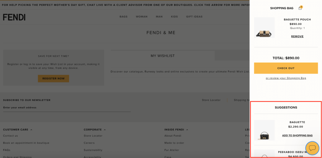
Given the high price tag of most of Fendi’s products, offering a user-friendly wishlist like this is perfect for giving shoppers some time to think about a potential purchase.
And when they’re ready and feel comfortable doing so, Fendi makes it a breeze to check out.
5. Max Mara
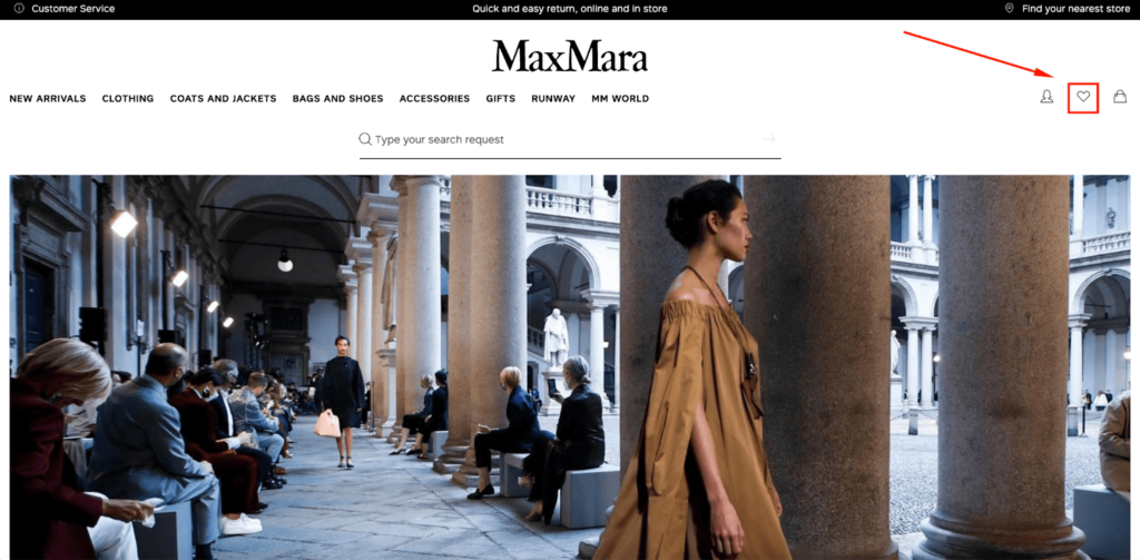
The last of the e-commerce wishlist examples comes from women’s luxury clothing brand Max Mara.
They follow the same basic formula, placing their wishlist at the top right-hand corner like all of the other examples.

When it comes to adding items, shoppers can do so by clicking on the heart icon on any product page.
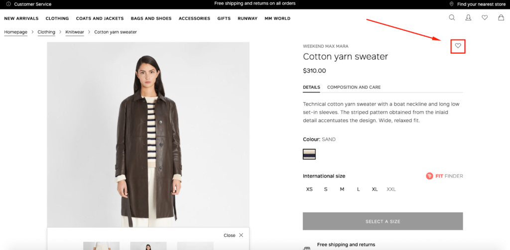
Once that’s done, the heart icon changes from white to black to confirm that the item has been successfully added—both on the product page and on the sticky icon at the top of the site.
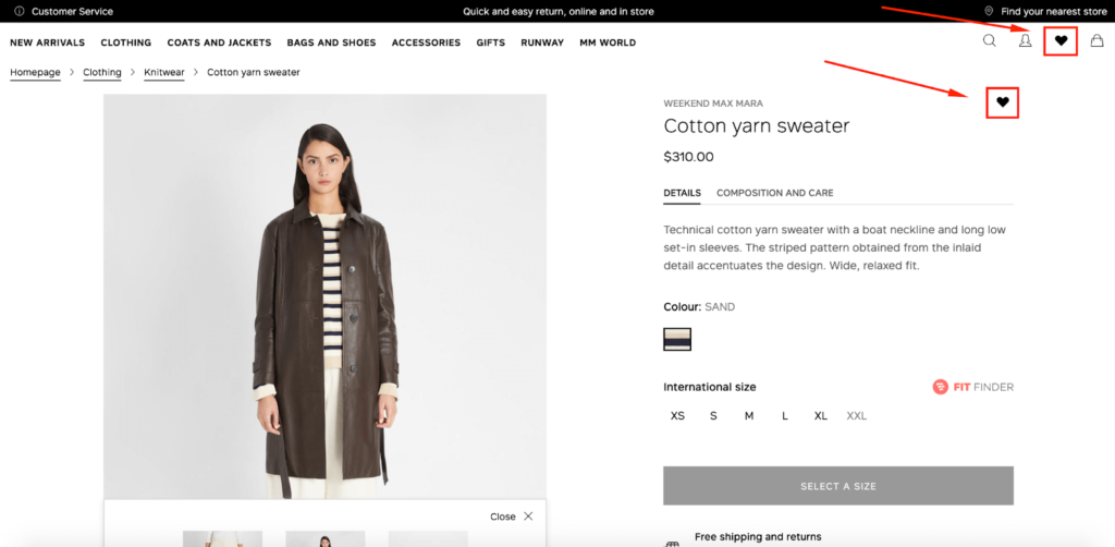
Now, whenever a shopper wants to go back over their wishlist, they can do so at any point by clicking here.
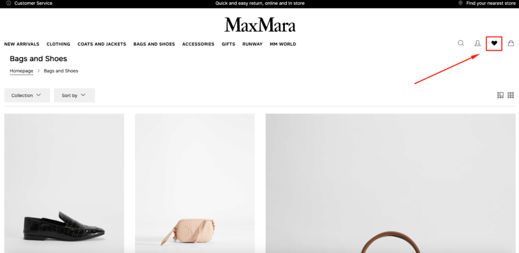
This, in turn, takes them to the wishlist page where they can find details and review products.
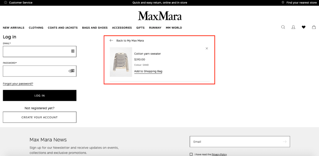
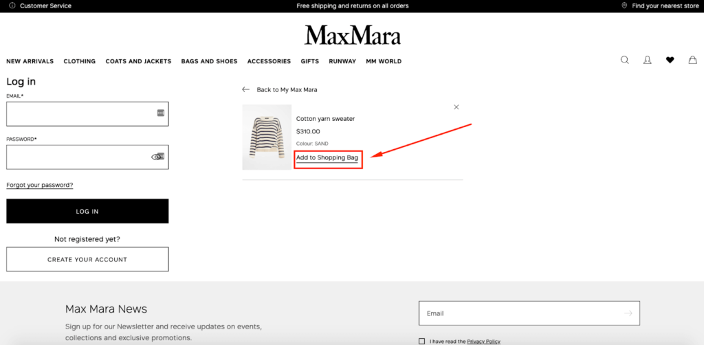
At that point, they can add it to their shopping bag…
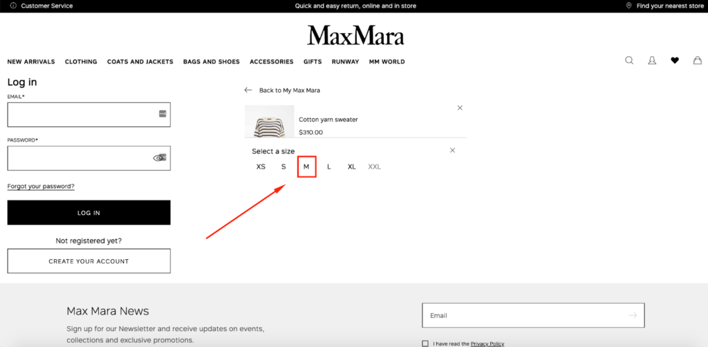
…where Max Mara prompts them to choose a size.
Then, the product appears here on the checkout page, where it’s ready to go.
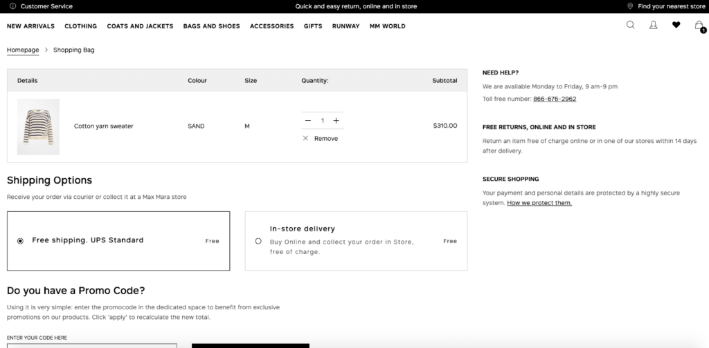
I personally love the clean interface Max Mara uses and how intuitive they make it for shoppers to add items to their wishlist and make a purchase whenever they’re ready.
It’s uncomplicated and shoppers never have to scratch their heads trying to figure out the process.

Conclusion
With 44 percent of e-commerce shoppers saying they want a wishlist and the long list of benefits that having one offers, I find it amazing that it’s not something more brands are currently doing.
It took me a while to find all of the e-commerce wishlist examples I mentioned here, as many brands have still yet to get on board.
This shows that being a brand that offers a wishlist can put you ahead of the competition and can be a cure for any cart abandonment woes you may be experiencing.
Just remember to follow best practices, which include:
- Featuring your wishlist in an easy-to-find location (ideally in the top right-hand corner of your site);
- Creating a simple, user-friendly experience;
- Clearly confirming when an item has been successfully added to a wishlist;
- Not gating it and forcing shoppers to sign up; and
- Making it simple to remove products shoppers are no longer interested in.

