A recent study shows that a big portion of e-commerce returns happens when products don’t match their online descriptions.
In other words, online shoppers return e-commerce items if the way the company describes the product doesn’t align with their needs or fit.
That’s where e-commerce size guides come into play.
With size guides that help visitors find the best items for their needs, you can reduce your return rates and improve the shopping experience in your online store.
To help you with that, I put together seven e-commerce size guide best practices you should follow on your website. You’ll also find a real-life example accompanying each best practice, so you, too, can create outstanding size guides that’ll help your visitors.
Let’s get started.

Table of Contents
1. Add a Size Guide to Your Navigation
3. Feature Customer Reviews to Validate Your Size Guide
4. Use an Interactive Size Guide
5. Display Product Videos to Highlight Fit
1. Add a Size Guide to Your Navigation
Research from the Nielsen Norman Group shows that visitors often leave a website in around 10-20 seconds. If you’re in an industry where sizing is crucial, such as fashion, make sure to place your size chart somewhere prominent and easily accessible, such as your top navigation menu.
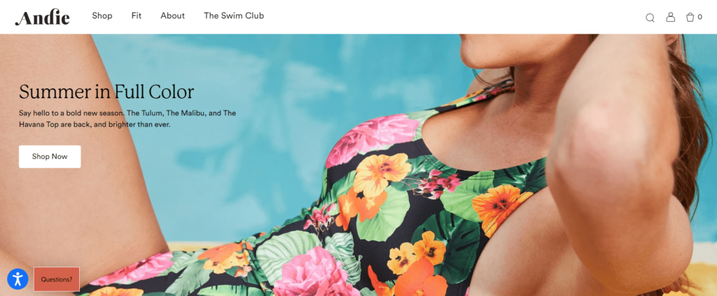
Andie, a swimwear company, follows this best practice on its website:
When Andie’s visitors hover over this top menu, they see three options:
- Fit Guide;
- Fit Quiz; and
- Fit Experts.
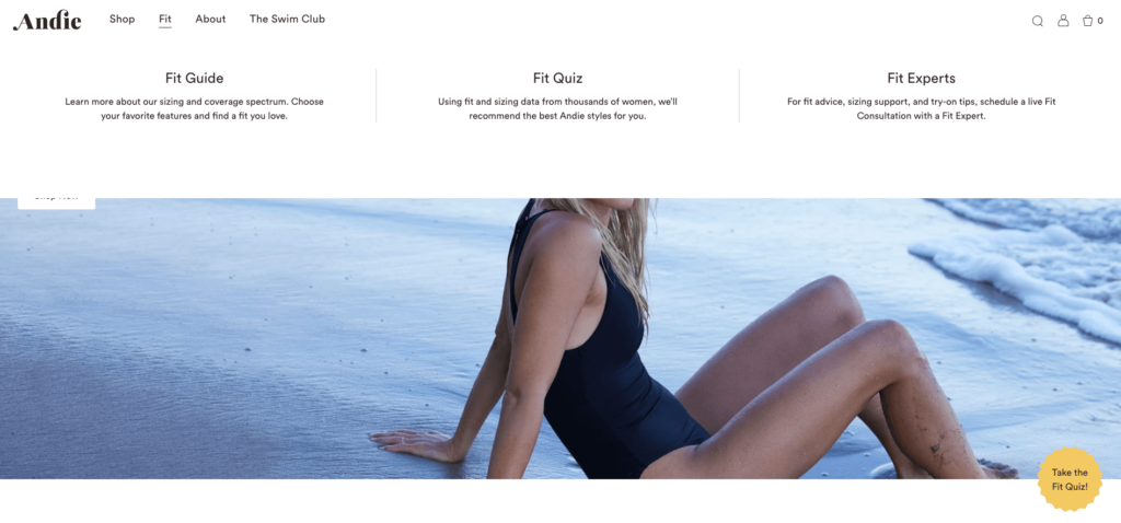
If shoppers are interested in Andie’s products but unsure of their size, it’s ridiculously easy to follow one of these options and shop without hesitation.
2. Use a Fit Finder Quiz
Fit finder quizzes are ideal to guide shoppers in a fun way. Plus, they can help you collect warm leads that are interested in your products.
Beardbrand does both by inviting visitors to find their perfect fragrance with a quiz:
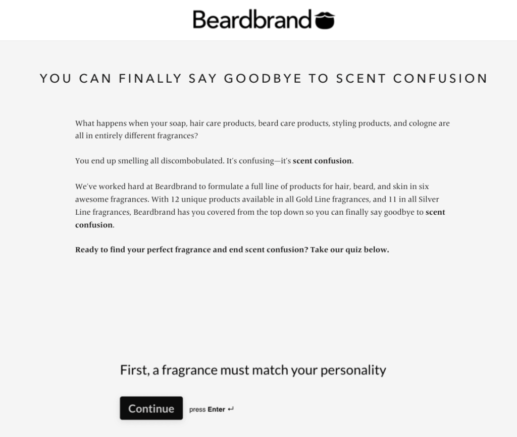
Once visitors fill this quiz based on their favorite free-time activities, workout preferences, and favorite fragrances, Beardbrand recommends products that are a great fit for the visitor.

But before doing that, the company smartly asks visitors to submit their email address:
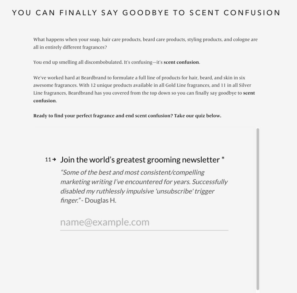
This way, Beardbrand helps shoppers discover products that match their needs and collects email addresses they can later target with personalized email campaigns.
3. Feature Customer Reviews to Validate Your Size Guide
Customer testimonials are crucial in e-commerce.
In fact, 97 percent of consumers consult product reviews before making a purchase. This means that reviews are no longer a ‘’nice to have’’ but an essential part of the shopping experience to boost your brand’s credibility.
Shein is aware of this. That’s why they feature customer reviews on their product pages.
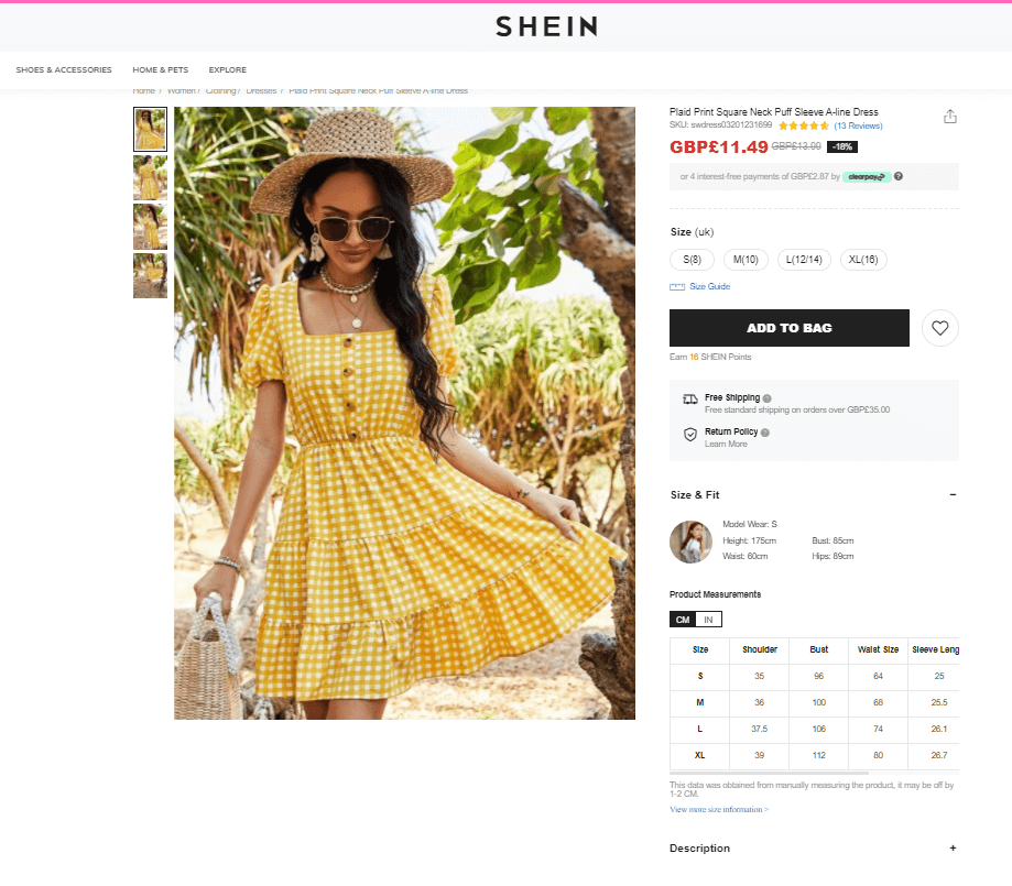
This section provides shoppers with an average rating based on the product reviews. What’s more, Shein’s visitors can also see if the buyers thought that the item fit well.
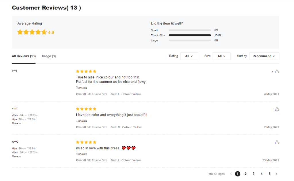
Here, customers can also comment on how the product fits them, the item’s size, and their body measurements. This way, Shein’s new customers can use previous reviews to determine the best size for their needs.
4. Use an Interactive Size Guide
Pricing or promotions aren’t enough to differentiate your e-commerce brand from competitors anymore. You need to go further and create a memorable online experience for your customers.
One example of such experiences is interactive size guides that help shoppers find the perfect item, and SRFACE does this right.
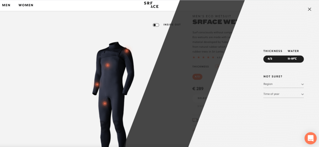
After landing on SRFACE’s homepage, you can, first, choose your gender. Based on your answer, the company takes you to a page with relevant products. Each product comes with an informative description to make your decision much easier.
Next, SRFACE invites you to choose your preferred thickness and size. And if you’re unsure, the company guides you through it all by asking a few questions.
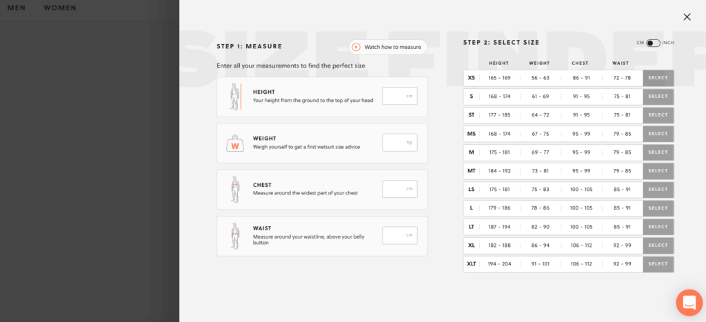
Finally, SRFACE helps you find the right size by asking your body measurements, such as height, weight, bust, waist, and hips.
In addition to this interactive size guide, SRFACE also offers an instructional video showing customers how they need to measure themselves to find the perfect size.
5. Display Product Videos to Highlight Fit
While showcasing your product photos on your e-commerce site can help demonstrate fit, you can take this one step further by using models. Using models to showcase an item helps customers better understand how the item, when worn, can look on them.
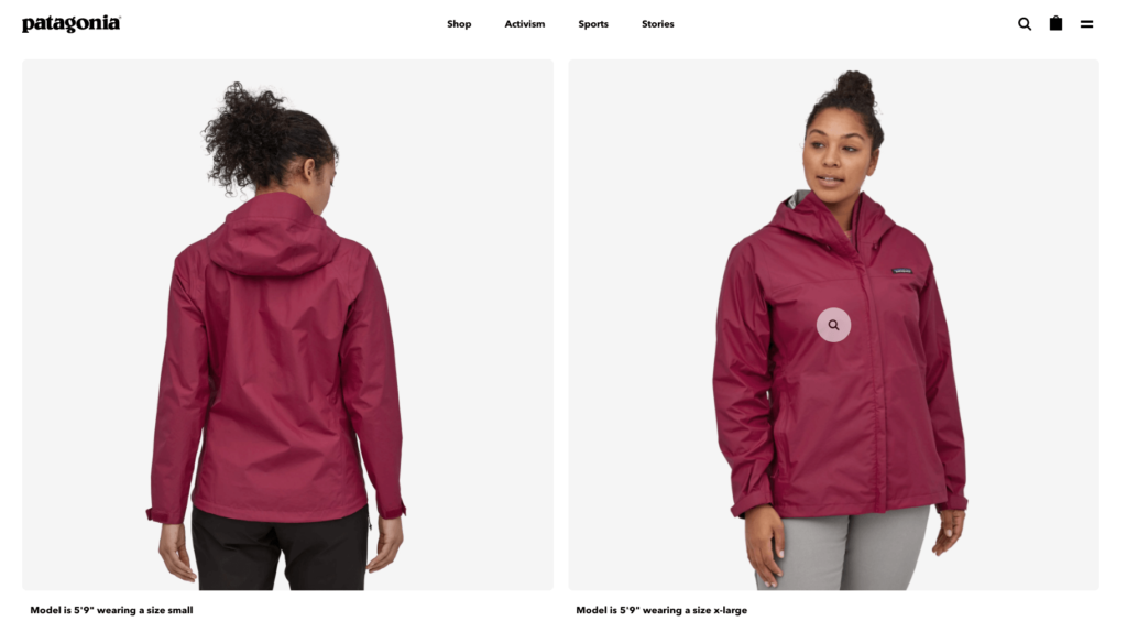
Patagonia is one of the companies that follow this advice on its product pages.
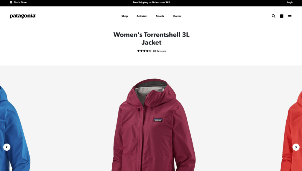
When you land on a product page, Patagonia shows you multiple photos of a model wearing the product from different angles.
The company also features a video that shows how the product looks in real life.
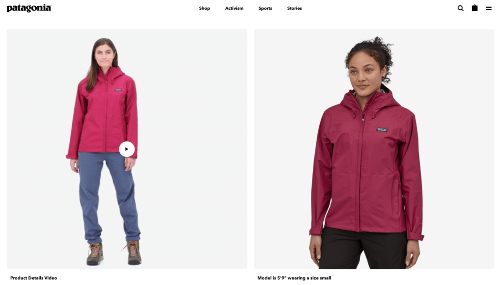
Research backs up the power of video as 69 percent of people prefer watching a short video to learn more about a product.
6. Use Multiple Models to Show Different Sizes
One of the most underused size guide best practices is to use multiple models with different body types to demonstrate different product sizes.
Madewell, the clothing retailer best known for its denim products, knows this well. That’s why they promote each jean style by using different models:
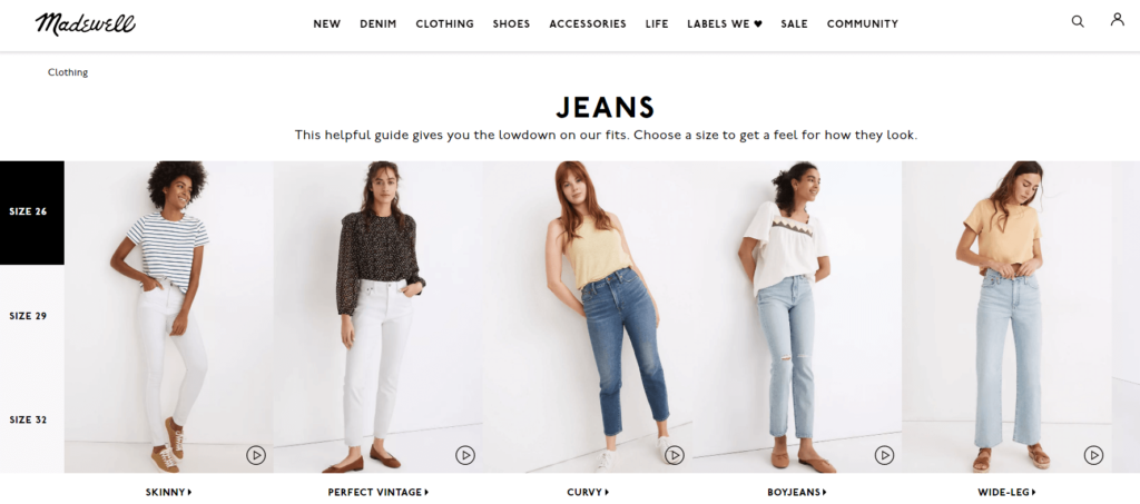
When you click one of Madewell’s jeans and land on a product page, you can see a model wearing the item. And if that’s not enough, you can change the model with a click:
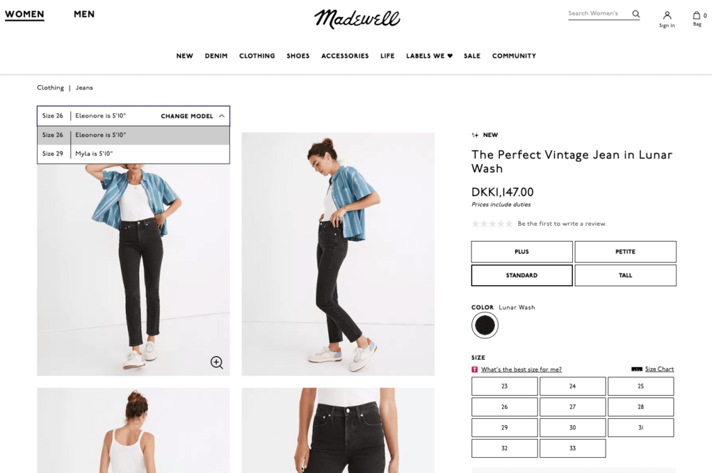
For instance, if you prefer a bigger size than 26, you can see a model wearing a size 29, instead:
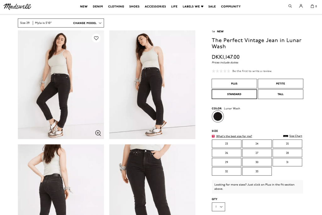
Madewell also includes a regular size chart to help you decide, including measurements for different countries…
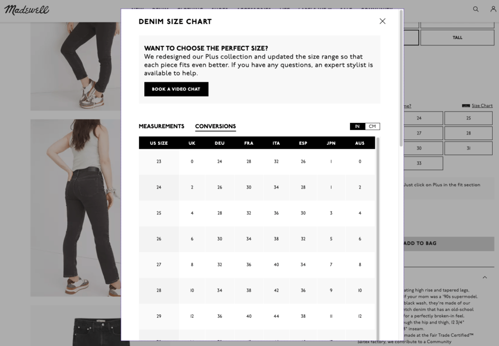
…which brings me to my next point.
7. Include Measurement Conversion Charts
If your store is catering to a wider geography and audience, your size guide needs to include measurements for international visitors, too. After all, a size 6 in the US isn’t the same as it is in the UK.
By adding a measurement conversion chart to your e-commerce size guides, you can ensure that all visitors find the perfect item, as ASOS does.
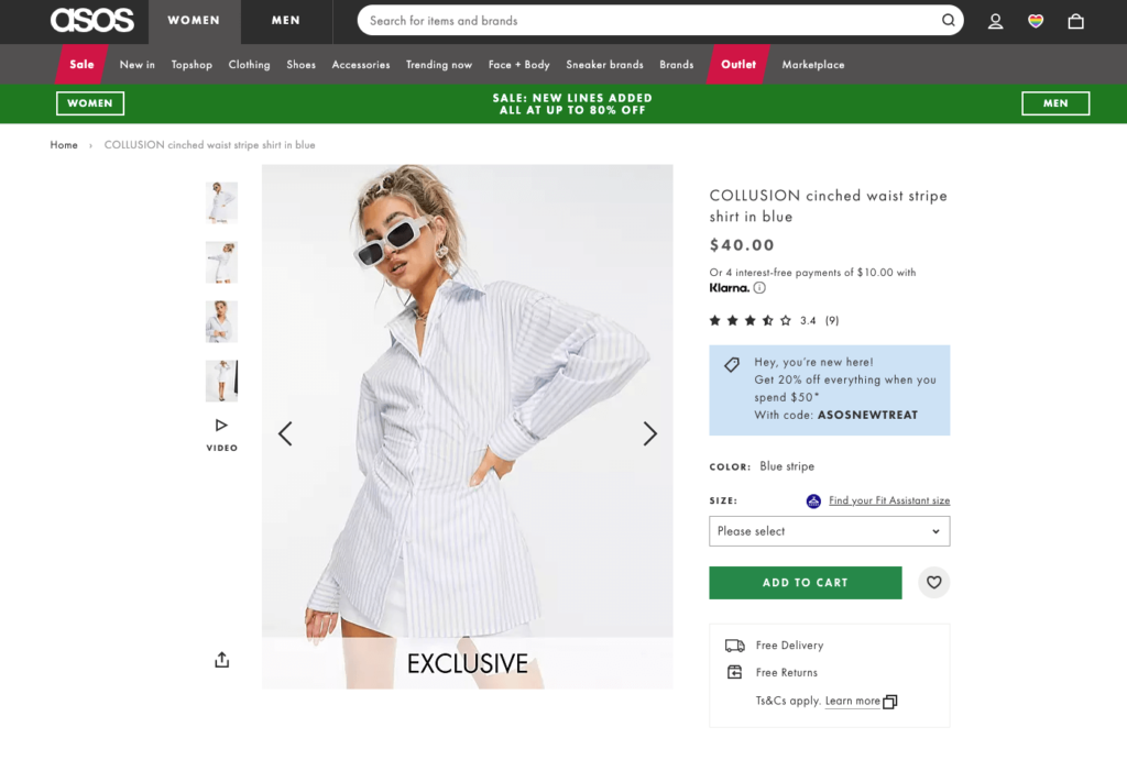
When you visit one of ASOS’s product pages, you see a call to action that reads “Find your fit assistant size.” When clicked, ASOS asks you a few questions regarding your weight, height, and so on—in multiple units of measurement.
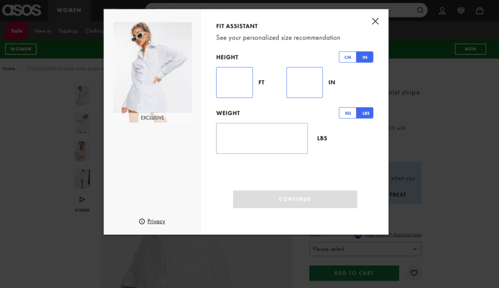
When you complete the quiz, you get your recommended size for this product in your country’s measurement:
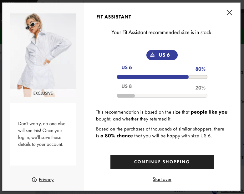
If you don’t want to go this far, you can simply link to a measurement conversion chart in your size guides and help international customers quickly find their ideal sizes.

Conclusion
Size guides are an essential part of the e-commerce customer experience.
Hopefully, these seven examples will help you create helpful size guides that’ll minimize returns and maximize customer satisfaction in your store.
Use these best practices and examples as inspiration and keep building on what’s working well for your visitors.

