Driving a high volume of targeted traffic to your e-commerce store is essential. But it’s only half the battle. You also need to convert traffic into customers.
After all, it doesn’t matter how many leads you generate if you have a measly conversion rate. Considering the average e-commerce conversion rate was 2.04 percent as of mid-2019, it’s safe to say there’s plenty of room for improvement for most brands.
While numerous factors contribute to conversions, a major one is how well shoppers understand your products. And that’s one of the most significant disadvantages e-commerce stores have when compared to brick-and-mortar stores.
Shoppers can’t physically touch, feel, and inspect your products when browsing through your selection virtually. So the better job you do at helping them understand your products’ core features and benefits are, the better your odds are of making a sale.
In this post, I’ll tackle some essential e-commerce conversion rate optimization strategies that address this in detail so you can deliver an excellent digital shopping experience and motivate prospects to buy.
Let’s dive in.
Table of Contents
1. Display Multiple Porduct Angles
2. Offer Videos for Complex Products
1. Display Products from Multiple Angles
Having a professional store design and fantastic product photos should be a precursor to pretty much everything else (except for having a fast loading site).
It’s vital that you help shoppers visualize your products so they can envision themselves using them.
Of course, you’ll want each feature image to be crisp and clean with great aesthetics.
But I recommend taking it one step further and displaying each product from multiple angles.
This can make a huge difference and gives shoppers a much better feel for your products.
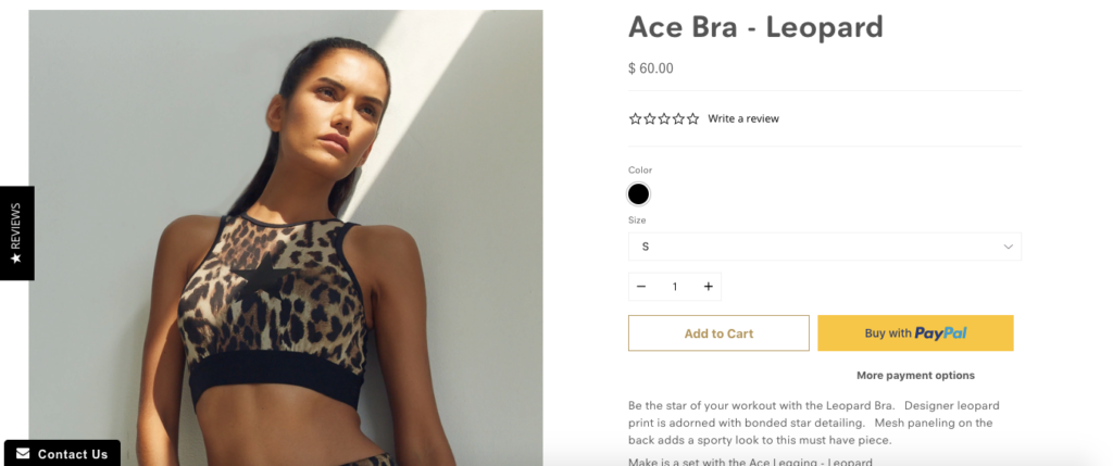
Women’s yoga apparel and activewear company Noli Yoga does a great job at this.
Here’s their feature image for one of their products.
And just below that, shoppers can find additional products from a variety of angles.
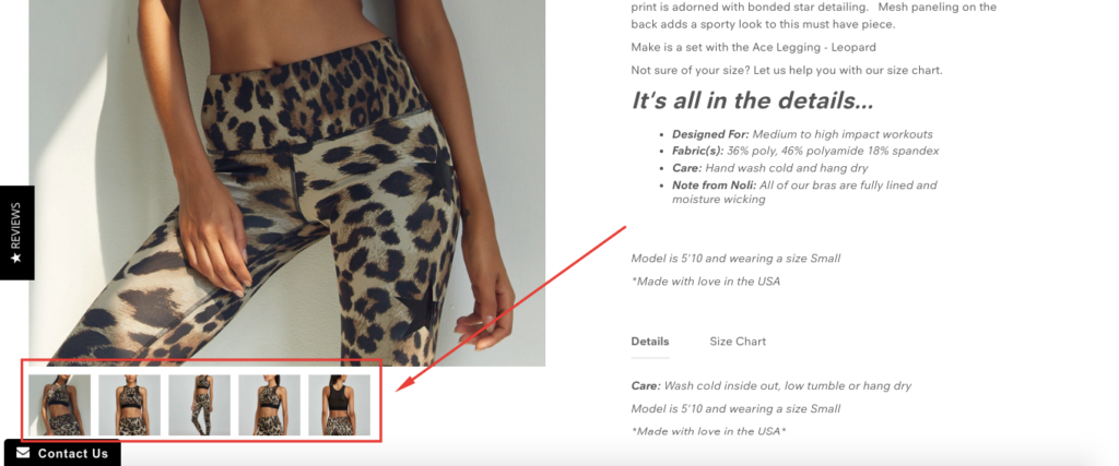
Just like that, they can see the product from the back as well as the side.
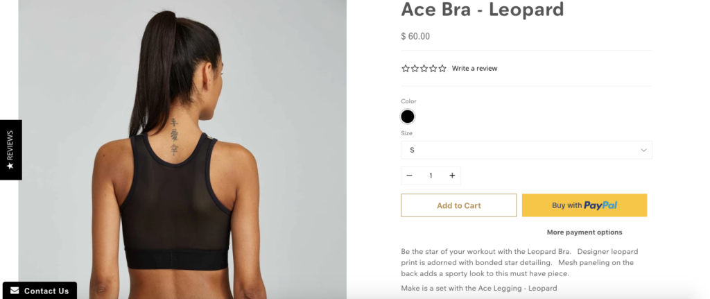
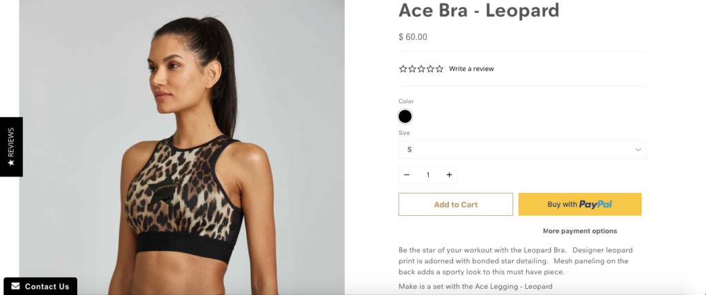
In turn, shoppers can quickly tell if it’s something they’re interested in, which should make them more comfortable making a purchase.
2. Offer Videos for Complex Products
If a picture is worth a thousand words, a video is worth a million.
Most people naturally gravitate toward video, and if there’s any potential confusion on how a product works, this can quickly fill shoppers in on the details.
In fact, “97 percent of businesses said their explainer video has helped increase user understanding of their product or service.”
Not only that, 81 percent said it led to a spike in sales.
So this is a strategy I highly recommend implementing, especially if you have a complex product that’s difficult to understand with just pictures.
It requires some time and money, but the long-term payoff should be well worth it in most cases.
One brand that has made great use of a product video is Training Mask, a brand that sells high altitude equipment for respiratory conditioning and exercise.
When checking out their product, it looks interesting enough.
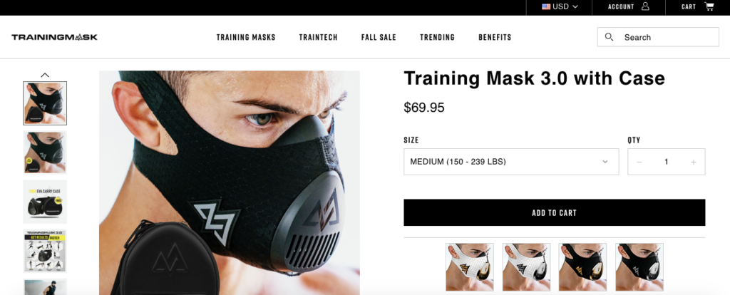
But you don’t necessarily know exactly what it does and how it works right off the bat.
However, with a brief video that’s just a minute long, you quickly learn the details and see it in action.
I think this video does a great job of hyping the product up and shows shoppers how much more intense their workouts would be if they used the Training Mask.
3. Be Clear About Product Details
You should never assume that e-commerce shoppers know the full scope of a product’s details.
And you don’t want them to have to do a bunch of research and play detective to figure it out.
If any significant points are murky, it will likely reduce their comfort level, and you can kiss any potential for a sale goodbye.
That’s why you should leave no stone unturned.
One brand that I think nails this aspect of CRO is Brilliant Bicycle Co. who offers beautiful custom bikes.
Check out the product page for one of their bikes—the “Cooper.”
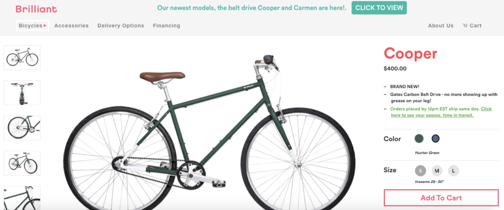
It looks solid.
But rather than leaving it at that, shoppers can scroll down and find a lot of other helpful information so they can make a well-informed decision.
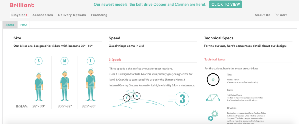
There’s the “Specs” section, which outlines the size, speed, and technical specs.
And there’s the “FAQs” section, which highlights ordering information and addresses customer satisfaction.
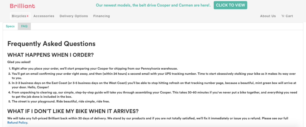
I don’t know about you, but I would find all of this very important if I were considering spending $400 on a new bike, and it would help set my mind at ease.
So whatever your niche may be, make it a point to be transparent about product details, so your customers know what they’re getting and what to expect.
Not only should this help increase conversions, but it should also reduce your return rate as well.
4. Create a Product Benefits Section
The more transparent the benefits of using your products are, the more likely shoppers are to convert.
It’s that simple.
So it’s critical that you do an excellent job of conveying the benefits and make them easy to find.
One way to go about that is to create a formal product benefits section on your e-commerce store.
Case in point—Luxy Hair, a brand that offers high-quality hair extensions.
Just check out their navigation menu.
There’s a page called “Why Luxy Hair.”
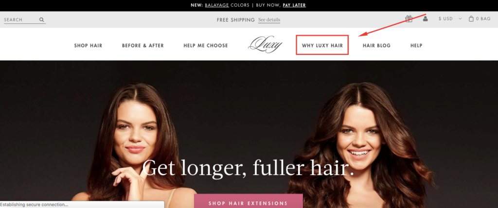
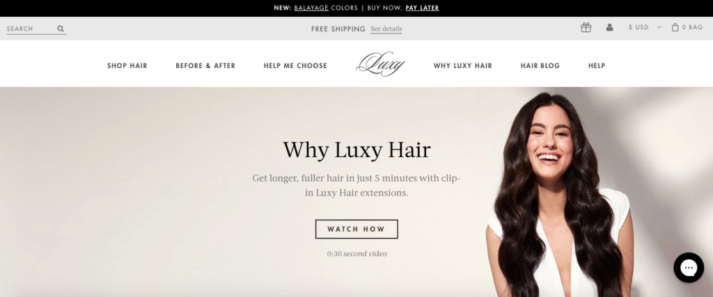
After clicking on it, shoppers can find reviews, store rewards, and learn about the benefits of using Luxy Hair.
Scroll down, and they can learn about the top 10 reasons to choose this product.
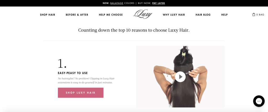
And what’s cool is that each step offers a video that makes the product come to life.
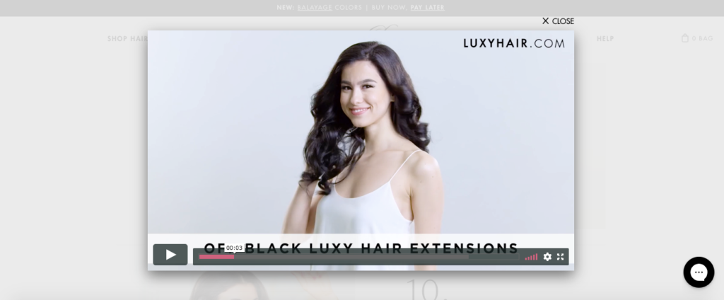
Besides that, it includes CTAs to different products and resources.
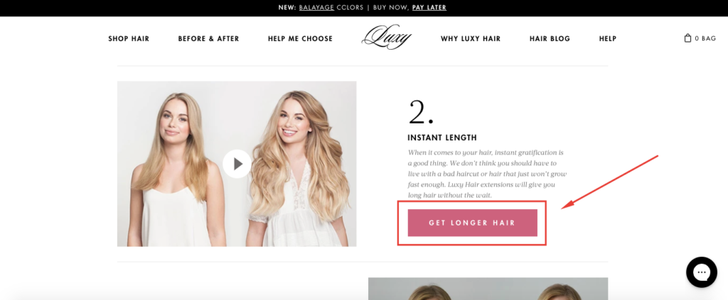
This way, shoppers can conveniently navigate to the sections of the site they’re most interested in at the most convenient time.
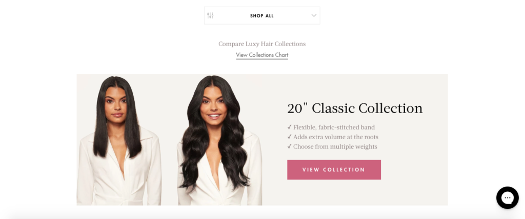
This is going to have a positive impact on conversions. So I think following a similar formula that Luxy Hair uses is a great idea.
5. Offer Customer Reviews
I’m sure you know by now how powerful customer reviews can be.
“Nearly 95 percent of shoppers read online reviews before making a purchase, and 72 percent of customers don’t take action until they have read reviews.”
So another one of my e-commerce CRO tips that will help shoppers better grasp your products and encourage them to buy is to integrate reviews directly into your product pages.
Take camping and backpacking brand Sierra Designs, for example.
Here’s what you see at the top of their page for one of their tents, the “Clip Flashlight 2”:
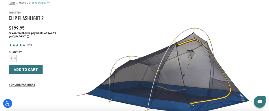
It looks great, and they offer plenty of product information. But what I love is their “Product Reviews” section below that. First of all, you see that this particular tent has a 4.8 rating, which is good.
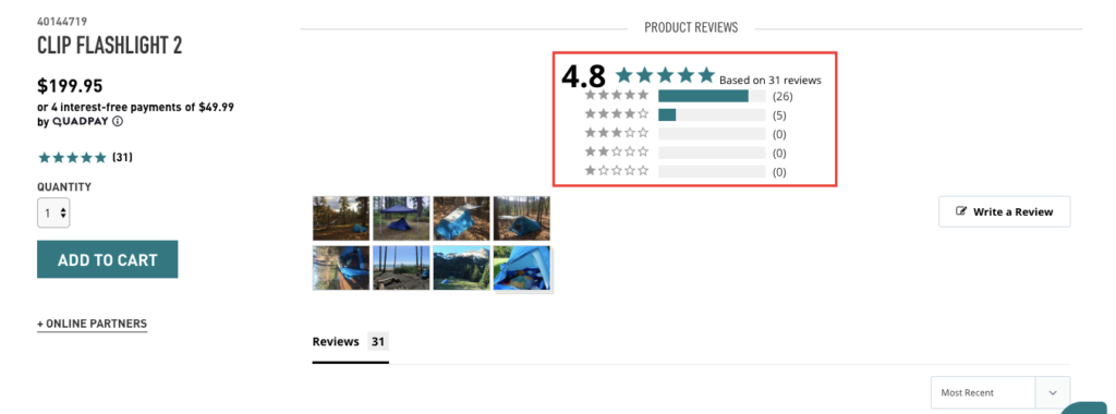
That alone could be enough to persuade a good percentage of shoppers to buy. But if you scroll down just a bit more, you see over 30 written reviews from customers that give you an objective perspective on the tent, with many including pictures of it in action.
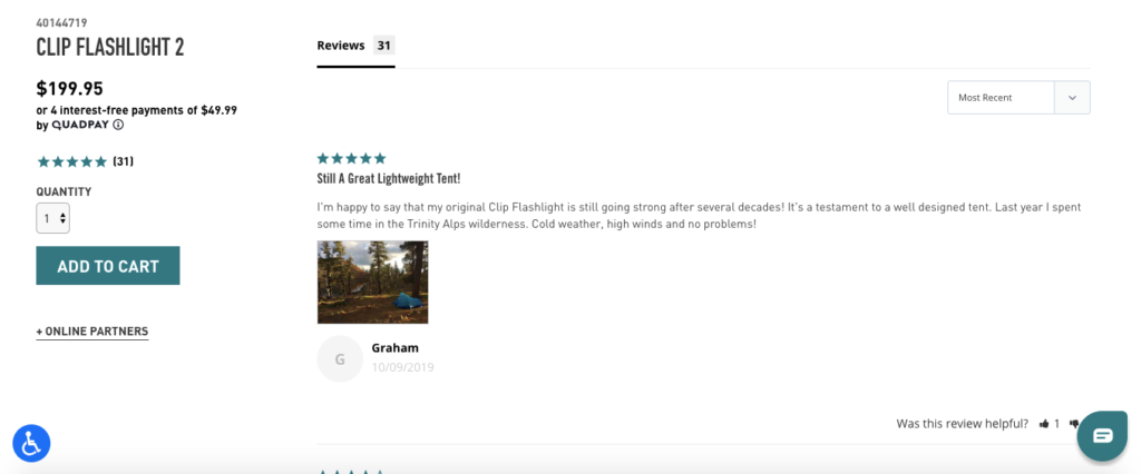
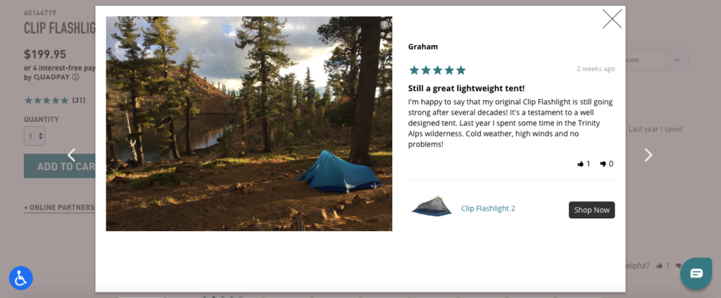
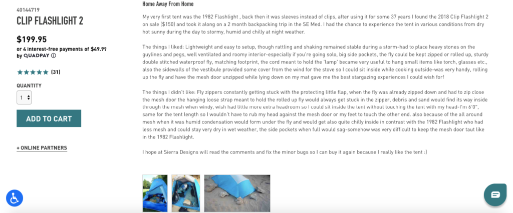
And some reviews are super detailed like this one and point out the pros and cons.
I can’t think of a much better way to provide shoppers with unbiased feedback.
By getting actual customers into the action and proving that your products deliver, you should be able to reduce skepticism among shoppers and persuade a higher number of leads to go through with their purchase.
6. Give Shoppers a Glimpse Into Your Culture
People don’t just buy products anymore. They buy into brands.
“Eighty-seven percent of consumers stated they would purchase a product based on values—because the company advocated for an issue they cared about—and 76 percent would boycott a brand if it supported an issue contrary to their beliefs.”
Therefore, I think it’s more important than ever to let shoppers know about your culture, including your mission, philosophy, and values.
This creates a compelling story and is a great way to build instant rapport with your target demographic.
Ethical and sustainable clothing brand Happy Earth is a brand that pulls this off brilliantly.
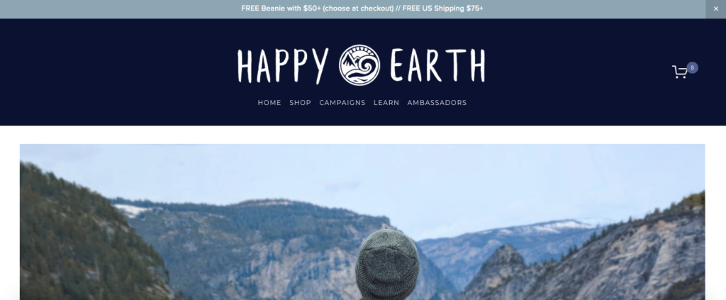
They have a bold motto with “Give a Damn” and give 50 percent of their net profits to promote conservation and sustainability.

And their culture is woven into their copy.
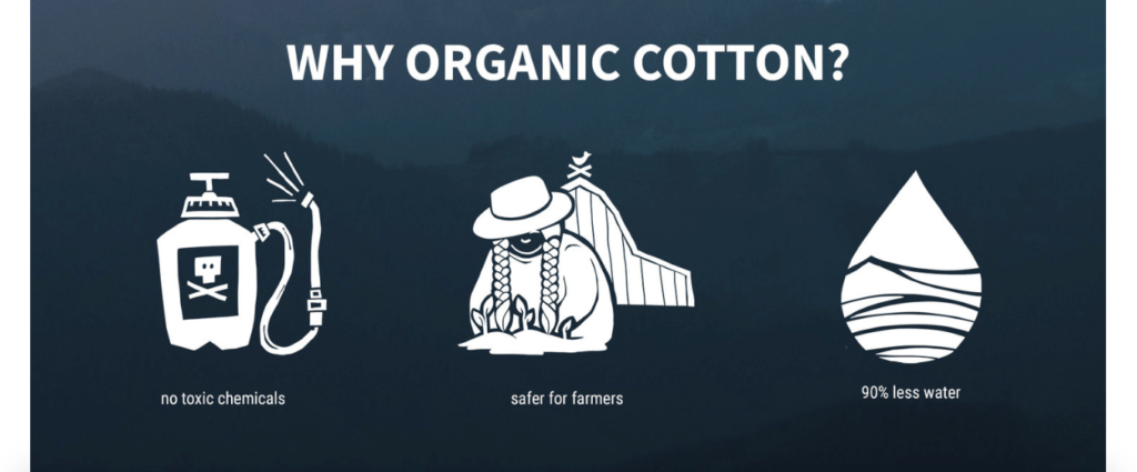
First, they explain why they use organic cotton.
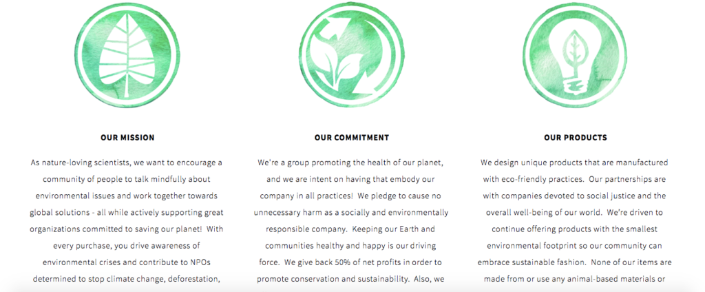
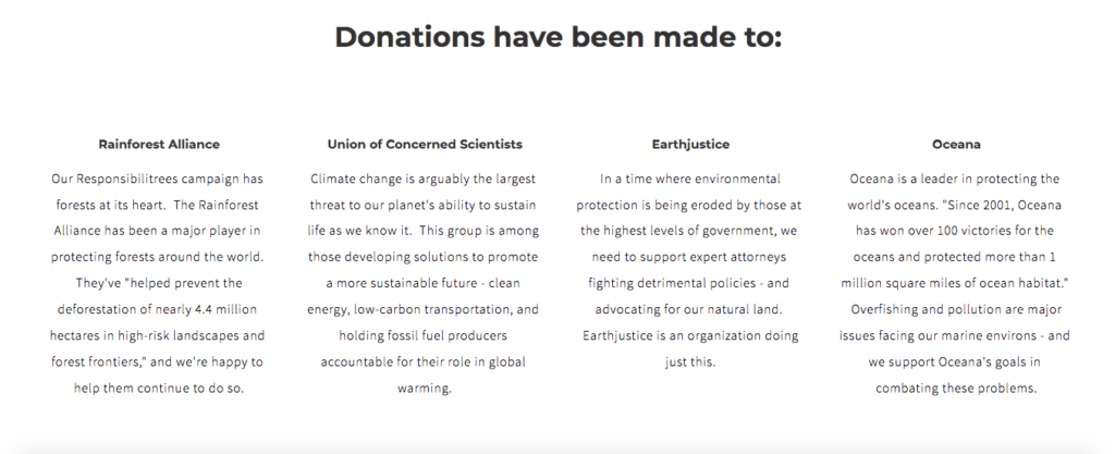
Then they mention their unique selling proposition of giving away 50 percent of profits to support conservation efforts.

Shoppers can click on the link to learn about the details and see what specific contributions Happy Earth has made.
This isn’t to say that you need to have environmental or social consciousness at the core of your brand culture to be effective.
But it’s definitely smart to let shoppers know what you’re about and what you stand for because it can have a significant impact on your conversions long-term.
7. Use a Chatbot to Answer Basic Questions
Did you know that chatbots are predicted to handle up to 85 percent of all customer service interactions by 2020?
This stat shows how big of a role chatbots are already playing in e-commerce.
And many of the world’s leading brands are taking full advantage and using this technology to guide shoppers and assist them with any basic questions they may have.
Chatbots serve as a digital salesman that’s available around the clock.
For instance, Levi’s has a chatbot that helps direct shoppers to the products they’re looking for and instantly answers their questions.
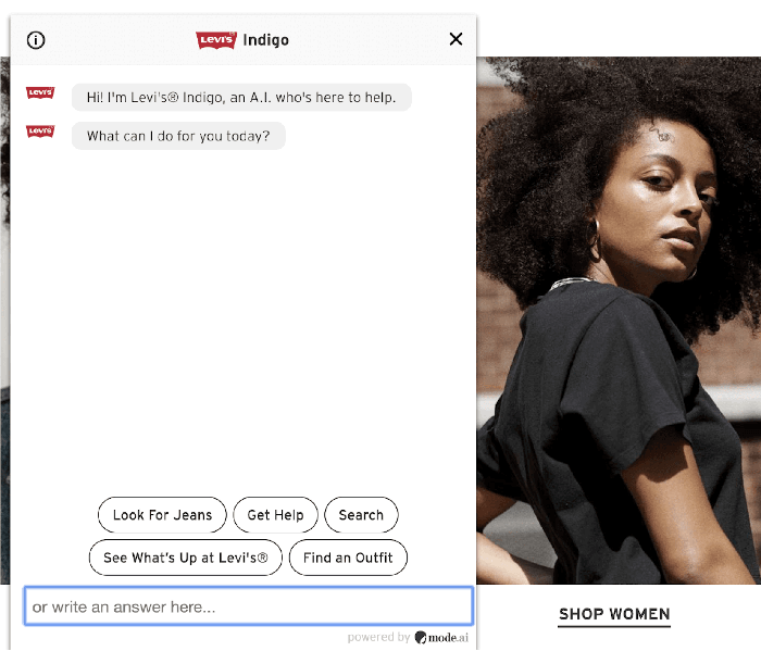
I think this is innovative and makes the clothing shopping process a breeze.
They also have a “stylebot” that helps shoppers find the perfect fit for their jeans that’s 100 percent tailored to their unique preferences.
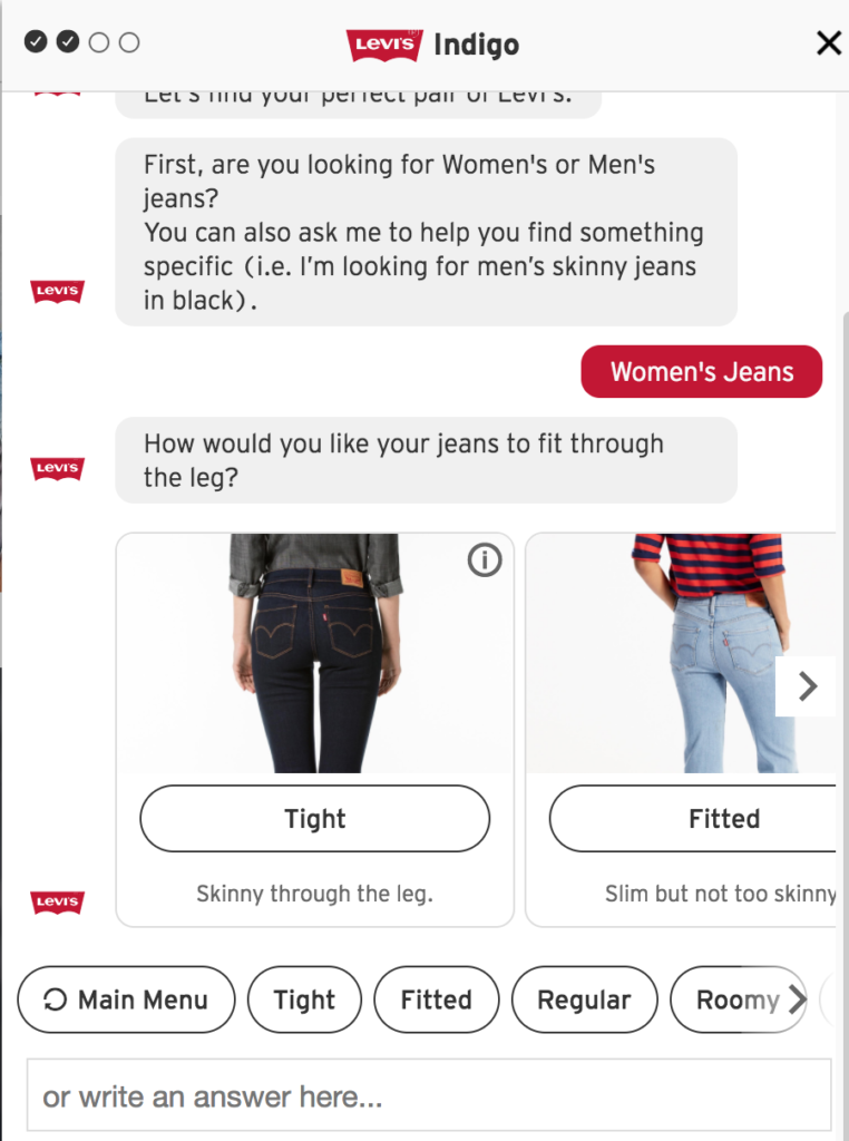
I know how big of a pain it can be to find the right pair of jeans, so this is a definite game changer and puts Levi’s way ahead of the competition.
This creates an ultra-simple, streamlined shopping experience that drastically increases the chances of someone making a purchase.
And here’s the thing: a good chunk of shoppers already embrace this technology.
“Forty-seven percent of consumers are open to buying items through a chatbot. As long as they can get help quickly and easily, 40 percent of consumers don’t care whether a chatbot or a person answers their customer service questions.”
As this technology continues to advance and evolve, a much higher percentage of shoppers will likely be on board..
At this point, you probably think that chatbots can be an excellent CRO tool, but you may also assume that only huge brands with deep pockets can afford to use them.
While you may not have the resources to create something as sophisticated as Levi’s chatbots, this technology is still within your grasp.
In fact, most e-commerce platforms have plugins that allow you to implement a chatbot, with some being free.
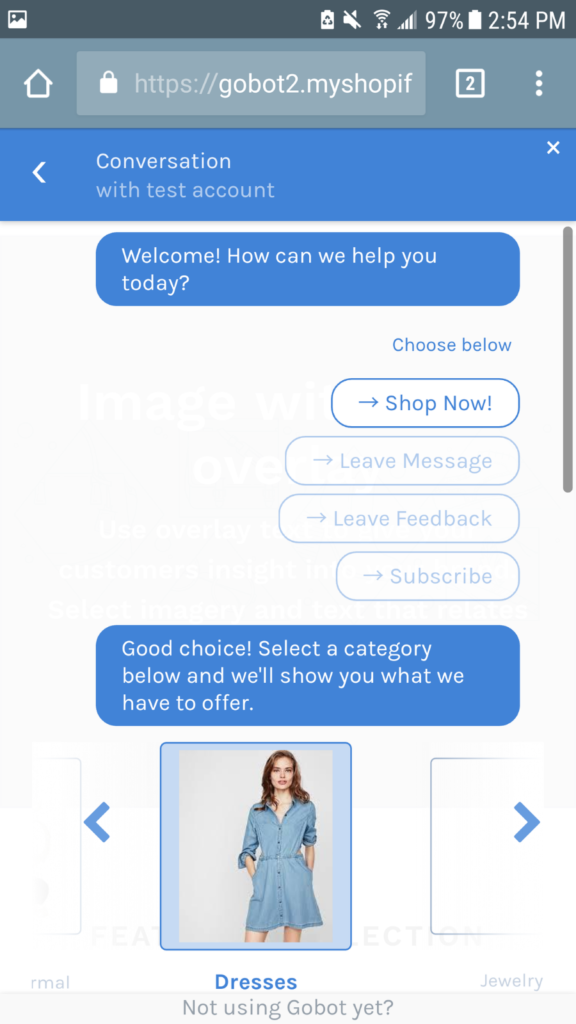
For example, Shopify has Gobot that helps your customers find products, answers their questions, and collects their feedback in real-time.
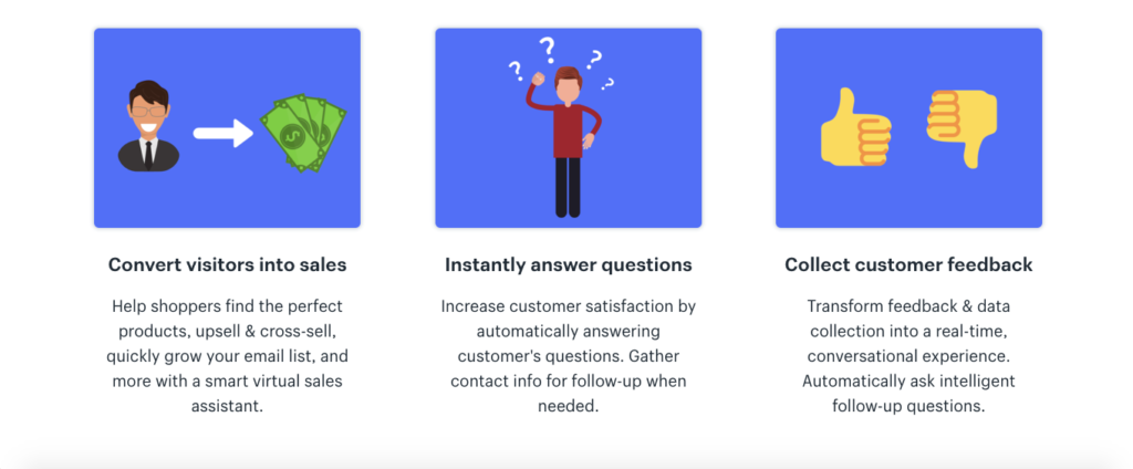
Here are some screenshots of what it looks like.
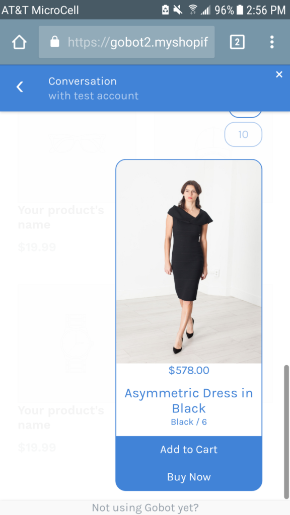
And if you use Magento, you can check out this guide that features the top chatbots extensions for 2019.
My point here is that you don’t have to have a ton of money or an in-house development team to build a chatbot, and you can create a basic one with relative ease.

Conclusion
There’s a lot that goes into making an epic e-commerce store where products convert at a high rate.
But one of the absolute fundamentals is making your products easy to understand.
If you can do this successfully and take the guesswork out of it, you should be in good shape.
The e-commerce CRO tips outlined here should ensure your shoppers have no trouble figuring out your products, how they work, and why they should buy them.
So when it’s all said and done, you can get the most out of your leads and elevate your sales to the next level.


