If you’re anything like me, you’re continually scavenging for new and exciting newsletters to learn from and model.
There are a lot out there, but e-commerce newsletters have much to offer by way of inspiration.
Think about it: they’re competing with dozens if not hundreds of other brands in your inbox, fighting to get your attention and, hopefully, order.
In this article, I went through our Gmail swipe file to find the seven best newsletters to follow.
Table of Contents
1. Shinesty
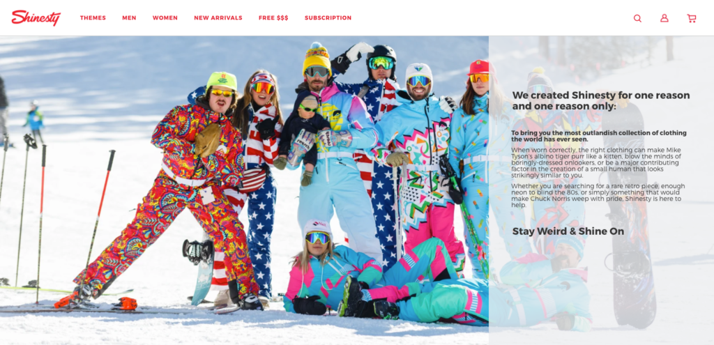
Shinesty is an online retailer that describes itself as “a vintage clothing brand that aims to bring an outlandish collection of clothing.”
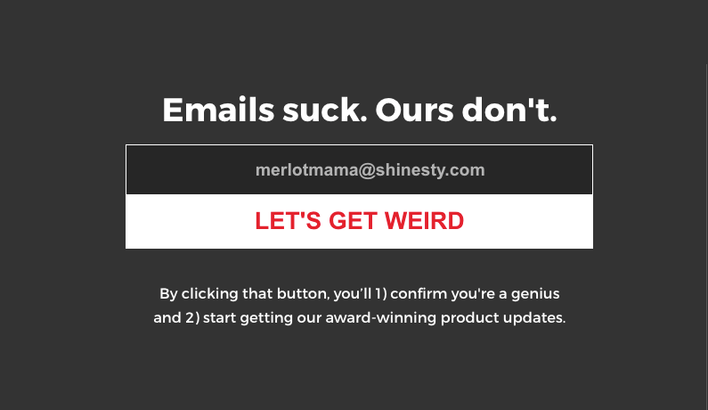
From its provocative headline (“Emails suck. Ours don’t”) to its humor copy promising “award-winning product updates,” the brand outlines what to expect from its emails.
Having opted in (and thereby confirming my inner genius), it wasn’t long before I found myself laughing—out loud at times—with a brand delivering on its promise for weirdness.
Bizarre. Entertaining. Controversial. There are too many adjectives to describe what it is that makes Shinesty’s emails memorable, but one certainty is they immediately grab your attention.

What I like most, though, isn’t even the emails themselves. Rather, it’s what they do before you even open their emails. Take a look at my inbox below. Notice anything interesting?
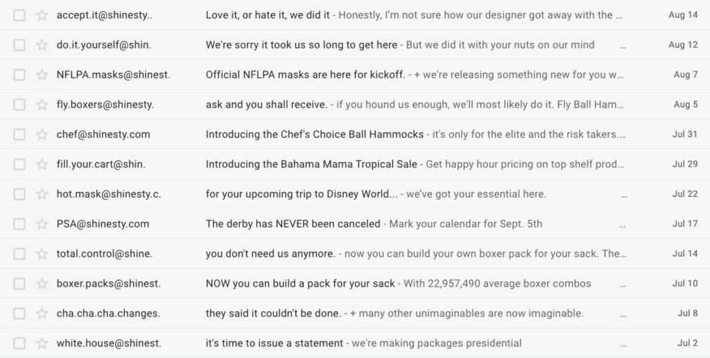
The email’s sender always relates to the email’s topic. For instance, do.it.yourself@shinesty.com relates to an email about a build a boxer workshop.
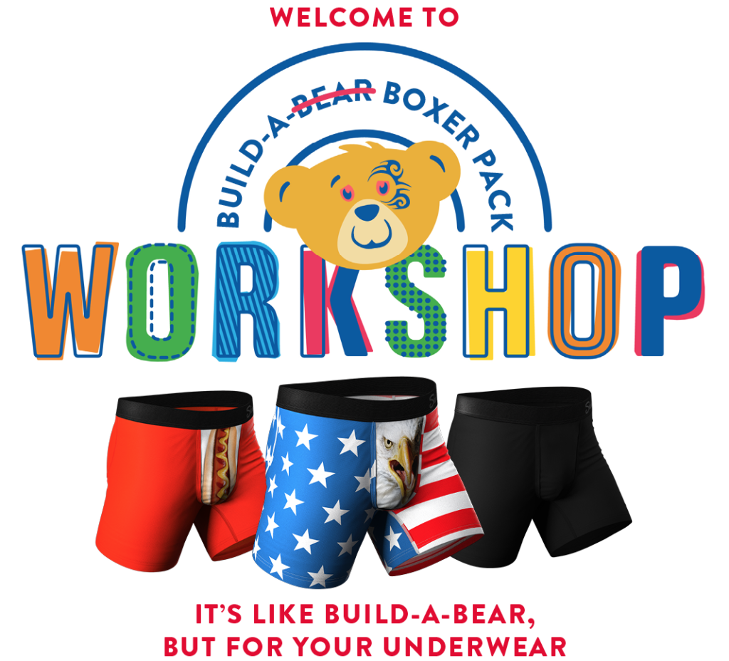
In addition to the email’s sender, Shinesty, with good reason, also personalizes each email’s preview text. According to one report, as much as 24 percent of respondents look at the preview text first when deciding to open an email.
In one recent email, Shinesty divided its audience for a new product by writing in the preview text, tauntingly, “It’s only for the elite and the risk takers.”

While Shinesty is known for its wacky humor, the brand isn’t afraid to address global issues. Following the recent civil unrest in the United States, Shinesty wrote an email titled “F**k Racism,” asking readers to unsubscribe if they disagree with its position.
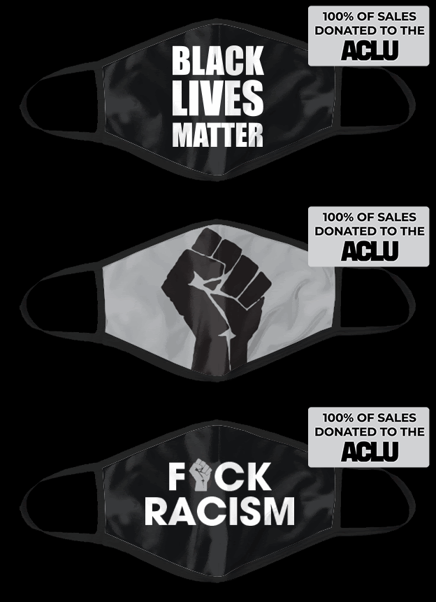
You don’t have to go to the length Shinesty goes with its email (especially when it comes to its humor). But personalizing areas of your email you wouldn’t have otherwise considered—like an email’s sender and preview text—can get you noticed in a red inbox of competitors.
2. Allbirds
Allbirds, a footwear brand that promises “The World’s Most Comfortable Shoes,” is a company worth following due in part to its exceptionally well-crafted newsletters.
Minimalistic, with a touch of persuasion, the brand has a knack for combining alluring GIFs and images with descriptive product copy, leaving you desiring more.
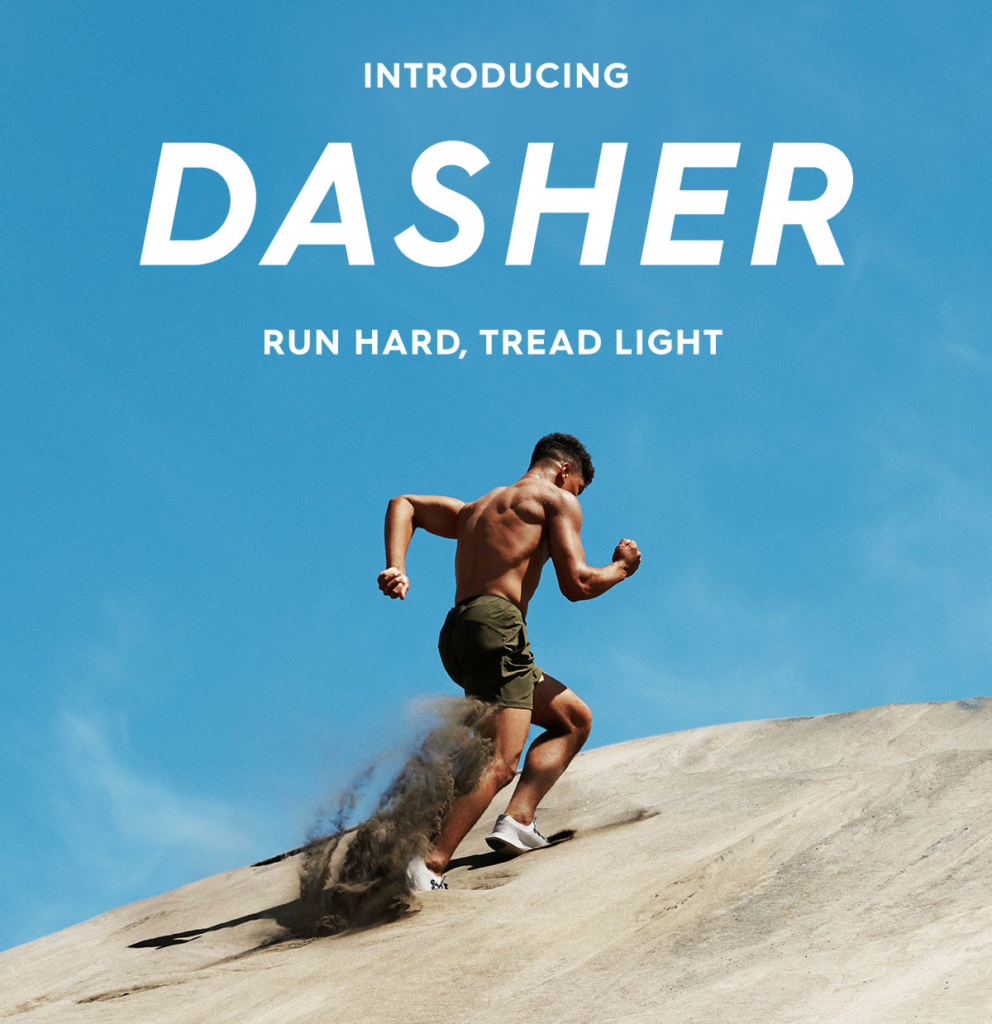
Take a recent email introducing Allbirds’ new Dasher footwear. It begins with an appropriate hero image of a man running up a dune, complete with the tagline, “Run hard, tread light.”
From there, it continues with compelling product copy, drawing words like “stability,” “support,” and “durability” to invite readers to click through and learn more.
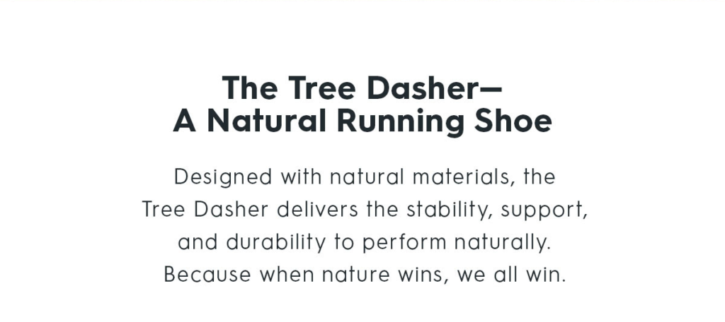
What’s most comforting, though, is that the brand isn’t afraid to highlight its value proposition (designing environmentally-friendly footwear) as one of its product’s key selling points.
In one recent email promoting its new product, “The Wool Piper,” Allbirds mentioned the product’s reduced carbon footprint to remind readers of the brand’s core value.

Remember, how you do what you do is a key differentiator for many brands (including, more famously, Schlitz Brewery). If you’re doing something different, don’t be afraid to tell readers in your emails.
3. Chubbies
Unless you’ve been living under a rock, you’re likely familiar with the cheeky frat-boy brand, Chubbies.
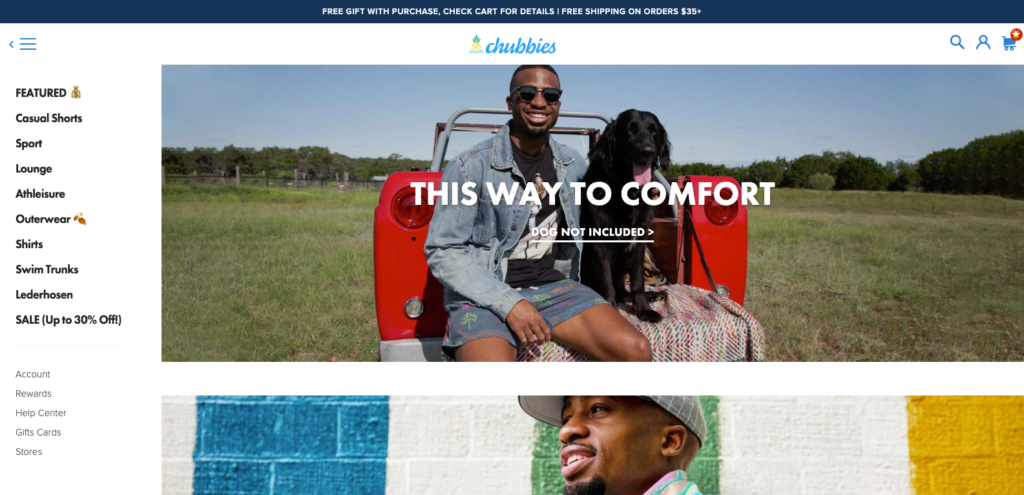
Describing itself as “an e-commerce company offering radical shorts for men,” the brand catapulted itself into the public zeitgeist by blending humor with its signature brand of short-shorts.
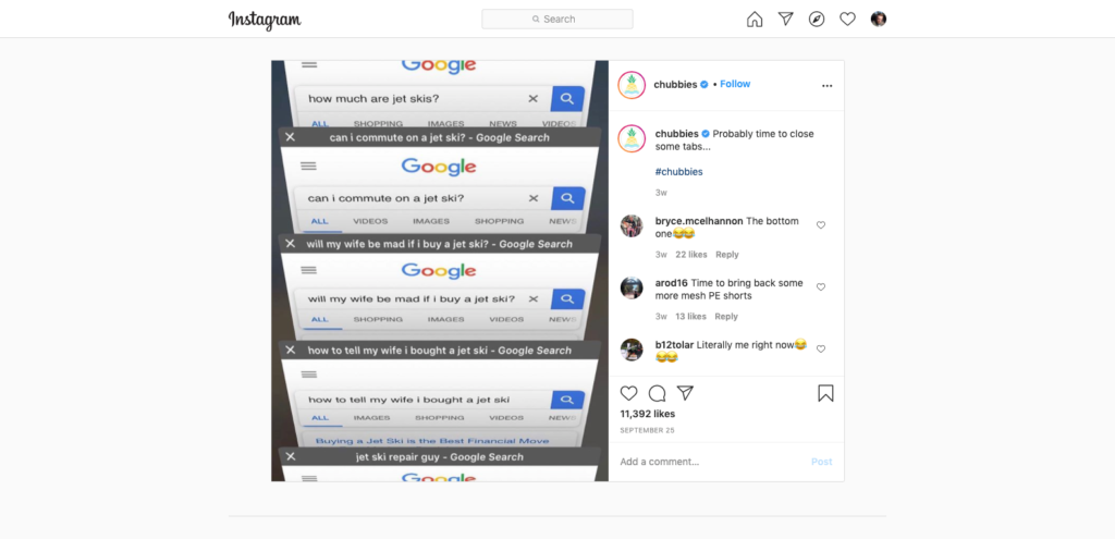
Like Shinesty, Chubbies goes above and beyond with every email, particularly with how it uses both a recipient’s first and second names in its subject lines.
In emails to our very own Rikke Thomsen, the brand has been known to riff on her first name…

…her last name…

…and even her location on one occasion.

The brand uses ultra-personalization for more than comedic effect, though, always rightly linking its subject back to the email’s body. In the above example, Chubbies linked the non-existent Lake Aarhus to shorts.

Another area worth highlighting is how Chubbies captures the reader’s attention from the offset, telling a quick, humorous anecdote in one or two sentences.
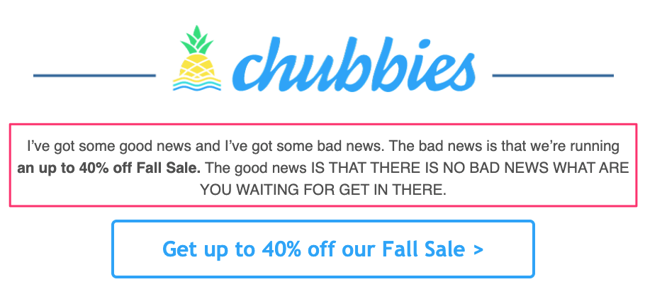
Combining humor with ultra-personalization might not be for you. And that’s okay; it’s not for everyone. But finding your brand’s voice has the making for building a tribe of raving fans.
4. Bellroy
If you’ve read my article on Bellroy’s marketing strategy, you’ll know that I’m a big advocate for the brand. (And not because they mailed me a free wallet; thanks, Andy!)
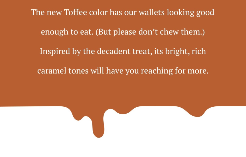
Known for its emphasis on ease and simplicity, Bellroy’s emails are as easy on the eyes as its signature wallets, in particular, its new Toffee wallet.
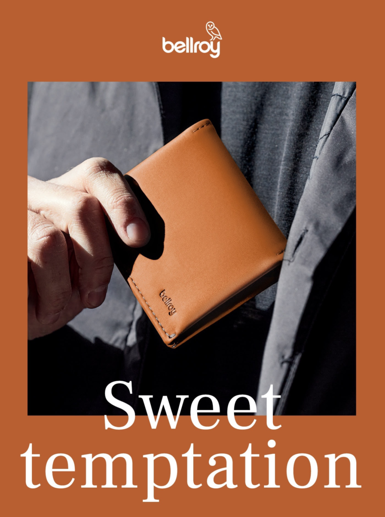
When describing the product, the brand combined humor with sensory-rich adjectives to tempt the reader to click through and learn more.
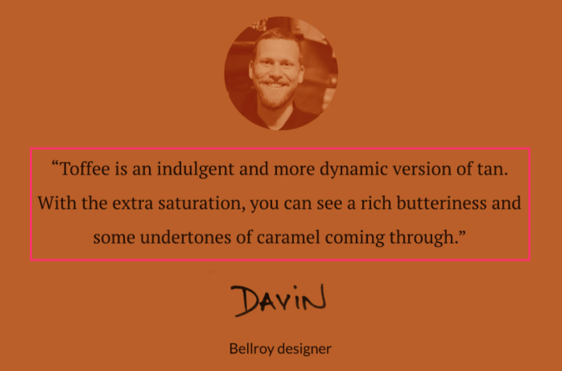
Bellroy even included a quote from its head designer, Davin, building on the email’s earlier sensory description.
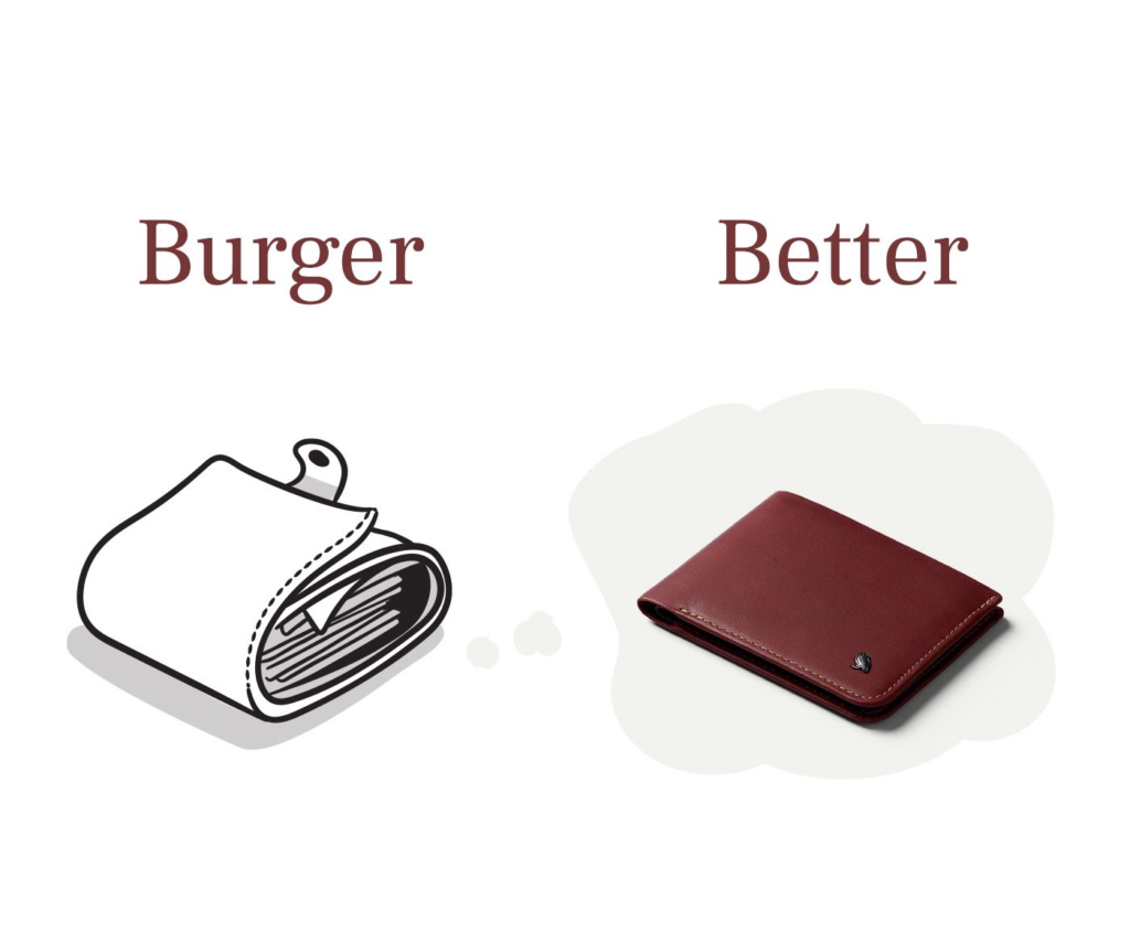
Copy isn’t Bellroy’s only advantage. In many of its emails, the brand often leverages before/after images to position its products as solutions to everyday problems.
In one of my favorite examples, the brand compares a “burger” wallet with a “better” option—Bellroy’s Slim Sleeve. They even omitted color from the before image to better contrast it against the after image.
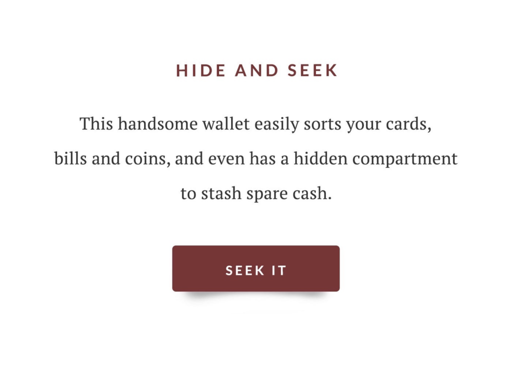
Beneath the image, Bellroy expanded on its Better image, positioning its Slim Sleeve as a solution to the everyday problem of not having anywhere to keep spare change.
If you have an offer that solves an everyday problem for your ideal buyer, as Bellroy does, don’t be afraid to communicate that position in your email’s copy and images.
5. Huckberry
Huckberry is an online shop and journal that inspires more active, adventurous, and stylish lives through members-only sales, original storytelling, and unique experiences.
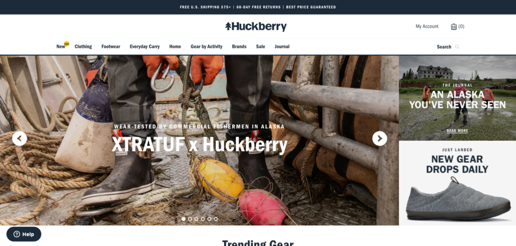
One way Huckberry was able to turn $20,000 into $4.4 million in recurring revenue was through their innovative approach to email marketing.
Describing its emails as “equal parts store, magazine, and inspiration to help you suck the marrow out of life,” the brand weaves storytelling with product marketing to entice the reader to want to become part of a like-minded community.
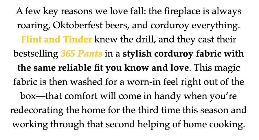
Huckberry’s product emails are a particular highlight of the above. Beginning with a brief anecdote or description—a signature for all its emails—the brand relies on an image-heavy, copy-driven design to draw in readers.
Here’s an example of one of its openings:
And here’s an image that followed, building on the offer:
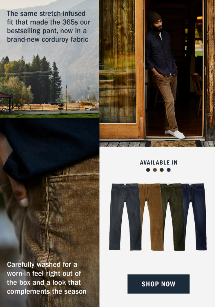
Huckberry demonstrates that an email can be whatever you want it to be—providing you put in the time and effort to create the right content to accompany what you’re offering.
6. Barkbox
I can’t write an article on the best e-commerce newsletter without mentioning Barkbox. A homestay on the Drip blog, Barkbox has charmed itself into our hearts with its blend of copy and content.
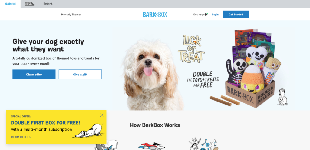
The genius of Barkbox’s copy is twofold. First, its ability to pitch not just to readers, but also to the reader’s dog(s). Take a recent outrageous example for its “Pigs in the Blanket” toy.
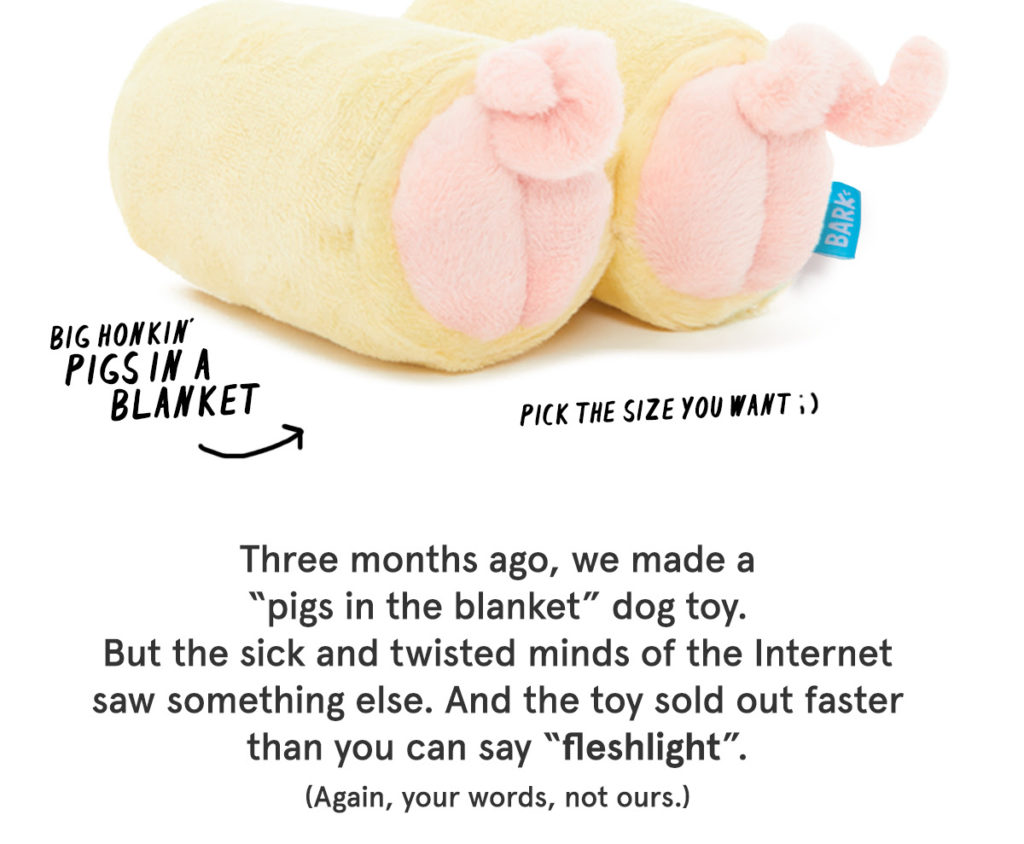
At the beginning of the email, Barkbox addressed the reader, specifically, the awkwardness that ensued from explaining to others what it was. But towards the end of the email, where Barkbox asks for the sale, they switch to speaking to the reader’s pet.
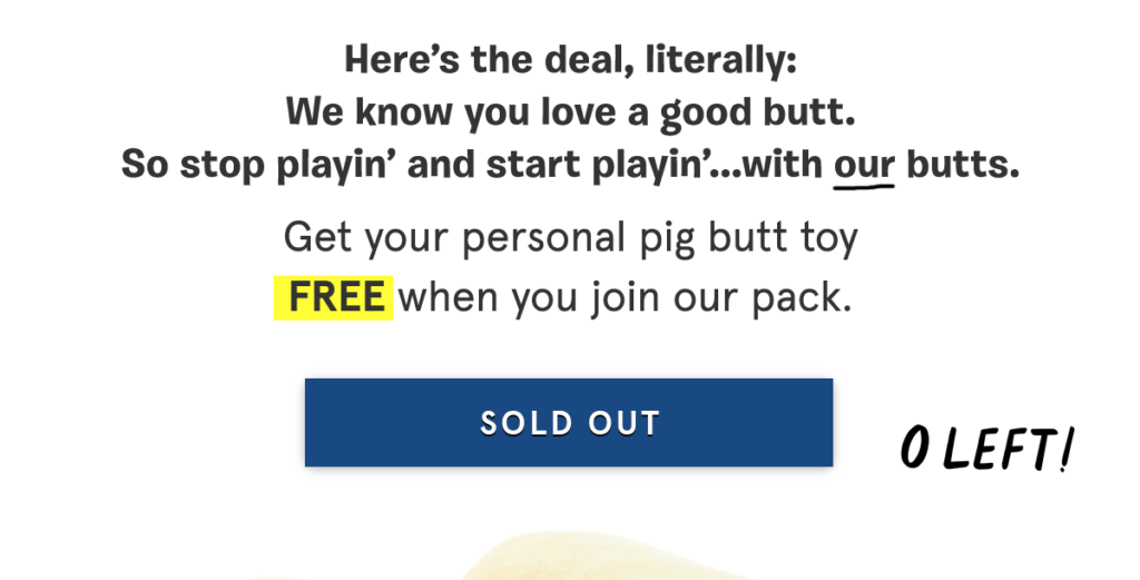
It’s subtle, but it’s a strategy Barkbox has mastered well. And this email is an expert example of how to do it while also having fun with the reader.
Second, Barbox has a gift for tying its products to politically-charged topics without rubbing people the wrong way. Let me share a recent example.
In one email, the brand asked, “Which Toy Will You Choose?” pitting a plush “Joe Biten” and “Dognald Trump” against one another. (Hi, Future Reader! I hope you come bearing good news…)
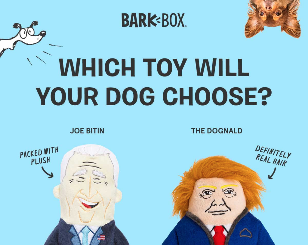
Beneath that, Barkbox expands on its headline, offering a free plush toy if you sign up.
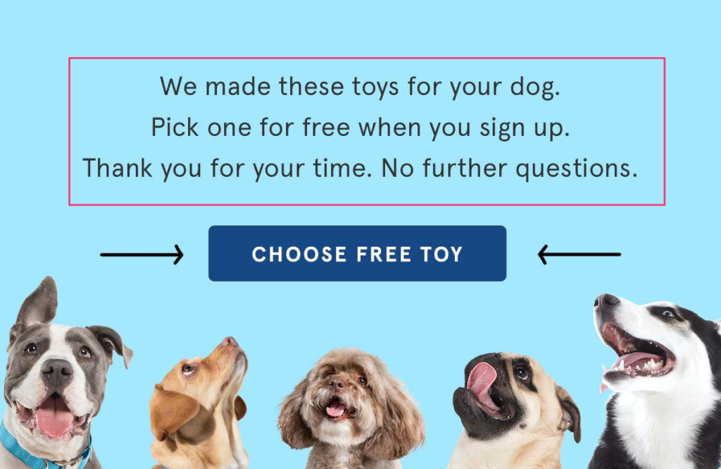
Barkbox is a brand that nails every aspect of its marketing—its buyer persona, language, and promotions. You can learn a lot from Barkbox, for that reason, and its emails are an excellent starting point.
7. Brooklinen
Branding itself as, “the Internet’s Favorite Sheets,” Brooklinen writes one of my favorite newsletters for two reasons.
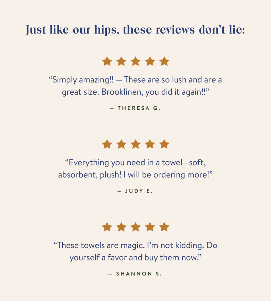
First, it has a gift for exciting its subscribers about something as mundane as bed accessories. Whether that’s prefacing its customer reviews with a humorous headline…
Or writing benefit-driven product copy…
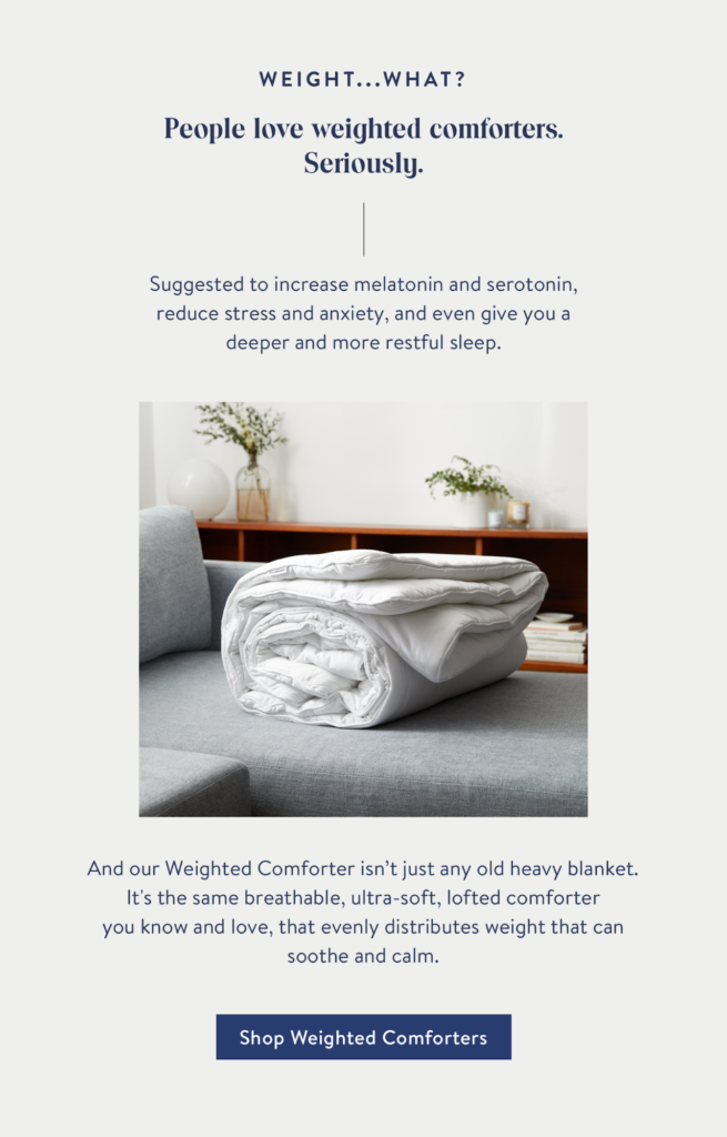
…Brooklinen knows how to cement its place as an industry leader.
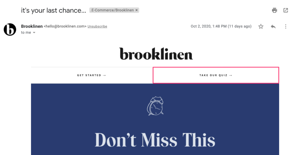
Second, it leverages that excitement into a way for readers to make the right purchase depending on their needs. One way it does that is with a quiz linked in the header of each email.
From there, readers can choose a product…
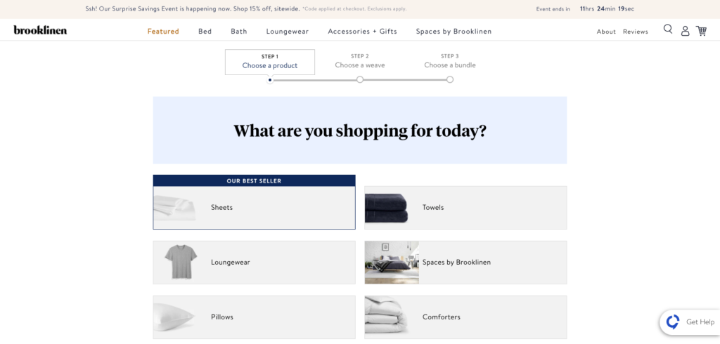
…a weave…
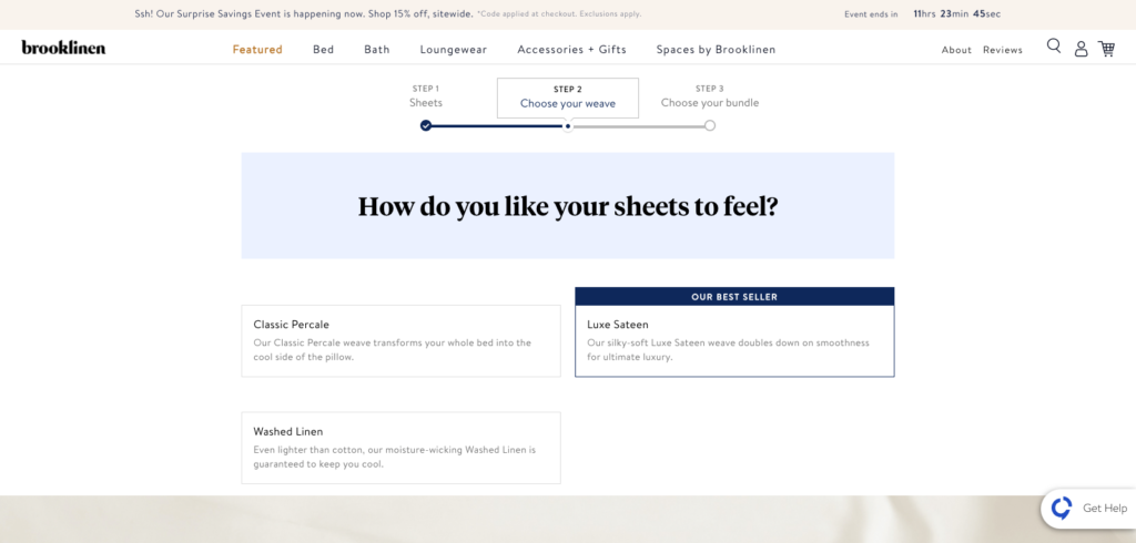
…and a bundle.
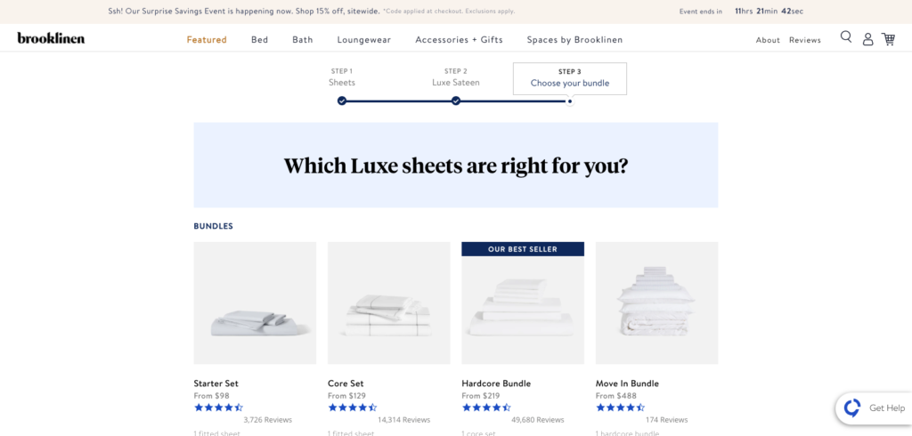
Brooklinen almost treats its emails like a landing page. There are calls-to-action to buy products, but also a consideration for first-time buyers who might need further help.
Conclusion
Steve Jobs once said good artists copy, great artists steal. And nowhere is that truer than with email marketing.
I’ve shared 7 of my favorite e-commerce newsletters to follow, and I hope they will inspire you.

