The average opt-in percentage for e-commerce sites is only 1.95 percent. This means you can expect fewer than two out of every 100 shoppers to subscribe to your newsletter.
That’s not ideal and shows that most brands have plenty of room for improvement.
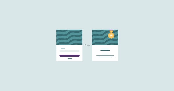
One technique that can help raise this percentage is creating a two-step opt-in form. If you’re unfamiliar, this is where an opt-in form popup or page appears after a shopper clicks on a CTA button to learn about an offer that promises value.
From there, shoppers can get the details, and when done correctly, a significant chunk will go ahead and opt in. It’s basically a non-committal way to pique a shopper’s interest and fill them in on the details of your offer.
Rather than asking them to sign up for your newsletter right away, you can supply them with some basic information and allow them to learn about the value they’ll get before taking the plunge.
So when it’s all said and done, you should be able to attain an optin percentage that’s considerably higher than the paltry 1.95 percent that most e-commerce brands get otherwise.
For this post, I’m going to explain why this approach is so beneficial and offer several two-step opt-in form examples from e-commerce brands that have gotten it right.
In turn, this should give you some practical takeaways you can apply to your own campaign as well as some inspiration to ensure it’s a continued success.
Table of Contents
The Psychology Behind Two-Step Opt-In Forms
First, let me give you a bit of background behind this concept and why it works. There are two main psychological principles at play.
One is called the Foot in the Door (FTID) phenomenon where shoppers are more likely to complete a larger action by first completing a smaller one.
According to Psychologist World, this “is a strategy used to persuade people to agree to a particular action, based on the idea that if a respondent will comply with a small initial request, then they will be more likely to agree to a later, more significant, request, which they would not have agreed to had they been asked it outright.”
For example, it may be difficult to motivate a shopper who’s casually browsing your e-commerce store to immediately sign up for your newsletter, as this would be a significant request.
Many don’t feel comfortable doing so as it could result in unwanted spam, and others simply don’t have any real incentive for doing so. After all, what’s in it for them?
But if you get them to first click on a CTA that doesn’t involve an immediate commitment (a small request), you can get your foot in the door and explain your value without intimidating them.
This helps them feel more comfortable with the idea of opting in and gives you an opportunity to provide a specific incentive. As a result, they’re more likely to sign up by using this two-step process.
The other psychological principle is called the Zeigarnik Effect, which “states that people tend to remember unfinished or incomplete tasks better than completed tasks.”
So they initiate a task by clicking on a CTA and complete it by filling out the form and opting in. And because you break it down into two steps, you can ensure a higher level of engagement.
In many cases, shoppers only have minimal interest when they complete a one-step opt-in form and may seldom (if ever) open emails, click-through to offers, etc.
But when they complete multiple steps, it usually means they’re genuinely interested, which tends to translate into increased engagement.
These are some of the primary reasons why this strategy has really caught on as of late and why a growing number of e-commerce brands are implementing it.
Now let’s take a look at some two-step opt-in form examples you can learn from and apply to your own campaign.
MUMA Health
MUMA Health is an Australian-based company that offers a variety of quality health products that cleanse, nourish and energize the body. They have an attractive website that features a plain, light-colored background and vibrant images that pop.
Their two-step opt-in form is dead simple.
After landing on their site, shoppers see this sticky CTA bar on the right-hand side asking if they want a deal.
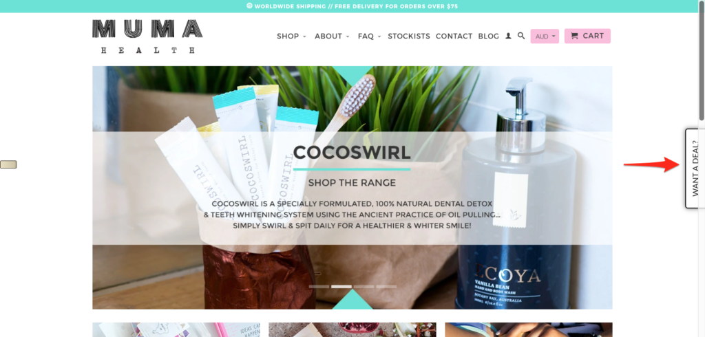
It’s on their homepage as well as every other page of their site.
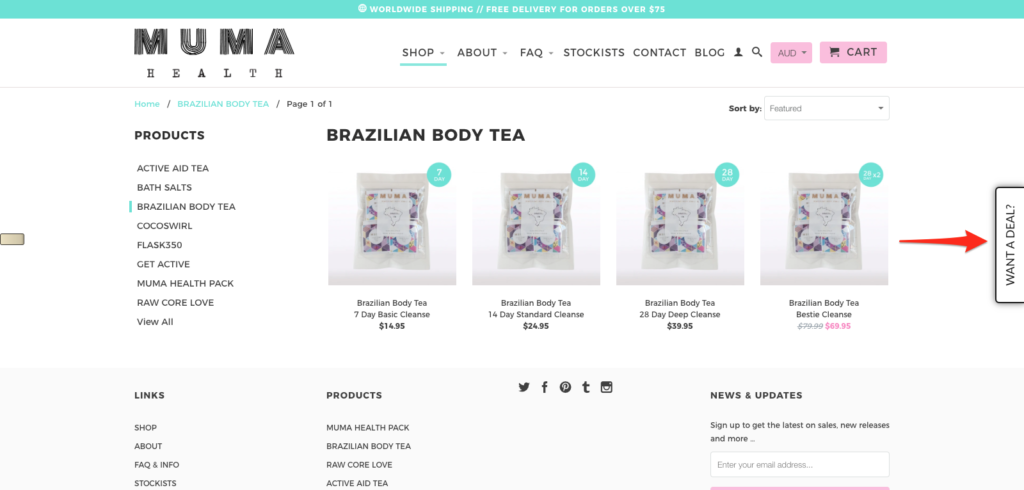
I don’t know about you, but it definitely piques my interest, and I’m sure that a good portion of MUMA Health’s shoppers feels the same. Therefore, it serves as good motivation to check it out to learn more.
By clicking on the CTA, this popup appears and offers shoppers 10 percent off of their order by signing up for their newsletter.
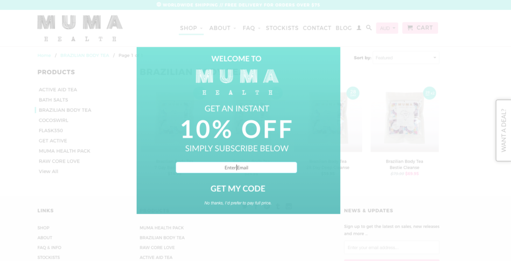
Although a 10 percent discount may not sway everyone to sign up, it should certainly have some impact. And the two-steps provide a nice transition where shoppers first click on the CTA to find out about the deal and promptly get an incentive to sign up.
Also, notice how the green opt-in form appears in a lightbox to grab a shopper’s attention.

It dominates the foreground and the rest of the page fades to the background, allowing shoppers to fully focus on the offer at hand.
And if they’re not interested, they can simply click on the text at the bottom saying, “No thanks, I’d prefer to pay full price” or click anywhere else on the screen to exit the popup.
No hassle.
So the strong points of this example are that:
- It’s simple
- It offers tangible value with 10 percent off for subscribing
- It brings shoppers’ focus to the offer by creating a clear contrast with the background
These are some of the core tenets of a two-step opt-in form, and it’s hard to go wrong with them.
Tattly
Tattly is a brand that sells “high-quality temporary tattoos, designed by professional artists.” They have a crisp, clean looking website with beautiful images displaying what their temporary tattoos look like on models.
And one of the first things shoppers notice when arriving on their site is this box at the bottom left-hand side of the screen that says, “Unlock exclusive rewards and perks,” along with a “Sign up” CTA.
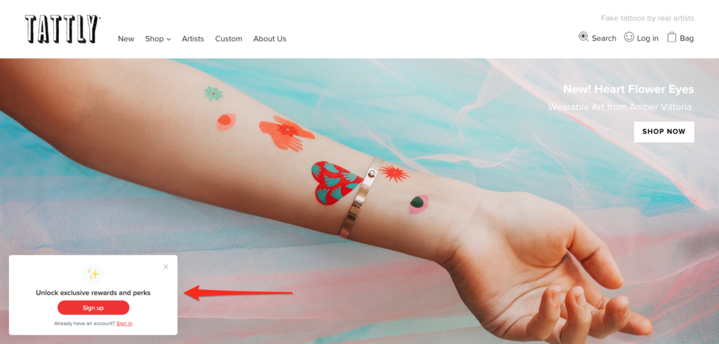
It’s very straightforward and to the point and does a great job of rousing their shoppers’ curiosity. After all, who isn’t interested in getting exclusive rewards and perks?
By clicking on the CTA, shoppers see this nifty popup that gives them 20 percent off on their next order by signing up for the Tattly newsletter.
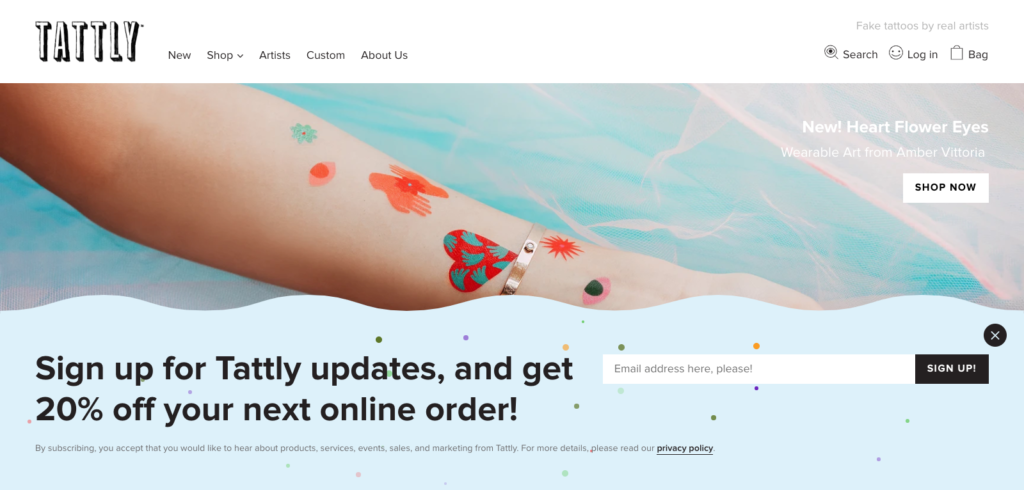
In many cases, this can be just what a shopper needs to take action and give out their email address.
Here are some particular things that I love about this two-step opt-in form example. First, the CTA has plenty of contrast that naturally brings shoppers’ eyeballs to it.

It’s hard not to notice the red CTA immediately after arriving on the Tattly website, and it clearly stands out from the rest of the content. But at the same time, it’s not obnoxious, and shoppers who aren’t interested can simply navigate around it without creating any unnecessary friction.
Second, it uses a captivating headline to motivate shoppers to click on the CTA. Mentioning they will receive exclusive rewards and perks should get a sizable portion of shoppers to take action and click.
Third, the post-click page is set up in a way that it covers most of the screen, which helps bring attention to the offer.

You can’t tell from this picture, but it also features moving confetti, which really gets shoppers to take notice. It’s a nice touch and definitely helps distinguish this opt-in form from most others.
Fourth, offering 20 percent off the next order sweetens the deal and provides a strong incentive—something that’s integral for maximizing conversions.
So when you put it all together, you can see why this is such a potent two-step opt-in form and definitely one you can learn a lot from.
Harvey Nichols
Harvey Nichols is a luxury British brand that specializes in designer fashion, beauty, food, and wine.
While I wouldn’t say their website is revolutionary, it certainly gets the job done and effectively generates interest in their products. It also seamlessly incorporates a two-step opt-in form.
Harvey Nichols places CTAs for it in two locations.
First, they have a sticky CTA bar located on the left-hand side of their site, which remains stationary as shoppers scroll down. It asks a simple question, “Want to be in the know?”
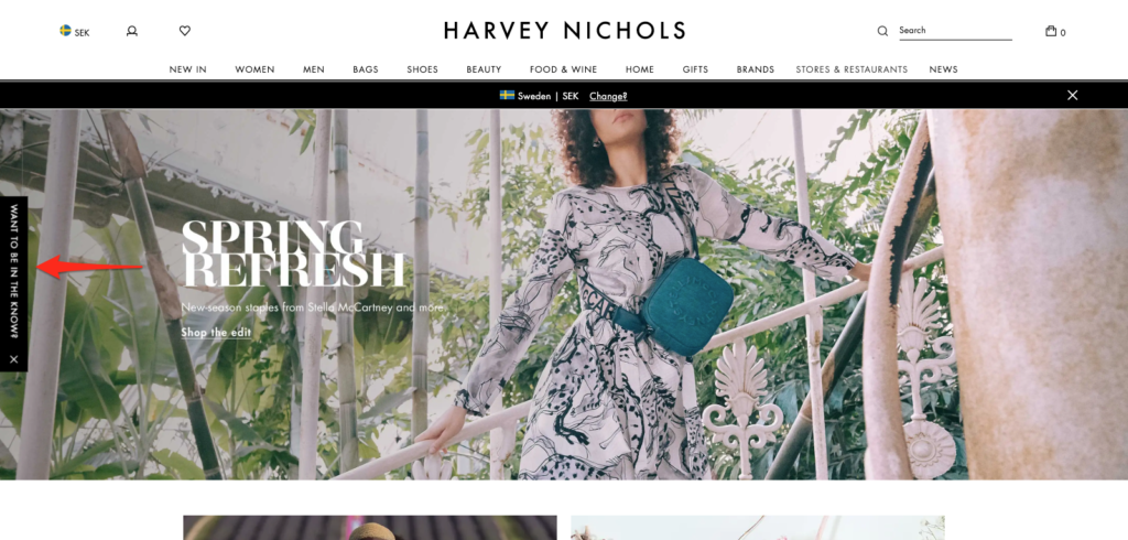
They also have a CTA located toward the bottom just above the footer, which says, “Sign up for the latest updates.”
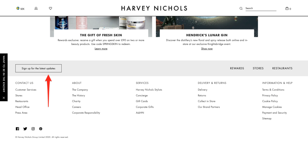
Whenever a shopper clicks on either one of these CTAs, they’re taken to this page where they’re prompted to sign up for the Harvey Nichols newsletter.
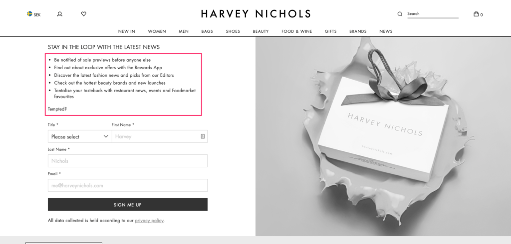
It succinctly lists the benefits they’ll receive, letting shoppers know the specific value that comes along with signing up, such as getting access to sales previews, exclusive offers, and fashion news.
This goes along with an underlying theme you’ve probably picked up on by now. Effective two-step opt-in forms give shoppers an adequate incentive to (1) click on the CTA and 92) sign up.
The previous two examples I mentioned did this by offering a discount on a purchase. But Harvey Nichols shows there are other ways to go about this, and simply filling shoppers in on the details of what they’ll receive by opting in is sometimes all it takes.
It’s just a matter of being crystal clear about it. Rather than just asking shoppers to sign up, Harvey Nichols gets super specific as to the value they’ll get by becoming a subscriber. So this is a nice example that shows a different type of approach e-commerce stores can take.
While you certainly don’t want to annoy your shoppers, it’s important that you do whatever it takes to get eyeballs on your offer.
Pop Chart
My final example comes from Pop Chart, a company that sells infographic posters. I really love the look of their site, and it has a clean feel with smooth navigation.
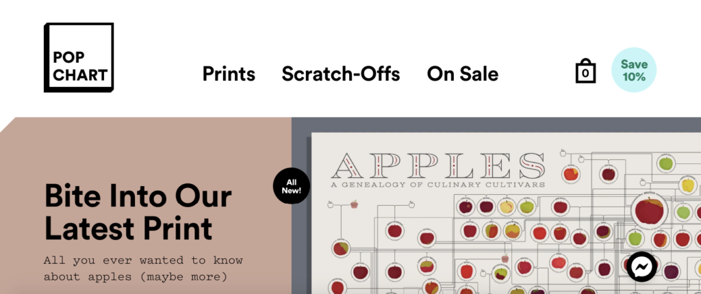
And of all of the brands that I’ve mentioned here, I personally like Pop Chart’s two-step opt-in form the best because it’s so incredibly simple.
For their CTA, it just says “Save 10 percent.”
That’s it.
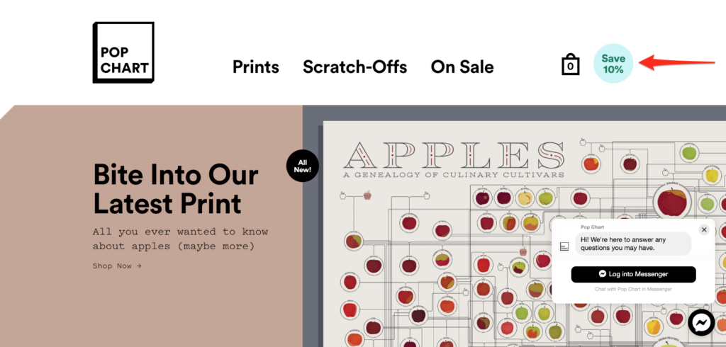
Whenever a shopper clicks on the CTA, they see this popup that promises “un-spammy” updates, which is something I’m sure most people can get behind.
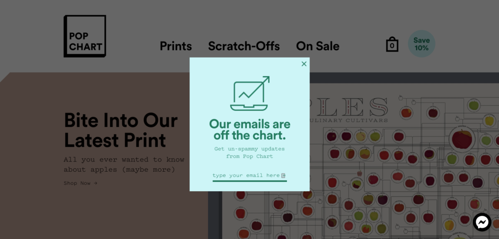
So basically, Pop Chart is very concisely telling shoppers that they’ll receive 10 percent off of their purchase and don’t have to worry about the drama of spammy emails.
By using a lightbox popup where their offer appears on top of the content with the rest of it dimmed out, it naturally brings shoppers’ attention to the offer.
And if they’re not interested, all they have to do is click anywhere outside of the popup box and they can resume browsing with no problem.
This example just goes to show that less is usually more when it comes to two-step opt-in forms. You don’t need to create an elaborate sequence to captivate shoppers.
You just need to grab their attention with a compelling CTA and follow it up by delivering real value. Do that and you should be in good shape.

Conclusion
Email marketing is still one of the best ways to reach e-commerce customers. But for it to be effective, you first have to get shoppers to sign up for your newsletter.
Using a two-step opt-in form is a great way to accomplish that and leverages two very powerful psychological principles.
Hopefully, these two-step opt-in form examples have provided you with some ideas and inspiration that you can put to use in your campaign to maximize your opt-in percentage and have more engaged subscribers.

