Product filters have a huge impact on e-commerce sales. However, this impact is often negative, rather than positive.
According to data from Smashing Magazine:
- Only 60 percent of websites provide a good filtering experience;
- 42 percent of e-commerce sites lack category-specific filters;
- 32 percent of e-commerce sites do truncation poorly; and
- Only 16 percent of e-commerce sites promote important filters actively.
Considering that most visitors land on your site without knowing exactly what to look for, an advanced product filter system can help simplify browsing on your site and improve the shopping experience.
But what’s the right way to use e-commerce product filters?
In this guide, I’ll show you the six best e-commerce product filtering examples that can improve your website navigation dramatically.
Let’s get started.
1. Macy’s
Not mentioning Macy’s when discussing product filtering performance is practically a crime. One of the leading e-commerce websites in the US, Macy’s overall filtering design is conventional and specific.
Suppose you want to buy a coat on the website. You’ll see several product categories, including coat style, length, brand, size, fabric, and color.
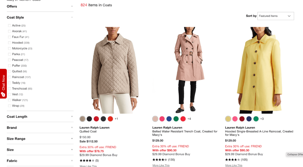
At the same time, Macy’s allows you to narrow down your search further by selecting appropriate subcategories. For instance, if you select “Coat Style,” you’ll see 15 different styles to choose from.
Furthermore, you can apply multiple filter values of the same type, which can be particularly time-saving. Surprisingly, over 32 percent of e-commerce sites don’t have this feature. You can imagine how complicated and time-consuming shopping can be on those sites.
What’s more, Macy’s lets you see the filters you selected at the top of the page. Seeing all the filters at once lets you add more filters to narrow your search further or remove a specific filter by clicking on the X button in the filter tag.
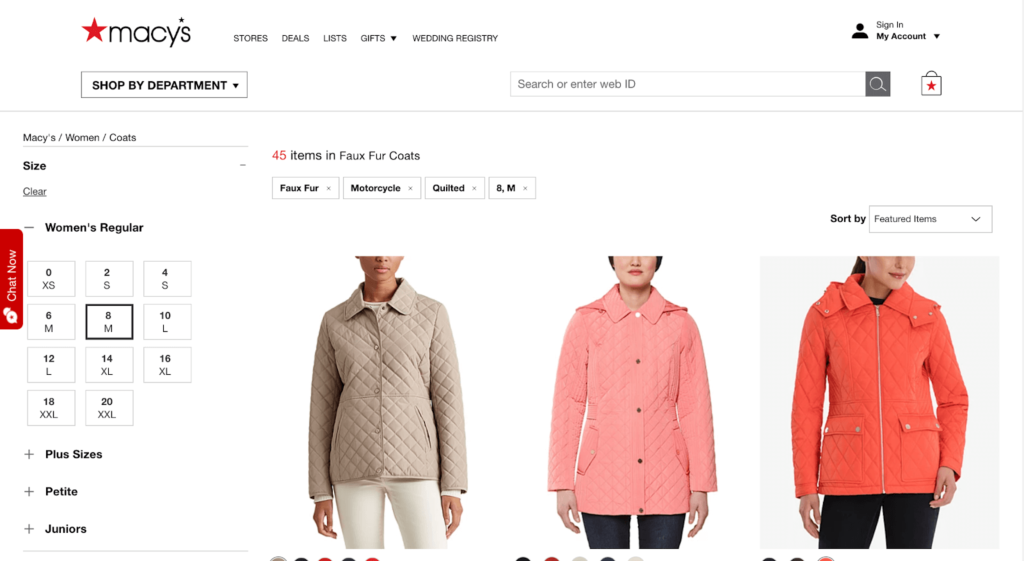
The truncation implementation is also decent.
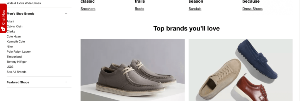
Macy’s displays up to 10 values before truncating, which is considered as the sweet spot. This way, users don’t get confused and their overview of other product filters isn’t blocked. Those who want to explore further can click on “See All Brands”’ to expand and see additional values.
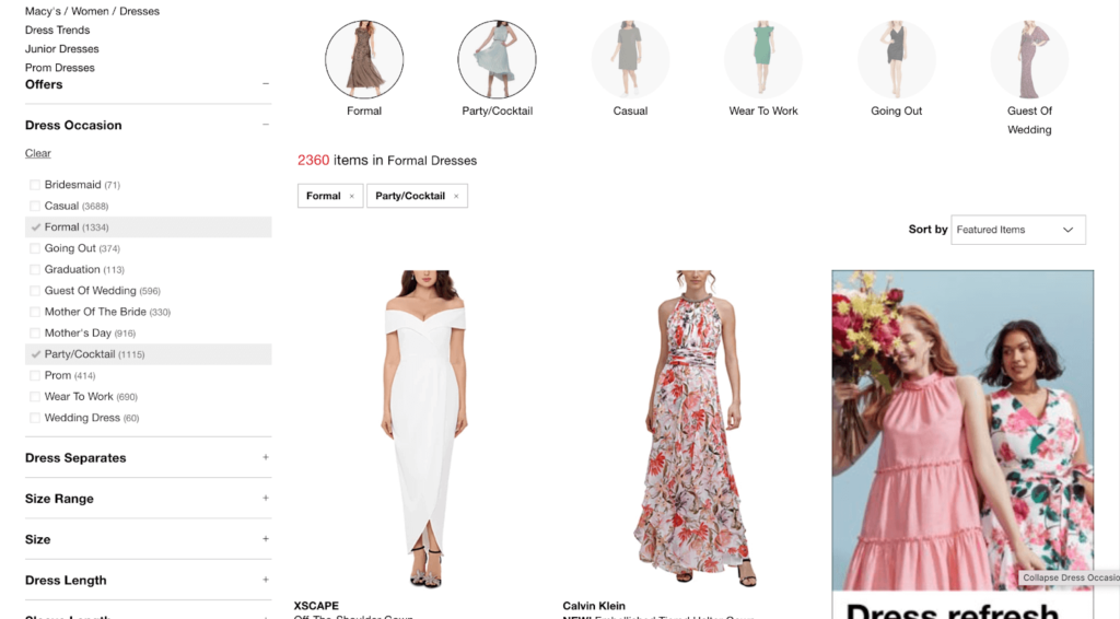
Finally, Macy’s allows you to search for products based on themes, thanks to the thematic filters implemented on the site.
For instance, if you want to buy a dress, you can shop depending on the occasion. Macy’s makes it easier to see dresses suitable for that specific occasion—graduation, cocktail, prom, and wedding, among others.
That said, Macy’s still has room for improvement where they could add a “New Arrivals” filter. But overall, the product filtering experience Macy’s offers is definitely noteworthy.
2. Zara
Zara has a more unique approach to product filters on its site.
As soon as you open the site, you notice the minimalist look. Your screen is covered by a white overlay, with the main product categories bundled on the left-hand side.
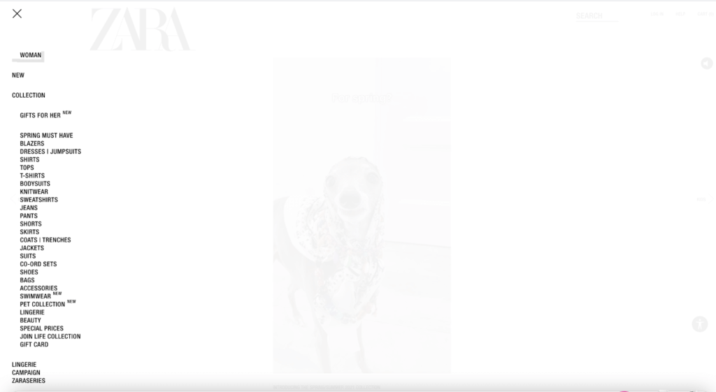
Things get more interesting when you click the “Filters” menu.
Zara lets you choose from several specific product elements under every category to really streamline product search, and when I say specific, I mean specific.
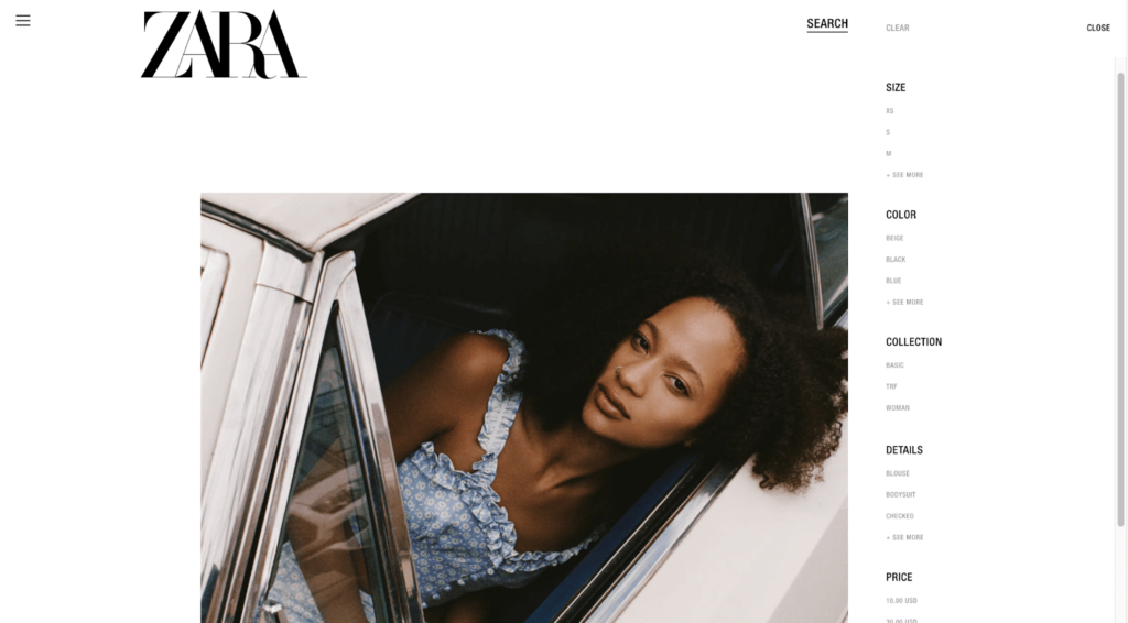
For example, the size category includes the regular XS, S, M, L, XXL, and XXL, but there’s also XS-S and M-L.
You can also shop by collection or according to the details you want on your top—sequin, stripes, checks, or florals, as well as colors.
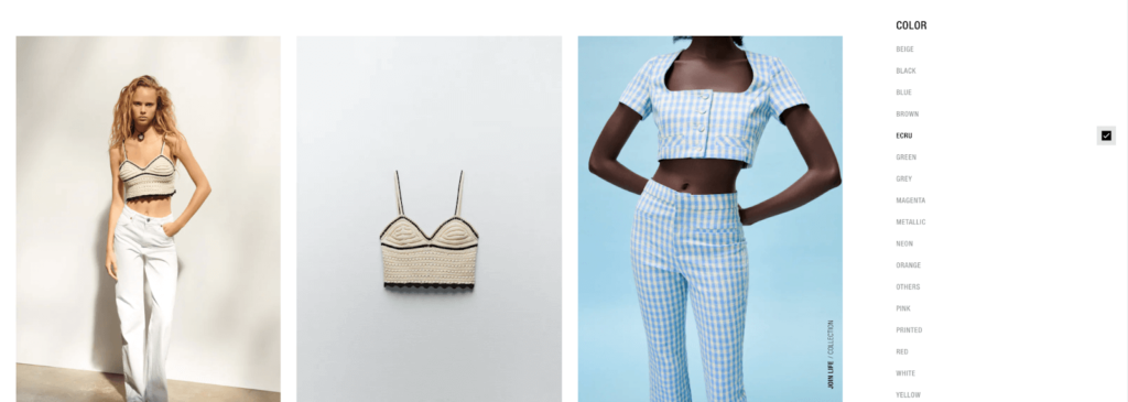
What I like the most is that Zara allows shoppers to select multiple features at once from every filter.
Notice how this site, too, has truncated a long list of product filtering values to avoid overwhelming the visitors. This also complements the minimalist aesthetic of the entire website.
3. Amazon
Amazon is another e-commerce marketplace that is hailed for its exemplary product filtering.
The platform’s autocomplete search experience, for one, is unparalleled. It immediately makes you feel accustomed to searching for products—not to mention, you save a few seconds typing too.
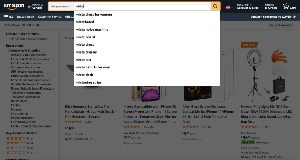
When looking for a product, (in my case, it’s a pair of earbuds), Amazon instantly presents you with a list of suggestions.
On the top, you see a “Shop by feature” category where different feature tags are listed underneath. Whether you want something lightweight, noise-canceling, or waterproof, you’ll find suitable options by clicking on the tags.
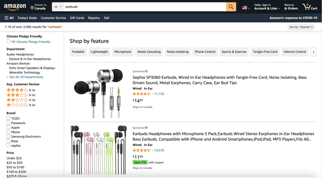
You quickly find the full product filter section on the left side of your screen, and choose from “Brand,” “Price,” “Color,” “Headphone Feature,” “Headphone Wireless Type,” and several other categories. Going through the whole list, you soon see that Amazon believes in “more is more”.
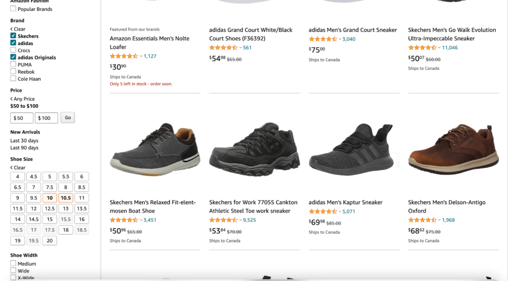
Interestingly, when shopping for men’s shoes, I could select multiple filters under every category. But when shopping for earbuds, I was restricted to only one from every category.
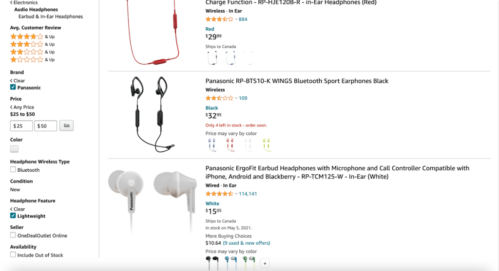
This shows that Amazon has different filtering options for different product types to ensure the best experience for each category.
Finally, all product filters on Amazon are visible with unique meta tags. The filters are also optimized to avoid duplication—something incredibly important when you take into account the vast number of products listed on Amazon.
Both in terms of layout and functionality, Amazon does a pretty good job of using product filters efficiently.
4. Lacoste
Lacoste’s product filtering system is packed with inspiration to make your entire site navigation more user-friendly.
But the main reason why I chose to feature the brand on this post is its unique double filter menu.
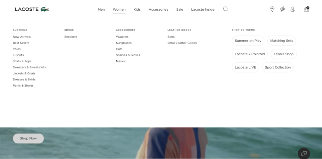
The clothing giant organizes subcategories under top parent categories, where you can shop by theme. You can also see collection names in the various top categories. Although this is unconventional, it does a great job to promote new products and collections.
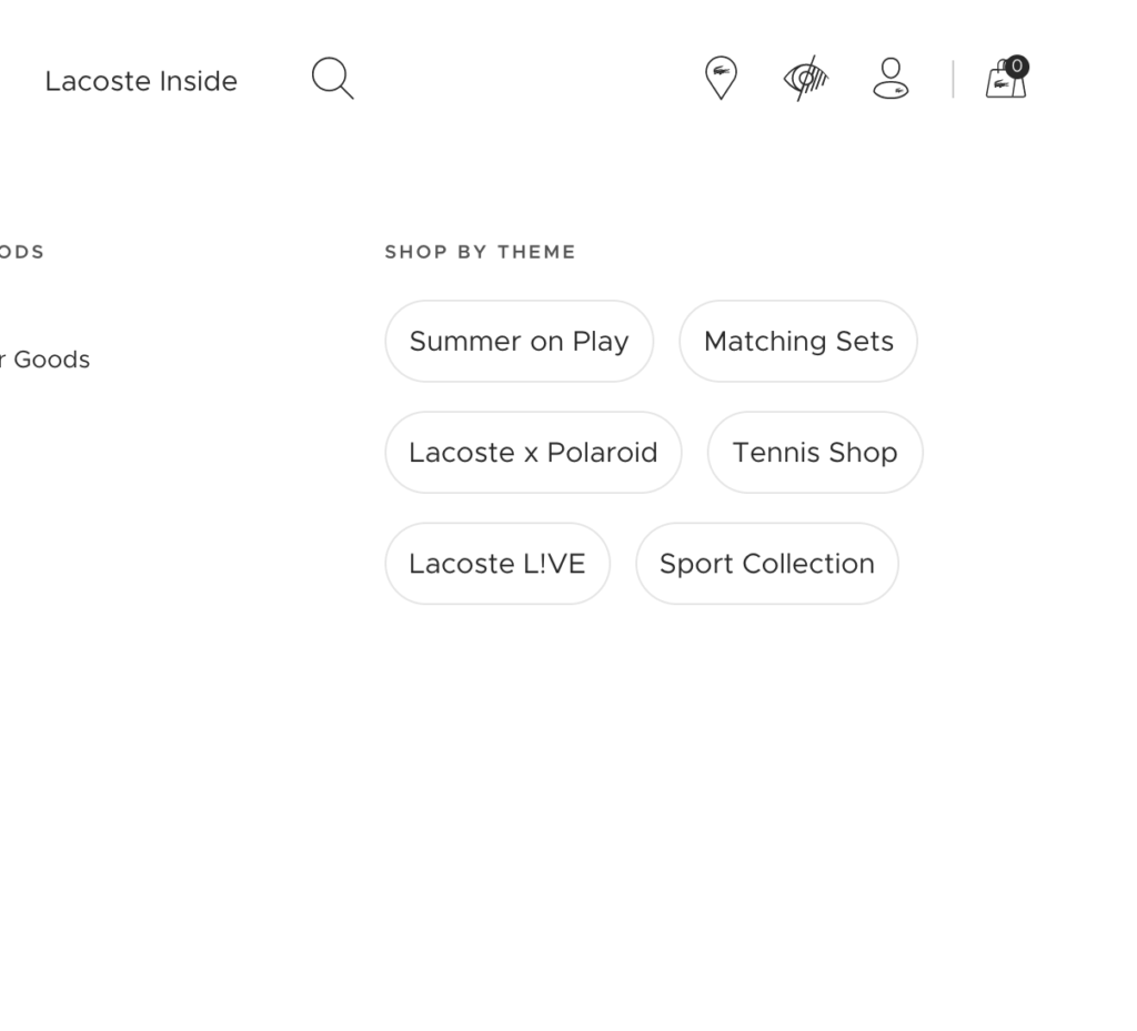
By adding more themes into its filters, Lacoste makes it more likely for shoppers to find what they want, which, in turn, will translate to more sales.
The “sort and filter” menu contains several filters, focusing on a rich palette of product attributes. The brand goes beyond the popular horizontal and vertical filters, opting for bold collapsible filtering featuring diverse filter tags like “Price” to “Collection” to the more Lacoste-specific ones, like “Crocodile.”
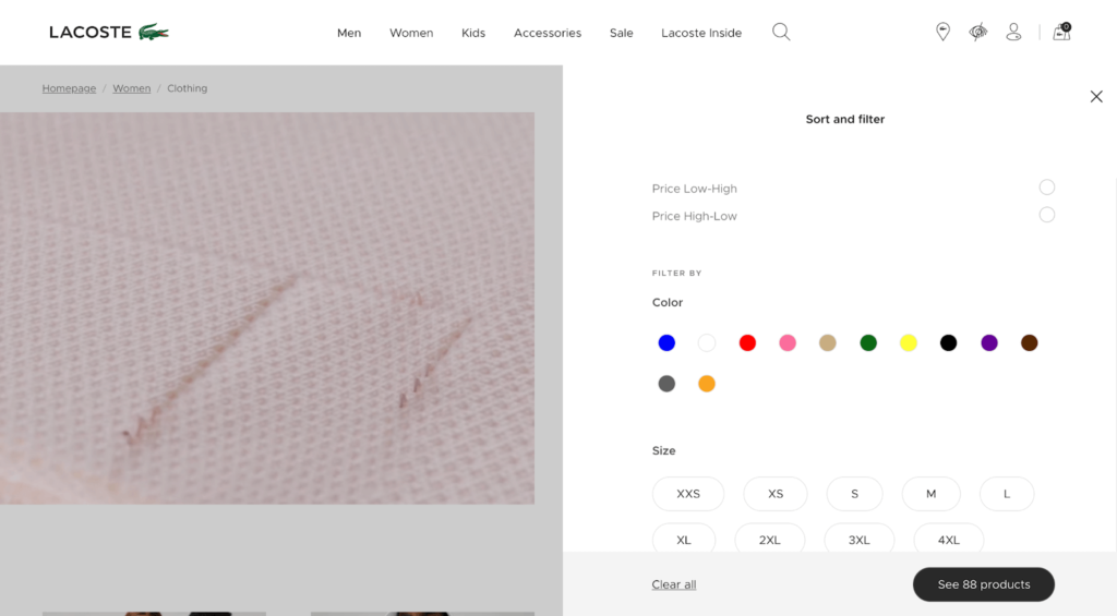
Overall, Lacoste’s filtering design is more interactive than the other examples, which allows shoppers to have more fun when narrowing down product characteristics.
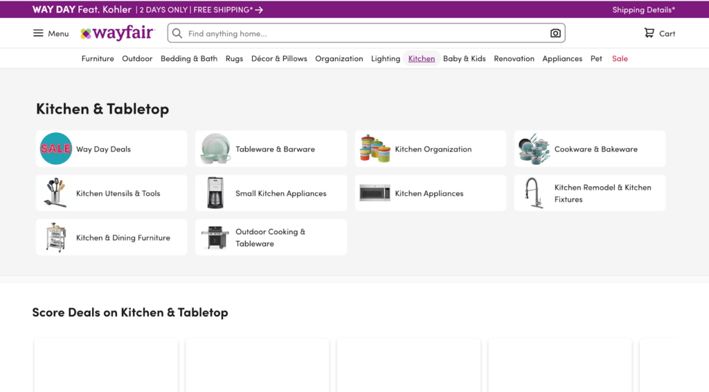
5. Wayfair
Looking for furniture online isn’t exactly the easiest job. It’s something you don’t buy every month, and instead, intend it for long-term use.
That’s why you have to put in the time and effort to find the right match and be completely sure of your decision. Wayfair helps customers filter their furniture search with one of the most impressive product filtration systems that I’ve seen.
You can select from categories like “Type/Design,” “Size,” “Upholstery Colour,” and “Price Per Item,” among several others.
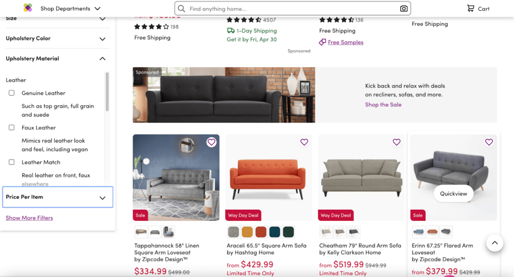
Just like Macy’s, Wayfair is another e-commerce site that implemented truncation effectively. Yet, there’s still a “Show More Filters” option as well. If you don’t want to see the extensive list of filters, you can click on the plus sign to hide them.
Despite offering possibly every filter type it can, Wayfair still keeps it manageable and maintains a neat and organized website design.
The filter tags are handy and include a few unique additions to help customers make better decisions. For instance, you can add dimensions to filter out sofas based on what would fit your space best.
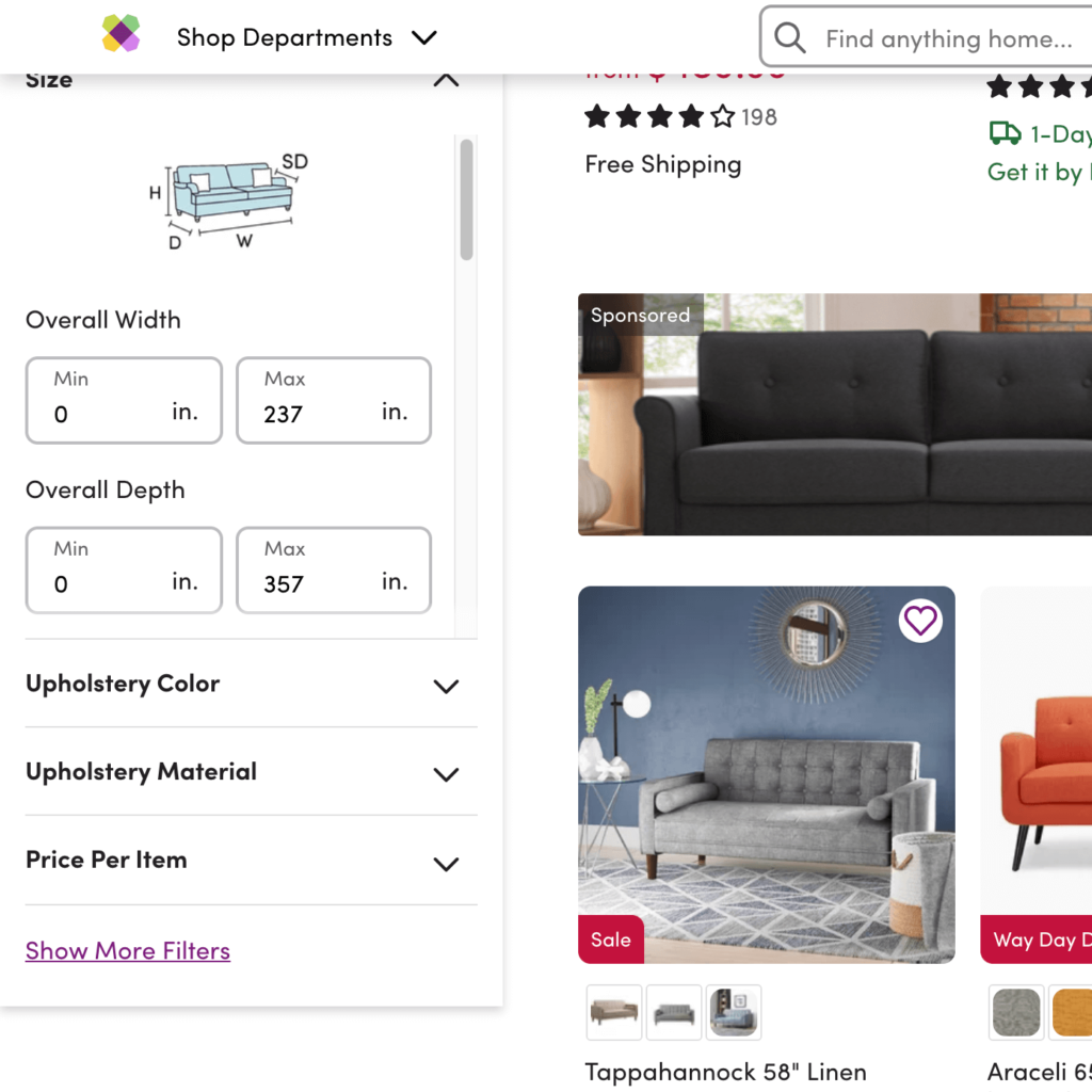
All the main categories are displayed at the top of the page. If you want to buy anything else or simply browse other offers, you can proceed to click on that specific category, followed by the subcategory, to explore other furniture.
6. Mavi
Mavi takes a more customized approach for its e-commerce product filtering.
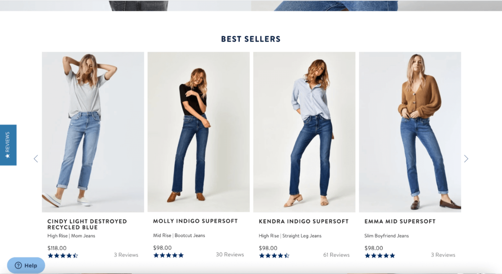
There are four parent categories, Women, Men, Fit Guide, and Sale, on its homepage. As you scroll down, you see a list of bestsellers, which can be useful for visitors who are in a hurry or prefer shopping products with the best customer reviews.
Besides that, the site is designed to help visitors find their exact product fit as quickly and easily as possible.
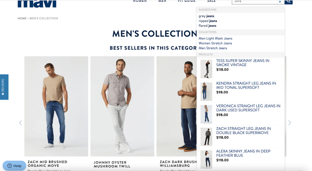
For example, if you’re looking for a pair of jeans, you can select detailed sizing filters, such as waist, length, fit, style, and color. This will show you the best matches within seconds. Sorting your list to get an even more precise display is also possible, thanks to the “Sort By” option on the right-hand side.
Another notable characteristic of Mavi is its superior internal site search.
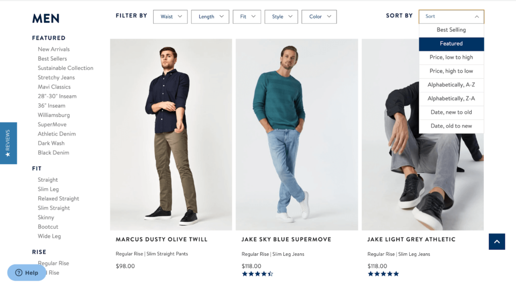
It has an instant smart search that assures a fast and precise product search every time. When you type the name of a product in the search bar, you’ll see a list of thumbnails of popular products, compared to the mentioned brands. You can also view their prices, along with any real-time updates, as the search term changes.
Conclusion
E-commerce sellers rarely sell just a few products.
If you also offer a varied product selection, having an organized inventory should be your top priority to reduce consumer anxiety when making choices.
Start by writing clear and concise product headlines that include relevant keywords to help you rank higher in search engines. This way, when you implement efficient product filtering for your website, customers will be able to shop hassle-free.


