Mobile Internet penetration was at 63.4 percent in 2019. That means nearly two out of every three visitors to your ecommerce store are using a mobile device.
What’s even more interesting is the number of mobile users that are buying.
Recent data found, “79 percent of smartphone users have made a purchase online using their mobile device in the last six months.”
That means the majority of your store’s visitors are mobile users, with nearly four out of five recently making a purchase.
Combine this with Google’s Mobile-Friendly Update in 2015 that officially gave priority to mobile-friendly sites in the SERPS, and it’s clear that mobile optimization is of supreme importance.
More so than ever before.
And that’s what I’m going to discuss in this post.
How to fully optimize your ecommerce store for mobile and make it enjoyable for shoppers. Because at the end of the day, that’s what’s important. Creating a smooth, seamless and comfortable UX. Shoppers should find it satisfying so they’re motivated to hang around longer and fully explore your ecommerce store.
With that said, here’s a list of the top mobile optimization best practices that will give an amazing user experience and increase conversions.

Table of Contents
1. Optimize for the “Thumb Zone”
2. Size Key Elements with Thumbs in Mind
4. Make Your Content a Max of Three Layers Deep
5. Offer Simple Navigation for Searchers and Browsers
1. Optimize for the “Thumb Zone”
UX expert and researcher Steven Hoober performed an in-depth study to figure out how people held their mobile devices and how they interacted with them.
He discovered that there were three main types of handholds.
There’s the one-handed grip, which was most popular with 49 percent of participants using it. There’s the “cradle,” which was used by 36 percent of participants. And there’s the “two-handed BlackBerry-prayer posture,” which was used by 15 percent of participants.
Here’s an illustration of exactly what those handholds look like.
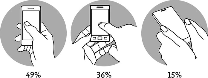
This data shows that the vast majority of people prefer one-handed use of their smartphones.
And while the grips differ, Hoober found that “thumbs drive 75 percent of all phone interactions.”
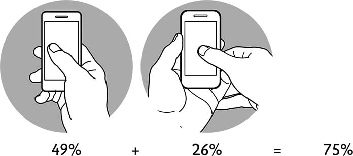
So what does this mean?
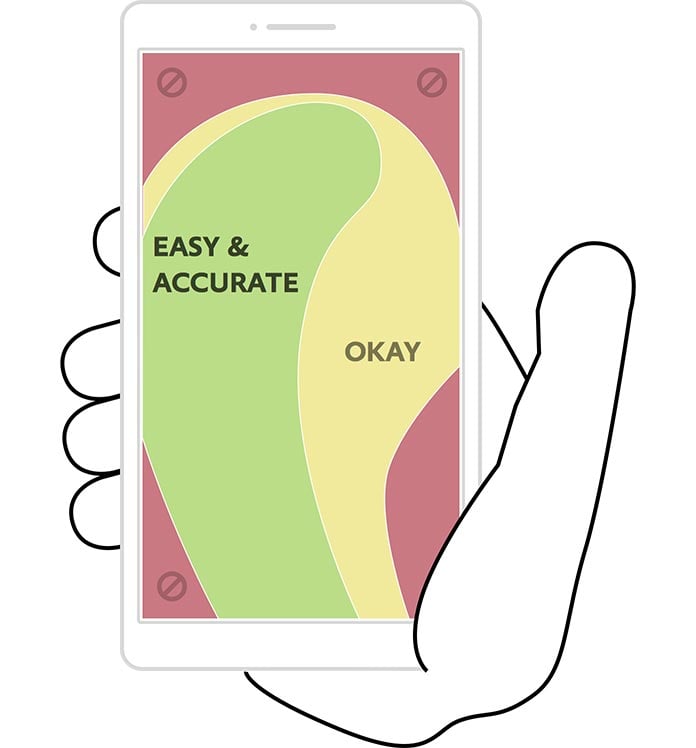
It means it’s important to optimize your ecommerce store for the “thumb zone,” where you place critical elements in this area to make it comfortable for mobile users.
Here’s what I’m talking about.
But what about lefties who make up 10-12 percent of the population?
Mobile design expert Josh Clark says, “The thumb zone flips from left to right. But this left-versus-right distinction isn’t especially crucial, since most of us switch hands easily (and frequently) depending on context.”
Since optimizing for right-handed users automatically hurts the experience for lefties, you should place core features in the middle of the screen where the two thumb zones overlap.
A good example of a brand who does this well is Lavish Alice, an international women’s clothing company.
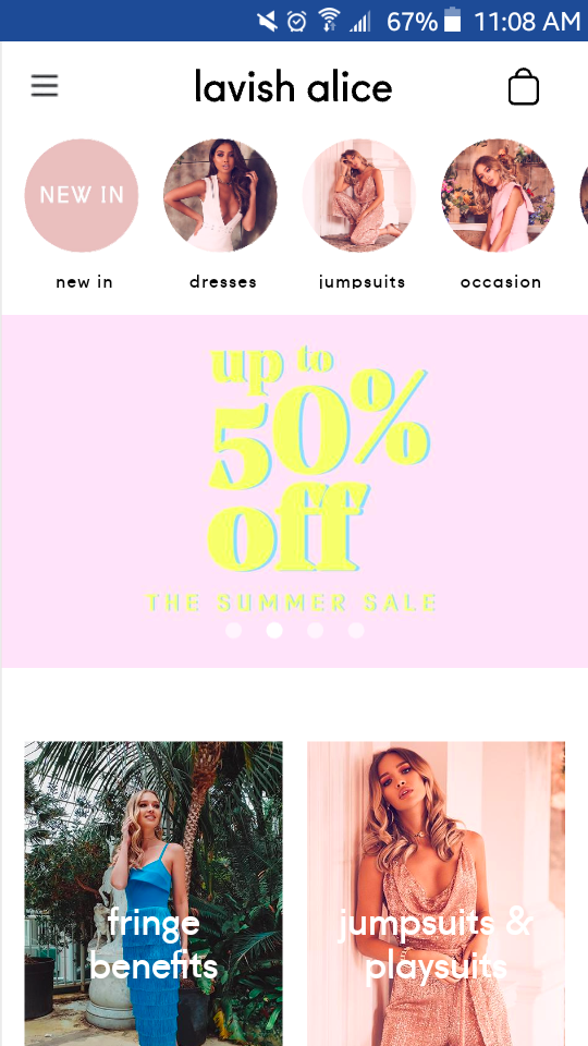
Their homepage is super easy to navigate using your thumb, and they feature their core features right in the middle of the screen.
2. Size Key Elements with Thumbs in Mind
Now that we’ve established that most people primarily use their thumbs to browse a mobile site, I also need to cover the issue of sizing.
I don’t know about you, but I find it incredibly frustrating when I’m trying to tap on a link using my thumb, but I have difficulty because it’s too small.
In some cases, I accidentally click on a different link. Other times, I end up bumbling around and having to pinch the screen to enlarge the link I’m trying to tap. It’s annoying.
But you can fix this problem by sizing key elements with thumbs in mind and ensuring they’re large enough to be tapped on with a thumb.
A good rule of thumb (no pun intended) is to make key elements larger than you think is necessary.
UK-based clothing retailer, Missguided does a great job of this with the categories section of their mobile site.

It’s zero hassle to tap on their different discount categories because they’re perfectly optimized for thumbs.
3. Offer Simple Swiping
Besides tapping on elements, swiping is another common way shoppers explore an ecommerce store.
So this is something you need to optimize for as well.
Whenever someone swipes with their thumb, for instance, it should feel comfortable and fluid.
To understand how to design with this in mind, let’s turn to some interesting data.
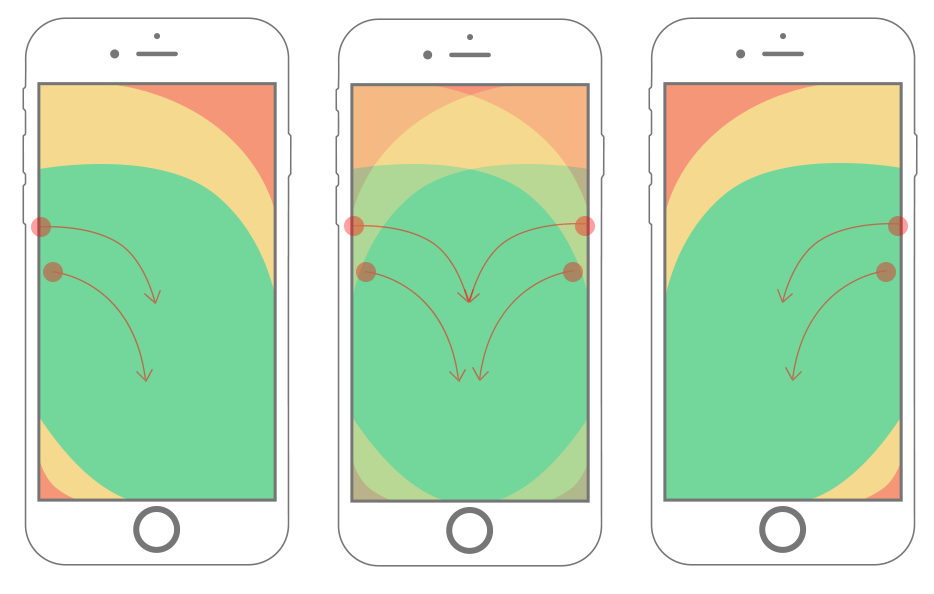
Website and app developer, Samantha Ingram explains that after analyzing several swipe-tracking scripts, she found that most mobile users swipe downward and diagonally like this.
I know I do.
“The data that I collected from tests shows that users usually swipe somewhere from the device’s edge towards the middle, diagonally downward,” writes Ingram. “I also found that users generally swipe in the natural area of the thumb zone.”
She also mentions that she had an initial misconception that mobile users swiped horizontally across—something that was dispelled after looking at the data.
The point here is that you should design any swiping elements with this information in mind.
More specifically, Ingram recommends keeping swipe areas out of hard-to-reach locations (such as the top or bottom corners) and using an appropriate size of swipe areas (at least 45 pixels tall and wide).
This ensures they’re easy to reach and offer enough space to avoid accidental inputs.
An example?
Here’s one from women’s shoes and accessories brand, Tony Bianco.
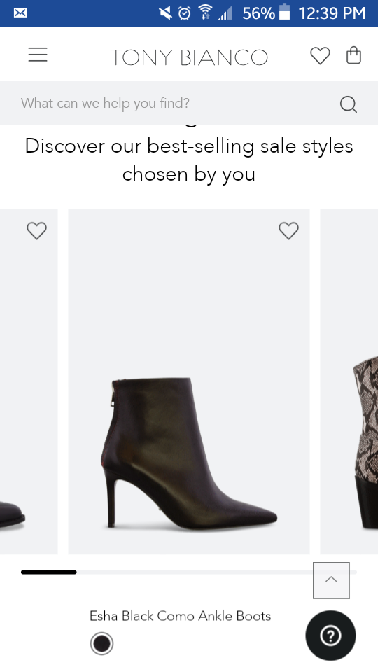
On their homepage, there’s a carousel featuring some of their top-selling shoes.
When you scroll with your thumb using a downward, diagonal movement like Ingram was talking about, it moves from product to product smoothly with little friction.
Another interesting feature is that once you reach the end of the carousel, it cycles back to the first product at the beginning of the carousel.
That way you don’t have to go back to look at a product again. You just keep swiping in the same direction.
Although this may seem like a minor detail, it can make a big difference and create a much more satisfying experience for mobile users.
4. Make Your Content a Max of Three Layers Deep
It’s easier for shoppers to get lost on a mobile site than on a desktop version.
They click on one link, then another, then another, and so on, until they lose their bearings and fall into a mobile rabbit hole.
This is bad for your shoppers because it makes it difficult to find what they want and checkout.
And it’s bad for you because your conversion rate will suffer.
An effective solution to this problem is creating only three layers of content on your ecommerce store.
For example, a shopper…
- Clicks on a category;
- Clicks on an individual product; and
- Adds the product to their shopping cart.
Here’s a real-life example of using three layers of content by jewelry brand, DANNIJO.
Upon arriving on their store, you see images of some of their top jewelry.

Click on one particular type of category you like such as bracelets, and you come to a page displaying their line of bracelets.
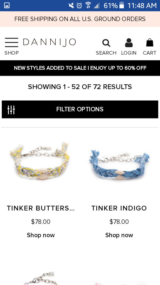
From there, you click on a specific bracelet you’re interested in, like the “Tinker Butterscotch,” and you come to the actual product page where you can easily add the item to your cart.
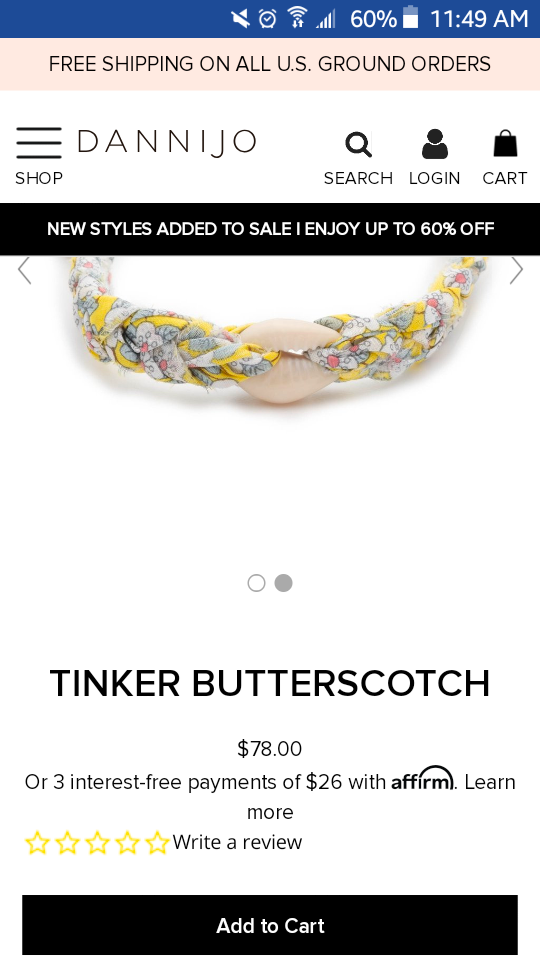
That’s it. You don’t have to keep going deeper and deeper to locate a product you’re interested in.
Their store is optimized in a way that shoppers can seamlessly find the exact type of jewelry they’re looking for and navigate their way to the checkout page with zero friction.
So this is one of the mobile optimization best practices you need to emulate.
Remember, the more steps a shopper has to take to get from the page they land on to the checkout page, the more frustrating it is.
And not only that, the odds of them converting diminishes as well.
Sticking with the three-layer strategy makes their experience easier and more comfortable while increasing your overall conversion rate.
5. Offer Simple Navigation for Searchers and Browsers
Visitors to your ecommerce store can be broken down into two main categories.
Some searchers are looking for a specific product, and there are browsers who don’t necessarily have a specific product in mind and just want to peruse through your product selection.
What you want to do is set up your site navigation in a way that caters to both types of visitors.
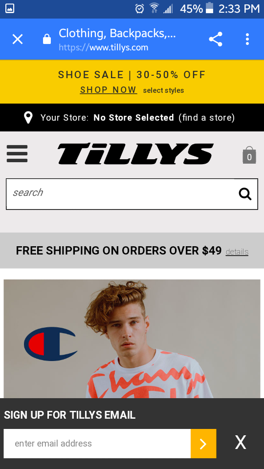
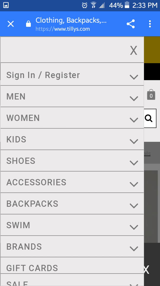
Retail clothing company, Tilly’s is a great example of a brand that pulls this off brilliantly.
Once arriving on their mobile site, visitors see a clearly marked search box, which is perfect for the searchers who know exactly what they want.
Type in a quick query, and they’re good to go.
And for the browsers, they offer a nice drop-down-menu so they can explore products by different categories.
And of course, they can always just scroll down to check out current offers and promotions.
That’s a nice formula to base your design after.
It creates a smooth experience for both searchers and browsers without compromising navigational flow.
6. Allow Shoppers to Return Home with Ease
Here’s the scenario. A shopper has spent some time on your ecommerce store and has clicked through from the homepage to a category to a product.
However, they realize that it’s not something they’re interested in and want to return to the homepage to see what else you have to offer.
They shouldn’t have to struggle to get there by tapping the back button multiple times.
That will only create frustration and could discourage them from making a purchase.
Instead, you want to design your store so they can instantly get back to the homepage with just a single tap.
This is something else that shoe company, Tony Bianco does well.
They place a marked link to their homepage at the top of the screen that’s visible from every single page of their site.
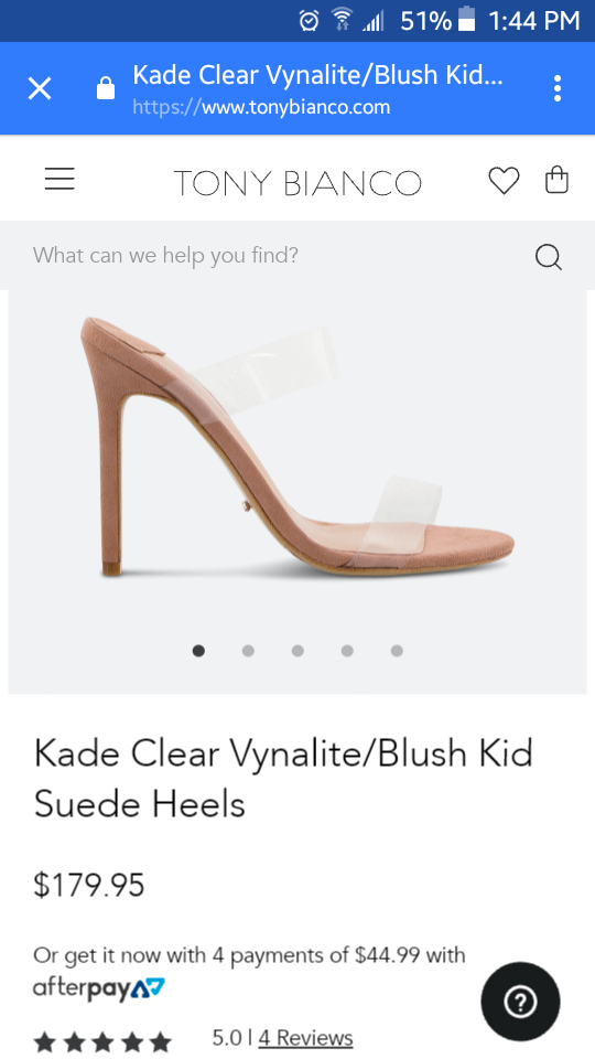
It requires zero guesswork for shoppers to figure it out, and with a single tap, they can go straight back to the homepage and begin a new search.
This is a formula that I strongly suggest using for your site because it should eliminate a lot of irritation and make for smoother website navigation.
7. Offer a Quick, Hassle-Free Checkout
One of the biggest roadblocks to conversions is having a long, drawn-out checkout process.
More specifically, forcing shoppers to register for a new account is a major dealbreaker.
In fact, “23 percent of users will abandon their shopping cart if they have to create a new user account.”
I know that I get annoyed when I have to go through the trouble of registering, especially if I only plan on making a one-time purchase.
So you’re shooting yourself in the foot if you require someone to register before making a purchase. It’s that simple.
That’s why I recommend ditching that model and being more flexible with your checkout options.
Now there are two main ways to go about this.
One is to offer guest checkout, where shoppers can go ahead and buy without having to create an account.
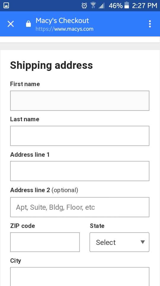
That’s what Macy’s does.
And I think it works well because shoppers can quickly find this option at the bottom of the screen.
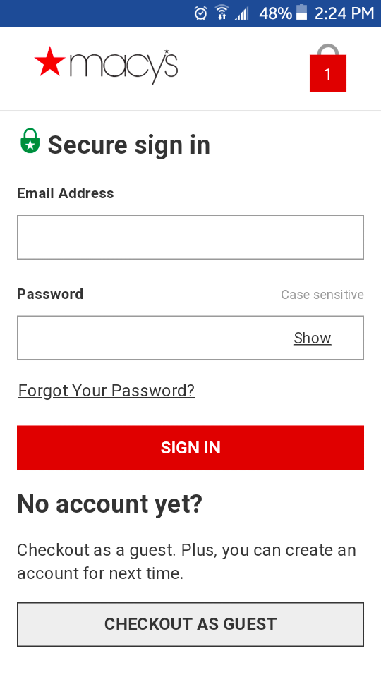
All they have to do is fill out their basic order information, and they’re all set.
The other option is to offer express checkout where customers can quickly pay using a widely accepted platform like PayPal or Google Pay.
That’s what New York fashion designer, Steven Alan does on their checkout page.

This makes checkout a breeze and greatly reduces the chances of someone abandoning their shopping cart.

Conclusion
We’ve long reached the tipping point where more ecommerce shoppers are on mobile devices rather than desktops.
So it’s no surprise that this demographic deserves the most attention in 2023 and beyond.
Using the mobile optimization strategies listed here should ensure your shoppers have a smooth, comfortable experience without any hiccups along the way.
In turn, they’re more likely to explore your store for longer and ultimately convert.
And assuming they enjoy your products, a decent percentage should be loyal customers who return again and again.


