Ever taken a week off and come back to 1,000 unread messages in your inbox?
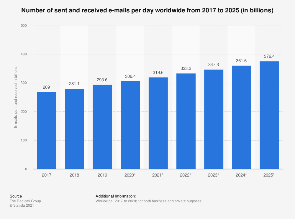
There’s a good reason for that: the average person currently receives almost 320 emails a day.
By 2025, that number is expected to surpass 375 emails a day—equivalent to over 15 an hour, or once every four minutes.

With so much traffic in our inboxes, it’s a wonder anyone ever opens our emails.
As email marketers, we’ve got three main “tools” to win that all-important click:
- Brand strength
- Subject line
- Preview text
Strengthening your brand is a far lengthier and more nuanced process than I’ve got time to discuss here.
Subject lines are a more obvious tool; chances are you’re already doing A/B testing and reviewing your email marketing metrics to understand what your best email subject lines look like.
And then there’s the final of those three tools: preview text.
The preview text section garners less attention from marketers than subject lines, but it’s still super important. In fact, up to one-quarter of respondents read the preview text before deciding to open an email.

Email Preview Text: Basics and Examples
What is Email Preview Text?
Preview text is the copy that shows up next to, or beneath, the email subject.
Think of it as a brief description of what’s within your email, working in tandem with the subject line to persuade subscribers to open your message.
Each email client has different terminology for this valuable piece of inbox real estate:
- Apple Mail calls it a preview
- Gmail calls it a snippet
- Outlook calls it a message preview
Whatever the name, they’re all referring to the short segment of copy ringed by the red box in this example:

Confusingly, some marketers use the terms “preview text” and “preheader” interchangeably. Don’t be fooled: they’re not the same thing.
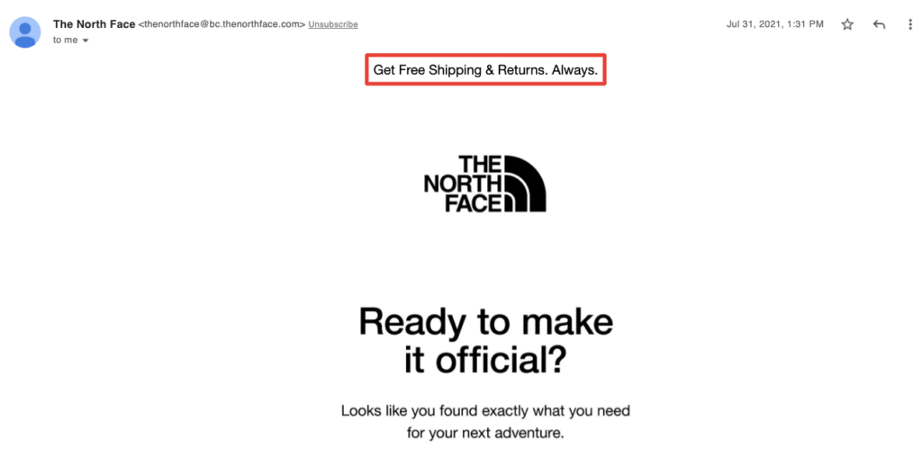
Whereas the preview text is visible within your inbox, the preheader only shows up after you’ve opened an email, appearing just above the header section:

Unlike the subject line, there are no hard-and-fast rules around how long your preview text should be.
That’s because settings can be changed by the recipient from within their email client. Depending on their preferences, a subscriber might see anything from zero to five lines (or about 278 characters) of preview text.
Frustratingly, there’s no way to track how much preview text your subscribers can see, which makes it difficult to set meaningful parameters.
But as with most marketing copywriting, I’d recommend being as concise as possible so your text displays to the highest number of recipients without truncating. Around 90 characters is a good limit to set yourself.
If you can’t communicate your message in fewer than 90 characters, chances are it’s too complicated anyway.
14 of the Best Email Preview Text Examples
Now that we know what we’re talking about, let’s dive into some real-world examples of killer email preview text. To give you some extra inspiration, I’ve segmented them by the tactics they use and the emotions they invoke to drive clicks.
Curiosity
Curiosity is a valuable emotion to tap into through email marketing because it makes us think: “What’s that all about?”
We, humans, hate uncertainty, so if you leave your audience with an unanswered question, there’s a good chance they’ll want to find the answer.
1. REBEL8

Honestly, I didn’t know what to expect when I read this subject line and preview the text combo. There’s absolutely no context, which makes it kind of intriguing.
Inevitably, that means I opened the email to find out what was going on, which is precisely what REBEL8 wanted all along.
This is one of several examples I came across of the subject and preview copy being used in tandem to create a more impactful message.
The learning here is: don’t treat subject lines and preview text as separate entities. Write them at the same time to get the most out of both.
2. POPFLEX

Who doesn’t love to be told they’ve got a gift waiting for them?
Let’s be honest: when we receive an email like this, we know there’s no chance of being told we’ve won $1 million, or a new Ferrari, or a free holiday to the Maldives.
Yet we can’t help but click, because what if this time it’s a real gift that we actually want?
(Spoiler alert: it was actually a 15 percent off discount code.)
Urgency
You don’t want your customers to buy tomorrow or next month—you want the sale now. But your audience is busy, so if you don’t instill a sense of urgency, don’t expect them to add-to-bag.
3. Kina and Tam

This is another classic example of a subject line and preview text working together in perfect harmony.
The subject line lures you in with the prospect of saving 10 percent on your next purchase, then the preview text forces you to take action right now by warning you the sale is a one-day-only deal.
4. Levi’s

In this abandoned cart email example, Levi’s achieves two things:
First, it uses the subject line to remind the recipient they left something in their shopping basket.
And second, the preview copy gives the potential customer a reason to complete their transaction: a 30 percent discount.
Exclusivity
The knowledge that we’re getting something that isn’t available to the “general public” can be pretty persuasive. After all, everyone likes a bit of special treatment.
5. Apothékary

This might not be the most subtle example of using preview text to give your product an air of exclusivity. But subtlety is overrated, especially in email marketing.
By stressing that this product launch is “LIMITED”, Apothékary makes it clear that if you don’t ask fast, you’re going to miss out.
It’s an effective tactic because it compels the recipient to buy (or, in this case, to register) without offering a discount or some other promotion.
6. Brooklinen

Personalization is an absolute must-have for any email marketing campaign.
If your emails sound templated and untargeted, people aren’t going to pay attention.
Sure, personalized email copy takes longer to write than generic copy. But if you put the effort in, you’ll get the reward. For instance, Campaign Monitor discovered that emails with personalized subject lines are 26 percent more likely to be opened.
Brooklinen leans into this with preview text that sounds extremely personalized. It’s literally promising items that have been hand-picked just for you.
Humor
Being funny isn’t easy, especially for brands—and especially within the confines of an email inbox.
With a limited character count and no visual elements (other than an emoji or two) to help you out, crafting humorous preview text requires some seriously smart copywriting.
7. Shinesty

I’m not saying this is laugh-out-loud funny (I don’t think I’ve ever received a marketing email that literally made me laugh out loud).
But the copywriting in the preview text is amusing in a fun, whimsical way that comes across as endearing and made me want to click. And it achieves all that in fewer than 50 characters.
8. Chubbies

Again, this preview text example probably isn’t going to win any comedy awards. But it’s playful and engaging, as long as you’ve heard the Sir Mix-a-Lot song it references (otherwise it doesn’t make a lot of sense).
Also, this one sparks curiosity because it doesn’t offer any context for what the email is actually about.
As I’ve already discussed, this air of mystery can be a pretty potent tool for persuading recipients to open your email.
Informational
Tell your audience something they don’t know, or that they’re eager to learn more about, and there’s a good chance you’ll compel them to click.
9. Prose

Here, we can see a solid example of a social responsibility email from haircare brand Prose. The preview text presents a pretty shocking statistic that the recipient might not be aware of.
In this case, it acts as a highly effective “kicker” following the subject line: “Beauty for a cause.”
Without specifically saying so, the whole thing makes you assume that Prose is doing something to support the fight against breast cancer.
If that’s a cause that’s close to your heart, there’s a good chance you’ll click to find out more.
10. Allbirds

Sticking with CSR, this preview text example makes a powerful statement: “We’re committed to forest restoration.”
Again, it works particularly well after a striking subject line that demands action to help Mother Nature.
With 85 percent of people willing to take personal action to combat environmental and sustainability challenges in 2021, this is exactly the sort of message consumers want to hear (provided your words are backed up by meaningful action).
Social Proof
Social proof is the idea that people naturally like to replicate the actions of others.
If it wasn’t for social proof, queues probably wouldn’t exist.
From an email marketing perspective, demonstrating social proof is about highlighting positive reviews and recommendations for your product.
11. Bellroy

This is a fairly “soft” example of social proof.
By which I mean: Bellroy explains that its customers love the products in the email, but stops short of giving any actual details (like how quickly they sell out, or how many five-star reviews they’ve been awarded).
That might work for your audience; sometimes words can be more impactful than hard numbers.
12. Everlane

On the flip side, Everlane uses specific data to leverage the power of social proof.
The preview text details both the average star rating of its product and the number of reviews it’s received.
That works especially well alongside the qualitative data in the subject line, which reads like an excerpt from a real review.
Spontaneity
We don’t always need to be goaded or coaxed into a purchase; sometimes it can just be fun to buy something on a whim. It’s worth reminding your audience of the simple joy of an impulse buy.
13. Bliss

Here, Bliss uses the idea of spontaneity to jazz up an abandoned cart email.
Rather than offering a discount to persuade the recipient to come back and convert, it shifts the task of closing the deal back to the consumer, making them ask: “Why haven’t I bought this yet?”
Admittedly, there might be a good reason. Maybe they found a better or cheaper version somewhere else; maybe they don’t have the money right now.
But if not, this simple preview text example might be enough to convince them to splash the cash.
14. Torrid

Convenience is the number one reason consumers prefer to shop online, according to Jungle Scout.
Torrid taps into our love of a friction-free shopping experience in this abandoned cart email by stressing that it only takes a “few clicks” to convert.
Just like Bliss, it forces the consumer to ask: “If it’s that easy to check out, why don’t I just buy it now?”

Conclusion
To me, there’s one clear takeaway from these 14 email preview text examples: preview copy is only effective when it complements the subject line.
Otherwise, it’s just a bunch of pointless characters standing between the consumer and your email.
Whether preview text adds more detail to the subject line, backs it up with data, or adds a relevant call to action, it should never be treated in isolation.


