Shopping in a brick-and-mortar store is an experience that engages all five senses, which is why merchandising long ago became something of a science for brick-and-mortars.
Merchandising for physical retail shops often includes engaging customers from the moment they walk by (think elaborate window displays) to the moment they exit, purchase in hand (think scents, music and other elements aimed at driving sales and leaving a lasting impression).
Today, with so much revenue being driven online rather than off, e-commerce companies are discovering their own ways to “merchandise” by making strategic visual decisions that go beyond designing a clean, responsive site.
As an online store owner, you may be wondering how merchandising an online store works or why it even matters.
Let’s get those questions out of the way.
E-Commerce Merchandising Basics
How E-Commerce Merchandising Works
Why E-Commerce Merchandising Matters
Collection-Based Merchandising
How E-Commerce Merchandising Works
The most important function of e-commerce merchandising, whether you have a small or extensive product catalog, is guiding your customers through the buyer’s journey.
While nearly every visitor to your brick-and-mortar will interact with the same visuals, smells, and associates while walking into your store, there are many different paths a customer can take to end up on your e-commerce site.
Merchandising can help ensure every customer who visits your site has a similar, on-brand experience, no matter how they arrive on your site or how they navigate around once they get there.
Why E-Commerce Merchandising Matters
Merchandising helps you take control of how your brand is perceived and how visitors shop, while also driving brand engagement and awareness.
Additionally, merchandising is a key part of a comprehensive sales strategy, helping you drive more revenue.
Visual merchandising can both increase the average order value (AOV) from your customers and inspire customers to return in the future, two of the main ways businesses see revenue growth.
Ready to elevate your customers’ online shopping experience?
Here are some best practices and examples of online brands doing visual merchandising right.
Homepage Storytelling
For most visitors to your site, your homepage is their first encounter with your brand.
Further, your homepage can do more than showcase selected products:
It can tell the who, what and why of your brand.
Start by including imagery and text that explain what your products or brand are, how your products work and why customers should buy them.
Structure the content so that the most important or influential information is near the top of the page, with more detailed information revealed as the visitor scrolls.
Back up your claims with third-party support, such as social proof like customer reviews and authority proof like media reviews of your products.
You can also include “liking” proof, which shows visitors how many viewers liked or shared your homepage on social media.
Finally, include clear calls-to-action (CTAs) at the close of each section to direct your visitors to the next part of your purchasing funnel.
Homepage Storytelling Example
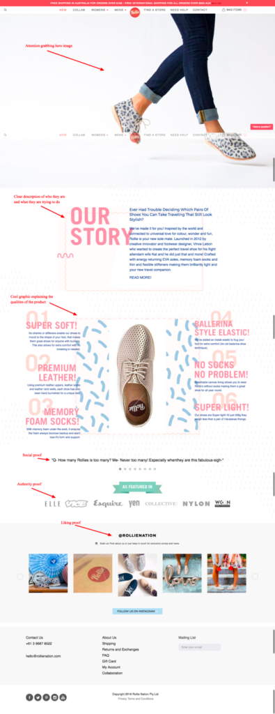
Shoe brand Rollie is a prime example of a homepage that tells the brand’s story.
The page opens with a clean image that immediately lets visitors know that Rollie sells shoes, the most important takeaway for any visitor to this site.
The next section tells the story of Rollie, letting visitors know that enabling comfort while traveling is the main goal of this brand.
The third section explains how Rollie achieves this goal: by creating shoes that are made from memory foam and are elastic, light and soft.
This is followed by social, authority and liking proof examples, showcasing customer imagery of the products and adding clout and trust to the brand.
Collection-Based Merchandising
Make it easy for your customers to know you can meet their needs with collection-based merchandising.
You’re likely familiar with this type of online merchandising if you visit clothing brand sites, but it can be used for a wide range of goods.
The beauty of creating collections is that they make it easy to target various customers through search terms, while also helping visitors navigate your store more easily.
Collections also guide visitors to delve deeper into your site, especially if you use cross-selling techniques once they click through to a product page.
For collection-based homepages, you will need an attention-grabbing image to highlight each collection and pair it with readable text that unambiguously describes what the visitor can expect from the collection.
To keep the homepage scannable and readable, utilize a grid style to host your collection photos and links.
Consider a homepage theme that makes your collections look similar to Pinterest and Instagram pages; these sites are engaging, easy to navigate, attractive and well known.
Collection-Based Merchandising Example
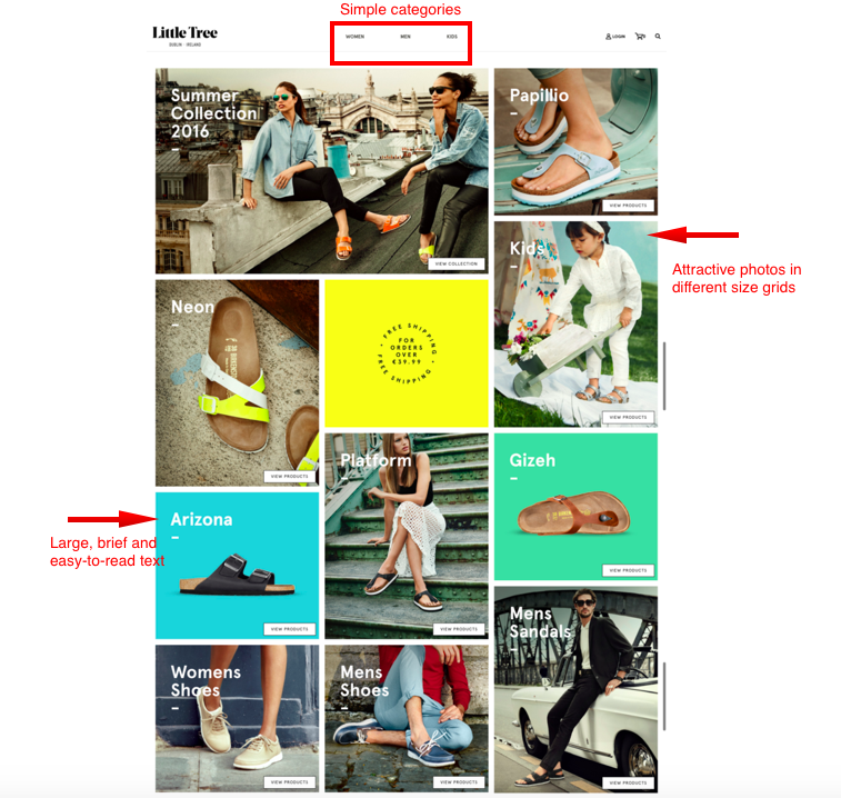
Shoe merchant Little Tree’s collection-based homepage leaves visitors with an immediate brand impression and makes it easy for customers to find what they are looking for.
The site theme features different sized panels for each collection for a modern and attractive look, and the text is large and brief to keep the site navigable.
As you can see, collection categories don’t always have to follow the norm. Little Tree relies on obvious and traditional categories, like “women’s shoes” and “kids,” but also has collections that focus on seasons and trends, like “neon.”
Feel free to change up collections as you see fit due to timeliness or terms that are frequently searched on your site.
Collection-Based and Featured Products Together
Using a combination of collection-based and featured product merchandising on the homepage is the best of both worlds for many online brands.
This allows you to highlight your most popular products while keeping your site navigable for shoppers with a specific need in mind.
These types of homepages use a combination of any of the following to make an impact through merchandising:
- an on-brand hero (featured) image
- a collection grid or a product grid
- positive third-party feedback through social proof, authority proof, and liking proof sections
Combo Merchandising Example
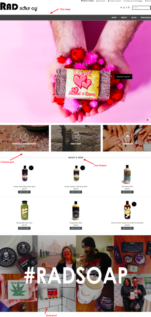
Artisanal company Rad Soap relies on this method to guide their customers’ experience.
The hero image lets visitors know what the brand is about right away, followed by three collection grids that give customers a deeper look into the brand’s story, what the soaps are made of and who some existing supporters are.
They then give customers a glance at their new products followed by a social proof grid, following the proper protocol to put the most imperative information at the top and get into the details as the page goes on.
Simple Product Focus
If the previous merchandising designs are making your head spin, you can also take it back to the basics with a simple product focus merchandising technique.
This is great for brands who are just starting out and don’t have social or authority proof yet or have a small product catalog. This design can also be easier on the wallet for those who aren’t ready to commit to a developer for a custom site design and want to rely on a template.
The idea is to highlight a few powerful images and text but to still keep the homepage interactive and engaging. One way to do so is to employ a carousel that allows you to highlight multiple images on your homepage, with only one being shown at a time.
Simple Merchandising Example
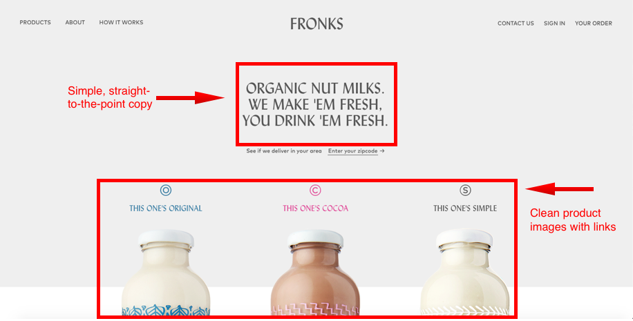
Fronks’s site offers a great example of a simple product-focused homepage.
This organic nut milk brand keeps it minimal, with few images and links on their homepage. Visitors may use the top menu to navigate or browse by clicking one of the three products on the homepage, which takes them to a clean and basic product page for each milk.
Merchandising Best Practices for All Online Brands
Regardless of the merchandising style you choose, there are other site elements every e-commerce owner should employ to ensure they are representing their brand clearly and attractively to site visitors.
1. Photography and Copy With a Voice
Imagery is everything and the corresponding copy is a close second.
Imagery should pull your visitors in and copy should be brief, yet descriptive and inviting. Both should be on-brand in the sense of color, voice, tone and word choice.
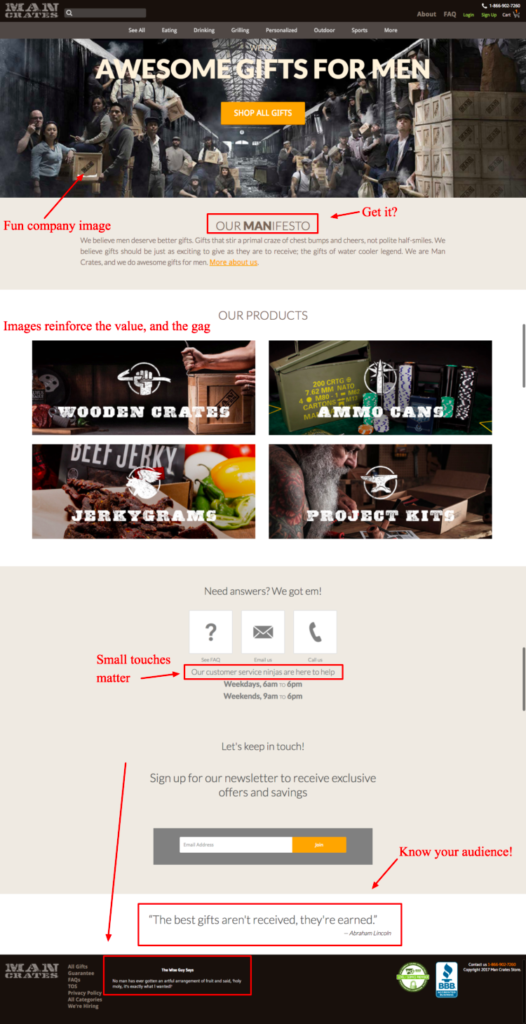
Take for example gift company Man Crates, which relies on humor to sell their male-oriented gift boxes to friends, girlfriends, and family.
The men depicted in the photos on the homepage are bearded, and follow traditional stereotypes of outdoorsy, “manly-men,” corresponding with the company’s products, such as jerky and ammo, many of which are delivered in wooden crates.
The typeface on their site carries this theme on as do other small touches on the site, like laidback verbiage and a play on the brand’s “man”ifesto.
2. Social Proof
Once your brand has had a few happy customers, let those customers do the talking for you by employing social proof on your site. More than 90% of consumers look at product reviews and customer testimonials before making an online purchase.
Further, 72% say positive reviews help them trust a company even more.
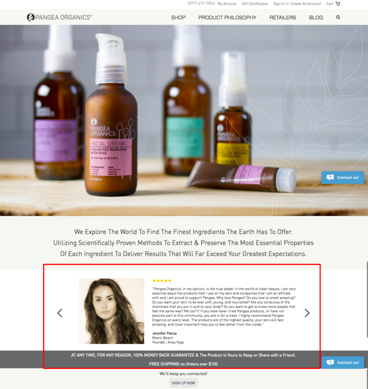
Pangea Organics has used this human need for third-party verification to their advantage by highlighting positive customer reviews on their website.
While their homepage is brief, they immediately instill brand trust in visitors through customer reviews and a money-back guarantee.
3. Goal Tracker
If your company gives a percentage of sales to charity, a goal tracker is one of the best ways to highlight your dedication to the cause.
Your cause, should you choose to champion one, is a key component of your brand’s story and should be interwoven throughout your site, not just highlighted on your About page.
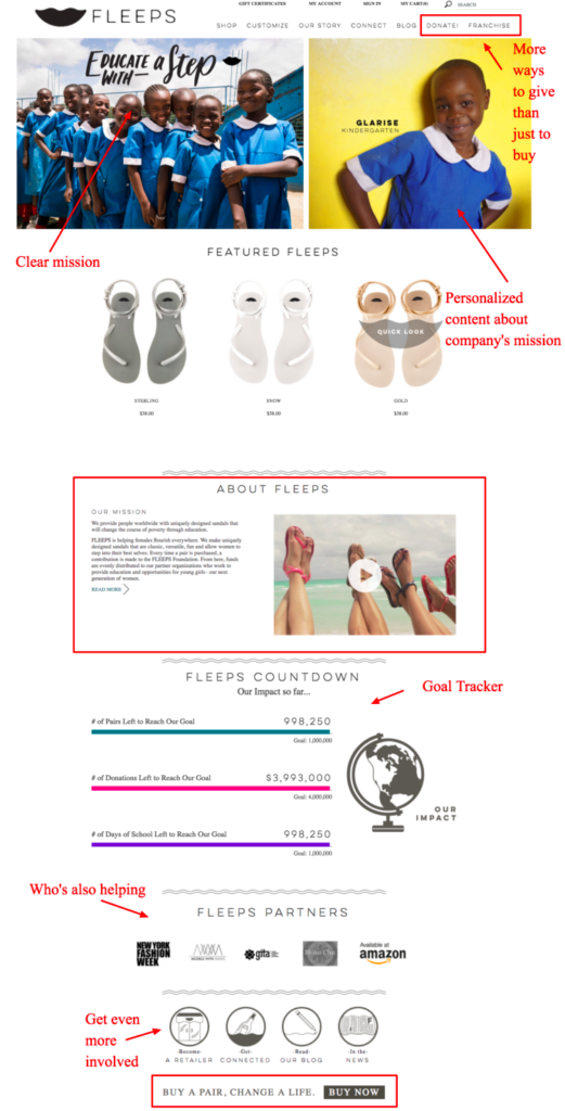
Shoe company Fleeps clearly states their mission throughout various elements of their homepage, from the hero image to the About section.
They also include a goal tracker, showing just how much they and their customers have raised for girls’ education worldwide.
This not only gives visitors a positive connection to the brand, it also makes them feel good about themselves if they make a purchase, knowing they made a tangible difference for impoverished young women.
As competition in the e-commerce space only continues to accelerate, it is important to consider how you can create a branded journey for consumers from homepage to checkout while also staying unique and true to your brand.
While you can’t yet entice online shoppers with scents and in-store displays as you would in a brick-and-mortar store, visual merchandising is still a necessity.
As time goes on, the online brands that can create a shopping experience that is just as engaging and personalized as brick-and-mortars will continue to beat out the competition, driving more traffic and conversions and bringing back more repeat customers for another great experience.


