Let’s be honest: we’ve all made at least one purchase that we ended up regretting.
Like all those people in the early noughties who spent $100+ on minidisc players, months before Apple changed the game by launching the first iPod.
So it’s no surprise that many of us prefer to do our due diligence before committing.
A survey from Google and Ipsos reveals that 53 percent of shoppers always do research before buying to ensure they make the smartest possible choice.
Inevitably, in a world where 87 percent of shoppers begin their product hunts on digital channels, much of that research is going to take place online.
This means it’s in your best interest to play your part in the research process by pointing shoppers in the right direction.
And that’s where buyer’s guides come in.
7 Best Buyer’s Guide Examples
What Is a Buyer’s Guide?
A buyer’s guide is a piece of content designed to help customers make a buying decision by providing all the information they need in one place.
That information might include:
- Price. How much should shoppers expect to spend on a product like this? Is it a one-off cost, or is there some kind of recurring element?
- Dimensions. How big are these products?
- Materials. What are they made from? Is there an advantage to choosing one material over another?
- Generic characteristics. What sort of features do products in this category include?
- Product-specific functionality. Do certain products have key characteristics that others don’t?
- “Vs.” comparisons. Wireless or wired? Portable or desktop? Metal or wood? These are the key A/B-style decisions typically made early in the buying process.
Buyer’s guides can be created for any product category you can think of. However, they’re understandably a lot more common for big-ticket items like furniture, electronics, and high-end clothing.
If I’m buying a new kitchen scourer or a pair of socks, I likely don’t need a lot of advice along the way. But if I’m splashing out on a smart TV, I’d definitely appreciate a little help.
If you think there’s a place for buying guides in your e-commerce content strategy, take a look at seven real-world buyer’s guide examples to give you a better understanding of how yours could look.
1. Wayfair
Wayfair has a huge library of educational content, of which buyer’s guides play a key role. It offers guides on everything from blenders to fondue pots.
Here, we’re going to take a look at the homeware and furniture retailer’s guide to buying a pizza oven.
There are few wasted words here—Wayfair is happy to jump straight into the important stuff—but it spends a couple of sentences on “setting the scene”.
This works well because it allows Wayfair to address a key pain point: the fact that outdoor cooking solutions are expensive and require a lot of effort.
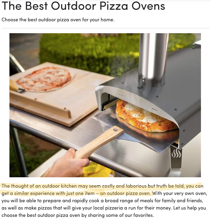
Enter the pizza oven—an easy and comparatively low-cost way to cook food outdoors.
Another thing Wayfair gets right here is its use of calls to action (CTAs) throughout the body copy. For instance, in the second section of the article, shortly after introduction, Wayfair sets out the various considerations for choosing an outdoor pizza oven:
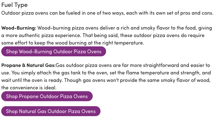
At each step, Wayfair incorporates a CTA to the relevant product category page. Not only does this allow the brand to add more internal links throughout the article, but it also gives the content a commercial focus.
Remember that a buyer’s guide isn’t purely informational content. It’s about explaining what the customer is looking for, then once they’ve found the information they need, pointing them in the direction of relevant products.
2. REI
Like Wayfair, REI has a huge content library. Its buying guides are listed under “Expert Advice”, which gives them an air of authority and credibility.
You’re not just reading a bunch of product recommendations; you’re accessing useful tips and tricks from people who know what they’re talking about.
This is reinforced at the top of each buyer’s guide through the use of reviews:

Every guide has a star rating, with readers asked to provide their own rating once they reach the end of the article:
This tells us that (at least) 225 other people found REI’s hammock buying guide useful.
Given that half of consumers trust online reviews as much as personal recommendations from friends and family, this approach makes REI’s content look much more reliable.
But that’s not the only thing I love about this buyer’s guide. It also makes effective use of rich media in the form of an explainer video that talks through some of the key considerations for buying a hammock, plus some of the other products you might want to buy alongside it.
That video clocks in at just over one minute, so it’s a short and sweet introduction to the topic. Then, if buyers want more information, they can dig into the rest of the guide.
Ernest Capbert from TOG knives explains how they have a knife buying guide that delves into the purpose behind each knife they've designed, highlighting the charm of owning a variety of knives for different food prep needs, and they walk customers through the best uses for each knife, even creating videos featuring renowned chefs discussing the knives, making it an engaging and educational experience. <embed video>
3. Best Buy
Best Buy sells more than $40 billion worth of products every year, so it clearly knows a thing or two about converting customers.
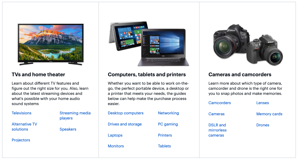
Buyers’ guides play a key role in their content strategy. However, unlike some of the other brands I’ve looked at while researching this article, it doesn’t bother producing buyer’s guides for anything and everything.
Rather, it focuses on the product categories that shoppers are most likely to have questions about—things like streaming media players, smart speakers, and computer storage.
Activity and health trackers definitely fall within the category of “products that might require a little explanation before I’m ready to make a purchase”.
Best Buy makes the process of choosing a health tracker seem unintimidating by breaking down the basic types of tracker available, and spelling out why you might choose each one:
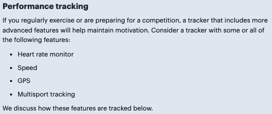
For the most part, it keeps the copy free of CTAs.
There’s a time and a place for a call to action. When you think the customer is ready to buy, that’s your opportunity to steer them in the right direction. But if they still have questions, the last thing they want is to be told constantly to “buy now”.
Another intelligent feature of this buying guide is its use of a navigation bar at the top of the page:
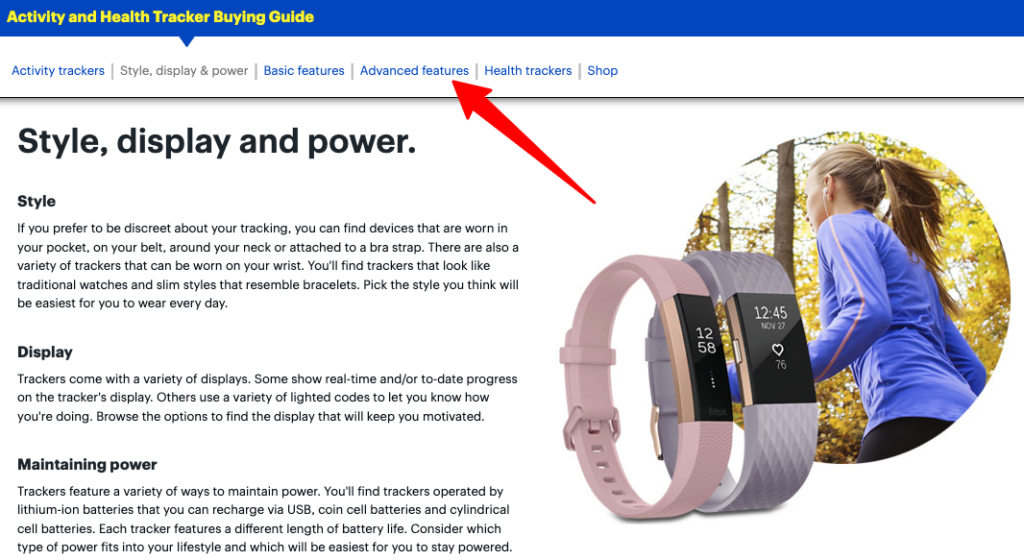
It allows you to easily refer back to a previous section to remind yourself of a key piece of information or jump forward to a later section if you’re looking for something specific.
4. B&H Photo Video
One of North America’s largest photography and video equipment retailers, B&H offers buyer’s guides across six broad product categories: photography, video, pro audio, computers, home entertainment, and mobile.
Let’s dive into the retailer’s vlogging camera buying guide to see what’s going on here.
One of the best things about this guide is that each product is accompanied by a bullet point list of features:
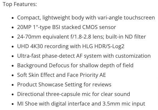
This works well because it pulls out key information, making it easy for shoppers to find. Because let’s be honest: not everyone has the time or patience to sift through hundreds of words of copy to get a nuanced view of the best product for their needs.
However, my favorite thing about this guide is B&H’s decision to add a scrollable list of all the featured products:
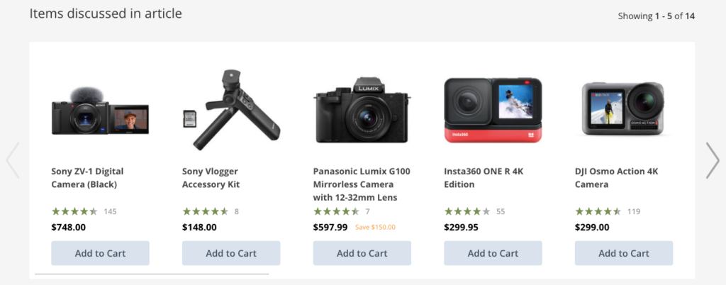
That list appears right at the bottom of the article. So by the time you’ve got all the information you could possibly need to buy the right vlogging camera, you’re presented with a list of all the cameras and accessories you’ve just read about.
One more minor point here. At the top of the guide, we can see the last time this article was updated:

That’s a trust factor because it shows readers that the information we’re about to read is up to date. It also serves as a useful reminder to brands that content creation is rarely a one-and-done exercise.
Once you’ve written and published your buyer’s guide, get into the habit of renewing the content every few months to ensure it’s still relevant. As an added bonus, there’s plenty of evidence to suggest that Google likes “fresh” (e.g. new or recently updated) content.
5. John Lewis
Most of the other examples in this article focus on gear, much of it technical in nature. But not all buying guides need to be “techy”.
Department store chain John Lewis gives us a fantastic example of a buyer’s guide to help shoppers choose the best suit.
Admittedly, it’s a little less wordy than most of the other buying guides I came across. But it’s still packed full of useful information.
One element that works especially well is this “checklist” that appears early on in the guide:
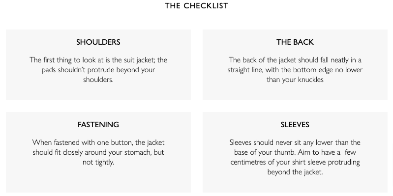
In four steps, it makes it simple for readers to understand whether a suit is a good fit.
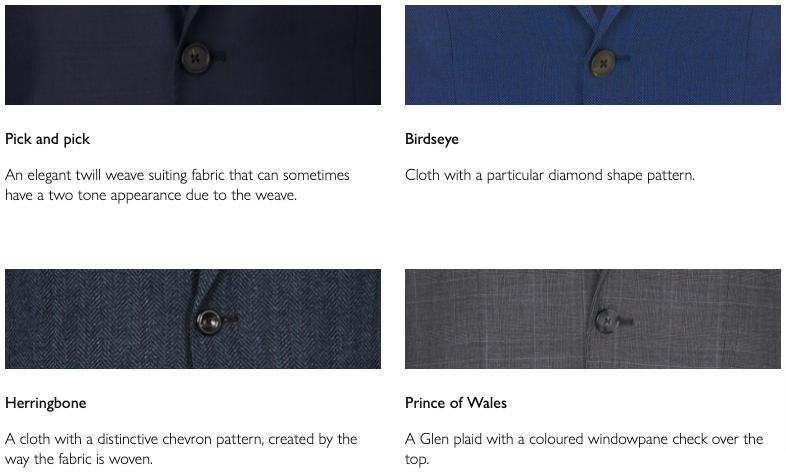
Much like with tech products, there’s also a lot of opaque jargon involved in buying a suit. This guide also does a great job of explaining terminology—like birdseye and pick and pick—that might not make sense to an inexperienced suit purchaser:
6. JB Hi-Fi
Back to the world of tech, Australian home entertainment retailer JB Hi-Fi has a much smaller content library than most of the other retailers in this article. Nonetheless, it definitely understands what a good buyer’s guide looks like.
Perhaps my favorite thing about its TV buying guide is that it doesn’t try to do too much. Specifically, it’s 100 percent focused on educating the audience rather than recommending specific products.
The guide itself is packed full of useful advice, such as this tidbit about choosing a TV screen size based on the ideal viewing distance:
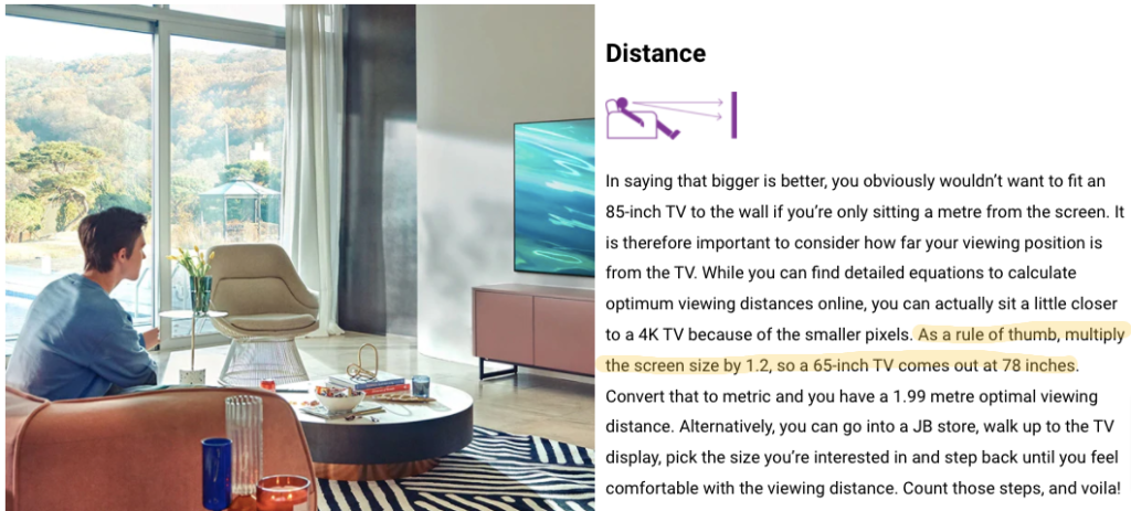
Honestly, I had no idea it was such a scientific process.
Unusually, JB Hi-Fi’s buying guide is purely informational, meaning it doesn’t actually refer to specific products or incorporate any “buy now” CTAs. Instead, it incorporates a prominent call to action that links to the brand’s TV finder tool:
This approach works nicely: once you’ve gathered all the information you need to make an informed choice, you can click through to the TV finder, answer the questions, and be presented with the perfect device for your needs.
It’s a classic example of the customer effectively “closing the deal” for themselves.
7. Dyson
From hair straighteners to air purifiers, Dyson is all about being at the cutting edge of household technology.
Naturally, when you’re striving to innovate and push boundaries, it’s not always going to be easy for consumers to immediately understand your products—especially if you sell multiple products within the same category.
To get around this, Dyson produced a buyer’s guide for its full range of vacuum cleaners. Each product is summed up in one or two short sentences, making it easy to understand which one is best for their needs.
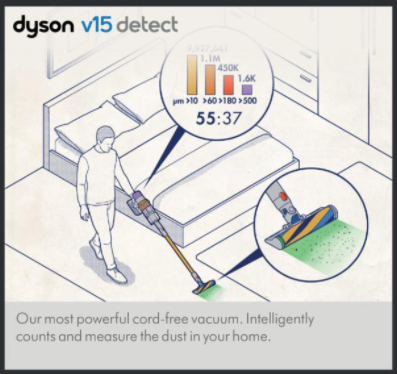
Similar to JB Hi-Fi, Dyson doesn’t attempt to “close the deal” within its buying guide. Instead, it ends with a CTA that points readers toward its range of “accessories for every cleaning task”, encouraging them to choose the right model themselves.
Conclusion
As we’ve seen, there’s no set format for a buyer’s guide.
But one thing shared by each of these examples is simplicity.
It’d be easy to overcomplicate a buying guide, cramming it full of highly detailed, product-specific information. But it’s better to leave that stuff for your product pages.
The job of your buyer’s guides isn’t to give the customer every single detail they could ever wish to know about every product within a given category.
It’s about arming them with enough knowledge to make an informed choice, then steering them toward the relevant category page.


