Admittedly, I’m no car expert. I can barely change a tire. I do, however, know a thing or two about automotive email marketing.
And I know how potent of a strategy it can be for automotive companies who are looking to nurture leads and set the stage for an ultimate conversion. Recent data from HubSpot also found that email engagement is on the rise.
In fact, “78 percent of marketers have seen an increase in email engagement over the last 12 months,” with 59 percent of readers saying it influences their purchase decisions.
The key is to craft winning emails with well-written copy and stunning visuals while concisely conveying critical messages and getting readers where they need to go.
To give you an idea of what that looks like, here are some of the best automotive email examples. Along with a breakdown of what they did right.
The 6 Best Automotive Email Examples
1. Subaru
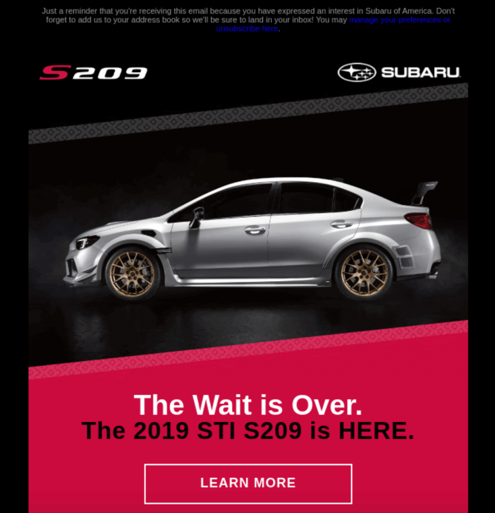
This email from Subaru promotes the release of their car model the 2019 STI S209. The subject line reads, “Wait…how many s209 are being made?,” which instantly piques the interest of most diehard Subaru fans. And it was the limited production of this vehicle that was the focal point of the email.
In fact, Subaru only made 209 of them in total.
It starts off with a jaw-dropping image of the car, a catchy headline, and a clear-cut CTA that simply says, “Learn More.”
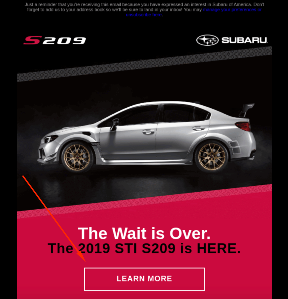
So, at a glance, readers know exactly what’s being offered, why they should care, and what action to take. In short, it helps them quickly get their bearings.
And best of all, this information can be found above-the-fold without having to do any scrolling whatsoever.
While you certainly don’t want to jam-pack the above-the-fold section to the point that it’s cluttered. It’s important to highlight key information so readers don’t have to do too much investigative work.
Below that, Subaru elaborates on the offer, explaining that the wait is over on this new model, and the first-ever S-line produced exclusively for the US is here.
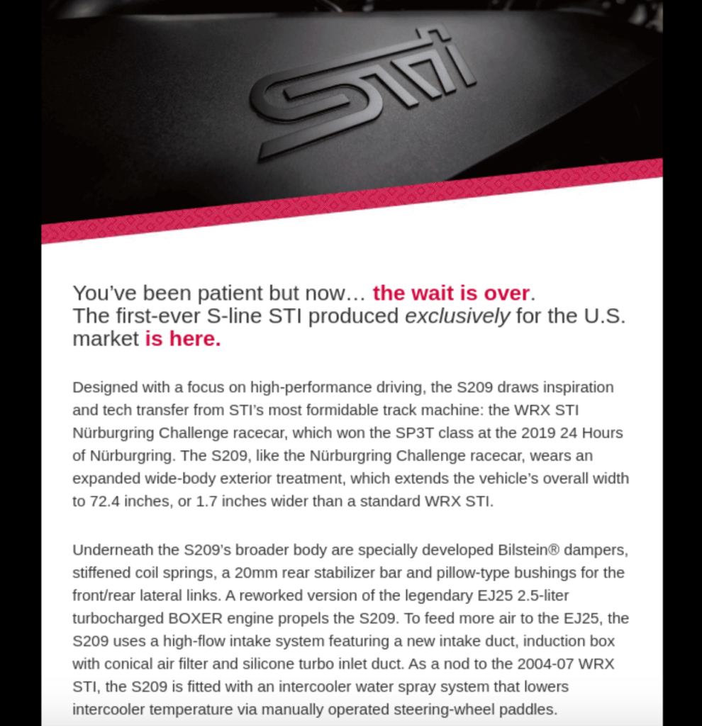
Then, they feature another sexy image of a blue model of the S209 and mention the starting price. This is followed by the same “Learn More” CTA…
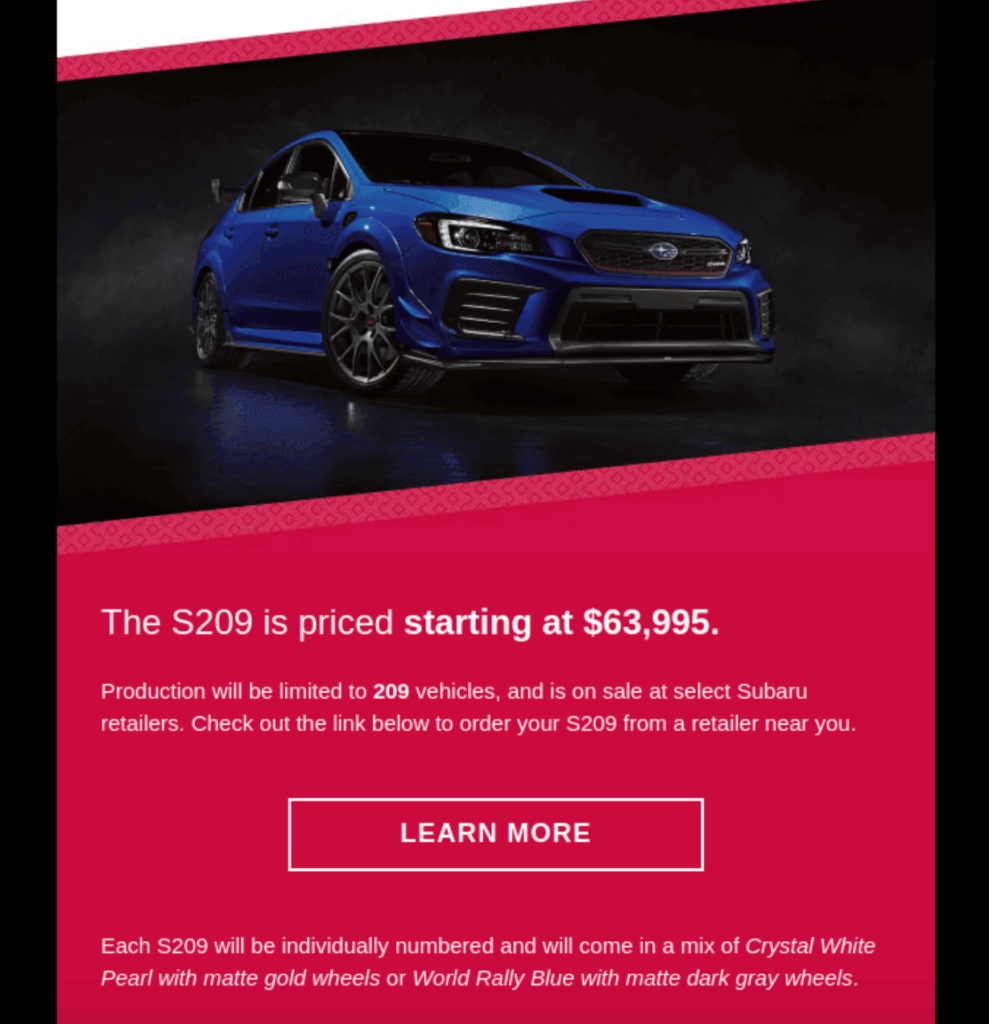
…and they wrap it with yet another beautiful image and listing a few additional benefits, which really crystallizes the UVP of the email.
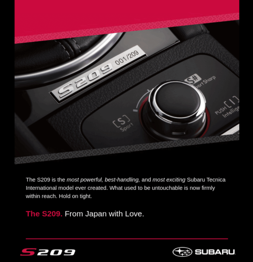
So, if you’re looking to promote a new car that’s coming out, this is one of the perfect automotive email examples to draw inspiration from.
2. Mitsubishi

Next, there’s this email from Mitsubishi, which has three main objectives.
- Show off and promote the Pajero Sport
- Share some practical automotive tips with readers
- Promote their 100 Years of Adventure Sale
To begin, Mitsubishi places an epic looking picture of the Pajero Sport climbing up a craggy rock face above-the-fold. It’s a beauty and immediately grabs readers’ attention and makes them want to explore more.
Just below that, Mitsubishi features a video, which lets readers see straight up what the Pajero Sport looks like in action, and is followed by some crisp copywriting that specifically targets adventure lovers.
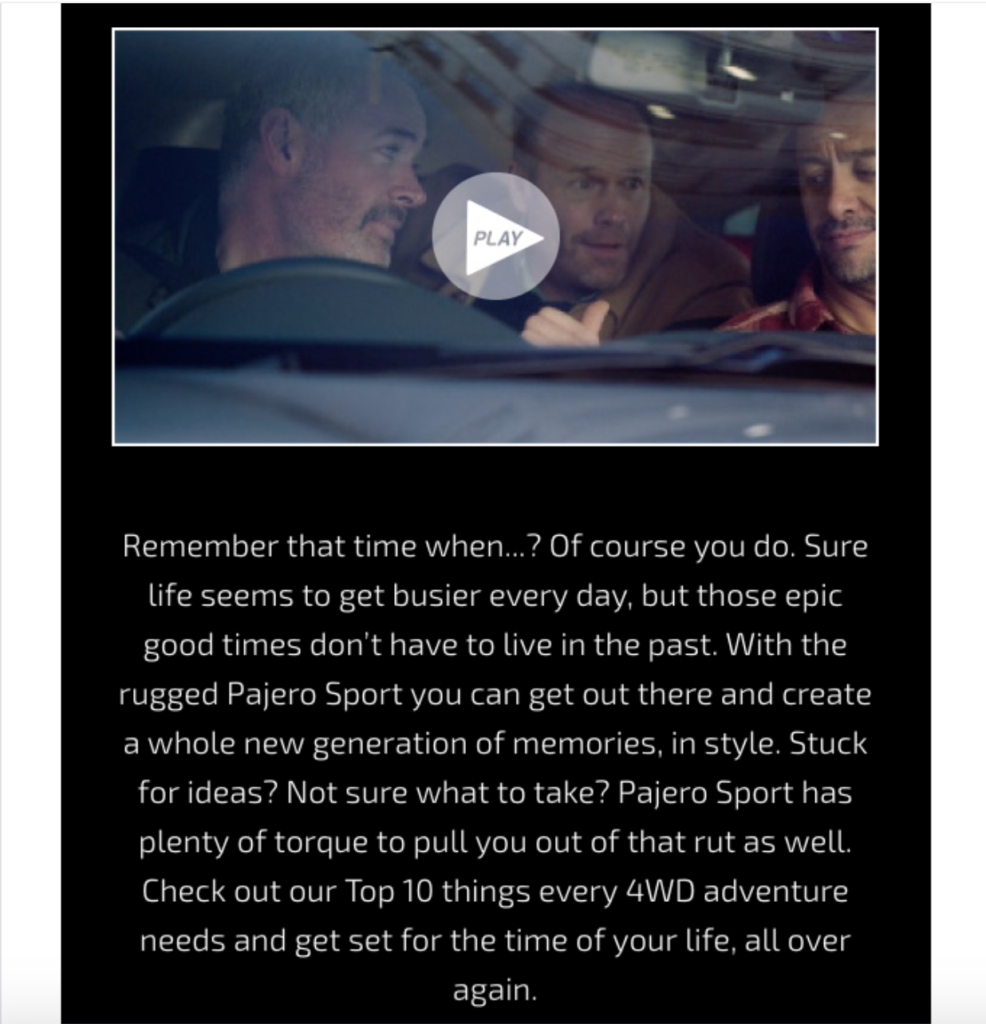
So, with minimal cognitive lifting, Mitsubishi gets readers up-to-speed on their core offer. From there, they include two informative, educational sections.
One is on how to tackle a tow…
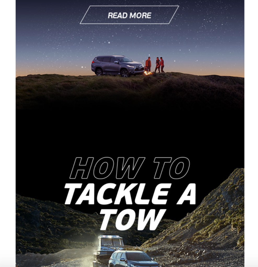
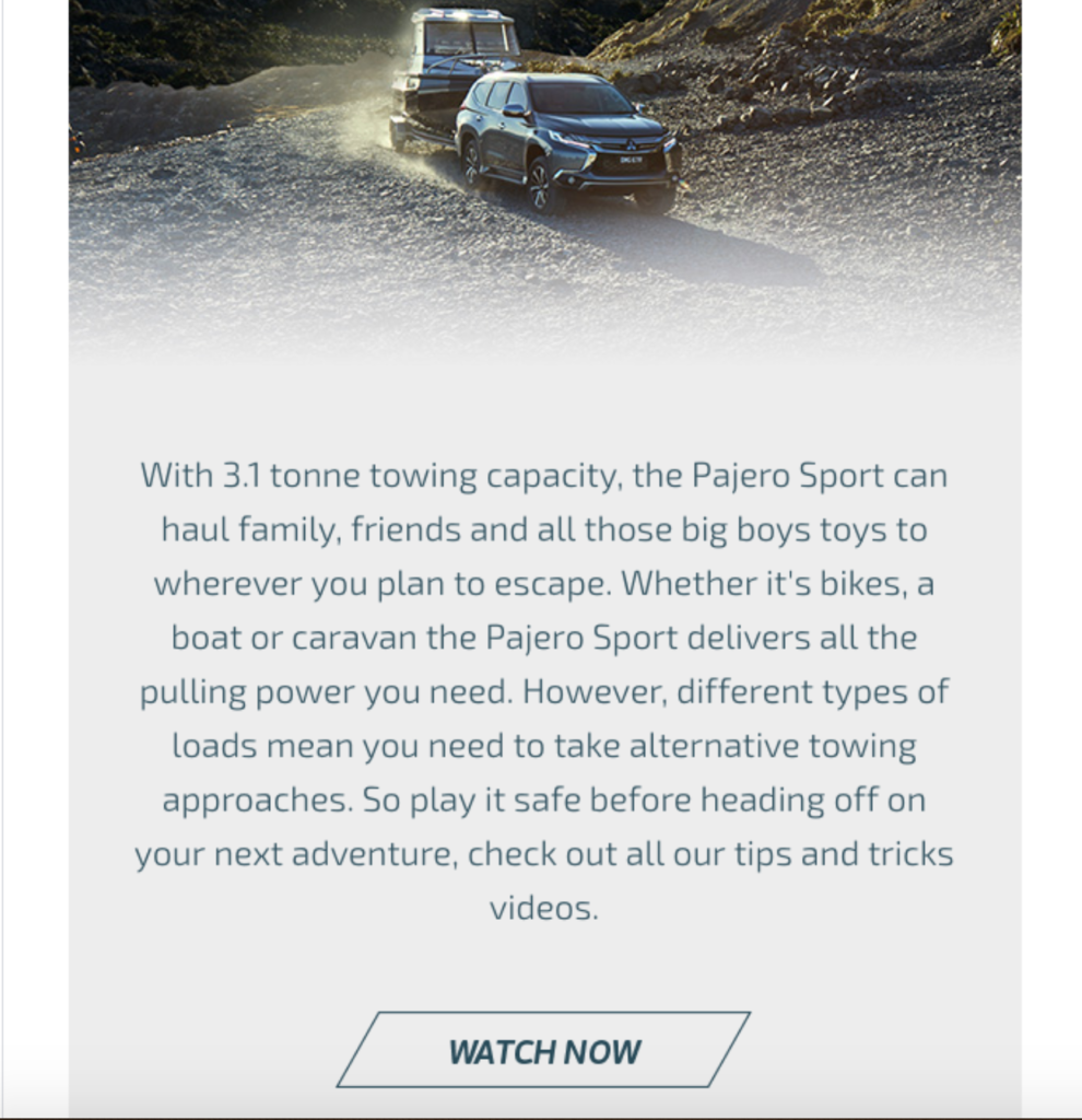
…which includes another video to check out.
The other is on how to pack for adventure trips…
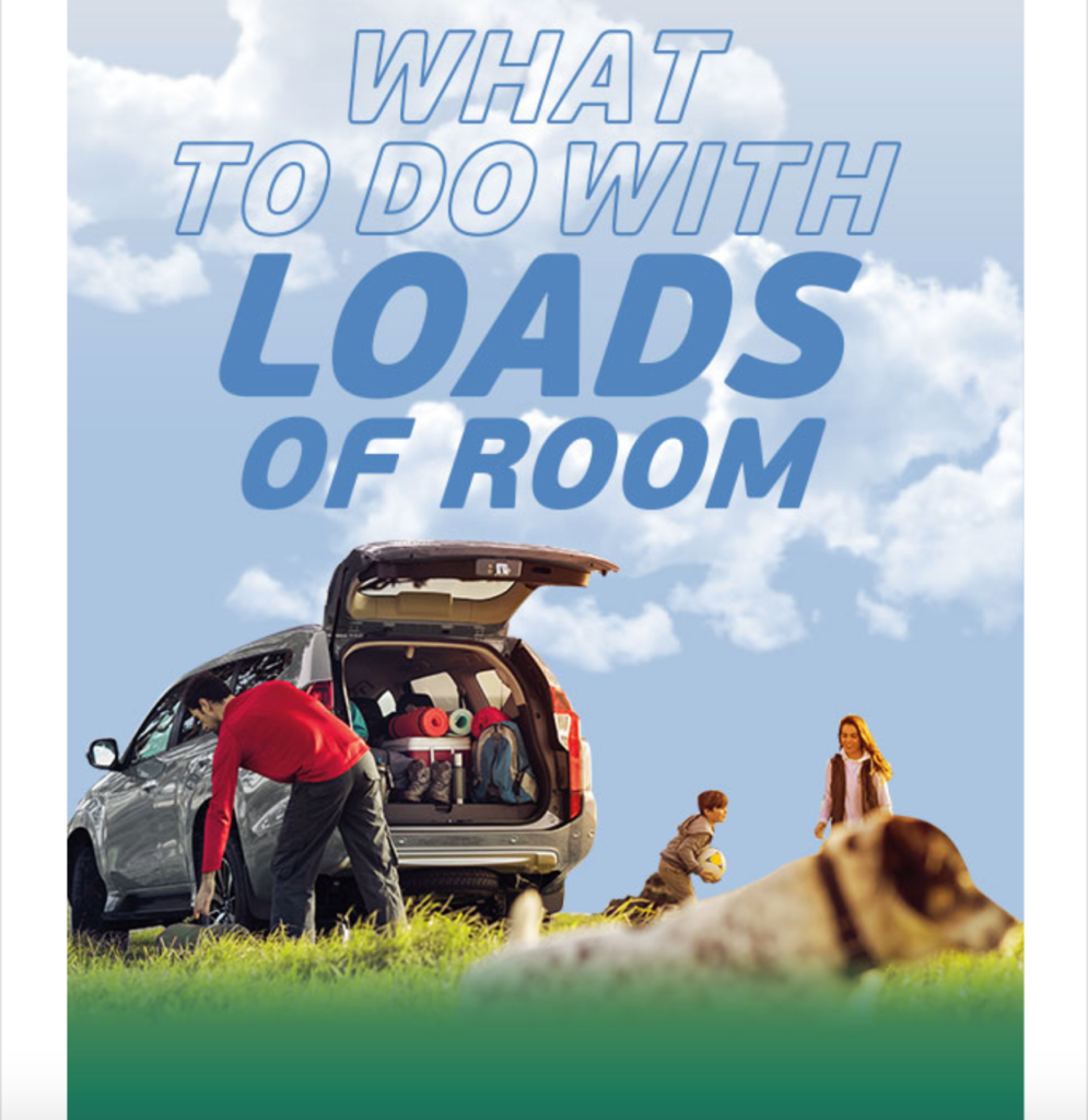
…which features a link to their six-step packing guide.
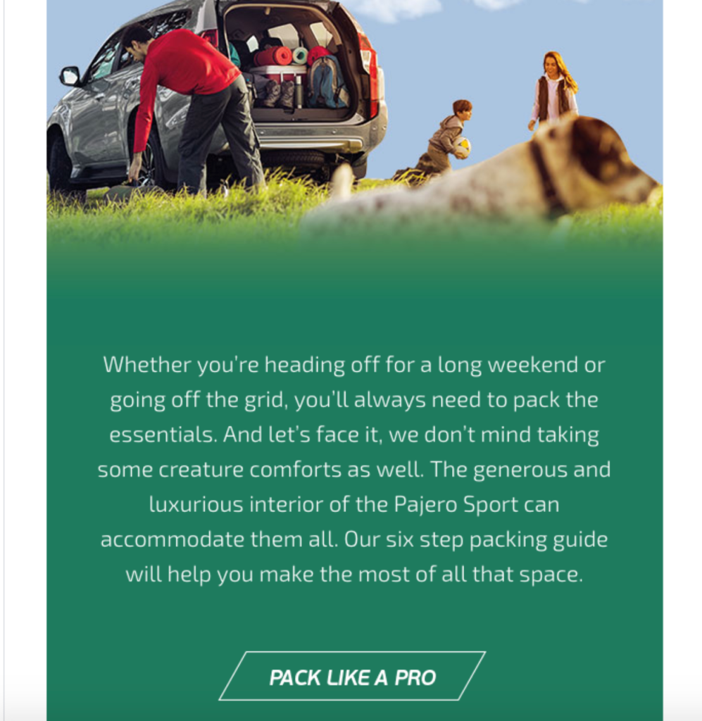
Known as education content marketing, sharing knowledge and helpful tips like this can be a winning strategy.
Experts have found that it’s huge for developing stronger rapport, trust, and brand loyalty.
It’s also a great way to show that you know your stuff and are an authority in your industry.
After that, Mitsubishi talks about their 100 Years of Adventure Sale…
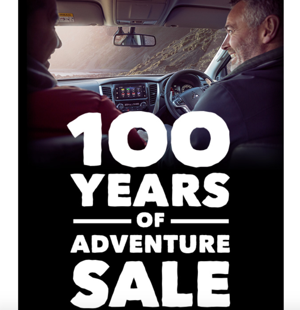
…and features a few different vehicle models.
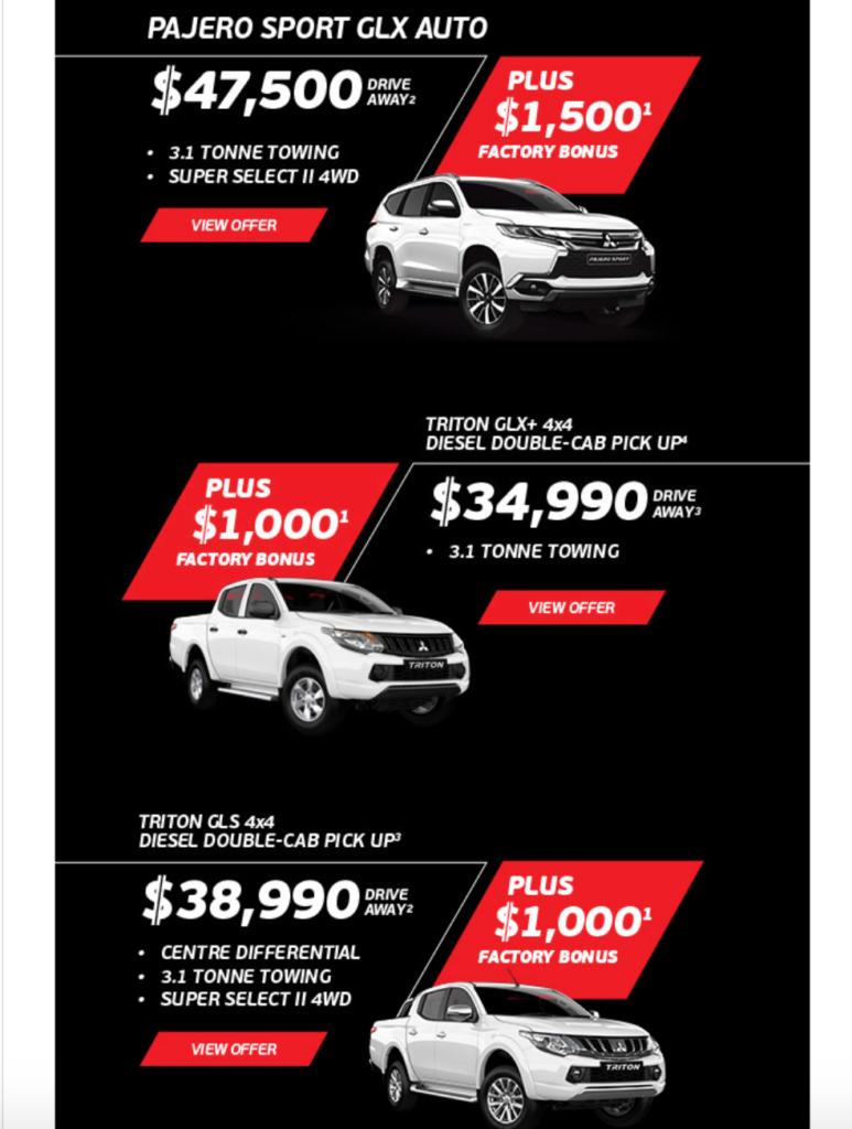
This is one of the best automotive email examples I’ve seen because it does such a great job of unpacking a lot of information into a straightforward email format that’s easy to digest.
There’s a strong visual component, which nearly all great emails have, with short, “snackable” sections that readers can quickly browse through.
Without overwhelming anyone, Mitsubishi covers a lot of ground and uses simple CTAs, pointing readers to the pages they want them to visit.
3. Honda
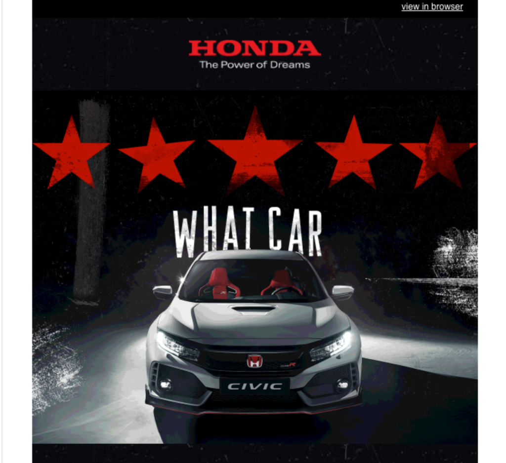
This email from Honda is an absolute masterpiece. It reminds me more of a movie advertisement for a summer blockbuster than it does a traditional automotive email.
Just check out the face-melting images and riveting headlines promoting the Honda Civic Type R. At the top, above-the-fold, Honda starts off with a breathtaking picture of the vehicle, five stars, and the simple yet potent headline of “What Car.”
This helps get readers immediately dialed in, compelling them to scroll down to learn more. When they do, they see this quick copy that gets them up-to-speed on the purpose of the email.
Honda explains that they “gave a few lucky motoring journalists the chance to experience the brand new Type R around a test track in Dresden” and include a straightforward CTA for readers to check out the reviews.
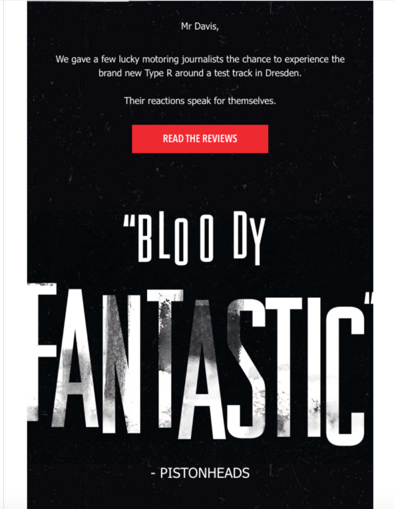
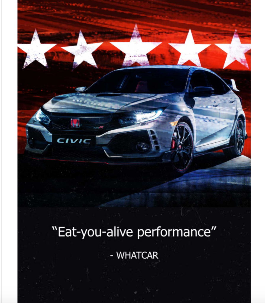
Then, they launch into more brief yet powerful quotes from some of those publications.
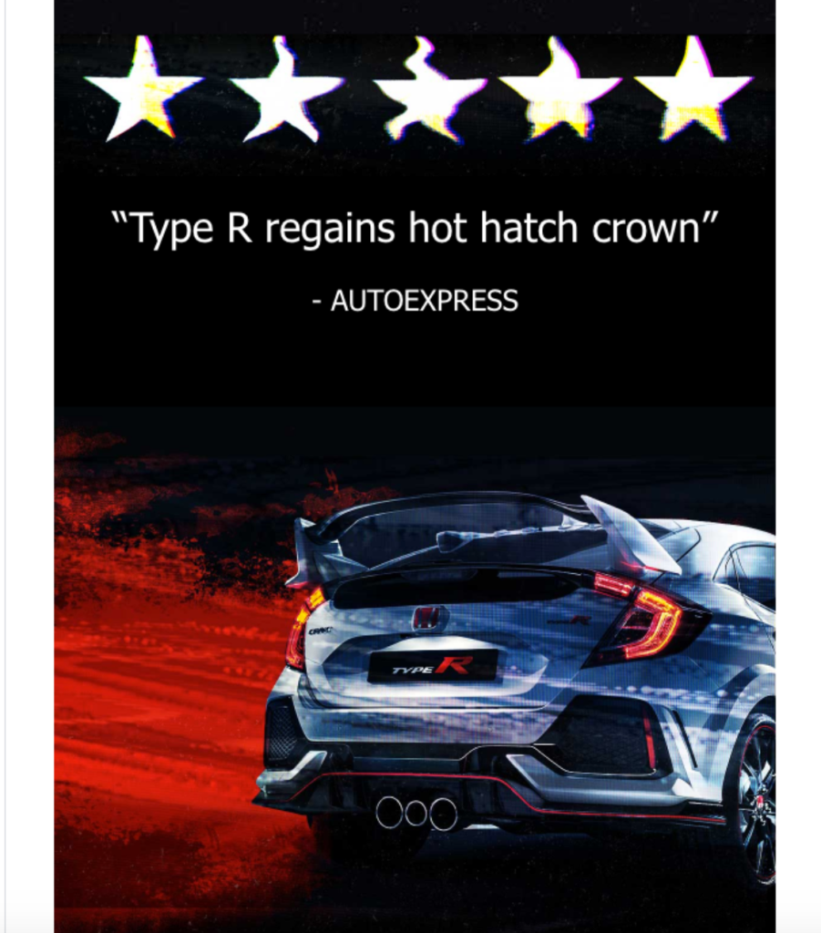
And just look at how mesmerizing the combination of images and reviews are.
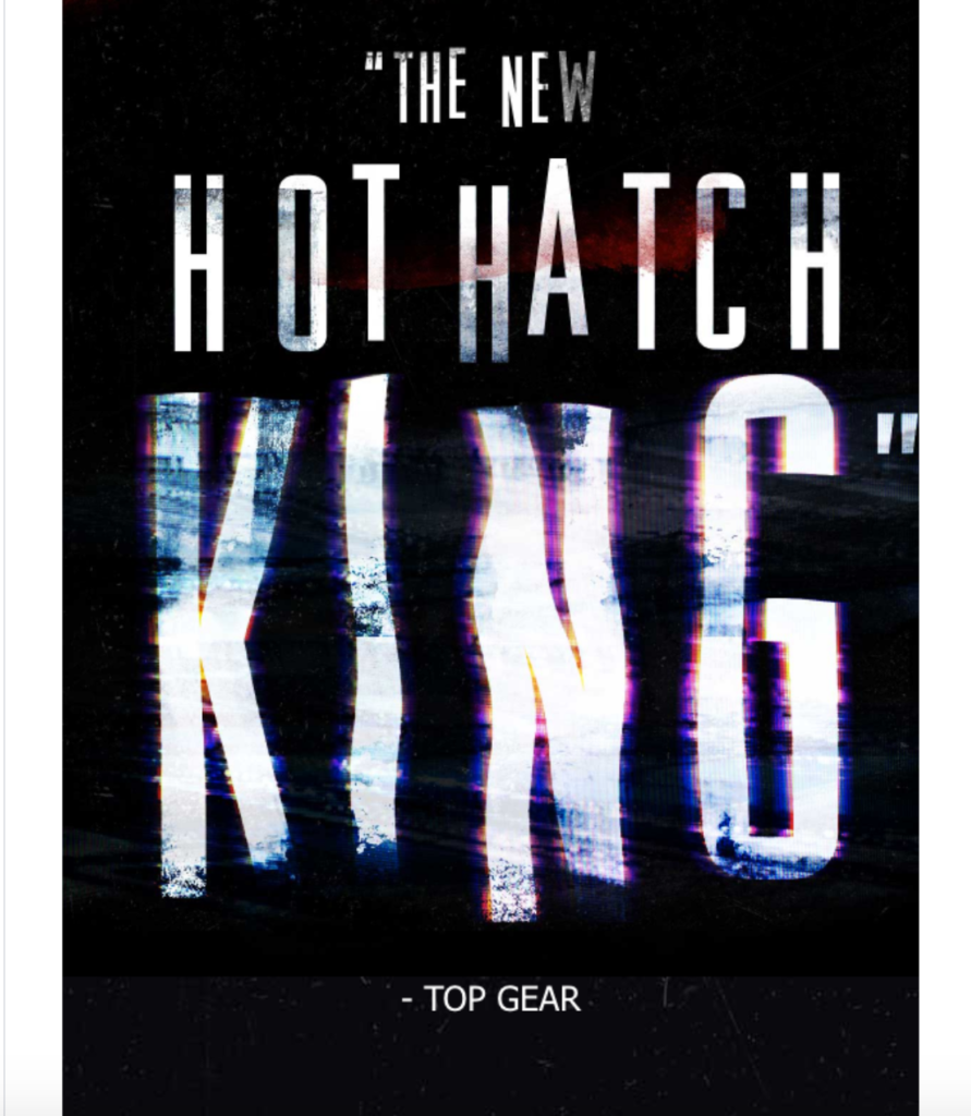
They really pop, and anyone who’s even remotely interested in the Honda Civic Type R can’t help but get excited.
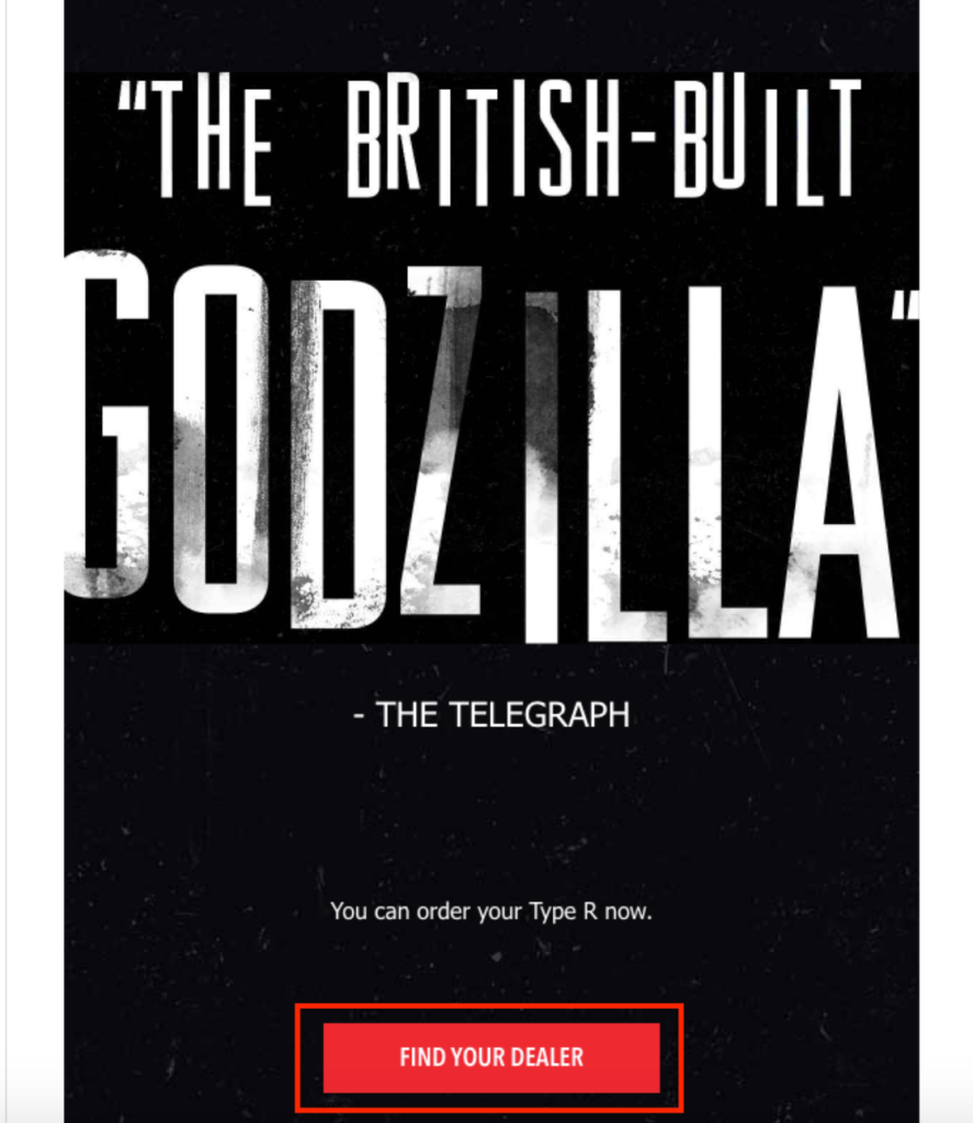
I especially love this last review from The Telegraph that calls it “the British-built Godzilla.”
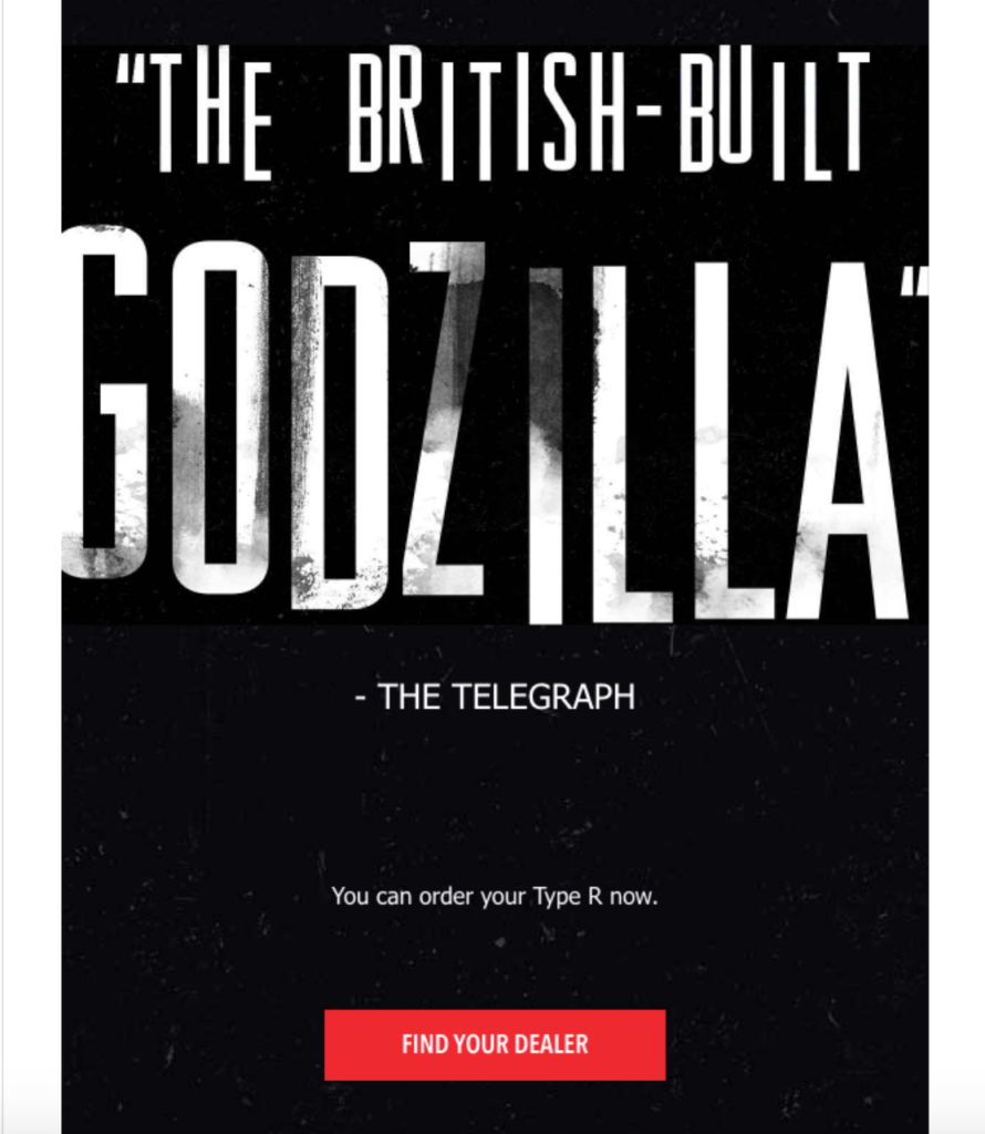
Just below that, Honda inserts the “Find Your Dealer” CTA, letting readers conveniently find a location near them where they can find the Type R.
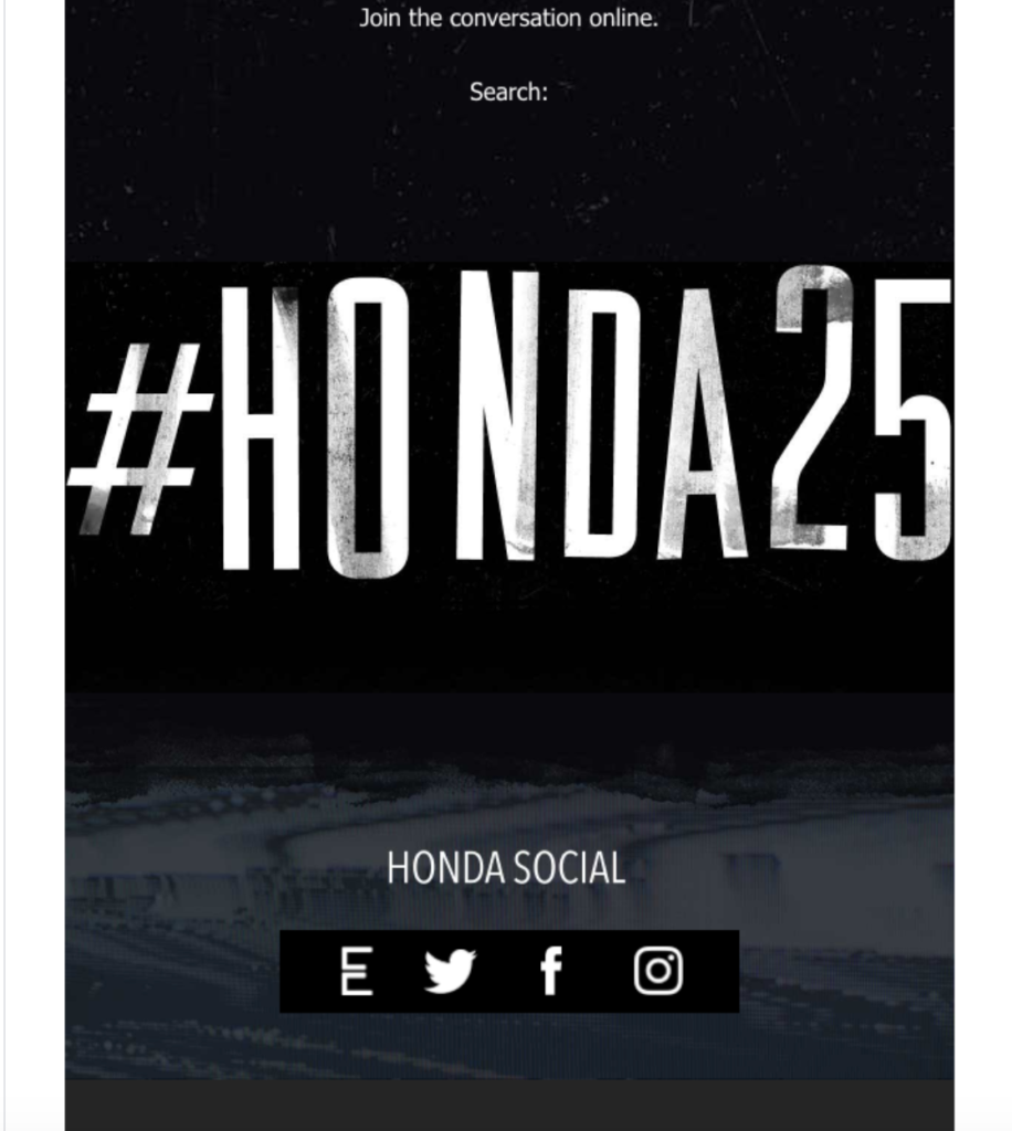
And at the very bottom, they promote the hashtag #honda25, along with links to their social media accounts.
This is honestly one of the most eye-catching automotive email examples I’ve come across and shows that bold aesthetics combined with simple but catchy copywriting is a magical formula. And it’s one that you can replicate as well.
4. Infiniti
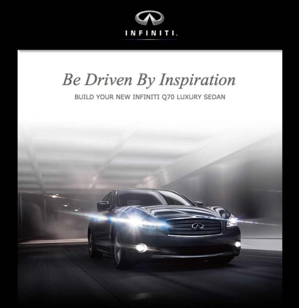
This one from Infiniti is the shortest example on this list, which makes it perfect for reaching mobile users — something that’s important given that “mobile opens account for 46 percent of all email opens.”
It starts off with a fantastic headline of “Be driven by inspiration. Build your new Infiniti Q70 Luxury Sedan.” And there’s a jaw-dropping image of this car model that evokes a sense of elegance and sophistication that Infiniti is clearly going for.
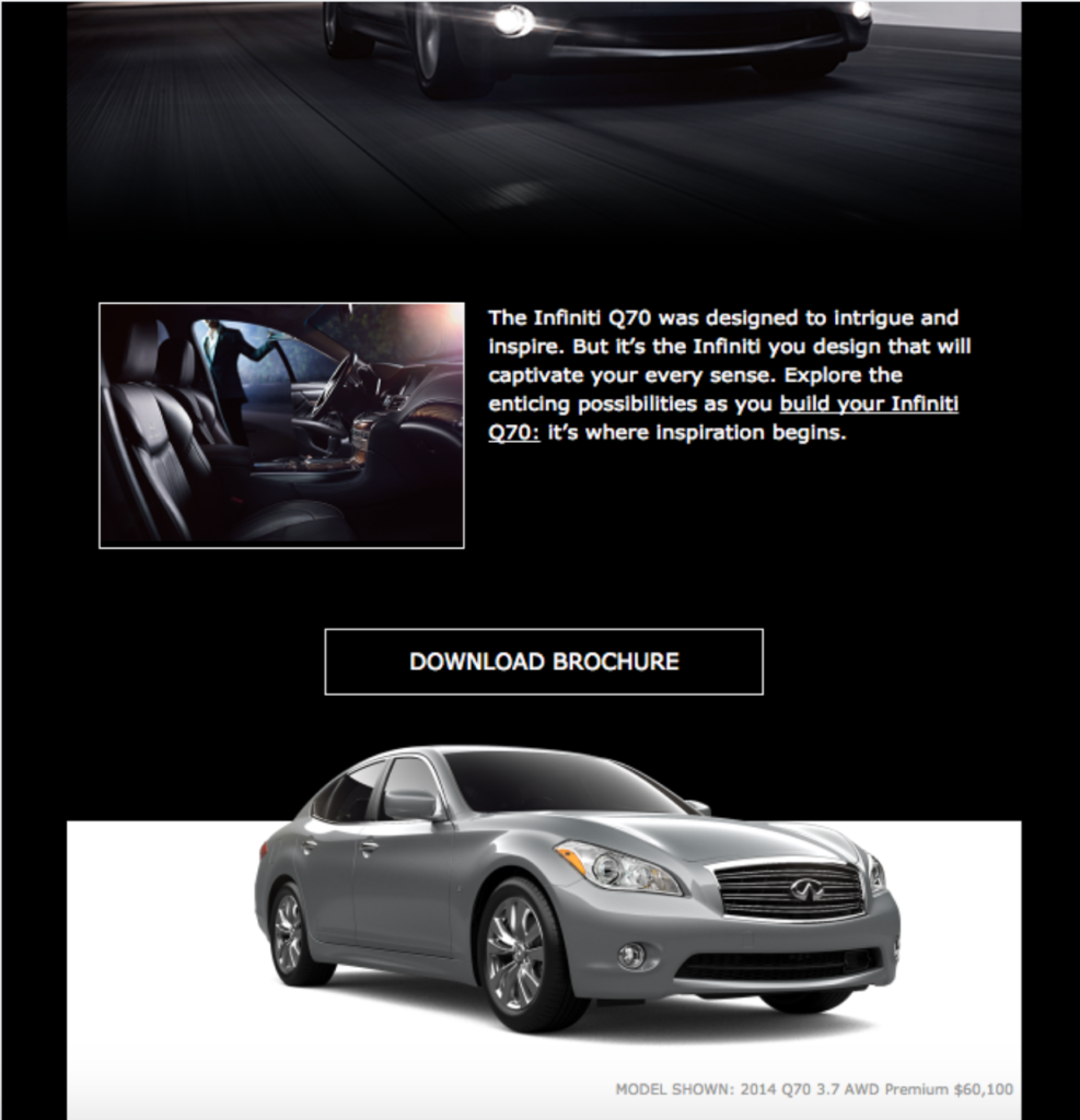
Beneath that, there’s a short section that goes over the highlights of the offer, along with a CTA directing readers to download the brochure. There’s also a second image of the Q70 Luxury Sedan on a contrasting white background, giving readers a better sense of the subtle details.
The third and final part of this email is this section where readers learn about the $10,000 cash back bonus Infiniti is offering, and find links to the various sections of the website.
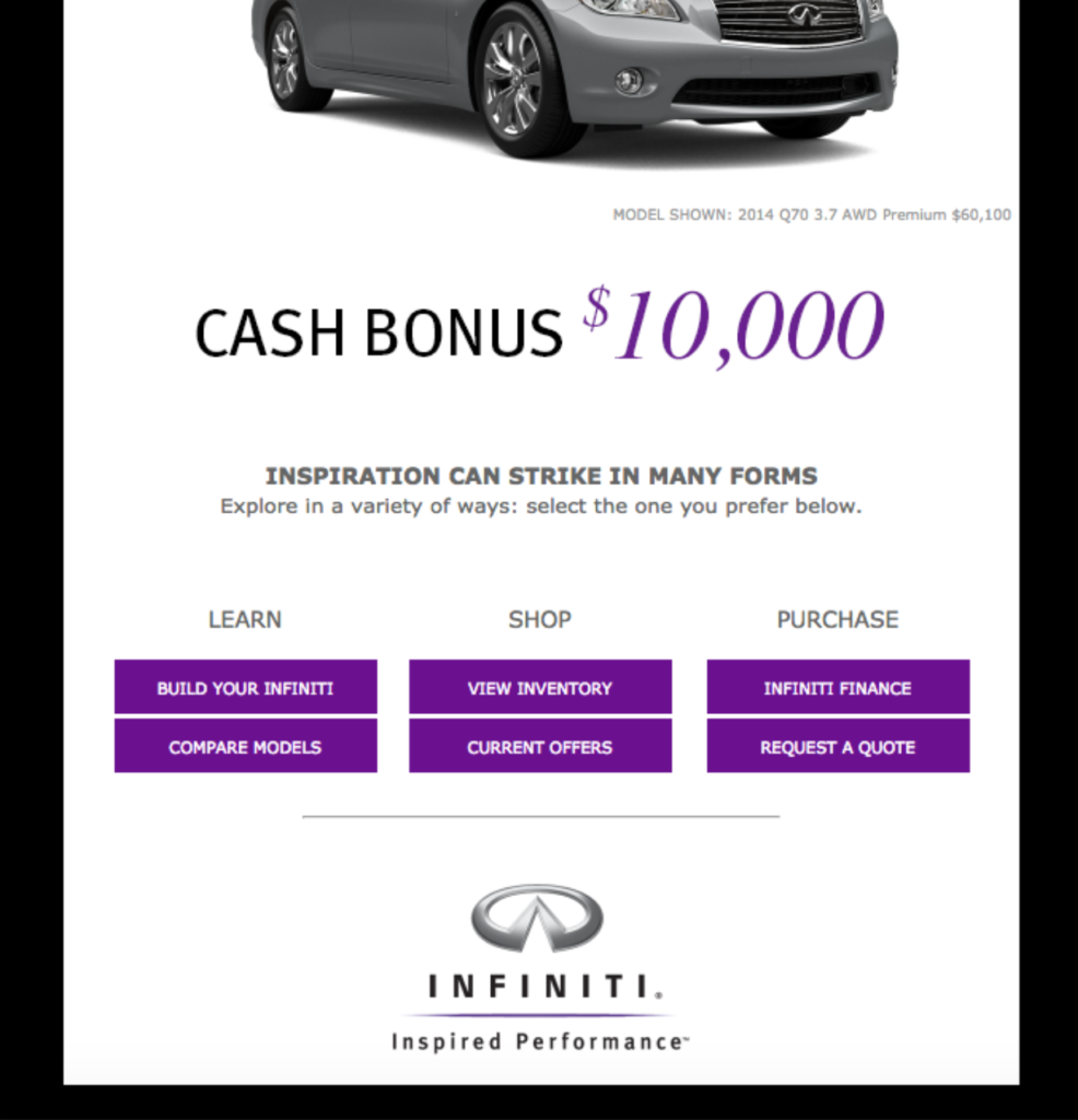
For instance, there’s a link where readers can learn how to build their own Infiniti, compare models, view inventory, and more. Everything flows together nice and smoothly on this example, and it proves that you don’t need a long-winded spiel to have an impact.
In fact, less is usually best, especially when your goal is to reach mobile users.
5. Tesla
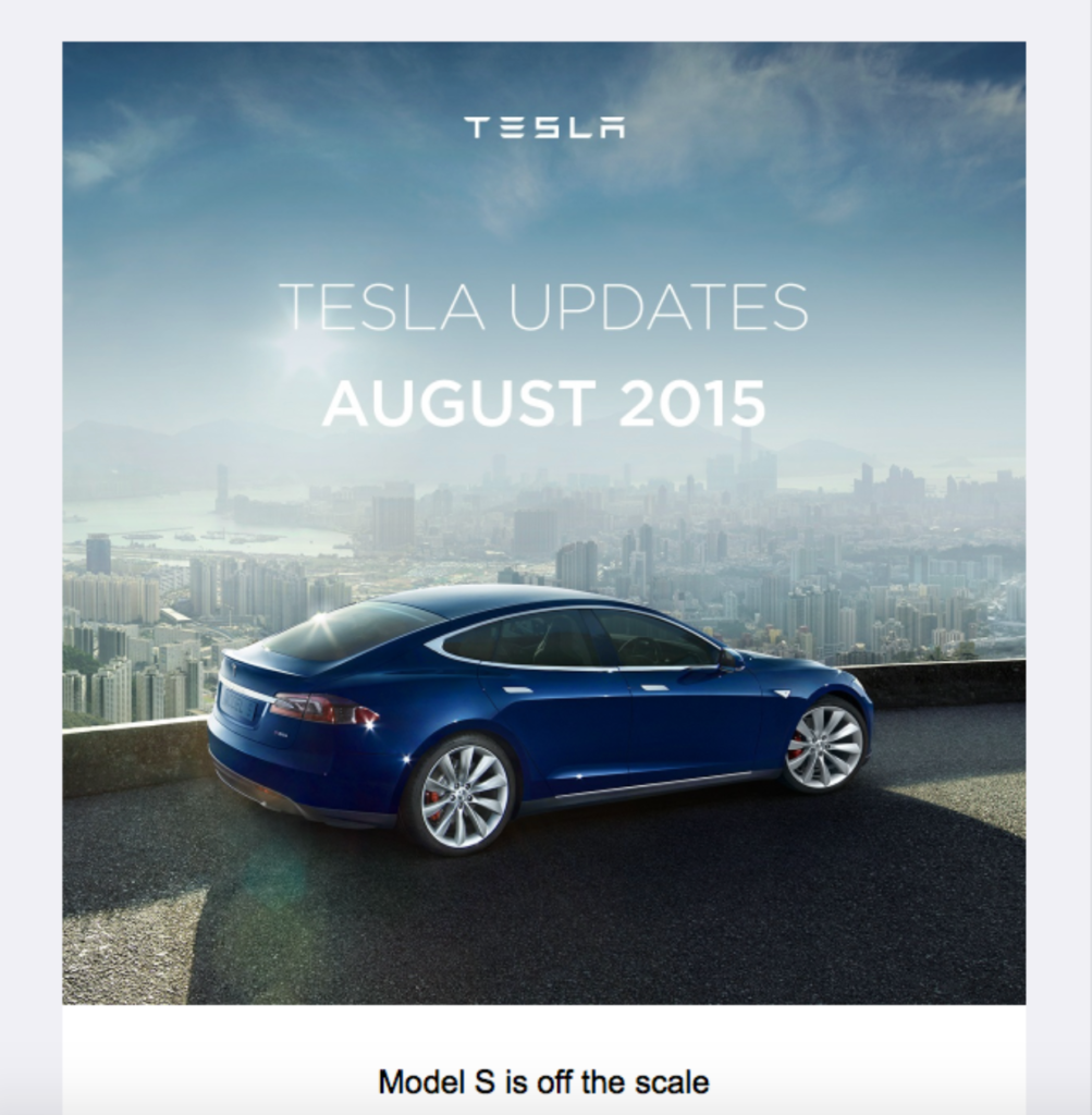
Although this email from Tesla is a little old from 2015, there’s still plenty you can learn from it.
The crux of the content is to highlight some of Tesla’s major updates from that period, and they get right down to business with this ultra clear headline.
They start off explaining the upgrades they made to the Model S, including adding a more robust battery pack, increasing range by 6 percent, and improving acceleration by 10 percent.
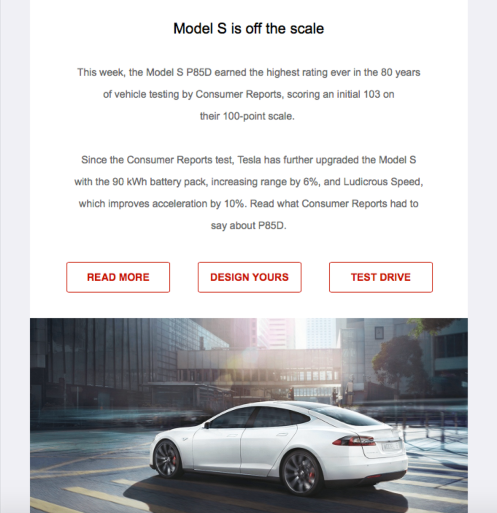
Note that it’s always smart to use quantifiable numbers like these whenever possible because it helps readers get a sense of the value you’re offering. Rather than saying, this new model is faster, for example, saying acceleration has improved by 10 percent is far more effective.
Below the copy, Tesla includes three CTAs of “Read More,” “Design Yours,” and “Test Drive” to efficiently point readers to the right section of their website. Notice how clear these CTAs are and how they leave no room for misunderstanding.
Next, Tesla has this section on the economic advantages of electric cars, where they explain how drivers can save big money long-term by making the switch.
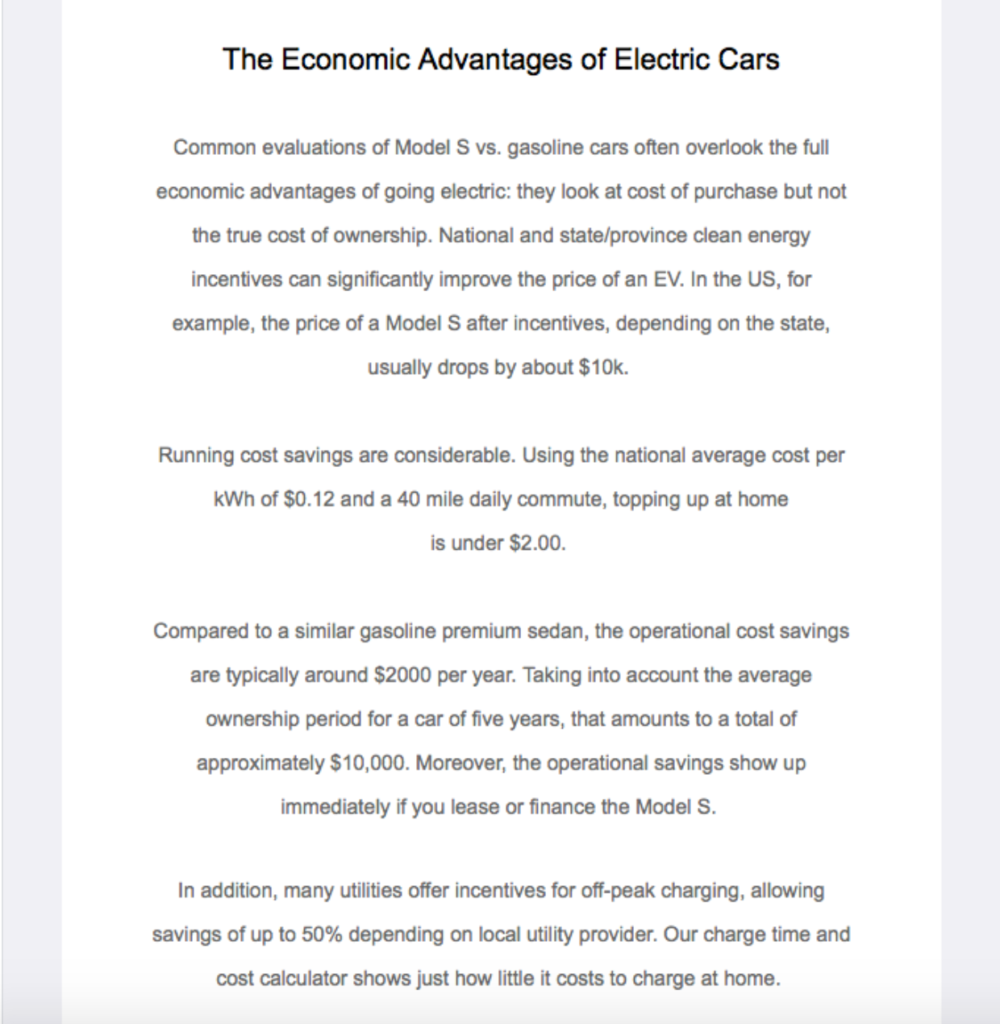
Again, they use plenty of concrete numbers, and like Mitsubishi did in a previous automotive email example, Tesla is incorporating customer education into their marketing mix.
As I mentioned before, education is empowering for customers and helps them make more informed buying decisions. So, always be on the lookout for ways to educate and pass on your knowledge.
For the rest of the email, they feature additional information on the Model S, highlighting the core benefits and pointing readers to helpful resources where they can learn more.
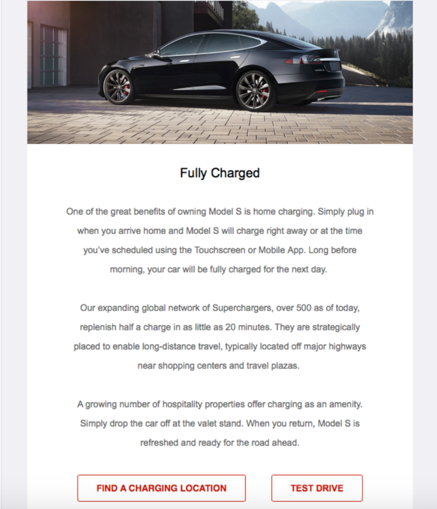
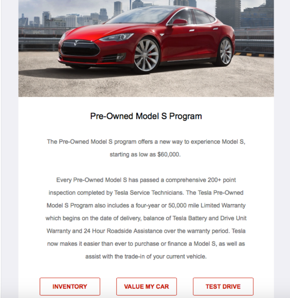
I like this email because it’s super informative and helps potential customers navigate the car buying waters. It also has a nice layout with plenty of white space so readers can seamlessly scroll to find the specific details they’re looking for.
So, if your goal is to provide your audience with updates, this is an excellent formula to follow.
6. Harley Davidson
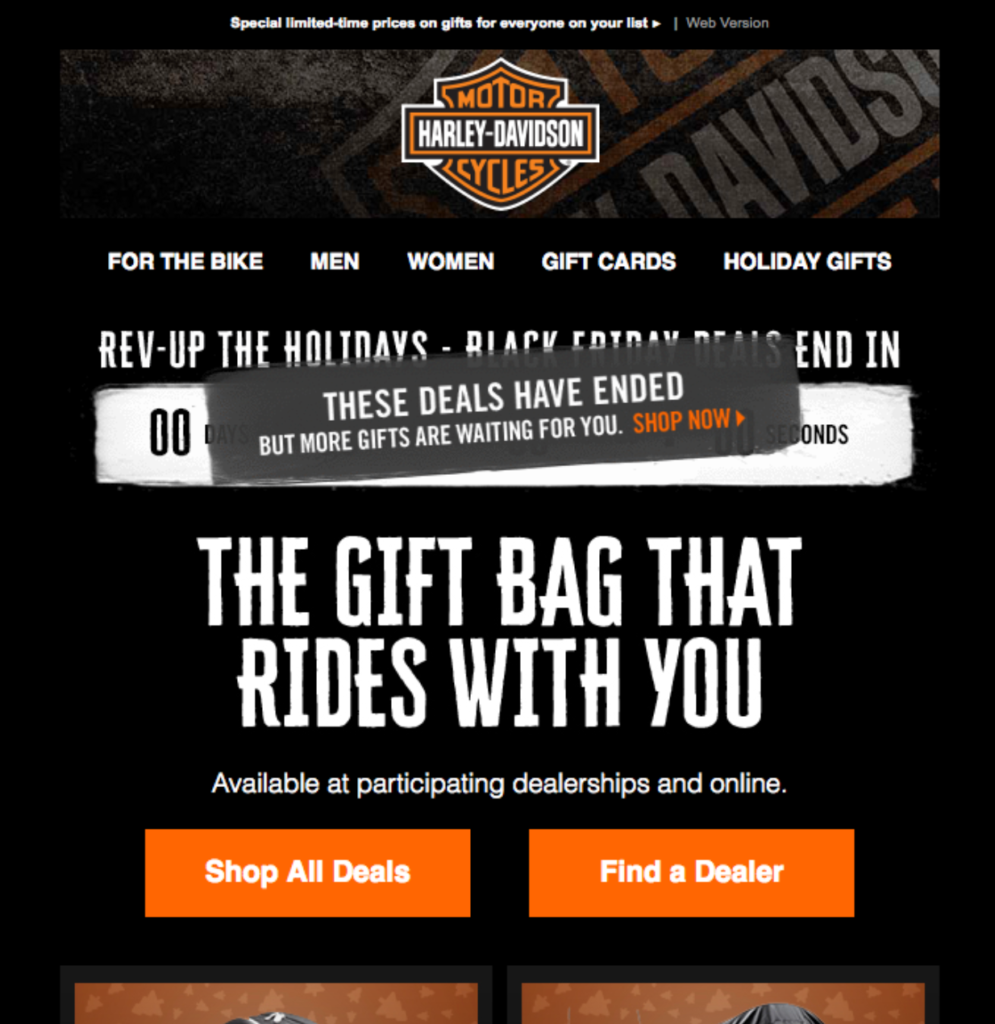
My final automotive email example is from Harley Davidson and takes a different approach than the others I’ve mentioned so far.
Rather than promoting vehicles, it promotes gifts and accessories.
Sent out during the holidays of 2017, this email starts off with a crisp headline of, “The gift bag that rides with you,” which is followed by two conspicuous CTAs for “Shop All Deals” and “Find a Dealer.”
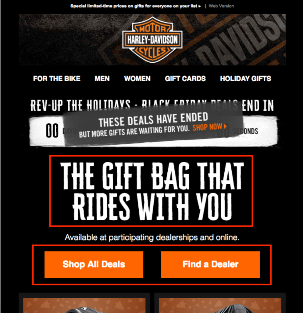
Piggybacking off the subject line, “Day 2 of Deals: Luggage, Motorcycle Covers + more,” this email helps readers quickly get their bearings and figure out exactly what Harley Davidson is offering here.
Then, it transitions into highlighting two specific types of accessories — luggage and motorcycle covers.
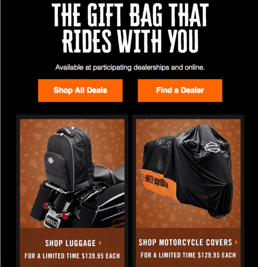
There are great looking images, and Harley also includes pricing information, ensuring total transparency right from the start.
I don’t know about you, but I hate having to guess how much something costs and do a bunch of sleuthing on my own. And many other people feel the same, which is why it’s always nice to include pricing info whenever possible.
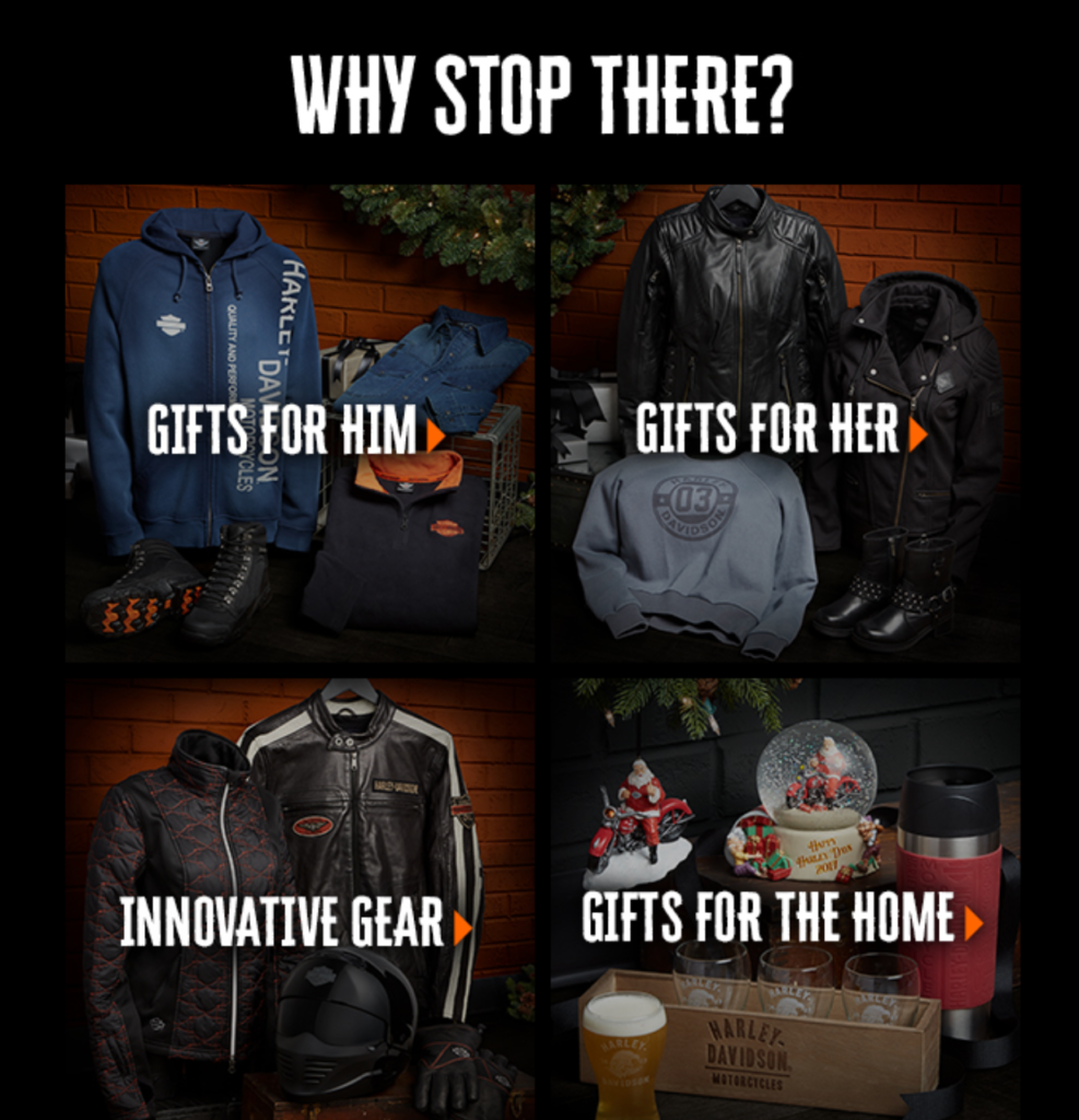
After that, Harley features four gift sections with crystal clear CTAs so readers know precisely what’s being offered and the action they need to take.
Lastly, there’s this section where they have a link to all holiday gifts, a free gift with a $300 purchase, dealer information, and free shipping with a $50 purchase, plus free returns.
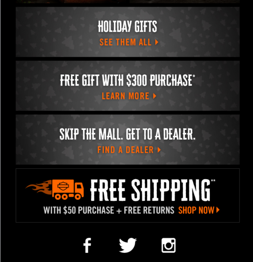
Everything is laid out smoothly, and the color scheme of this email perfectly matches Harley’s signature black and orange. And that’s really important because having consistent brand presentation across different channels can boost revenue by as much as 23 percent.
“Every piece of collateral—from social media channels to website designs to product packaging—should maintain a similar color scheme, tone, overall aesthetic, and communicate a similar message that fits your brand identity and core values,” writes Gabriel Shaoolian of Forbes.
So, if you’re looking to bring exposure to gifts and accessories and make smaller sales, this template from Harley Davidson is a good one to follow.

Conclusion
At the end of the day, a well-crafted automotive email has five main components:
- Eye-catching visuals
- Concise copy that conveys essential information without rattling on
- An easy to digest layout
- Clear, logically placed CTAs to get readers where you need them to go
- Cohesive branding elements
As long as your content checks all of those boxes, you should be in good shape. Remember that nearly half of readers now open their email on mobile. So you’ll always want to keep the mobile viewing experience in mind.
The automotive email examples listed here all go above and beyond. It should provide you with plenty of creative fuel for your own email campaign.

