Using images to tell stories is nothing new. Ancient Indonesian cave paintings of animals were created 17,400 to 39,900 years ago.
This relied upon the use of simple symbols to represent objects and convey information.
And it worked brilliantly. Nearly anyone can look at these cave paintings and get a basic idea of the message they’re trying to get across.
That’s because visual communication is the universal language.
Fast forward to the present day, and visuals are still being combined with stories, but in an entirely new way.
Savvy e-commerce brands are now using visual storytelling to pass on information to consumers to inform and entertain them.
Visual storytelling can be used for defining a company culture—its philosophy, values, beliefs, and mission—explaining products and so much more.

How to Use Visual Storytelling
What is Visual Storytelling?
Visual storytelling “is a story told primarily through the use of visual media. The story may be told using photography, illustration, or video and can be enhanced with graphics, music, voice and other audio.”
You can also use presentations, memes, GIFs or even comics—basically, any visual medium to get your message across.
Our favorite medium?
GIFs, of course.
Why Does Visual Storytelling Work?
Our propensity as humans to seek out visuals knows no end.
This is mainly because it’s quicker and more efficient for us to process images than words. We simply respond better to visual information than anything else.
In fact, “Visual information gets to the brain 60,000 times faster than text, and 90 percent of information transmitted to the brain is visual.”
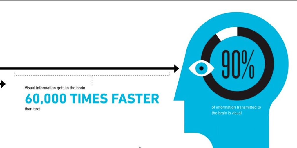
Seeing visuals helps us understand complex concepts that would be tricky with just text alone. In other words, it helps us connect the dots.
When it comes to stories, most of us love them. Hearing stories stimulates us and encourages us to engage.
Just think about when you were a child. Storytime was often a moment of great joy and excitement when the world came alive.
Sheffield Audio Video Productions explains how we’re impacted by storytelling on a cognitive level, saying that it lets us experience a story in our own way and helps us remember information with greater accuracy.
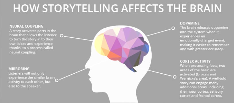
Combining visuals and storytelling is incredibly powerful.
Tapping into it can be your ticket to connecting with consumers in a meaningful way.
Visual Storytelling Examples
There are a ton of ways to use visual storytelling. That’s one of the main reasons I love it.
At the end of the day, you’re only bound by your level of creativity.
In my opinion, Burt’s Bees is one of the best brands at using visual storytelling. Explore their website, and you’ll see it used in a few different ways.
One is to explain the company’s history.
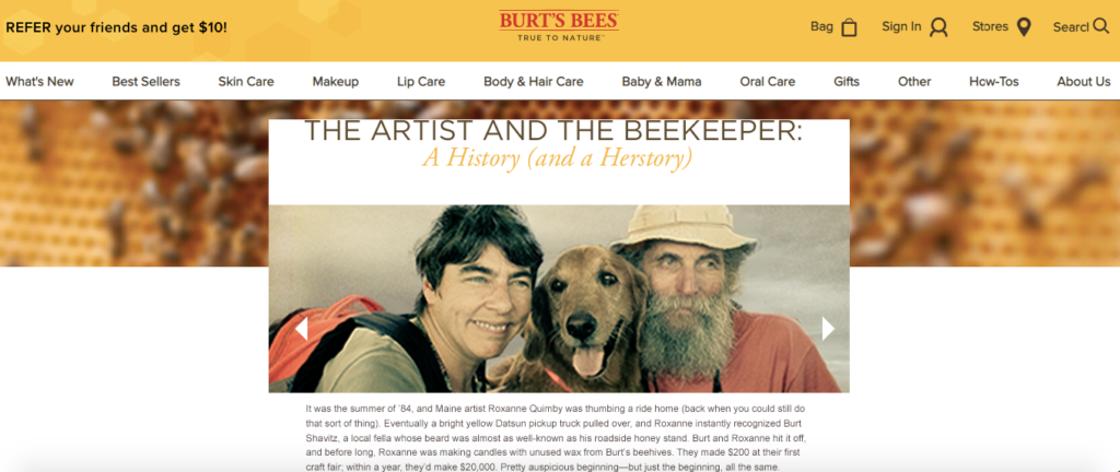
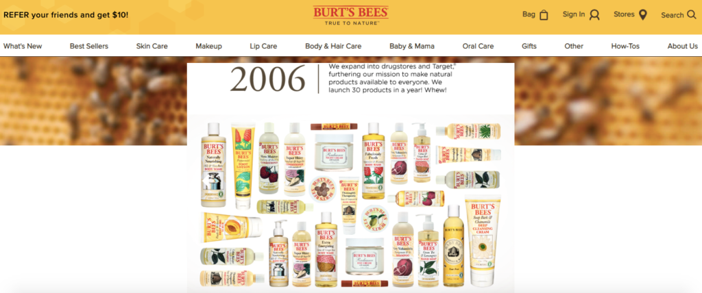
This page offers a great looking slideshow that explains how they got their start back in 1984 and walks you through a timeline until the present day.
For instance, in 1989, an NYC boutique picked up their products and expanded distribution.
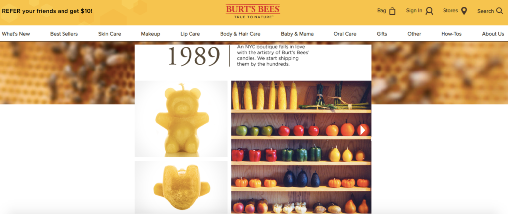
By 2006, they had made it to major drug stores and Target.
By 2012, they had one million Facebook fans.
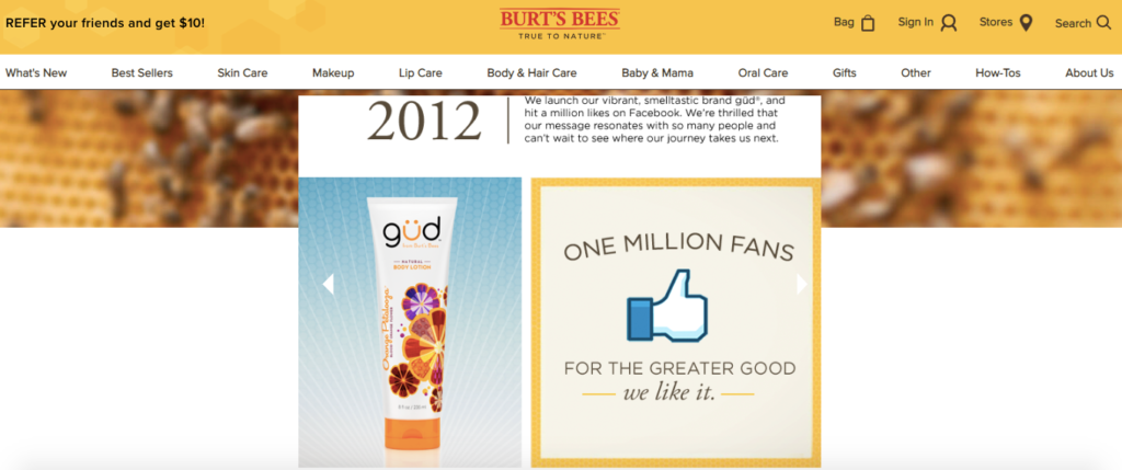
The slideshow is a simple way to let customers know how the Burt’s Bees brand got to where it is today.
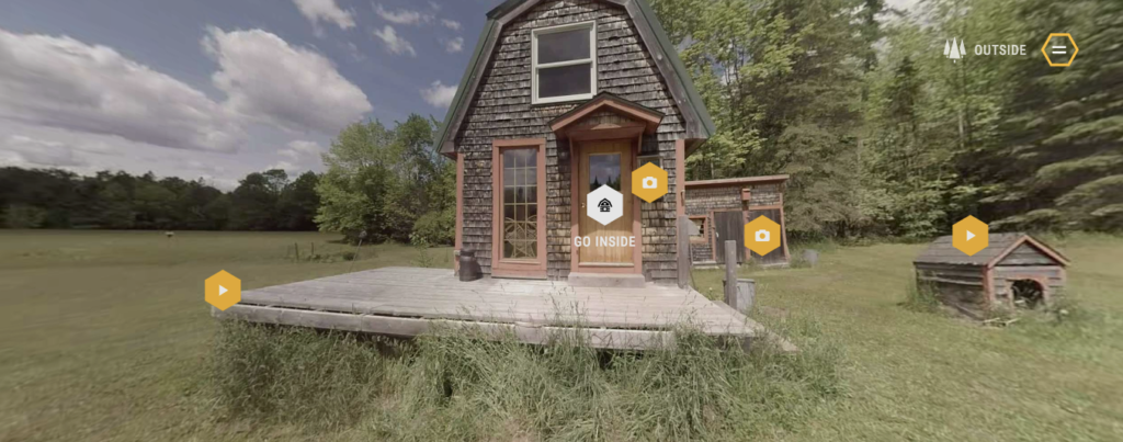
And one of the coolest, most unique features of their site is the 360 degree of Burt Shavitz’s home and property, which was featured in a documentary called Burt’s Buzz.
You can take a virtual tour and see how he lived.
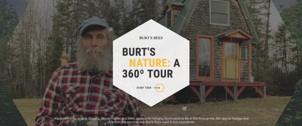
It’s one of the most clever things I’ve seen on a website and gives you a feel for Burt’s simple, minimalist lifestyle surrounded by nature—elements that are central to the company’s identity.
Another brand that pulls of visual storytelling flawlessly is Airbnb.
Their site is incredibly visual, to begin with, and has some of the most crisp and clean images I’ve seen.

But their “Stories” section takes it to a whole new level.
In it, you can find glimpses of daily life, big city living and escaping the crowds. These give you a close up look at some amazing travel destinations and give you a feel for what it’s like to be there.
What’s really cool about it is that each story is created by actual Airbnb customers.
Take “Japan: A Visual Kaleidoscope” for example. This offers a series of clips of restaurants, outdoors, sporting events, draft beer brewing, and more.
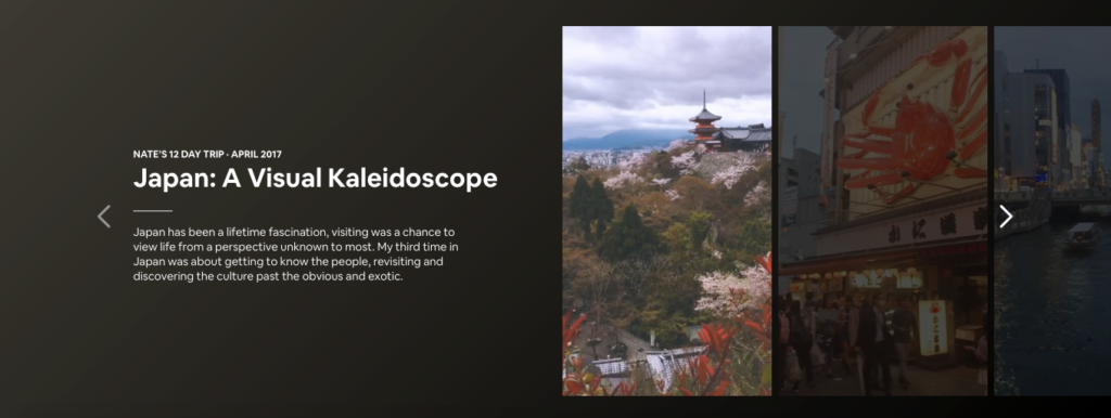
Within seconds, visitors are transported virtually to Japan. Scroll down just a bit, and you can see an outline of the person’s trip as well as the location on a map.
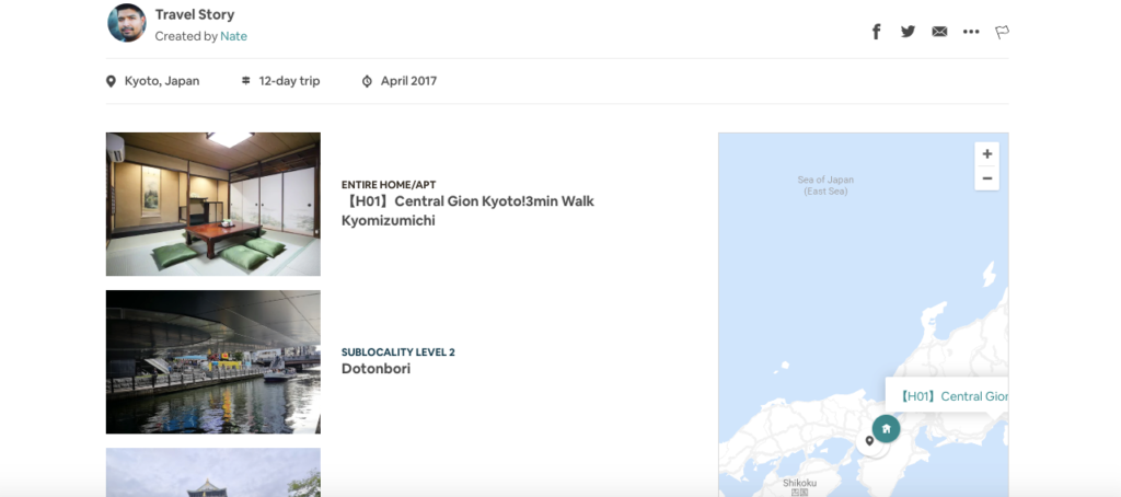
You can then click on individual destinations and find places to stay on Airbnb.
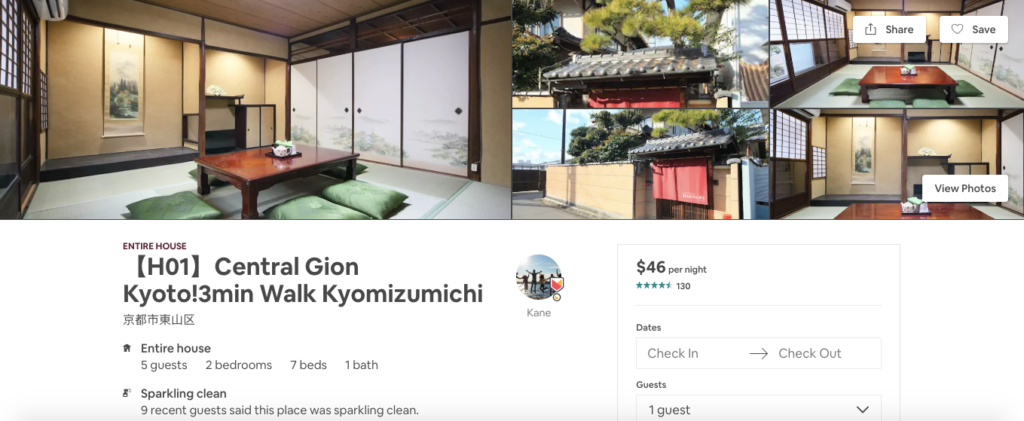
This has to be one of the most creative ways a brand has used visual storytelling and proves there are no limits to the possibilities.
And here’s what’s so genius about it.
Airbnb is very customer-centric. Their whole purpose is to connect hosts with guests in a convenient online marketplace to promote travel and adventure. That’s their brand identity.
The “Stories” section of their site is the perfect way to showcase Airbnb and what it’s all about. It’s a super interesting way to use visual storytelling while making it all about the customer.
Key Elements of Visual Storytelling
What constitutes as great visual storytelling can differ depending on who you ask.
But I think that there are four core elements that you’ll see across the board.
- It contains eye-catching visuals;
- It captures the brand’s essence;
- It’s well thought out and has a clear purpose; and
- It’s nicely organized.
Eye-catching visuals are essential because otherwise what’s the point?
If the photos, graphics, illustrations, etc. fail to pull people in, there won’t be much of an impact. So you need to go above and beyond and only use original, high quality, A+ visuals.
Cheesy stock photos aren’t going to cut it.
Capturing your brand’s essence is equally important. At a glance, customers should be able to easily tell what you’re all about.
For example, workwear and outdoor brand Duluth Trading Company focus on offering its customers tough, durable clothing and accessories. It’s very blue collar and no-nonsense.
And that’s the vibe you get when exploring the “Duluth Lore” section of their website.
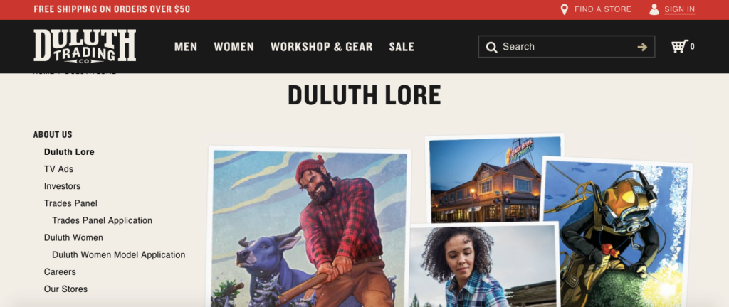
You can’t help but envision images of burly, flannel-clad lumberjacks and tough as nails construction workers.
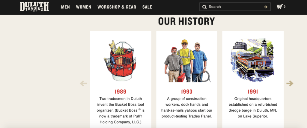
Being well thought out and having a clear purpose is also vital.
Oru Kayak, makers of the foldable, “origami” kayak definitely accomplishes this with the “Oru Kayak Adventures” section on their site.
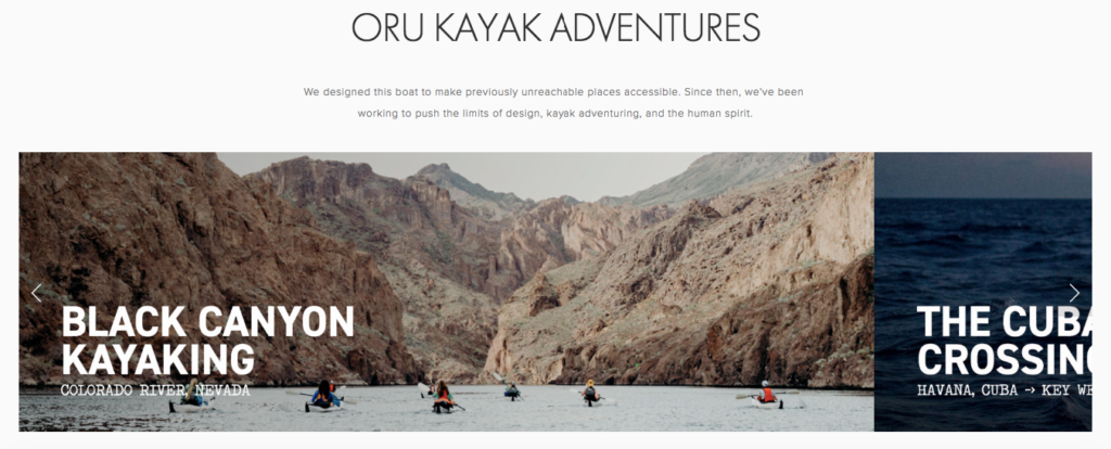
Here customers can check out several adventures that Oru users went on and actually see the product in action.


It’s clear that the point of their stories is to see how easily it can be transported and the epic adventures that you can have with an Oru Kayak.

And like any piece of digital content, a story should be well organized and move consumers through it phase by phase.
Bone broth company Kettle & Fire does this flawlessly on their “Our Mission” page.
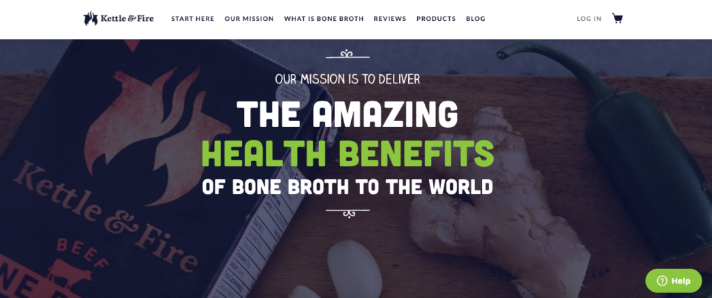
It starts by explaining a bit of how their bone broth is made and the effort that goes into it.
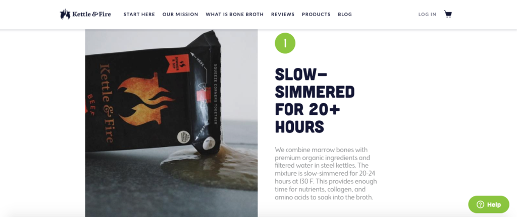
Then it discusses ingredient quality.
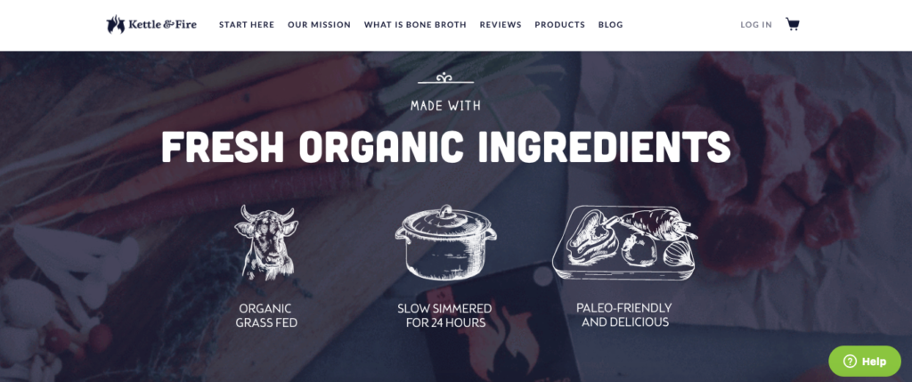
Then the standards they have for ensuring a quality product.
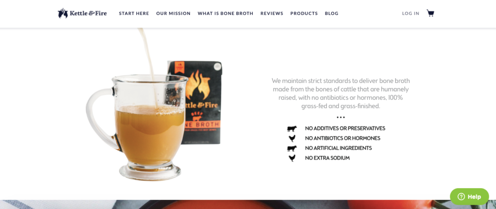
Finally, it wraps up with a video featuring the creators and their journey.
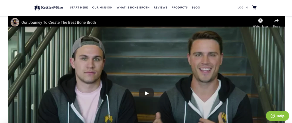
The whole thing is laid out in a very logical, sequential manner, which makes the information easy to absorb.
How to Tell a Captivating Story
So how do you tell a story that people want to hear? How do you make it interesting?
My first bit of advice is to identify exactly what it is you want to share. Figure out what your central message is.
This is what you’ll build your entire story around, so there shouldn’t be any ambiguity.
For instance, the examples I mentioned from Burt’s Bees and Duluth Trading Company both focus on succinctly explaining their brand history.
Airbnb concentrated on sharing adventure through their customers’ eyes.
Don’t try to accomplish a million things at once with visual storytelling. Instead, focus on your central message, and strive to do that really well.
Remember that you can always create additional content later on if you need to cover another topic.
Make Visuals the Focal Point
“Show don’t tell,” says content developer Samantha Lile. “Don’t tell your audience something if you can make them see it, be that through descriptive text or vivid images.”
You’ll likely need to include some copy, but that should be kept to a minimum.
Instead, let the visuals do the talking.
For example, Oru Kayak only uses a single sentence in their adventures section.
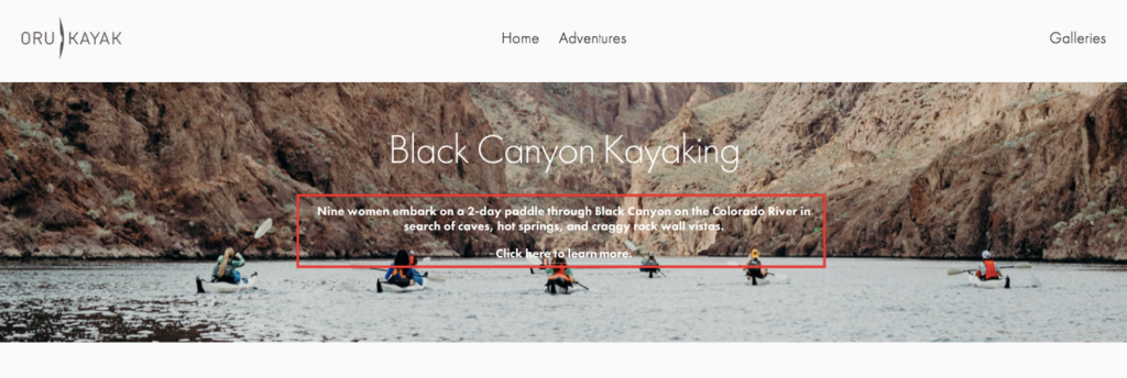
The rest of the content consists solely of images.
Feature People
“People relate better to other people than inanimate objects or ideas,” adds Samantha Lile. “So don’t tell the story of a business or a product, but the people behind it: you, your customers and your employees.”
Featuring people is huge for making the all-important human connection.
So keep this in mind, and add images of people whenever possible.
Be Creative
The cool thing about visual storytelling is there’s no conventional format you have to follow.
Burt’s Bees proved that with their 360-degree tour of Burt Shavitz’s home. So did Airbnb with their stories section.
You can do whatever you want. And the more creative you are, the better your chance of hitting the mark with consumers.
So make it a point to experiment with different combinations of visual mediums until you find the right recipe for your e-commerce brand.
Keep it Simple
At the same time, you don’t want to go overboard to the point that it complicates things.
Ultimately, your goal is to condense the story into as few visuals as possible. Remember that people only have so much cognitive bandwidth, so you want to keep it fairly simple.
If something doesn’t add value to the story, get rid of it.
Teach
Samantha Lile makes another great point that visual storytelling is an ideal teaching tool. In fact, countless teachers use it in the form of slideshows and presentations to educate their students.
This makes even the most complex of topics understandable. So I recommend using it as a teaching mechanism whenever possible.
Going back to my example of bone broth company Kettle & Fire, they use visual storytelling to explain what bone broth is — something not everyone is familiar with — and how it’s made.
A big part of earning the trust of modern consumers is showing them that you know your stuff. This assures them that you’re knowledgeable, which makes it easier to convince them to buy.
Visual storytelling is one of the best mediums for demonstrating your expertise through teaching.
Tools You Can Use
Finally, I’d like to share a few tools that can assist you in your visual storytelling.
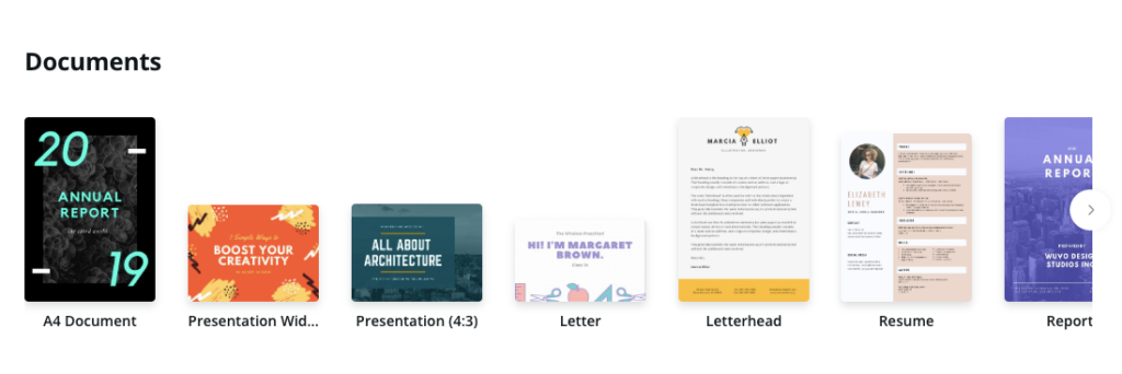
My favorite is Canva.
The basic version is free to use and offers robust features that allow you to create a ton of stunning, professional designs. It’s also super easy to use.
Here are some specific types of documents you can create.
Prezi is a tool that’s ideal for making killer presentations.
Simply pick a template, and Prezi allows you to fully customize it. It’s very intuitive to use and easy to get the hang of.

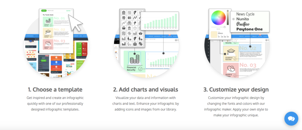
And when it comes to infographics, I really like Venngage.
You just choose a template, add your visuals and customize your design for amazing looking infographics.

Conclusion
Although humans have been using images to tell stories for thousands of years, visual storytelling within the context of e-commerce is fairly new.
According to data from Google Trends, it only really picked up in 2011.

But numerous brands have seen some amazing results from it.
Mastering the art of visual storytelling allows you to convey a lot of information in a way that’s easy for consumers to absorb, helps spread your message and define your brand.
Besides that, it’s just fun.
I personally find it really enjoyable to browse through this type of content. And many of your customers will too.


