May is a key month for ecommerce marketers.
We all know sales can be a little slow at the start of the year. But with the weather warming up and a bunch of key retail dates—including Mother’s Day and Memorial Day—taking place, many consumers are looking to splash the cash when May comes around.
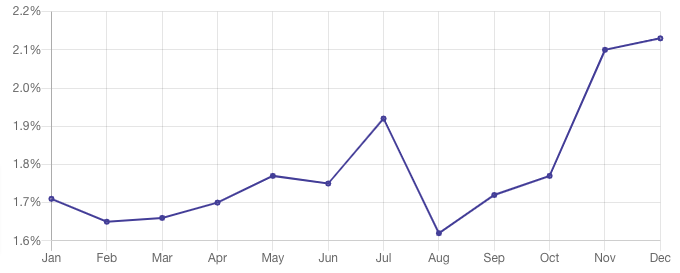
This is reflected by data from IRP Commerce, which shows that May sees one of the highest average ecommerce conversion rates of any month, at 1.77 percent—only behind July, November, and December.
 Of course, there are no guarantees in ecommerce.
If you’re going to capitalize on an apparently sales-hungry audience, you need to get your messaging spot on. To help you out, I’ve compiled some of my favorite May marketing ideas from DTC brands like yours…
8 May Marketing Ideas
- 1. Start pushing your summer collection
- 2. Build a dedicated landing page for Mother’s Day gifts
- 3. Add a prominent reminder for Mother’s Day shoppers
- 4. Promote best-selling seasonal products
- 5. Tap into the start of wedding season
- 6. Shift old stock with a spring sale
- 7. Show your support for Mental Health Awareness Month
- 8. Launch a travel-themed campaign
1. Warby Parker: Start Pushing Summer Products
Technically, summer doesn’t actually begin until June. But there’s no doubt that once May comes around, your average consumer is thinking about hot weather, barbecues, and beach breaks.
This is reflected by Google Trends data, which shows two clear peaks in search activity for the term “summer fashion”—the first of which falls in late May:
 DTC eyewear brand Warby Parker capitalizes on this interest with a homepage banner promoting its summer 2023 collection:
 This banner sits just below the fold on Warby Parker’s homepage, ensuring a high proportion of site visitors will see it (and, hopefully, take action).
The three calls to action point would-be customers toward new arrivals in the eyeglasses and sunglasses categories, and also to the brand’s summer 2023 collection page—making it easier for shoppers to explore the most relevant products.
That’s very much a good thing, because consumers hate having to click around to find what they’re looking for. Indeed, 69 percent of shoppers head directly to the search bar when landing on an ecommerce store, while 80 percent will exit a site if the search function isn’t up to scratch.
If you can mitigate this problem with a few well-placed CTAs, you stand a better chance of converting those impatient shoppers before they bounce.
2. Bombas: Build a Mother’s Day Landing Page
Heads up: I’m going to mention Mother’s Day a couple times in this article, because it’s a major event for ecommerce brands.
According to the National Retail Federation, 84 percent of Americans planned to celebrate Mother’s Day in 2022, with the average person spending close to $250 on gifts. And with total spending topping $31 billion, Mother’s Day even surpasses big shopping events like Valentine’s Day and the Super Bowl in the revenue stakes.
In short: it’s an occasion few brands can afford to miss. So it’s no surprise to see Bombas displaying prominent Mother’s Day messaging on its homepage:
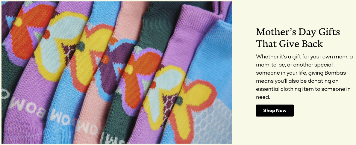 But the specific element of their onsite marketing we’ll be focusing on here is their dedicated Mother’s Day gift shop (which, incidentally, was previously a catch-all “women’s gifts” collection):
 Creating a Mother’s Day landing page is a smart play because it gives Bombas an obvious destination for any offsite Mother’s Day marketing, such as Instagram ads and email newsletters.
Indeed, that’s precisely where this Mother’s Day email points to:
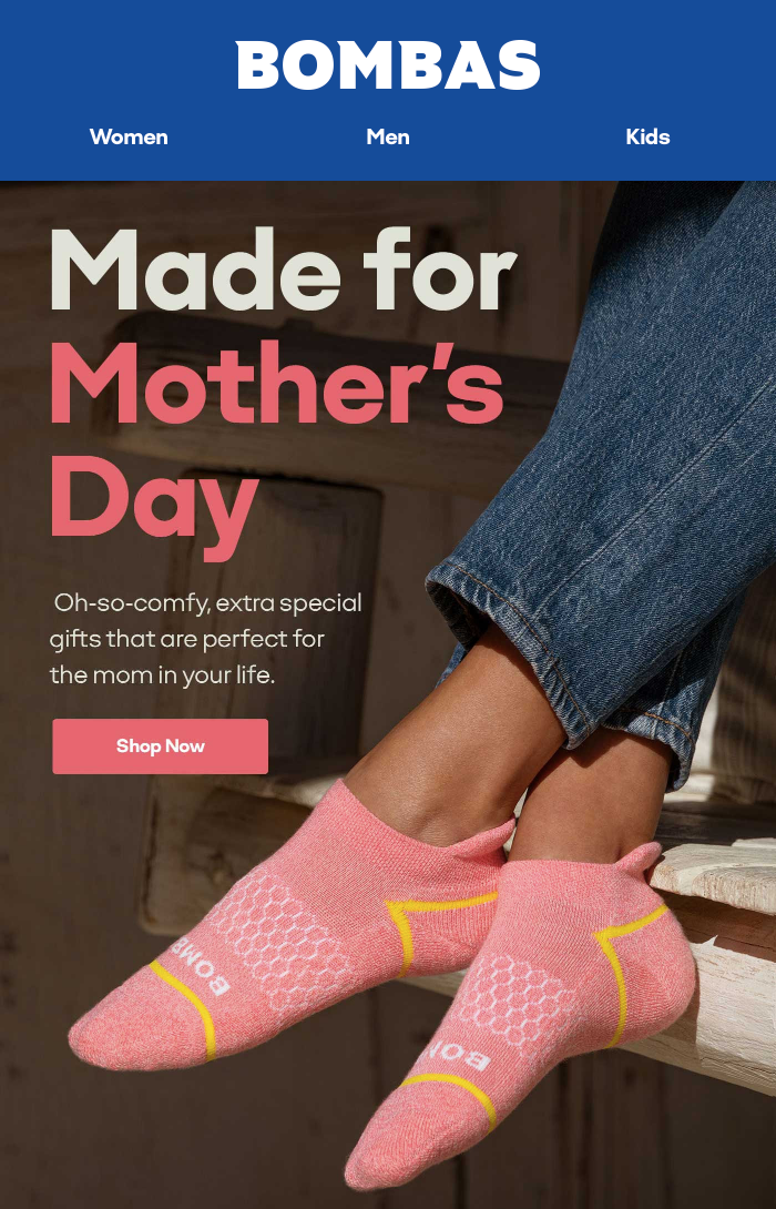
Because if you’re running a Mother’s Day marketing campaign, you don’t want to send interested shoppers toward a generic page containing a bunch of irrelevant products.
3. Brilliant Earth: Add a Prominent Mother’s Day Reminder
Sticking with the same theme, jewelry brand Brilliant Earth carries a banner at the top of its homepage prompting customers to order now in time for Mother’s Day:
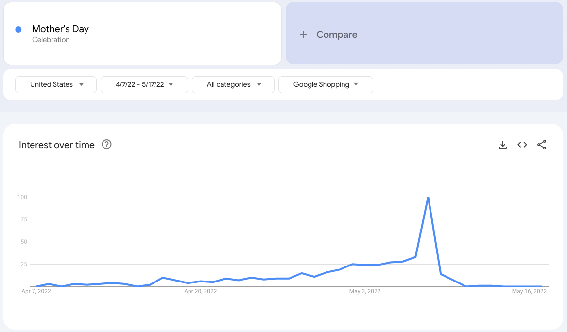
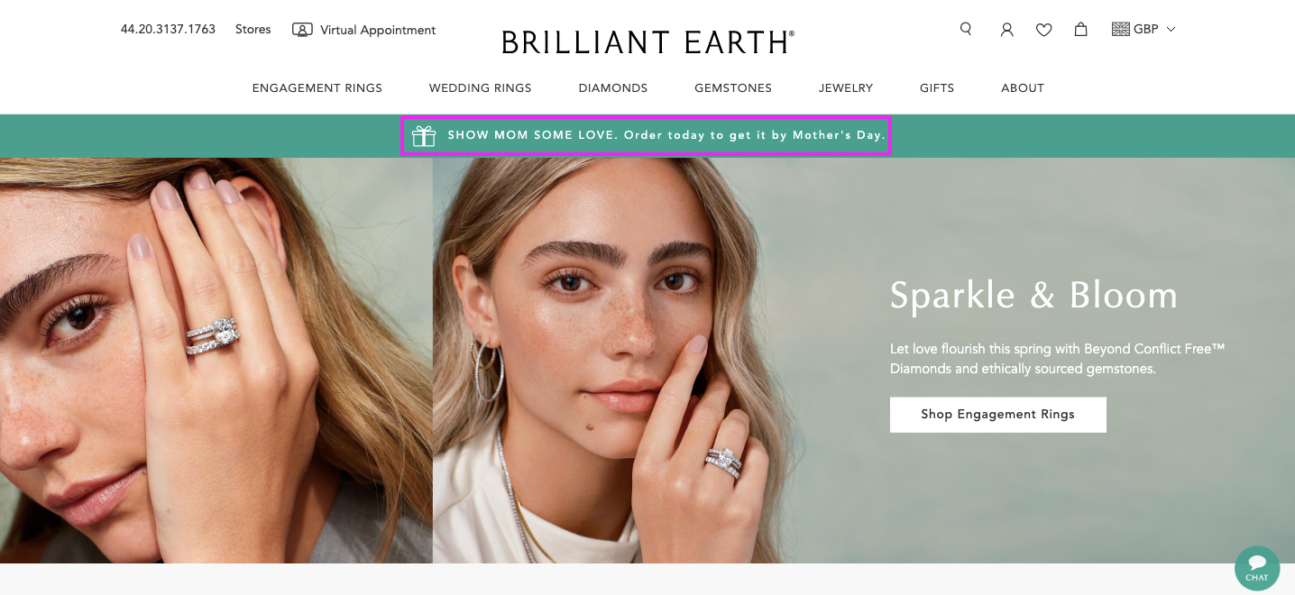 Again, this is a smart move, with Google Trends data revealing that in 2022, Google Shopping searches related to Mother’s Day didn’t peak until May 8—AKA the day itself:
That tells us there are a whole lot of last-minute Mother’s Day shoppers out there. Exactly the sort of people who’d appreciate a reminder to pick up a gift next time they’re browsing your site.
And with research showing that one-sixth of Americans haven’t bought their mom a present in more than a year, it seems plenty of us could use a heads-up.
As well as providing a valuable public service to would-be Mother’s Day forgetters, this tactic adds an element of urgency to Brilliant Earth’s campaign, which is a proven way to increase conversion rates. The subtle message here is: buy now or risk missing out.
4. MVMT: Promote Seasonal Best-Sellers
Feels like we’re constantly being told that our attention spans are shrinking. Or maybe we’re not—I wouldn’t know, I never make it past the headline.
Anyway, this certainly seems to be reflected in consumer behavior, with the average amount of time spent on ecommerce sites dropping across all device types in recent years:
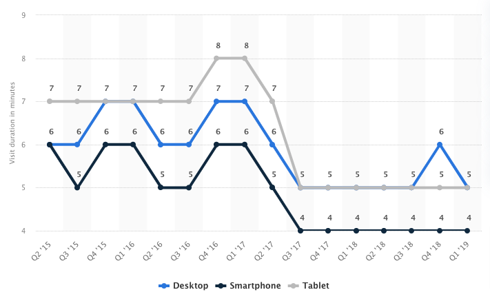 As such, we’d advise directing visitors toward your most popular and relevant products as quickly as possible. Because if they immediately see something they love, they’re more likely to convert.
Watch brand MVMT does this through an above-the-fold homepage banner promoting its top picks for spring:
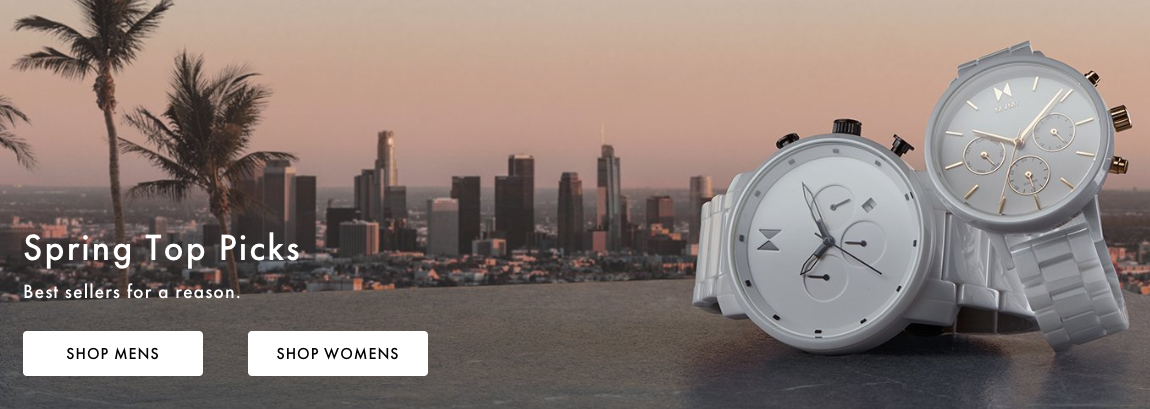 Generally speaking, the faster you can encourage customers to click through to a collection or product page, the more likely you are to seal the deal.
5. SprezzaBox: Capitalize on Wedding Season
According to a survey of almost 12,000 American couples who tied the knot in 2022, close to three-quarters of weddings take place between June and November.
That makes May the ideal time to start pushing wedding-related messaging onsite.
Men’s subscription box brand SprezzaBox takes advantage of the impending wedding season by promoting its collection of gifts for groomsmen through a prominent homepage banner:
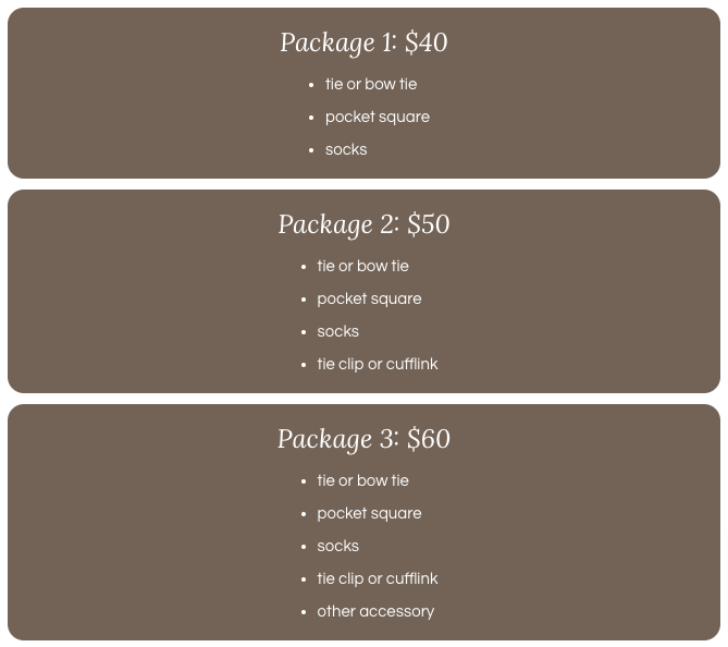
 Once you click through, you’re presented with SprezzaBox’s various packages for groomsmen, helping customers better understand all the options (and how much they cost):
 The page also features some helpful, visual inspiration that demonstrates the array of products on offer:
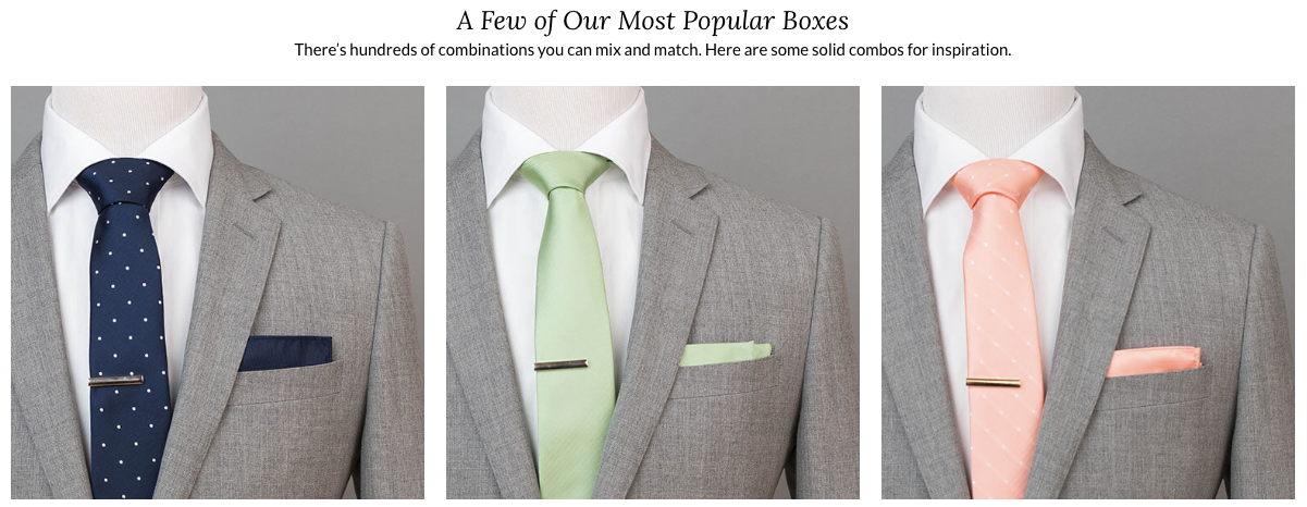 In short, the page contains pretty much everything a soon-to-be-wed needs to know about groomsmen gifts (and for anything else, there’s a handy contact form embedded on the page, too).
6. Stance: Promote a Spring Sale to Shift Old Stock
Dead stock is the inventory you fail to sell (and are unlikely to sell in the future). Seasonal products are a classic example; if you haven’t shifted your spring collection by the time June comes around, you’ve basically missed the boat.
That’s a big problem, because dead stock hits you right where it hurts: your bottom line. According to one estimate, the total cost of holding onto these outdated, unsold products amounts to as much as 30 percent more than the item’s cost value once warehouse and storage fees are factored in.
So, as summer approaches, you should be doing whatever it takes to clear out spring-specific stock.
Underwear and apparel brand Stance does this by promoting a 50 percent sale on its spring collection via a banner sitting right at the top of its homepage:
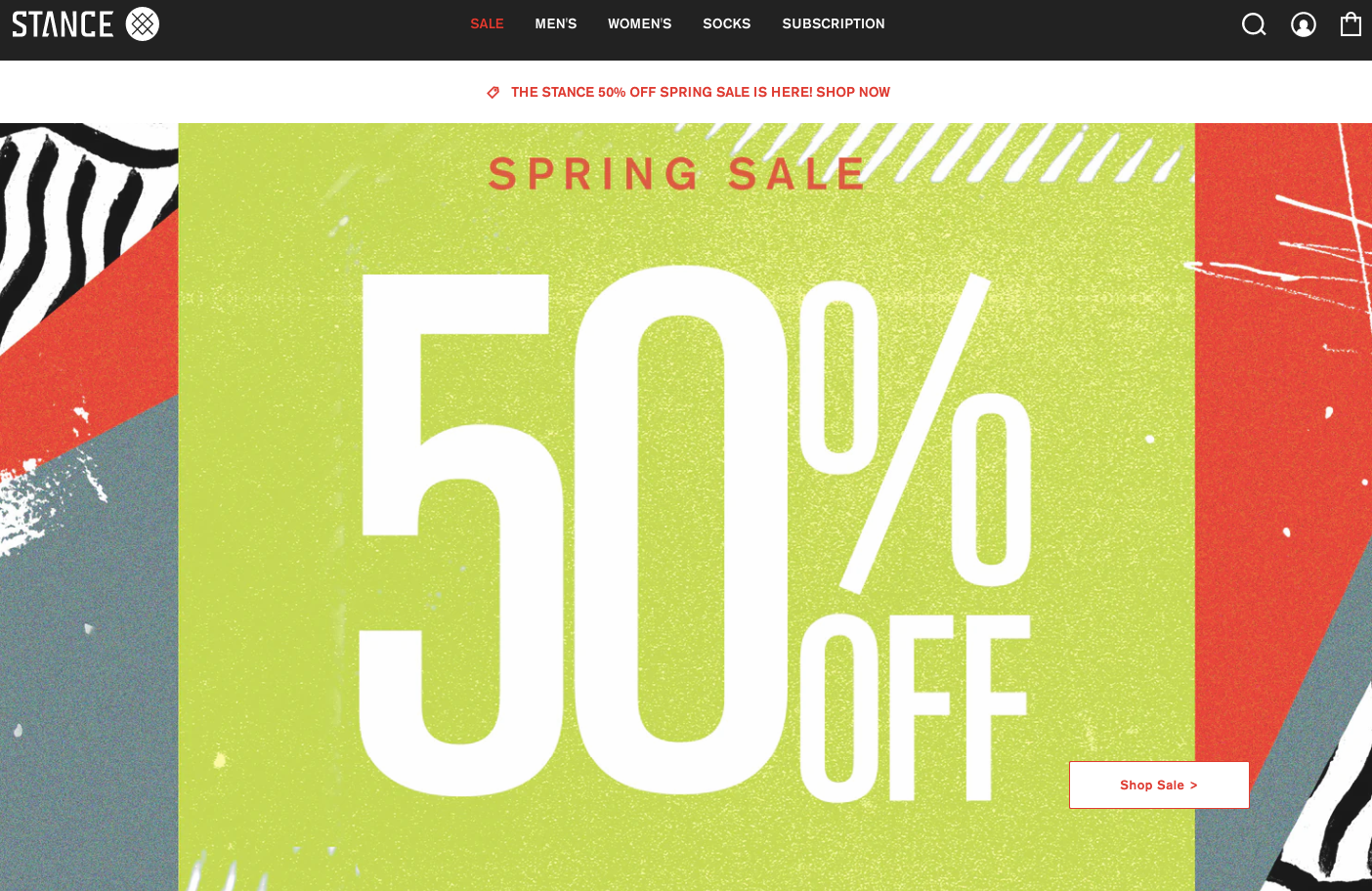 For every visitor to the Stance site, this offer will be the first thing they see. Which gives the brand a fighting chance to sell its spring stock before it’s too late.
7. Pura Vida: Support Mental Health Awareness Month
For the uninitiated, Mental Health Awareness Month is a US awareness event that started out way back in 1949. With over one in five Americans living with some form of mental illness, it’s an occasion that’s relevant to a huge chunk of the population.
Without wishing to sound cynical, this makes it an opportunity for brands. But only if they get their messaging right and approach the issue sensitively and authentically.
For my money, bracelet brand Pura Vida does it pretty well with this onsite campaign to support the awareness month:
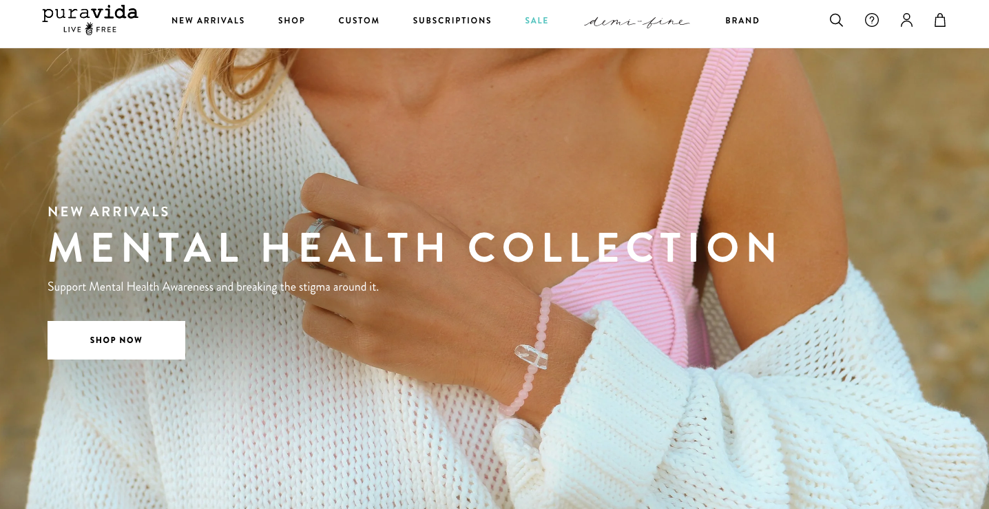 The idea is pretty simple: For every bracelet purchased, Pura Vida donates five percent of the proceeds to mental health-related charities like the Anxiety & Depression Association of America, Mental Health America, and SAVE.
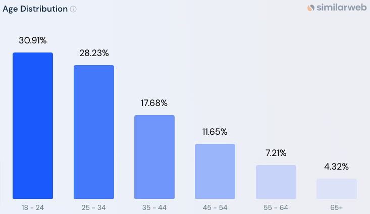
Pura Vida’s strategy here is especially strong for targeting younger audiences, who make up the vast majority of the brand's audience:
According to YPulse, three-quarters of Gen Z and Millennial consumers say they actively look for brands that support causes they believe in, with two in five saying they do so “always” or “often”.
Of course, this doesn’t mean Mental Health Awareness Month is a guaranteed “gimme” for brands. Far from it.
YPulse’s research also found that 60 percent of Gen Z-ers and Millennials only want brands to get involved in causes that actually relate to the products they sell.
Pura Vida gets a pass here thanks to its impressive track record of contributing to good causes, with the brand having donated more than $4 million to more than 200 charity partners over the years.
It also feels like a natural fit because the company’s products (bracelets) give customers an easy way to demonstrate their support for a cause.
8. Adore Me: Launch a Travel-Related Campaign
Research shows that May, June, and July are the most popular months for Americans to take their summer vacations:
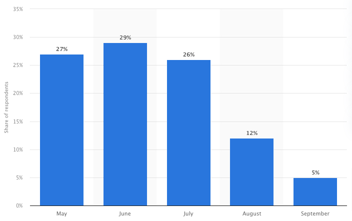 I could be pedantic and point out that it’s impossible to take a “summer” vacation in May. But instead, I’m going to discuss how this makes May the perfect month to debut a travel-themed campaign, like this example from lingerie brand Adore Me:
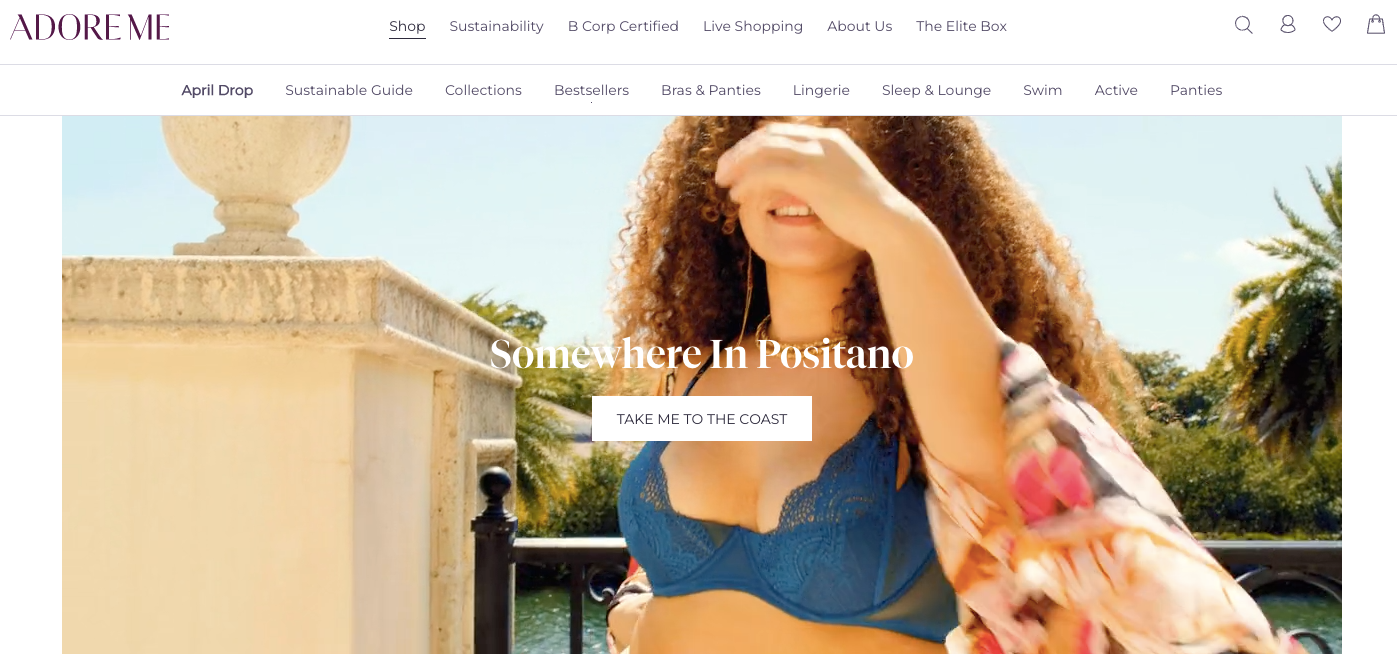 This is a simple but effective strategy to engage your audience, with research showing that one in four Americans spend most of the week daydreaming about travel.
Showcase your products alongside some inspirational, travel-themed imagery at a time when people are already thinking about their next vacation, and you’ve got all the ingredients for a successful campaign.
Turn Store Visitors Into Paying Customers With Drip
Did you know that, on average, 98 percent of visitors to your ecommerce store are totally anonymous? You don’t know their names, email addresses, or anything else about them.
That makes it difficult to deliver the types of personalized customer experience you need to drive conversions and revenue.
Fortunately, there’s a solution: Drip.
Our onsite marketing capabilities allow ecommerce brands like yours to design campaigns that guide first-time visitors along the path to purchase—first to becoming paying customers, then loyal repeat buyers and brand advocates.
Use our intuitive form builder to create beautiful, eye-catching popups, slide-ins, and sidebars that appear when and where you want, helping you capture more data and sell more.
But don’t take my word for it.
See for yourself by signing up for your 14-day free trial.

