Elton John got it right when he sang “sorry seems to be the hardest word.”
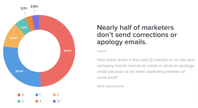
According to research from Litmus, almost half of marketers don’t send corrections or apology emails after making some kind of email marketing mistake.
To be fair to them, it’s easy to see why.
In a world where 86 percent of consumers will leave a brand they were once loyal to after only two to three bad customer service experiences, companies are often scared to admit they got something wrong.
So the last thing they want to do is flag up their mistakes.
On the flip side, some brands are only too happy to say “sorry.”
Take Skittles, which recently live-streamed a press conference to apologize for discontinuing its apparently popular lime-flavored Skittle nine years ago.
In the intervening years, more than 130,000 people complained online about the decision, and Skittles has now promised to make amends by apologizing to each and every one of them.
Okay, so this is a pretty tongue-in-cheek example.
Skittles is talking about reinstating a candy flavor here, not saying “sorry” for accidentally leaking customer data or causing an environmental disaster.
But that’s not the point.
What Skittles understands is that cynical as it might sound, an effective apology can also be a brilliant marketing opportunity.
That’s why I’ve written this article to round up some of my favorite brand apology email examples.
7 Apology Email Examples
Mugsy: Correct Your Mistake
I’m going to start this roundup with an important takeaway:
Sending an apology email isn’t enough.
If you’ve made a mistake, customers don’t just want to hear that you’re sorry—they expect some sort of action.
This isn’t just my opinion; it’s backed by academic research.
Jagdip Singh, a professor of marketing at Case Western Reserve University’s Weatherhead School of Management, analyzed 111 customer service interactions at US and UK airports.
Speaking to Harvard Business Review, he explained: “What we were finding was that in these situations of problems where customers are working under time pressure, the solving work is the dominant factor in customer satisfaction.”
Or to put it another way, customers are much more satisfied when you offer a solution rather than simply apologizing.
Mugsy understands this.
The menswear brand accidentally messed up one of its emails, leading to—in its own words—a “jumbled mess of images” that were intended for two separate emails:
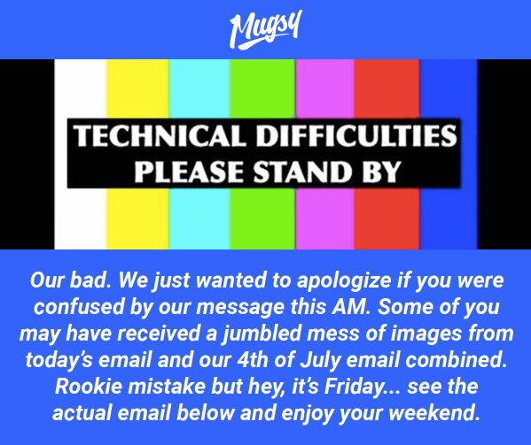
Rather than just saying “oops, our bad”, Mugsy followed up by sending the proper email, accompanied by a short apology.
So it got something wrong, it fixed it, and it said sorry—no muss, no fuss.
Vinomofo: Be Totally Transparent
Another key element to sending an impactful apology email is to be totally open and honest.
Turns out transparency is a pretty big deal to consumers.
According to research by Label Insight, 94 percent of people would be more loyal to brands that are transparent, with 56 percent saying that transparency would secure their loyalty for life.
As I’ve noted many times before, customer loyalty is a massive bonus for brands.
Loyal customers will go out of their way to buy from their favorite brands, and many are prepared to spend more on that brand’s products if a cheaper alternative exists.
But it’s one thing to promise transparency; it’s another to put your words into action.
Apology emails are a fantastic opportunity to practice what you preach.
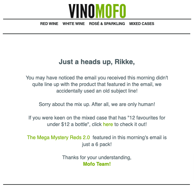
In this example, Vinomofo apologized for an email marketing snafu in which the product mentioned in the email didn’t align with the special offer it was promoting:
It would be easy to brush this under the carpet and blame it on a generic technical glitch.
Instead, Vinomofo responded by explaining that it had accidentally included the wrong subject line.
That way, no one feels misled, or like they aren’t being given the full story.
Mistakes are going to happen—you’re only human.
So don’t shy away from them; explain what happened, say sorry, and—if relevant—discuss what actions you’ve taken to ensure it doesn’t happen again.
OUAI: Fix Critical Issues, Fast
Let’s be honest: not all mistakes are equal.
In a lot of instances, you’ll get something wrong and barely anyone will notice.
You might still want to apologize for those mistakes in the name of transparency, but they’re unlikely to cause much (or any) reputational damage.
Other errors are a much bigger deal.
I’m talking about things that directly impact the customer experience; things that would actively put them off buying, and potentially dissuade them from shopping with you in the future.
Shipping is a prime example of something you don’t want to get wrong.
Customers love free shipping, with an analysis from Retention Science revealing that online shoppers are twice as likely to respond to free shipping offers vs. price discounts.
What’s more, research from the Baymard Institute discovered that “extra costs” on things like shipping, taxes, and fees are the number one cause of shopping cart abandonments.
So if you promise customers free shipping, then fail to deliver, that’s potentially a big problem.
Hair and skincare brand OUAI recently encountered this issue.
It sent an email promising free shipping across its haircare products:

But there was a problem—when shoppers hit the checkout page, their free shipping wasn’t being applied.
That’s the sort of thing that could really annoy your customers.
Realizing this, OUAI corrected the issue on the same day and sent out an apology email explaining its mistake:

You can’t turn back time and prevent an error from happening, but you can definitely control your response and take swift action.
Paperchase: Give Customers What They Expected
It can be all too easy to obsess over the perfect apology email.
You got something wrong and you’re desperate to make amends; the last thing you want is to annoy your loyal customers.
But often, the best apology email is also the simplest one.
Rather than trying to do anything too complicated, just say sorry and fix the problem.
That’s precisely what Paperchase does here:

Sure, a bunch of people might have missed out on the promotion over the weekend, so Paperchase may have lost a few sales.
But it fixed the issue, owned up to the mistake, and gave customers the offer they were expecting to receive in the first place.
Long-term, there’s no harm done.
Storybook Cosmetics: Apologize Via Preview Text
Crafting the perfect apology is one thing.
Choosing the best way to communicate that apology is a whole other issue.
Think about it: if you only explain what went wrong (and what you’re doing about it) in your email body copy, there’s no guarantee anyone will see it.
The average email open rate across all industries is 21.33 percent, so odds are that about four-fifths of your subscribers will never bother to click.
And if your apology email doesn’t get opened, you may as well not have apologized in the first place.
Many brands get around this by apologizing in the email subject line.
But with subject lines of just four words seeing the highest open rates, that doesn’t give you much room to play with.
How do you cram all the key information into such a short space, while still making it sound like you’re giving a genuine apology?
The smart solution is to make use of email preview text—that is, the chunk of copy that shows up next to the subject line in the main inbox.
You’ve got about 90 characters to play with here.
Combined with the subject line, that gives you a whole lot more breathing room to apologize and explain what went wrong.
Not only that, but as many as one-quarter of respondents read the preview text before deciding to open an email, so there’s a fighting chance people will sit up and take notice.
Storybook Cosmetics shows us how to make effective use of preview text when sending an apology email:

As you can see, it sent a flash sale email, but mistakenly forgot to include the discount code (we’ve all been there).
But it quickly corrected the mistake by sending out a new email containing the missing code and explaining the issue in its preview text, giving the best possible chance that people will see—and understand—what went wrong.
Death Wish Coffee: Give As Much Detail As Possible
Here’s another example that harks back to the importance of transparency.
This time, Death Wish Coffee apologized for the slow delivery times in the run-up to Christmas 2020.
While the brand didn’t have any direct control over shipping, it was a big issue nonetheless.
Why? Because consumers have high expectations around delivery times.
Just 42 percent of online shoppers consider shipping within 3–4 days to be “fast”, while only 10 percent say the same about products shipped in 5–7 days.
This is a particular concern during the holiday season when consumers need their purchases to arrive in time.
So a simple apology just won’t cut it.
With that in mind, Death Wish Coffee responded by explaining the cause of the delays and their likely impact on customers:
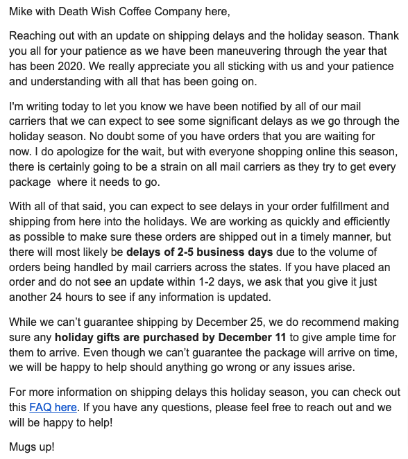
As you can see, it even included a link to an in-depth FAQ page offering further information on the situation.
In instances like these, it’s smart to over-explain the issue, rather than leaving customers with a bunch of unanswered questions.
It doesn’t make the problem go away, but it certainly helps to manage expectations.
One Kings Lane: Say Sorry for Making Customers Wait
We, consumers, are an impatient bunch.
Not only do we expect our purchases to turn up in a day or two (or even on the very same day we bought them), but we hate waiting for web pages to load.
According to a survey from Digital.com, 53 percent of online shoppers expect ecommerce pages to load in no more than three seconds.
What’s more:
- 21 percent say slow-loading pages are their main source of dissatisfaction when shopping online
- Half will abandon their shopping carts if pages don’t load fast enough
- Businesses with slow-loading pages leave a negative impression on 45 percent of customers
So if you encounter some kind of technical gremlin that causes your site to load slower than a sloth wading through treacle, it’s a good idea to apologize.
One Kings Lane clearly understands this.
As well as apologizing for slow page loading speeds on Cyber Monday, it also extended its sale for a further day as a gesture of goodwill.
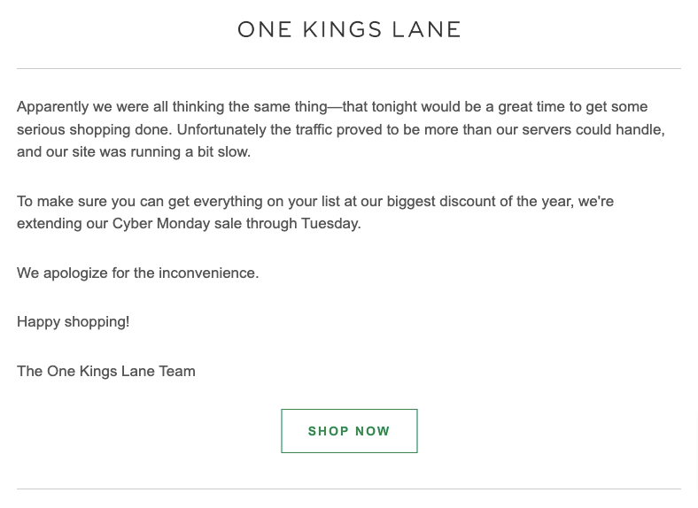
That way, anyone who missed out on a discount due to a poor website experience could go back and buy at a (hopefully) quieter time.
They get the product they wanted; One Kings Lane gets a bunch more sales—everyone wins.
Level Up Your Email Marketing With Drip
Your objective as an email marketer shouldn’t be to avoid ever making a mistake.
That’s just not going to happen.
Instead, focus on making your email marketing more useful, engaging, and persuasive.
Because if people love the stuff you share, they’ll forgive you the occasional typo, broken discount code, or mangled email layout.
Drip can help you do all of that.
Our email marketing software helps you hone in on the email marketing activities that drive opens, click-throughs, and sales.
Are your subscribers more likely to buy on a Wednesday afternoon?
Do they prefer free shipping or price discounts?
Should you include special offers in your welcome emails?
With Drip, you can answer all those questions—and lots more besides—by testing, testing, and testing some more.
See how it works for yourself by signing up for our free 14-day trial.

