What customers demand from an online shopping experience has changed drastically over the years.
Customers of all ages have grown accustomed to intuitive interfaces on sites like Amazon, meaning expectations have grown.
Online shoppers today want their experience to be smooth and efficient.
If they don’t have a good experience on your site, they won’t hesitate to move on to the next one.
That’s why UX design is so important. You must be able to differentiate your business from the competition by providing your customers with a unique, user-friendly shopping experience.
In this article, we’ll look at the key elements of ecommerce UX design, what benefits it brings, and seven practical strategies for standing out from the competition.
What is Ecommerce UX?
Ecommerce UX refers to the user experience (UX) that a customer has when they visit an online store or shop.
To put it simply, it refers to the overall process of a customer interacting with a company online — from the moment they first land on your website, to the time their order arrives at their front door.
From the navigation system to payment methods, from product discovery to the checkout process — every step of the journey is an important part of creating a successful user experience.
And it's your responsibility to make every step as smooth as possible.
3 Real Benefits of Good UX Design in Ecommerce
UX is not just a fancy word — it's the backbone of any successful ecommerce site.
There are three real benefits that good UX design can bring to your business.
1. Increased Conversion Rate
Good design can make the difference between a customer clicking the "buy" button or leaving your site without making a purchase.
Think of it this way:
- The easier it is for users to navigate, the more likely they are to convert.
- The clearer the checkout process, the fewer abandoned carts you'll have.
- The faster your page loads, the more likely people are to stick around.
Whether you like it or not, your UX design has a direct impact on your conversion rates.
2. Increased Customer Lifetime Value
As a brand owner, you should strive to increase your customer lifetime value.
And UX design is one of the best ways to increase it .
When customers have a good experience with your website — they're more likely to come back and purchase again.
Plus, satisfied customers are more likely to recommend your products and services to their friends and family.
3. Improved Customer Satisfaction
The quality of your user experience has a direct impact on customer satisfaction.
When customers can quickly find what they're looking for, and the checkout process is smooth and hassle-free, they'll be more likely to rate your business favorably.
This in turn will lead to more repeat customers and higher overall customer satisfaction.
7 Best Practices For Ecommerce UX Design
Now that you have an idea of the benefits of UX design in ecommerce, let's look at seven practical strategies when it comes to your Ecommerce UX Design. For each of these, I will provide some brief tips on how to implement them.
1. Don't Build Websites — Build Sales Funnels
Some of the most aesthetically pleasing websites can also be some of the most poorly converting websites.
That's a bold statement, but it has a lot of truth to it.
If you focus on creating an amazing website but don't consider the buyer's journey (i.e., sales funnel), you'll likely end up with a website that looks nice but has poor conversion rates.
Every page should contain a purpose to guide customers through the sales funnel, and you should always consider how the customer will behave on each page.
Why is that important?
In the end, only an average of 3.3% of your website visitors actually buy from you.
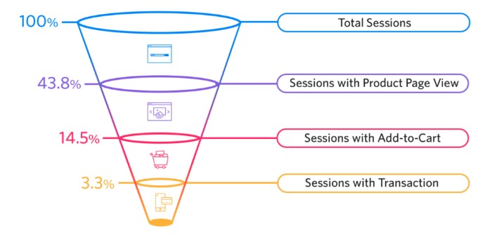 Your goal is to optimize each stage that a customer goes through so that as many people as possible eventually get to the point of completing their purchase.
This means making sure they can easily find the product they're looking for, providing helpful content at each stage, streamlining the checkout process, and so on.
Think of each page as an opportunity to move a customer further down the sales funnel.
Optimizing your sales funnel is also one of the most effective ways to increase your conversion rate.
2. Know Your Target Audience
Closely related to creating your sales funnel, knowing who you're targeting is essential when creating a smooth UX experience.
The better you understand your audience, the stronger the value proposition you can then create, which then can result in more sales.
Ask yourself:
- What are the biggest pain points of my target audience?
- How do my products offer solutions to those pain points?
- How will consumers benefit from buying my products?
- What makes my brand different from competitors?
Answering these questions will help you create a website tailored to your target audience, which will result in a much better UX experience.
To know your customers better, you might consider customer surveys, A/B testing, or even just talking to them about what they like and don't like about your website.
3. Have a Strongly Functioning Website
Customers are quick to move away from a website that isn't loading quickly or functioning properly.
From the point your customer arrives to the point of checkout, your website must perform flawlessly.
With that said, there are things you can do to improve your website's functionality.
Make Navigation Easy
No one wants to navigate through clunky menus and confusing buttons. Make a clear path for customers to follow.
For better website navigation, you can do the following:
- Create specific product categories
- Have a search bar available
- Offer search suggestions
- Organize content into sections
- Have clear drop-down menus
Better navigation improves the user experience and the chances of a sale.
Optimize Load Speed
Your website conversion rate drops by an average of 2.11% with each additional second of load time (0-9 seconds), so loading speed is crucial.
That's a real bummer if you ignore it.
You can use tools like Google’s page speed insights to test your website speed, and then optimize it if necessary.
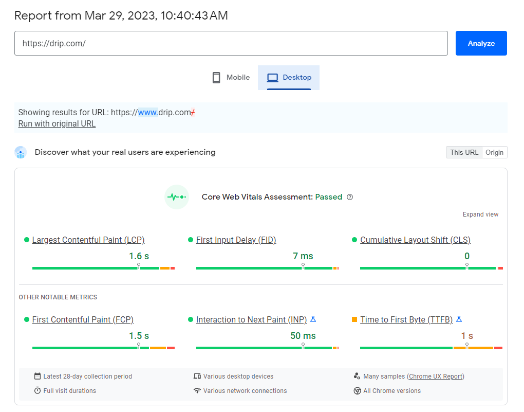 To make your website load speed faster, you can optimize your images, limit redirects and cache your web pages.
Make Sure Your Website is Optimized For Mobile
Mobile devices account for nearly three out of four dollars spent on online purchases today, so it's essential to make sure your website is optimized for mobile.
Following things help:
- Make sure buttons are large enough to be easily tapped
- Make sure content is easy to read on mobile devices
- Enable zoom and pan for images
- Make returning to the home page easy and accessible
Additionally, check that all the forms are easy to fill out when using a mobile device.
4. Keep Your Brand Voice And Style Consistent
I feel like the brand voice and style is easy to overlook in this day and age, because all the big brands are so good at it.
Not just your website, but your brand should communicate one consistent message across all platforms.
You don't want your followers getting confused down the line if one moment you're talking business talk and the next, suddenly you sound like a comic book. Try imagining that all your pieces are interconnected parts of one big story — it'll help keep your brand voice and style consistent!
These things will help you keep your brand voice and style consistent:
- Pay attention to the language you use, and keep it same
- Use the same fonts and colors in your website design
- Make sure your logo is consistent across all platforms
- Choose a short, punchy tagline
- Create a brand vision and sticking to it
- Offer consistent customer service across all platforms
A unified voice and style can help you distinguish your products or services from competitors, as well as appeal to your target audience.
On the other hand, inconsistent branding fosters an untrustworthy image.
5. Smoother the Checkout Process Is, The Better
A simple rule for checkouts: If something is not absolutely necessary to have, remove it.
A complicated checkout process is a big turnoff for customers.
The fact is that checkout is one of the easiest pages to optimize due to its minimal elements, yet many times people overlook it.
And in the end, it's the most important page.
Here are some quick fixes that can help:
- Start from a product page, make the call to actions clear, make it easy to move on add to cart, and leverage trust-building factors such as trust badge.
- Make checkout possible without account creation (aka guest checkout)
- Make sure shipping information is clear, and that there are no crazy additional expenses for customers (a big no!)
- Consider creating one-page checkout
If a customer is about to leave the checkout page, you can also target them with exit-intent pop-ups, and later reward them with discounts.
All the above tips are especially beneficial if your ads seem to have a high click-through rate, but when customers get to your checkout page, your conversion rate drops.
6. Leverage Trust Building Factors
When a customer is on the edge of whether or not to complete the purchase, trust-building factors are a deciding factor.
Things like customer reviews and ratings, a secure payment system, and trust seals are a few examples of how to build trust in your website.
Birchbox has a great example of this, openly showing customer testimonials on their website as a big hero image.
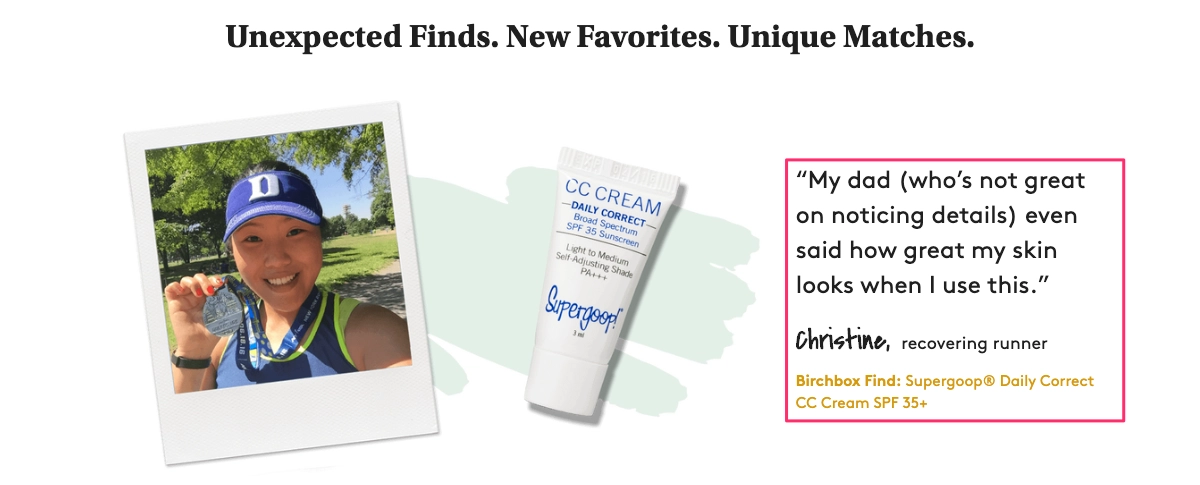 It's easier to empathize and move forward with a purchase when you see a quote from someone like you.
Part of Fabletics’ strategy is to showcase images from their Instagram Feed on their website.
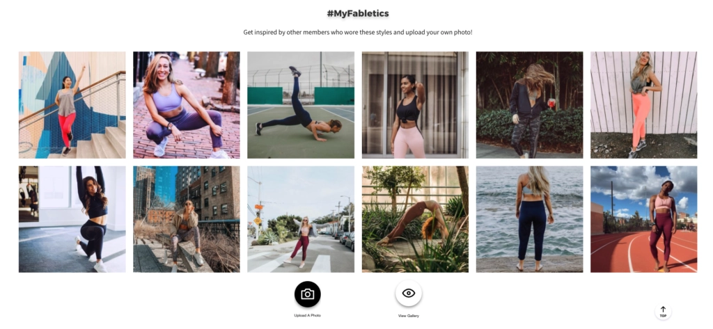 And these images are actually from their customers.
They encourage customers to share images of themselves using the products with a hashtag #MyFabletics, which they then show on their website as a trust building factor.
Again, this helps build trust because customers can relate to real people using the products.
On top of customer images, and reviews, trust badges can also do wonders.
Trust badges vary a lot, but here is how Allbirds is doing it.
 Basically, they display media badges that visually show customers that the company has been featured in major media outlets and is trustworthy.
There are many other trust badges you can use, like security badges (SSL), payment system logos, and money back guarantees.
Just make sure that the badge is relevant to your brand.
7. Take Advantage of Personalization
There are many things you can do when talking about personalization.
For example, imagine you've designed a shirt store.
Instead of making everyone view all the same shirts, why not personalize their shopping experience by showing them relevant items based on their tastes and previous purchase history?
Boozt is a great example of leveraging personalization.
They used cookies saved to my browser to remember my interests. This is what I saw the first time I visited their website:
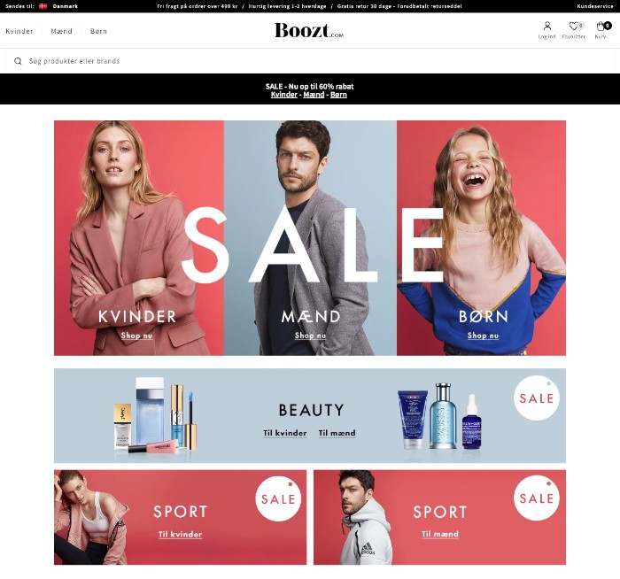 At first, they showed all three of their main categories. Then I clicked on the women's category and browsed different items for a bit.
When I visited later again, I typed boozt.com to the search bar, and they automatically directed me to the "women" page, and displayed relevant products:
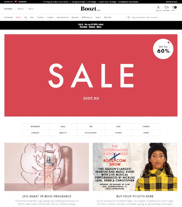
This is just one example of many things you can do for personalization.
Personalized guides, special campaigns, and behavior-based exit-intent pop-ups are also great ways to use personalization for a better customer experience.
Customer-centric approach
The goal of Ecommerce UX design should always be to create a customer-centric experience.
This means taking into consideration the customer’s needs and concerns, and creating an experience tailored to those. No two customers are alike, so you should strive to create a customizable user experience that adapts to the user’s needs.
And if you want to take things one step further - take advantage of automation.
With Drip’s automation, email, and popup tools, you can take your customer-first strategy a step further and really personalize the experience.
From automated welcome emails to personalized product recommendations, Drip has the tools you need to create a highly customized user experience.
Take advantage of Drip's 14-day free trial!
