Imagine you ran a brick-and-mortar store that got 100 unique visitors per day.
Of those visitors, about 30 of them would walk in the front door, say absolutely nothing, and walk right back out.
This is what an ecommerce bounce rate would look like in the flesh.
It wouldn’t be great for your store. It would probably leave you scratching your head and wondering why so many people weren’t interested in what you offered.
You’d probably want to do anything you could to prevent it from happening — short of locking the door behind your customers, anyway.
But online, this is reality. And a bounce rate can spell trouble for an ecommerce store.
Let's jump right in to understand this metric, and explore five effective ways that you can reduce the bounce rate of your ecommerce store.
What Is Ecommerce Bounce Rate?
Bounce rate is a key metric used by marketers to measure how well a website performs in terms of conversions.
Bounce rate is the percentage of visitors who leave immediately after landing on your site.
The bounce rate is calculated by dividing the number of bounced visitors by the total number of unique website visitors in a day (or a timeline of your choice).
But what does a high bounce rate mean for you?
It simply suggests that lots of potential customers are leaving your website without completing any desired action. And therefore, a poor conversion rate and abysmal sales.
Not to mention, a high bounce rate can be a nail in the coffin for SEO. Google measures and tracks whether visitors bounce when coming to your page from a Google search.
It’s essentially telling Google that you’re not the right answer for whatever query the user has typed in.
And if that’s a target keyword that you want to rank for, it’s going to hurt your rankings.
A high bounce rate can be caused by:
- slow page loads
- a weak CTA
- customers not being able to easily find what they're looking for
- grave discrepancies between your paid ads and landing page, and more.
What Is The Average (And Good) Ecommerce Bounce Rate?
Seeking a good bounce rate for your ecommerce website is a non-starter.
Why? Because it should be as low as possible to bring in more and more sales, period.
You need to compete only with yourself, and not feel satisfied if you’re experiencing a bounce rate similar to most of your competitors.
That said, your brand and products aren’t going to be for everyone. That’s okay.
It’s relatively normal to have some kind of bounce rate. Perhaps your pricing isn’t attractive to the buyer. Maybe they’re looking for something more specific. Maybe they’ve come across your site by accident.
Whatever the cause, knowing what the average ecommerce bounce rate can be helpful in understanding where your ecommerce store sits.
Here are a few observations regarding the recent average ecommerce bounce rate as per Kibo Commerce data:
- The average ecommerce bounce rate across regions was 42% in Q2 2022.
- The data reflects a high 7% increase in the bounce rate for Asia, Africa, and Latin America since 2021.
- What’s interesting is that bounce rates have increased overall since the past year, but they mostly spiked up when customers were trying to make a purchase via their tablets or desktops.
- Although only 35% of potential customers who visited an ecommerce website from an email link bounced, there's been a (little worrying) 15% increase since Q1 2022.
5 Effective Ways To Reduce Bounce Rate For Ecommerce Stores (Plus Examples)
1. Design Your Website Clean And Modern (Aro)
A well-designed ecommerce website helps clearly demonstrate the product value.
According to Top Design Firms, 50% of customers believe that the website design influences the impression that a brand has on them.
Plus, it helps a company meet their customer expectations.
A clean and modern ecommerce website design helps you:
- improve your brand image
- provide a top-notch user experience
- increase customer engagement
- attract new customers
- rank better on search engines
- fulfill customer expectations
- increase customer trust
And guess what: the reduced bounce rate and increased conversion rate are the side effects.
In 2023, an ecommerce website should be easy to use, responsive, fast loading, easy to navigate, and have a clear CTA so that your visitors know what they're supposed to do next.
Aro checks all of the above website design checkboxes.
The layout is minimalistic, practical, and non-chaotic. It is easy on the eyes and informative.
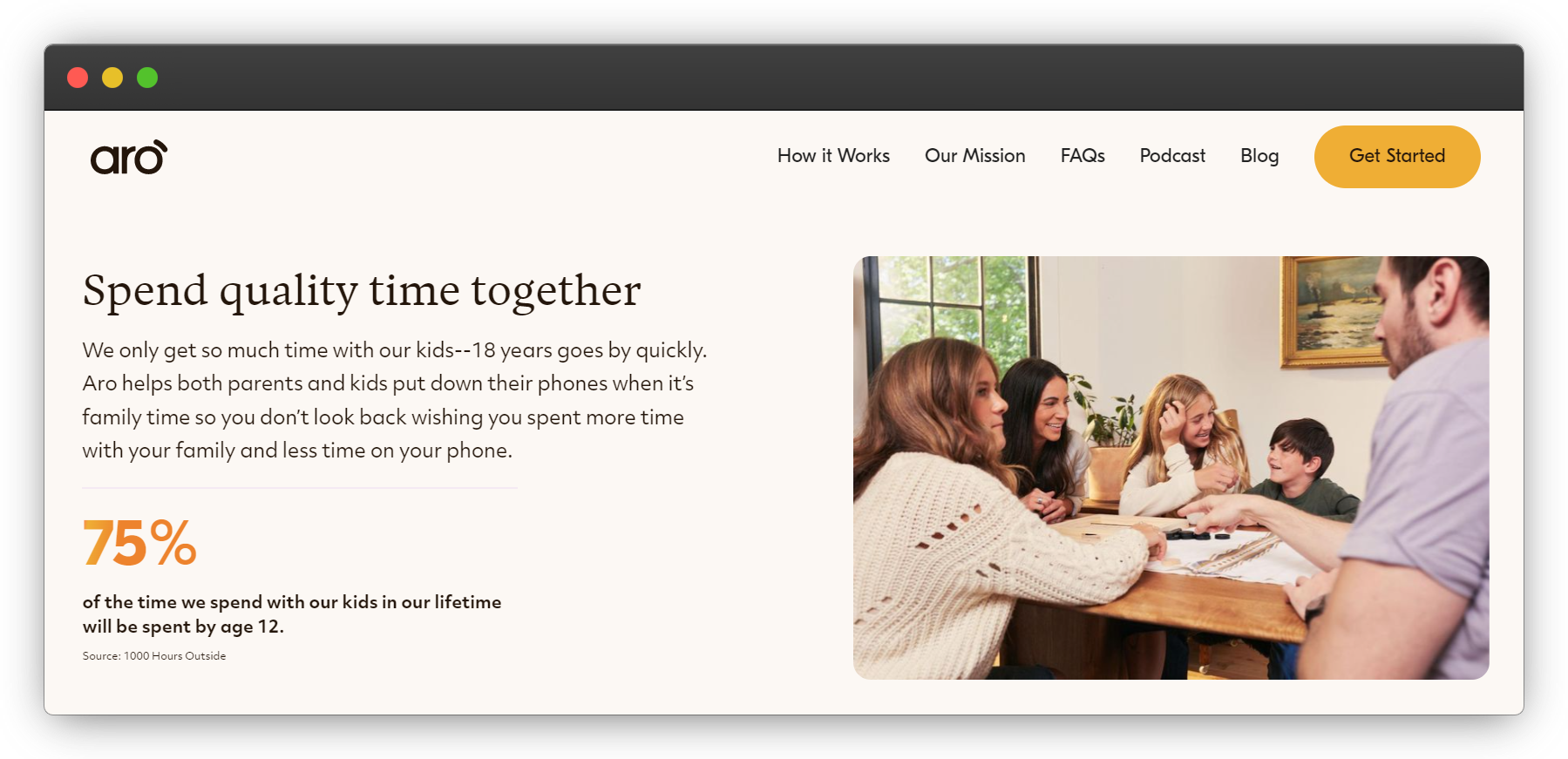 The images are subtly eloquent about the brand mission — the picture of the family members or friends communicating and spending quality time without gadgets.
You can navigate the website effortlessly. As you scroll, it keeps on quenching your curiosity about the product, their mission, and the most important question — should I buy it?
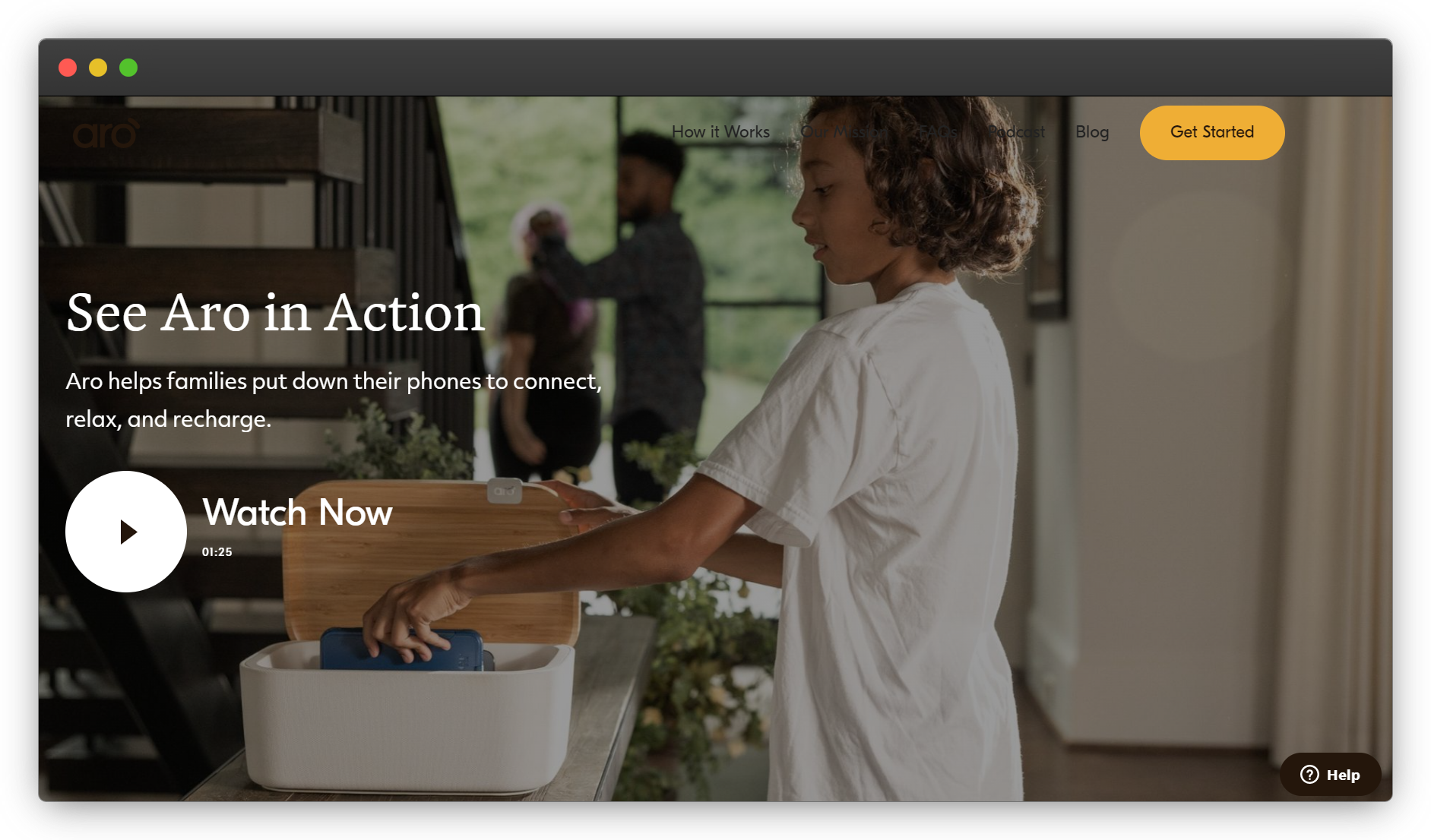 Its explainer video hits the doubt-ball out of the park, if the images don’t convince a customer to buy the product right away.
2. Write Persuasive Product Pages (Costa Brazil)
Optimized product pages best showcase your products, offering more information about them and letting customers know what they will get when they make a purchase.
This helps customers easily compare different products.
Let me emphasize: this is particularly important because customers often want to make a purchase based on the price, quality, and usability of the product.
The time required to make a purchase is shortened if customers can quickly find the product information they're looking for.
Assist your customers, instead of confusing them into buying.
By optimizing your product pages, you can improve the navigation, layout, and overall look of your ecommerce store — all of which help reduce the bounce rate.
This leads to a better user experience, which instantly gives you an advantage over the competition in terms of user satisfaction and conversion rates.
If you craft a persuasive product page and don't hold back on optimizing it well, it helps you improve search engine rankings.
How so?
Well, a product page has several key elements that are important for improving search ranking: keywords, images, descriptions, and customer testimonials (video, text, or both).
Search engines use these elements as signals to determine if a website is relevant and if it is worthy of ranking high.
When these signals are strong enough, Google ensures that visitors find relevant content on your store easily and quickly.
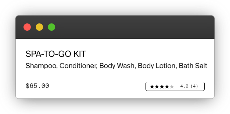
Costa Brazil (a premium sustainable beauty brand) has got its Spa-To-Go Kit product page right.
The moment you lay your eyes on the page, you see that description(s), images, ratings, price, CTA, Buy Now Pay Later option (afterpay), basically every key element is placed into individualized sections. This helps provide a top-notch user experience as customers can quickly find all the information required for their purchase decision. And guess what? The chances that they find this page bleh and bounce is almost eliminated.
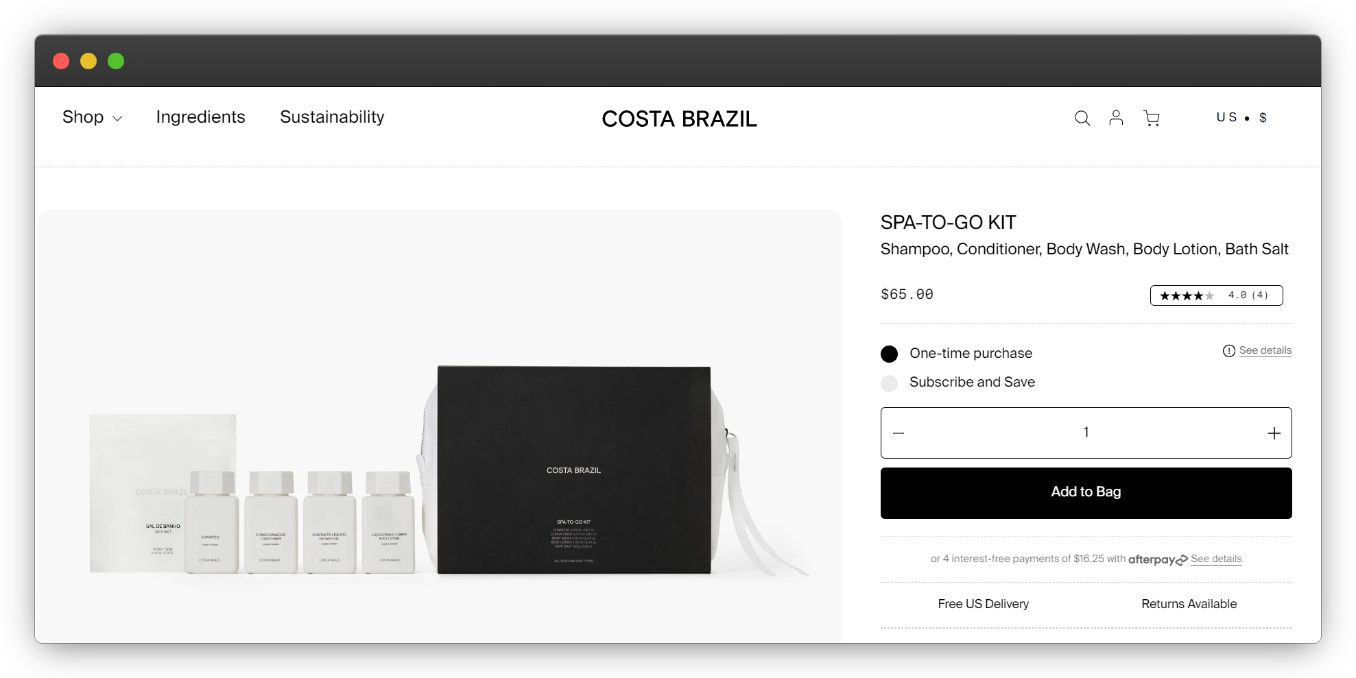 The premium packaging suggests a luxurious feel.
The highlighted star-rating indicates strong social proof. And it’s been intelligently placed in the same section as the price to leverage that social proof and pull the customer to buy this kit right away.
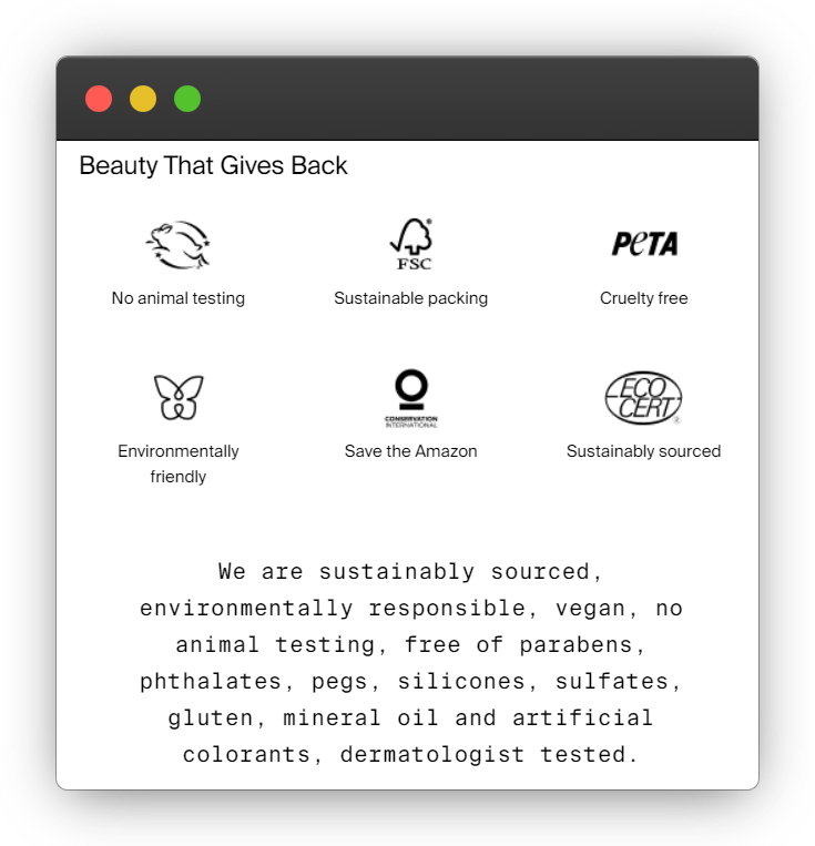
 Being a beauty brand centered around sustainability, the company knows that the majority of its customers care about the ingredients and the process used to make the products.
So, it details these elements well.
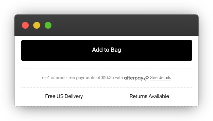
 The product page converts two major customer pain points into features with no shipping fee and the swift return policy. And paired together with an afterpay option makes it even more persuading.
 The product description mentions that this kit is found only in the most exclusive properties. This helps make a customer feel like they’re buying a piece of social currency for just $65, which now feels like a steal.
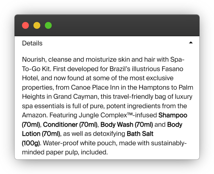 They go even a step further to demonstrate they care for their customers by mentioning the application steps for normal everyday products like shampoo and conditioner.
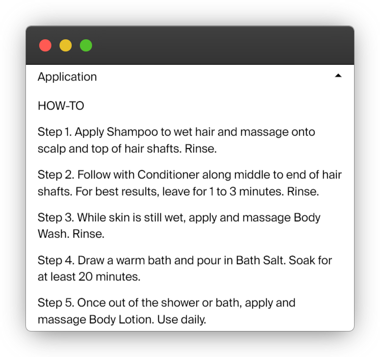 Customers can’t help but feel they’re now part of a luxe club.
Did you notice that the more you scroll, the more you get sucked into their product vortex? The brand tries to have almost no product page section which can make customers feel like exiting the website.
Lure them in, and they won’t bounce.
3. Make That CTA Pop (AIRSIGN)
A poppy Call-To-Action (CTA) button catches user’s attention as soon as they land on a product page.
When you’re on a road trip, signs guide you towards your destination.
Just like that, well-crafted CTAs usher your customers in their buying journey (leading them deeper into the sales funnel) by guiding them about ‘what to do next?’
A CTA button should:
- Be visually appealing
- Be strategically placed
- Complement the product
- Compel customers to buy now
Every extra second that a customer spends on your website, can alter the bounce rate, and therefore positively impact conversion rate.
AIRSIGN, primarily a vacuum cleaner brand, demonstrates on their AirBags product page that they understand the CTA-psychology well.
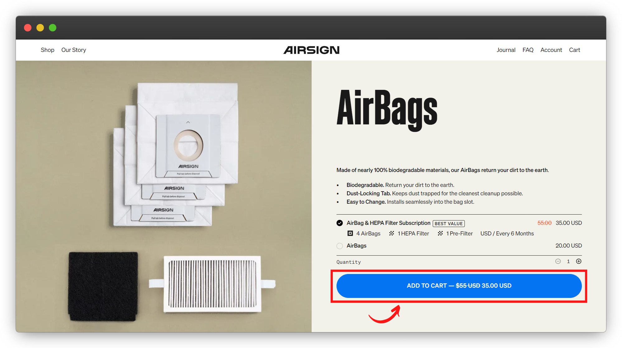 The soothing-blue CTA button is larger than usual, and spans across the width of the product description.
It pops even more as it is contrasting with the lighter backdrop and brand color guide.
Because it is the first product page element that arrests your attention, you’re subconsciously drawn to click on it.
One of the best ways to test your CTA’s pop-factor is the squint test.
Squint your eyes when you look at your page. Make your vision really blurry. Can you still see your CTA? Is it clear?
If so, congratulations. You’ve got a pop-worthy CTA.
They leverage the CTA to also highlight a discount — another tactic for increasing the likelihood a customer will click on it.
This compels a website visitor even more to grab the deal now as they may not be able to get their hands on it later.
And that’s a fine addition of FOMO-based (Fear Of Missing Out) conversion technique without appearing salesy.
4. Time Your Popup Right (J Crew)
Popups can be annoying, and shatter user experience.
But, if timed well, they can magically boost customer engagement rate.
 Let’s say you hop on J Crew’s website to buy a trendy blazer, and find their blazers to be simply irresistible!
But then you are taken aback by the pricing. Oh no.
And just when you are about to exit the page, defeated by inflation yet again, a message pops up with ‘Want An Extra 15% Off On Your Purchase?’
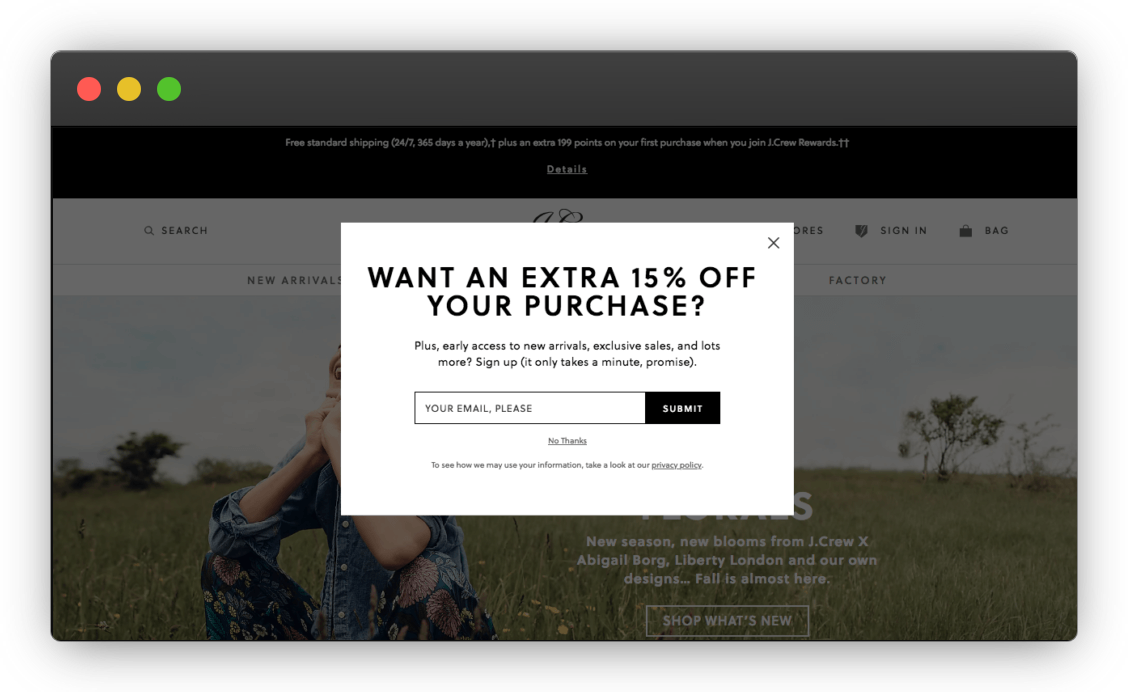 Would you still close the page without buying? You’d at least give it a second thought, wouldn’t you? At minimum, you’d take the time to calculate how much the product would be with that sweet discount.
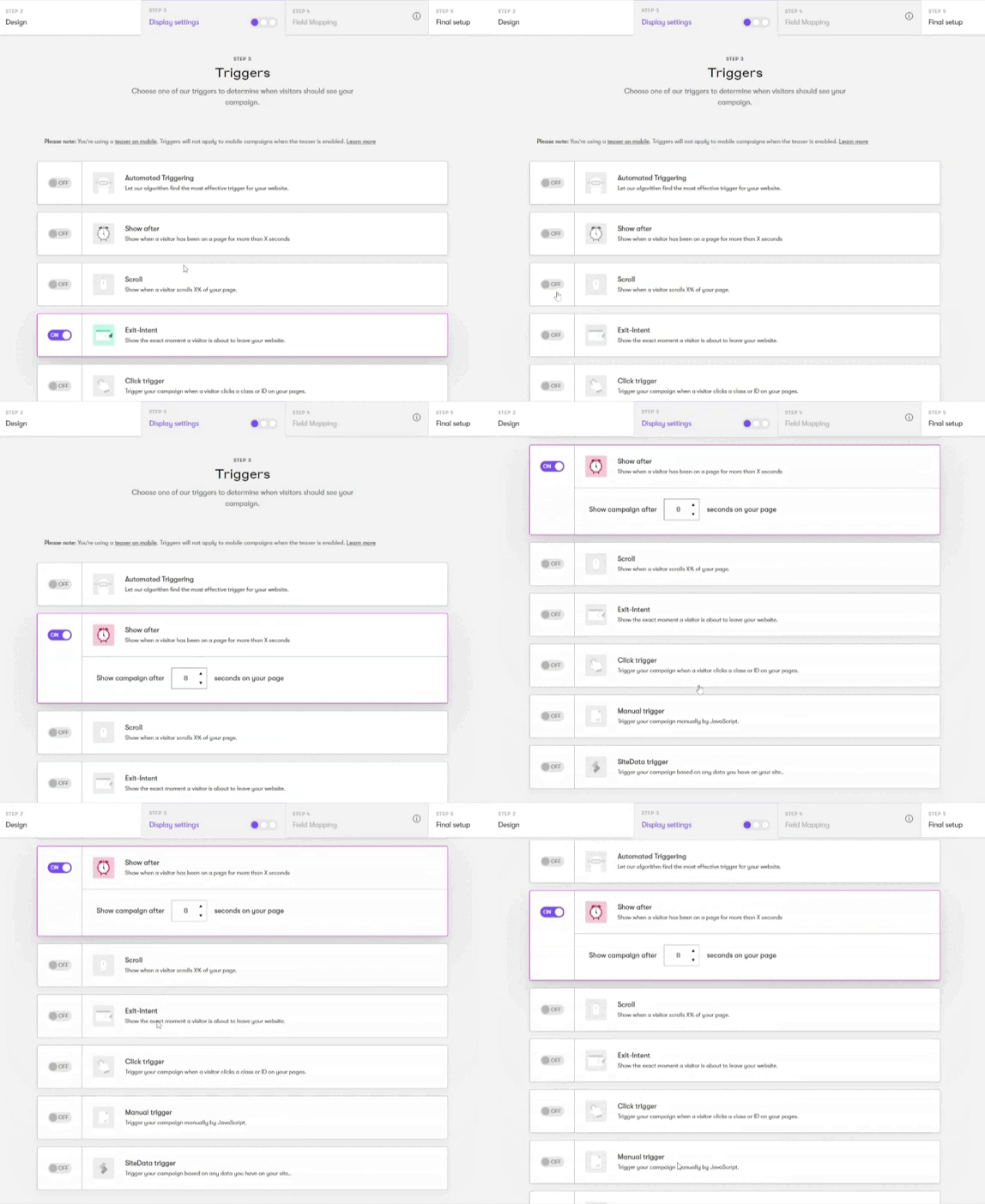
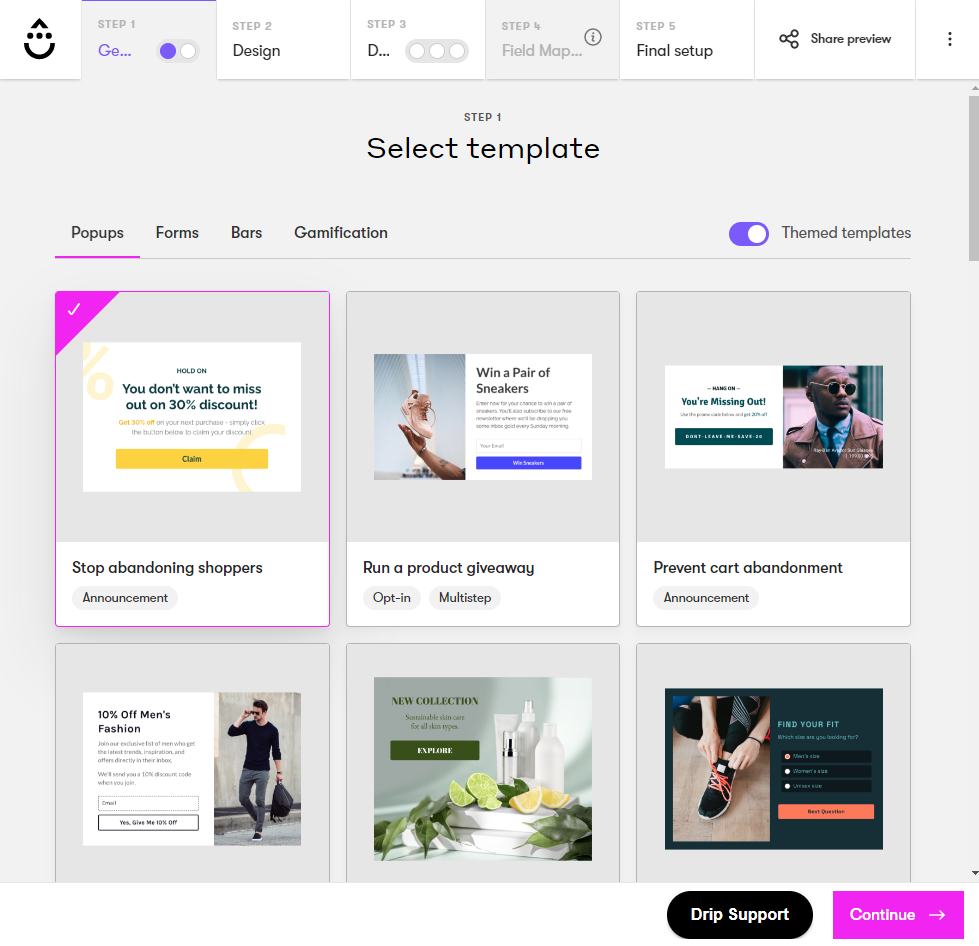
What kept you hooked to their page, prevented you from bouncing, and changed your mind at the very last moment is called an exit-intent popup.
It is like a company’s last effort to retain the visitors (who are about to bounce) by offering them a value-based prop — a discount, freebie on a certain purchase, etc.
It works by triggering when your customer moves their cursor towards the top left (the back button) or the top right (that red X) of the page.
In fact, you can use Drip’s Onsite to design beautiful and well-timed popups — exit-intent or just time-delayed ones.
5. Offer Real-Time and Grade A Customer Support (AD HOC Atelier)
What’s your buying process like? Whether you’ve to get yourself some gluten-free biscuits (you’ve got knowledge about) or a hunting tripod (something entirely new to you).
In both cases, you visit the product website and after some running through, you either confidently buy the product (gluten-free biscuits) or expect some guidance (a hunting tripod).
If you’re trying to buy a product that you’ve never used before, you’d mostly look for guarantees, refund and return policies, etc.But how would you know if a particular hunting tripod is the right one for you?
You’d definitely expect a human to guide you, right?
As an ecommerce business owner, you have to create a window of support and assurance for your visitors.
And this is exactly what real-time customer support offers your visitors.
According to Khoros, 79% of customers had a better and valuable buying experience when they interacted in an online conversation with a customer support rep.
This can be via chatbots or live chat windows that usually appear on the bottom right corner of a website.
Customers live in the now, and not in the abyss of uncertainty.
Instead, your chatbot should automatically forward customers’ concern(s) to the appropriate department where it is taken care of by human support through live chat or call.
This personalized, knowledge-based, human-enabled, and real-time customer support approach helps you win customer loyalty and decrease bounce rate.
See this approach in action on AD HOC Atelier’s website.
It flags Chat with Federica. This adds the human element and instantly comforts a website visitor with a feeling that if they need any help at all, there is Federica — a real human — to turn to.
This quietly projects that the brand cares.
Ask us anything reinforces that they have complete knowledge of their products, and can and will help customers at any point of their buying journey.
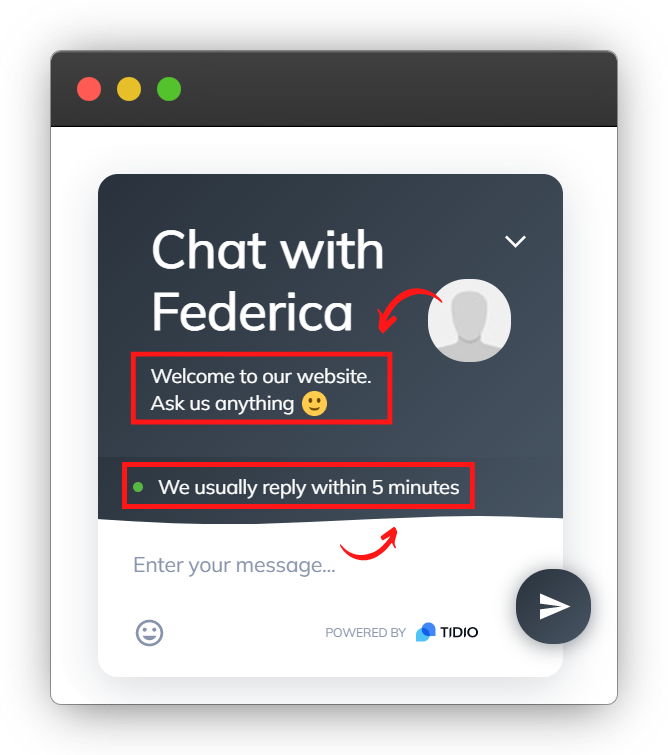 We usually reply within 5 minutes: this states the response timeline upfront so the customers don’t have to deal with frustrating uncertainty. This is a strong method to ensure that the customers don’t bounce, patiently wait for responses, and complete their purchase.
Final Words
Bounce rate isn't a metric that you can chase, and directly lower it somehow magically.
It's a side effect of doing multiple little changes (like the ones mentioned above) to enhance the user experience.
Think about it this way. Why would my potential customers bounce off my website if I:
- offer them the products they want or need
- present those products with interesting, well-organized, and easy-to-find information
- provide them with quick and human-enabled customer support
Think of what options you have to increase the time spent by users on your site.
Act on those insights, increase the value of each website visitor, and your bounce rate will start rocketing down.
When in doubt, a tantalizing exit-intent popup might just do the trick. Built to only trigger once the UX has already been broken, these popups can appear and offer an incentive to stay, or at least offer up a user’s email address for a sweet discount.
In fact, Drip has a world-class popup builder (plus tons of other great list-building features) that help you curate your email list from scratch.
It’s worth a try if you find your ecommerce bounce rate is just a little too high. Try it free for 14 days!
