Need to communicate critical information to shoppers the second they land on your website?
An e-commerce splash page is the perfect way to do it.
Unlike a traditional standalone landing page, a splash page is basically a large window with the main goal of providing important information upfront.
It helps streamline the user experience and adds value to the digital shopping process.
In this post, I’ll explain some specific ways you can use this type of content and some common attributes that well-crafted splash pages possess.
And most importantly, I’ll include seven amazing e-commerce splash page examples so you can see what I’m talking about firsthand and draw inspiration from them.
Here we go.
Table of Contents
Specific Ways You Can Use an E-commerce Splash Page
One of the main reasons I love splash pages is because they can serve a wide variety of purposes.
For example, you can use them to:
- Create a welcome screen or teaser to get visitors excited
- Inform shoppers of new products, promotions, giveaways, and invitations to events like webinars or contests
- Get their contact information to nurture leads through email
- Allow shoppers to choose which country they’re located in
- Allow them to select their preferred language
- Allow them to choose their product selection based on gender
- Create a “security fence” for sites that require age verification like CBD or alcohol brands
- And much more
It’s incredibly versatile and helps you get shoppers up to speed in just seconds.
Characteristics of Great E-Commerce Splash Pages
There are five main attributes that the best of the best share.
They have:
- Great aesthetics
- Minimal elements to not overwhelm shoppers
- Simple, straightforward messaging so shoppers can absorb important information at a glance
- An easy to find exit button that instantly takes shoppers to the homepage if they’re not interested
- A succinct CTA
At the end of the day, it’s all about adding value to the e-commerce shopping experience without including any extraneous information.
It’s also important not to annoy those who aren’t interested and allow them to navigate smoothly to the homepage without any friction.
To learn more on how marketers make and use splash pages, check out this video from Instapage.
E-Commerce Splash Page Examples
Now, let’s get into the meat of this post.
Here are some of the top e-commerce splash page examples you can learn a lot from and their key strengths.
Hugo Boss

Letting shoppers know about promotions is one of the most popular ways to utilize this medium.
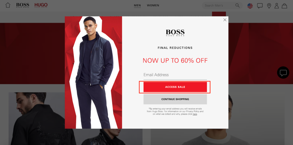
Case in point, luxury fashion brand HUGO BOSS who uses this splash page to notify shoppers they’ve got final reductions going on where they’re offering up to 60% off on certain products.
It’s a hot promotion that many people will be interested in.
With just a glance, shoppers know exactly what’s happening, and the value of this offer is instantly evident with “NOW UP TO 60% OFF” in red, uppercase letters.
Hugo Boss uses a great-looking image and features concise copywriting with only the essential elements.
Their messaging gets right to the point.
They make it easy to exit by clicking the “X” icon in the top right-hand corner of the splash page or click on “Continue Shopping.”

And they use a dead simple CTA of “Access Sale.”
This shows that less is best and you shouldn’t overthink an e-commerce splash page.
Instead, just focus on delivering legitimate value and making your offer ultra-easy to digest.
cbdMD
I mentioned earlier that some e-commerce splash pages create a security fence where shoppers have to verify their age before gaining access to a site.
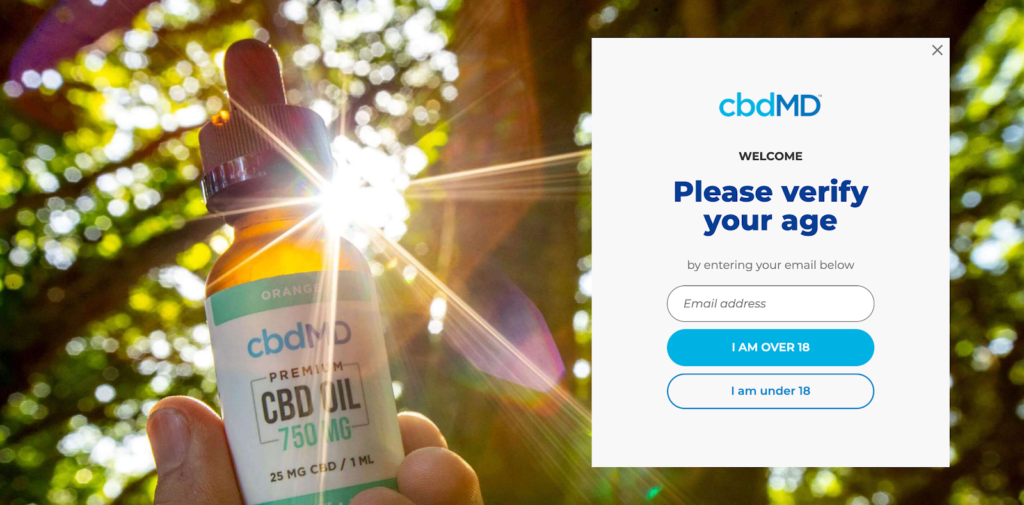
And this is a perfect example from cbdMD, a brand that sells “THC-free, superior CBD products, featuring award-winning, high-quality hemp oil.”
They sell age-restricted products, so their splash screen asks shoppers to verify that they’re at least 18 before entering.
To do so, they simply enter their email address and click “I am Over 18.”

After doing so, shoppers are taken to the homepage where they can browse for products…
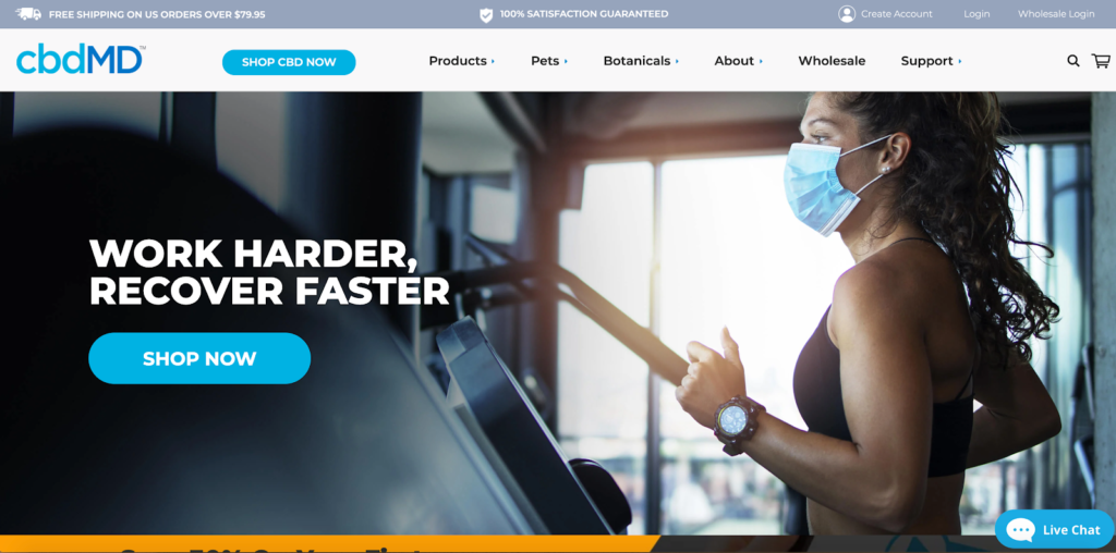
…and learn more about the company.
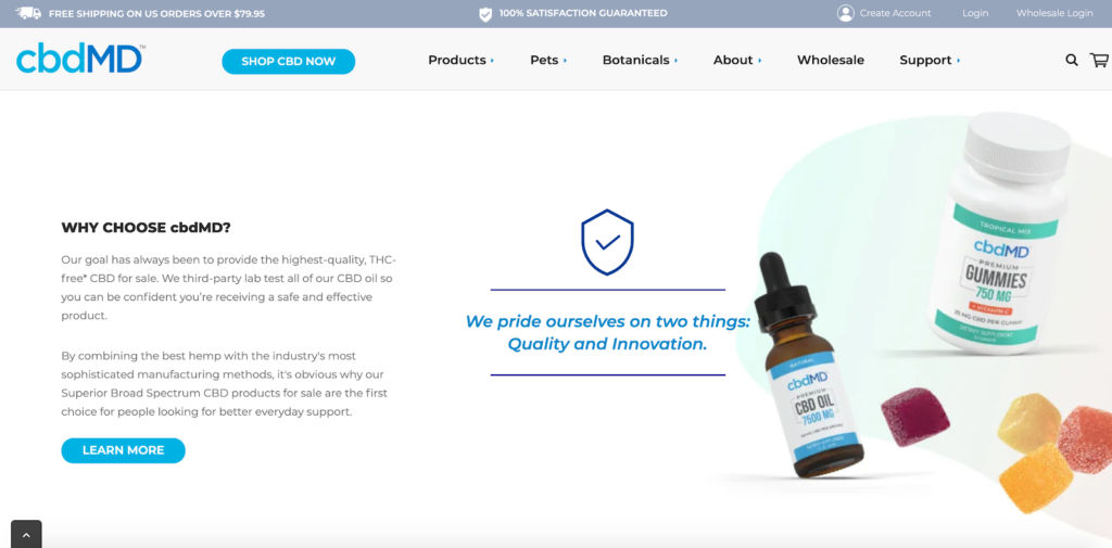
This e-commerce splash page example checks all of the boxes because it:
- Looks fantastic
- Has minimal elements, with only essential information shoppers need
- Features a straightforward CTA
And considering that this store isn’t suitable for shoppers under 18 years of age, it creates an effective framework to keep things on the up and up.
Killstar
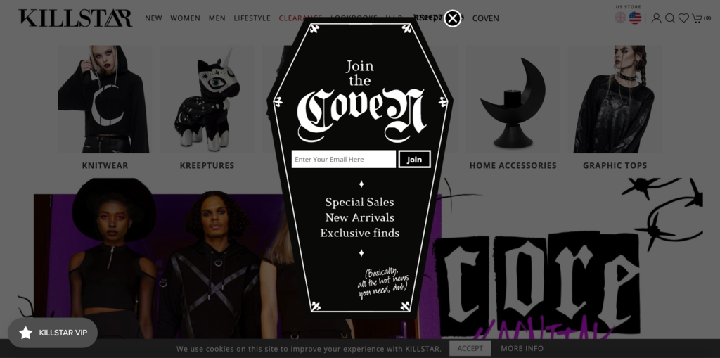
Killstar is a fashion brand that specializes in gothic and alternative clothing.
They cater to those with darker, spookier tastes, and their splash box stays completely on-brand with that.
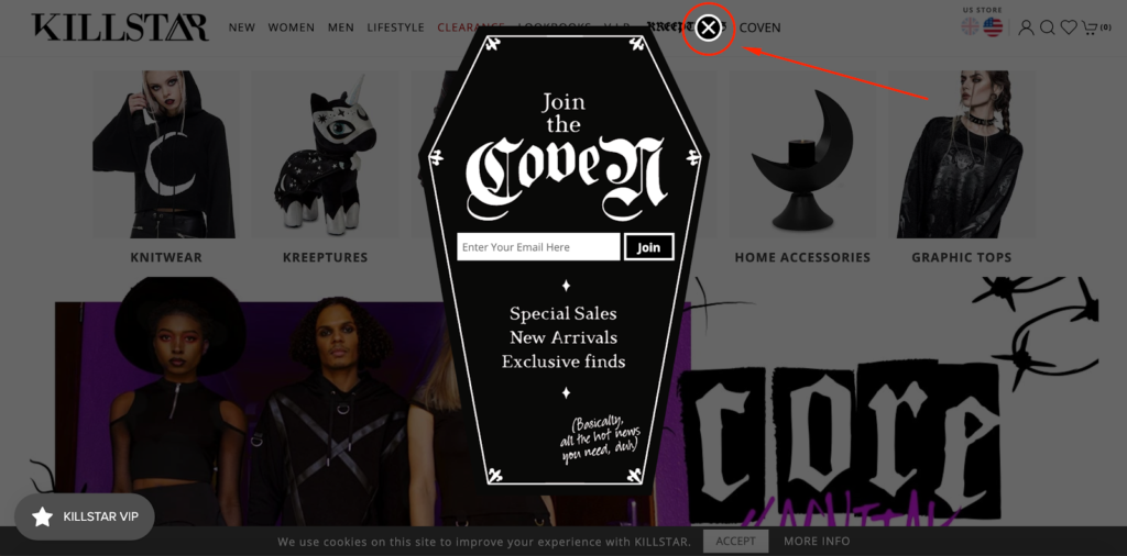
Although it’s a classic email capture form designed to collect contact information, it’s incredibly unique, featuring a coffin as the background.
I like the headline that says “Join the Coven,” which is a lot more unique than saying something like your standard “Join our email list.”
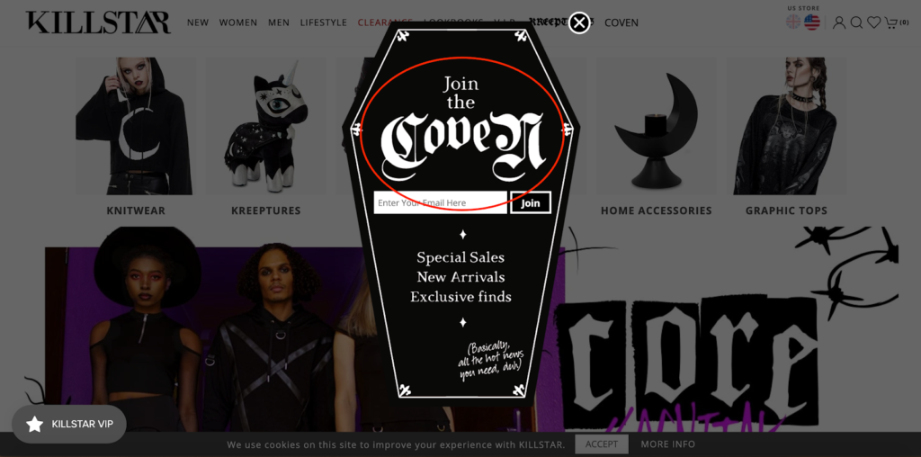
Although shoppers don’t get any discounts or deals from this splash page, Killstar clearly communicates the perks, which are access to special sales, new arrivals, and exclusive finds.
They also add a playful little quip in the bottom right-hand corner that says, “Basically, all the hot news you need, duh,” which definitely adds some playfulness to it.
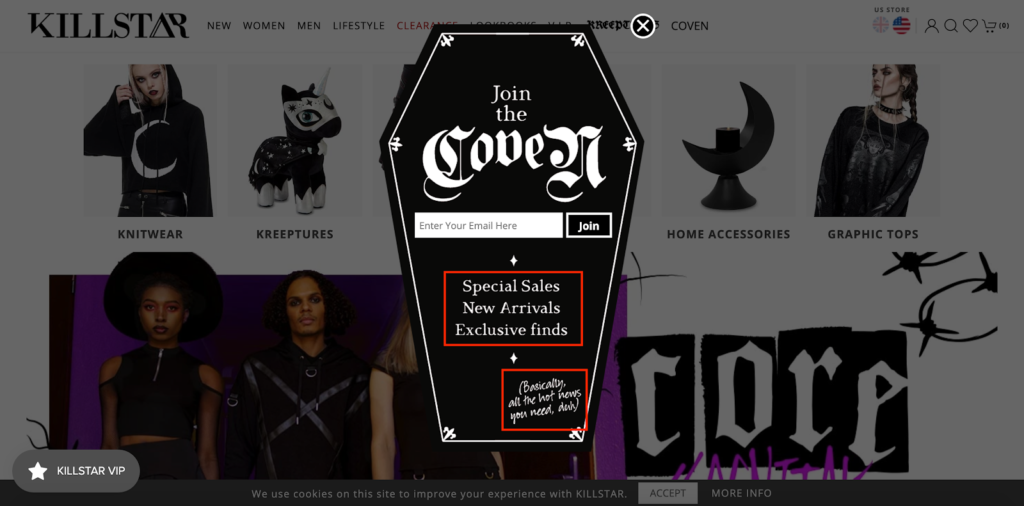
Killstar makes it easy to exit the splash page, either by clicking on the “X” icon or clicking anywhere outside of the coffin.
And the CTA is very straightforward and simply says “Join” after a shopper has entered their email address.
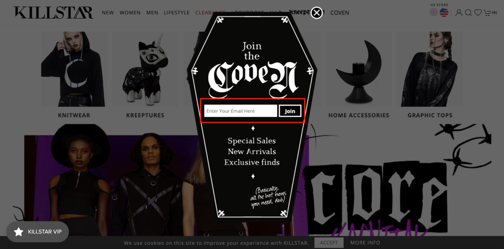
In short, this example follows the correct e-commerce splash page formula to a T and is one you can learn a lot from.
BABOON TO THE MOON
Giveaways are an excellent way to pique the interest of shoppers and begin the lead nurturing process.
And research has found that a good chunk of shoppers are responsive to them, stating that giveaways can:
- Raise brand awareness
- Increase customer loyalty
- Built trust and authority
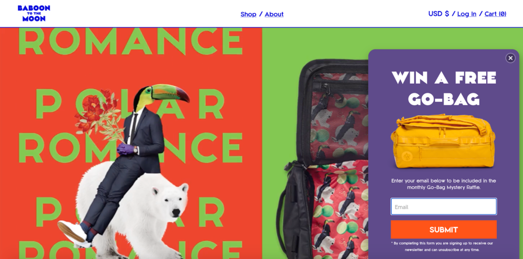
A great example of incorporating a giveaway into an e-commerce splash page is this one from BABOON TO THE MOON — a brand name I’m personally in love with.
They’re an adventure company that makes “versatile, technical, and radical bags” and are currently running a raffle where shoppers can enter to win a free “Go-Bag.”
All shoppers have to do is enter their email address and click the “Submit” CTA, which is about as straightforward as it gets.
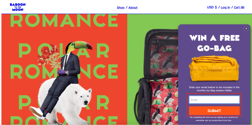
Here’s why this e-commerce splash page works so well.
First, it has simple yet eye-catching aesthetics.
It features a nice image of BABOON TO THE MOON’s Go-Bag so shoppers know exactly what’s being offered.
Second, it contains minimal elements — only the absolute essentials and nothing else.
Third, there’s succinct copywriting that lets shoppers know what’s up and what they need to do to enter the raffle.
Fourth, it’s super easy to exit out of the splash page.
Shoppers just need to click the “X” icon, which is located in a conspicuous location.

Finally, the CTA is really easy to understand.
So, with hardly any cognitive expenditure, shoppers are made aware of the raffle and directed them where they need to go with no disruptions.
And if they’re not interested, there are no hard feelings.
I also like that the splash page is so colorful, which fits in perfectly to BABOON TO THE MOON’s overall branding — something you should always be cognizant of when creating your own splash page.
Haute Hijab
A hijab is a head covering commonly worn by Muslim women.
And Haute Hijab is a brand that sells high-quality hijabs in a variety of different styles and fabrics.
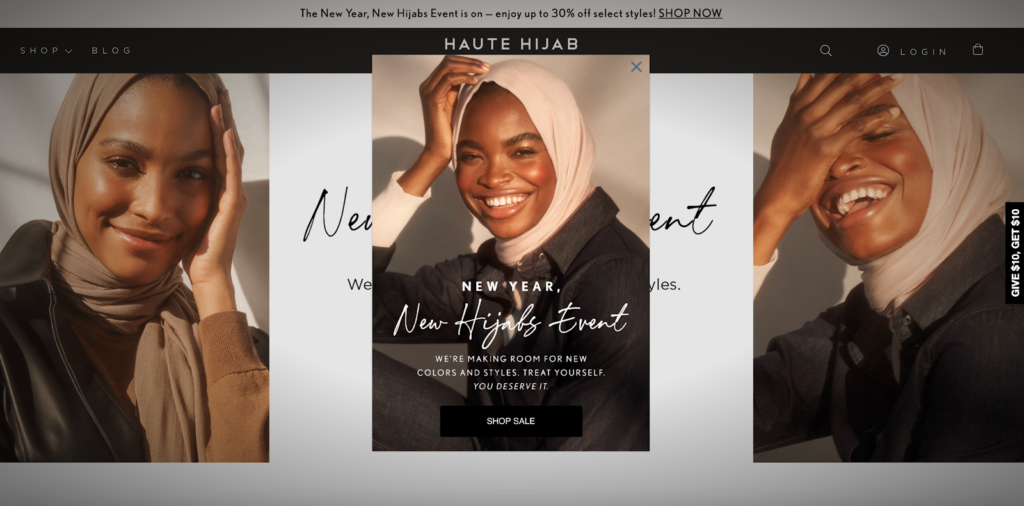
This particular e-commerce splash page highlights a special event the company is promoting — a farewell sale to limited edition hijabs.
Let’s start with the obvious.
The image looks fantastic and coordinates perfectly with the rest of the content shoppers see above-the-fold.
And the way they position the splash page creates some beautiful symmetry, which is very pleasing to the eye.
I love how Haute Hijab gets right down to business, using concise messaging that tells shoppers exactly what they need to know, which is that the brand is holding the “New Year, New Hijabs Event.”
They focus only on essential elements to make it easy to absorb the information.
And for those who aren’t interested, there’s an easy way to exit the splash page through the “X” icon.
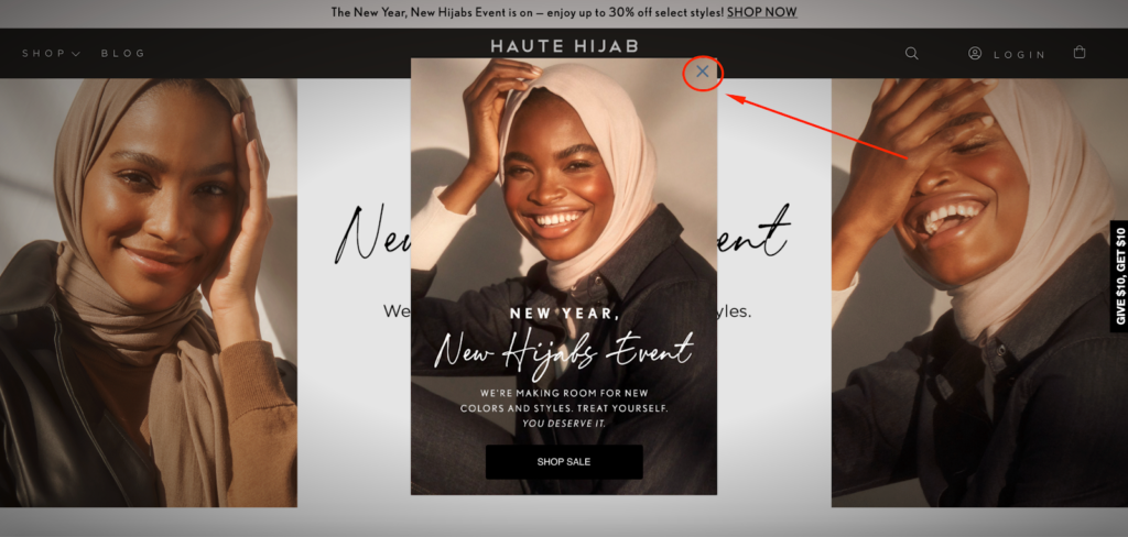
And the CTA is a home run with its simplicity.

Whenever a shopper clicks on it, they’re taken to the promotion page where Haute Hijab quickly fills them in on the details.
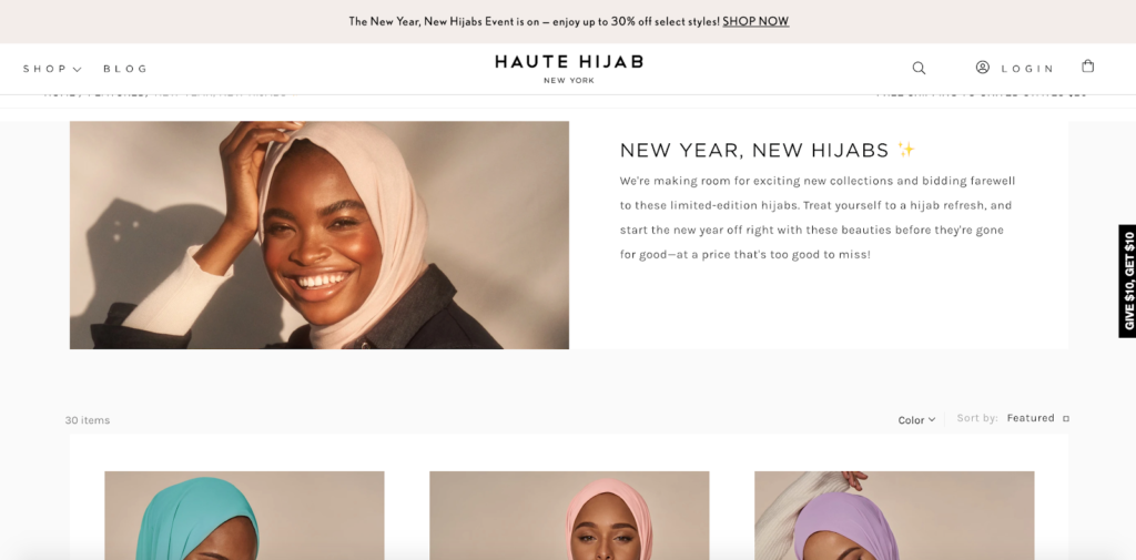
So, when you put it all together, the whole process is incredibly seamless and provides a ton of value.
Hobbs
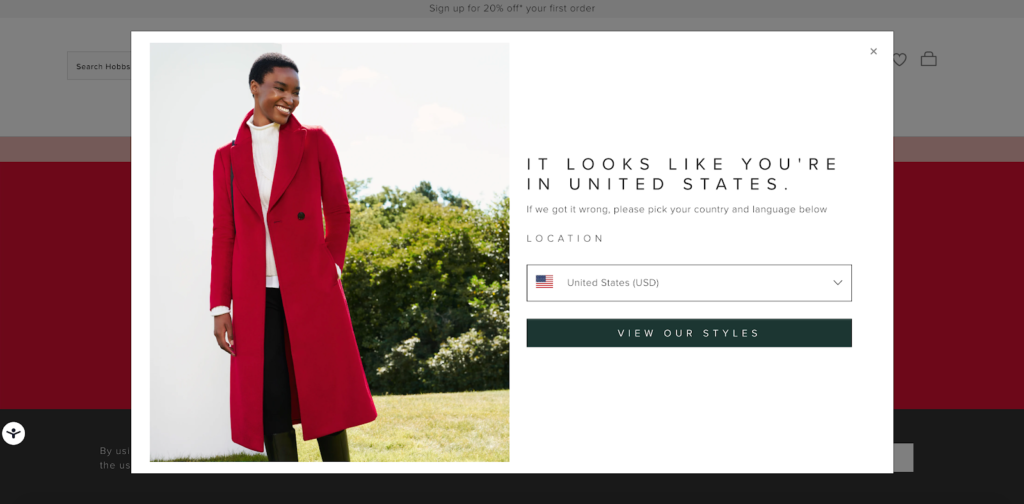
Remember how I said earlier that a common use of splash pages is to let shoppers choose which country they’re located in?
Here’s a great example of this from luxury women’s fashion brand, Hobbs.
Like all of the others I’ve featured, there’s a professional-looking image that grabs the shopper’s attention and is on-brand, showcasing one of the products they sell.
It has a clean, minimalist feel to it that quickly gets the message across without overwhelming shoppers or having them scratch their heads as to what’s going on.
There’s plenty of negative space…
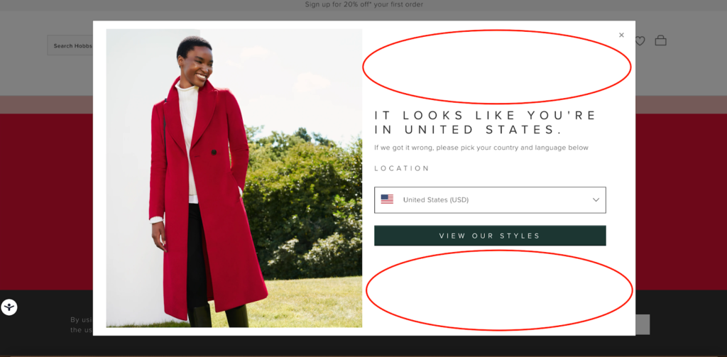
…and limited copy to prevent any cognitive overload.
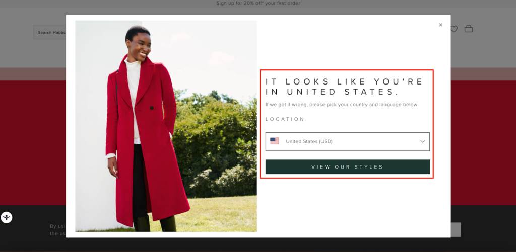
Rather, shoppers can quickly absorb the information and conveniently choose their location to find products that are available in their market.
Hobbs automatically displays what country they think the shopper is in based on their ISP.
Assuming that’s correct, all the shopper has to do is click on “View Our Styles” to start shopping.
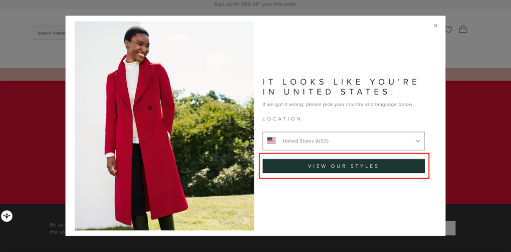
Or if not, they can click on the country drop-down menu to choose their country.

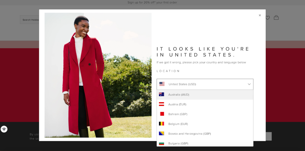
It’s really simple.
So, if you have a large international customer base of shoppers from all over the world, this is a great e-commerce splash page example to borrow from.
Madewell
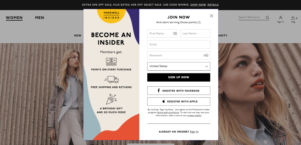
The final splash page I’d like to highlight is this one from Madewell, an e-commerce brand that sells “denim, clothing, shoes, bags, and accessories for women and men.”
Its purpose is to make shoppers aware of Madewell’s loyalty program called Madewell Insider.
By signing up, shoppers earn points and rewards they can redeem to save money, as well as get other perks like a birthday gift.
Again, the visuals from this example are on point and quickly capture a shopper’s attention.
Madewell condenses it down to only the vital elements and spaces everything out nicely, making it easy to digest.
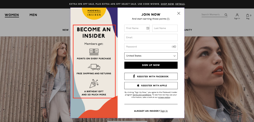
They do an awesome job of listing the benefits of joining their loyalty program, using a bullet point format on the left-hand side.
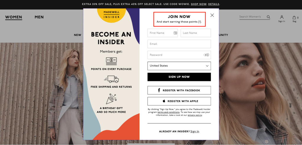
I also like that they included this copy that says, “JOIN NOW And start earning those points (!).”
This creates a little extra enthusiasm that should get shoppers excited.
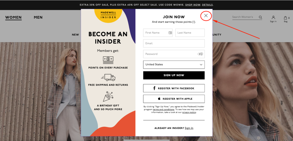
Madewell makes it easy to exit the splash page using the standard “X” icon here.
They also have a rock-solid CTA of “Sign Up Now.”
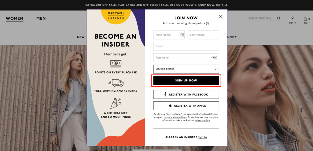
And for shoppers who prefer to register through Facebook or Apple instead, they can do that by clicking on one of these CTAs.

So to recap, Madewell has a very attractive offer that gets key information across utilizing brilliant aesthetics while making it uber-simple for shoppers to take action.
Conclusion
An e-commerce splash page is a highly effective way to get important information across to shoppers the second they land on your site.
And as we’ve just learned, it’s incredibly versatile, and there are a ton of different directions you can go with it.
You can use it to alert shoppers of deals and promotions, let them choose what country they’re in, gather their contact details for email outreach, and verify their age if you’re in an industry that calls for it, just to name a few.
Although the specifics can vary dramatically, there’s a definite formula that the best e-commerce splash page examples follow.
They:
- Look great visually
- Contain only essential elements
- Have straightforward messaging
- Feature an easy to find the exit button
- Include a concise CTA
Hopefully, you’ve found some inspiration from the brands I’ve mentioned and can use it to create your own amazing e-commerce splash page.

