April Fools' Day brings a welcome chance for ecommerce stores and their customers to have some good-natured fun.
It turns out that customers actually prefer humor in marketing. Oracle's recent research showed that 91 percent of people wanted brands to be funny and 72 percent chose brands using humor over their competitors.
While it's not a traditional ecommerce holiday, a harmless April Fools joke sent as an email can break the ice and create a lighthearted atmosphere between customers and the store. Nobody wants to be totally fooled, but a good balance of playful humor and actual info can make customers smile.
Who wouldn't appreciate a good laugh?
It's time to start off your April email campaigns on the right note.
If you’re ready to break through the mundane routine of many online stores and add some zest to your emails, let’s dive into some of the best April Fools email examples!
Table Of Contents
1. Pourri: Plugs For Your Sniffer
I absolutely love the April Fool's Day email from Pourri.
Pourri’s premise is a product that you spray in the toilet before using it to remove odors. Their April Fool's prank is a prime example of a harmless joke that brings a smile to the face of their readers.
As a joke for April Fools, they made a fake product called "Pourri Plugs,” which they then represented to their email subscribers.
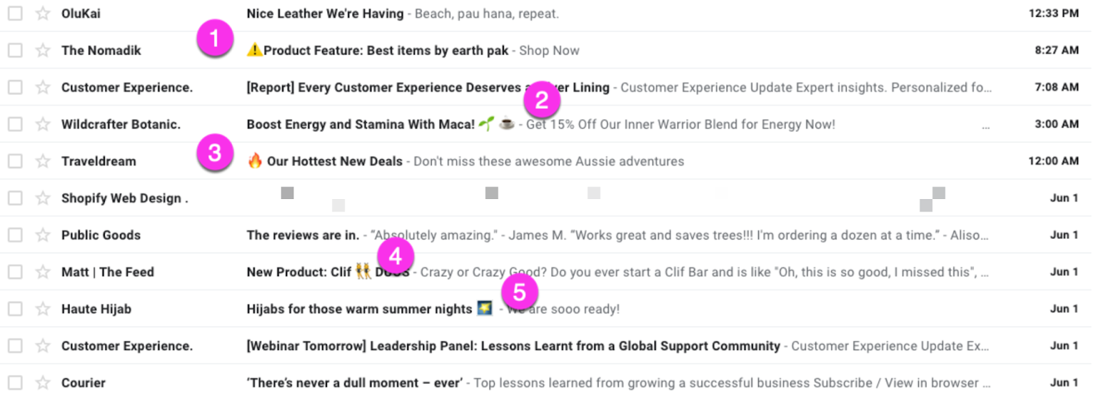
They started the joke by hooking readers in with their email subject line:

”What in the world are Pourri Plugs?” you may wonder.The email subject line already piques the reader’s interest and makes you want to click.
The use of nose emoji on the subject line is also smart, as emojis in general can heighten your presence in the filled email boxes.
Once you click on Pourri’s email, they introduce you to the fake product:
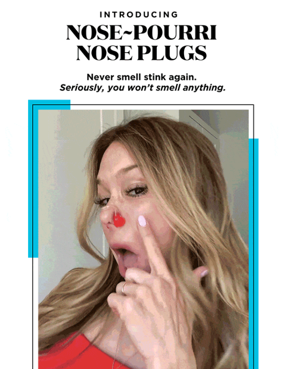
With the joke text "Never smell stink again. Seriously, you won’t smell anything,” Pourri, leads you to their April Fool's fake product.
Under this huge image, they have even priced the fake product, and the 14 different colors for the fake product show up on the email as GIFs.
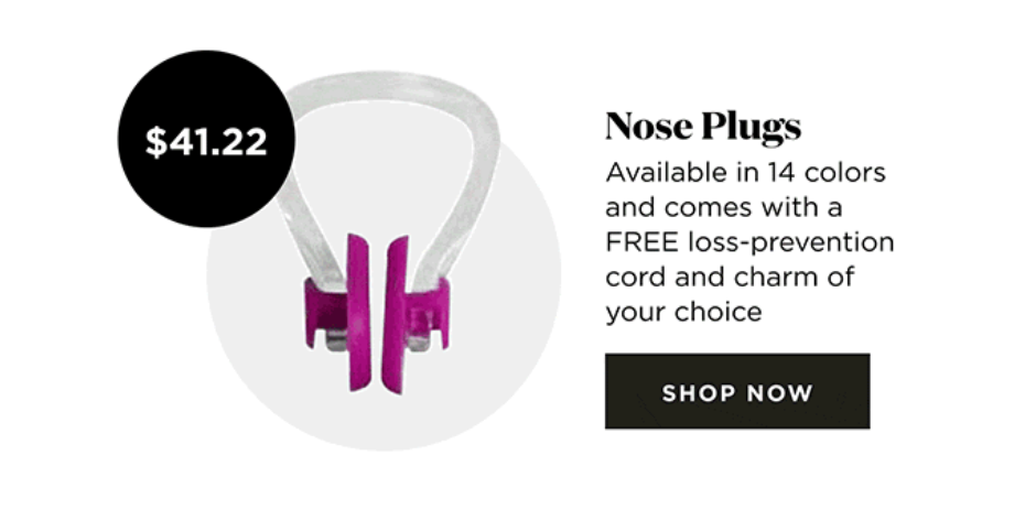
Once you click on the call to action button “Shop Now”, it will lead to their website.
And if you didn’t realize it yet at this point, they tell you on their website that it was an April Fool's joke…
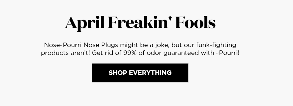
Directly below that, they advertise their real products, which solve the same problem as the fake product, which is the odor.
This time, with actual products that work.
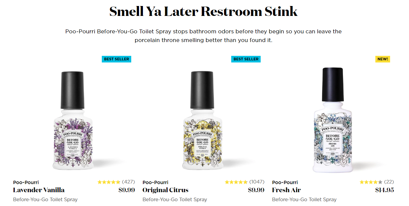 Despite being a joke, this April Fool's email was effective because it uses a proven copywriting formula called Problem-Agitate-Solve (PAS).
Pourri’s email starts with the problem (funky smell), agitates it (the smell can get worse if you don’t do anything), and offers a solution on their website with a real product —which is all-natural, reasonably priced, and promises to eliminate 99 percent of the home odor.
2. SAUCEY: You're No Fool
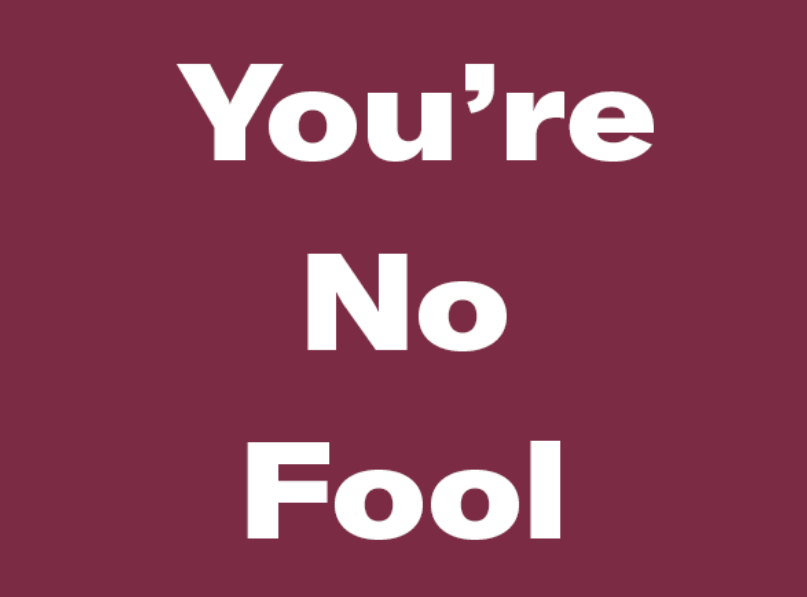
While many companies are fooling around on April's Day, Saucey takes a kind of safe line with their "You're Not Fool" email.
In terms of design, I loved the simplicity.
The first GIF takes up all the space and looks great, especially on mobile devices, which is the most important, as the majority of email views (41 percent) come from mobile devices.
Under this, the email has some text too, with a quote related to April Fool’s Day: “Whew. So many jokers today, huh?”
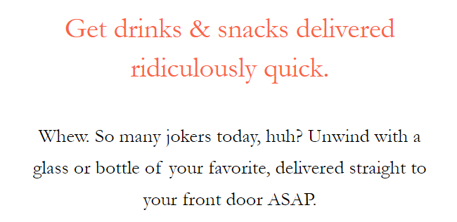 The call to action is clever here as it’s about this moment, not tomorrow, not this week. SAUCEY is an alcohol delivery brand, and in their email, they promise to deliver your favorite glass or bottle ASAP.
And if you go to their website, they even exceed your expectations by promising to deliver it in 30 minutes.
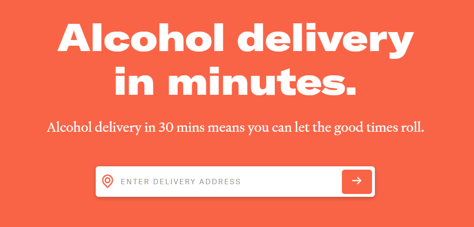 A 30-minute delivery window is something that not all companies can offer, but if you sell something more locally, you should use this as an inspiration!
I liked the fact that the email included two free recipes as well.
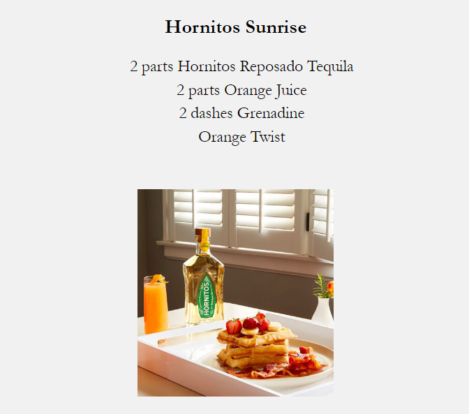
These recipes include products that SAUCEY delivers, which increases their chances of a sale.
With a simplistic email design, a bit of April Fools-related text, and an effective call to action, SAUCEY nailed its April Fool's email.
3. Vinomofo: No Jokes, Just Foolishly Low Prices
Vinomofo's April Fool email is an example that is possible to execute in almost any niche.
It starts with a compelling subject line to get people's attention and clicks.

The title promises you discounts, and that’s what they deliver. This is what you see when you open the email:
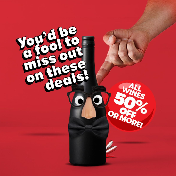
This is one of the most basic April Fool's emails, and that's why it works. The huge "You'd be a fool to miss out on these deals" banner catches attention, and the "50% OFF" text next to it makes people act.
Not every brand can offer as much discount as Vinomofo does, but a simple format like this works with less discount. It doesn't even have to be a discount, it could be a freebie or a competition with a prize.
Furthermore, while the 50% OFF sale might work for Vinomofo, it carries the risk of reducing your products’ perceived value.
Commonly used with e-commerce stores, there is also a limited-time offer that Vinomofo uses.
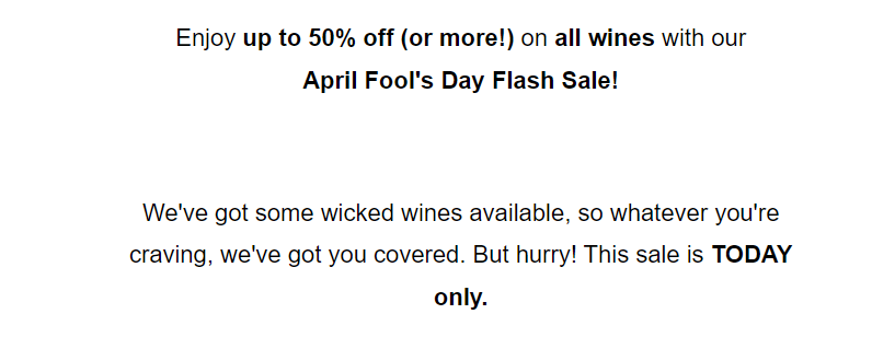
The text "This sale is TODAY only" raises a sense of urgency in the viewers and increases the conversion rate. It would be a shame to miss out on such a great deal, wouldn't it?
As part of this April Fools email, Vinomofo uses only one basic call to action button “Shop now” accompanied by “Ends midnight tonight,” which increases click-throughs.
If you want to execute an April Fool email, that doesn't require a lot of resources but can bring results, consider something similar to what Vinomofo does.
4. KiwiCo: No Joke, The Savings Are Awesome
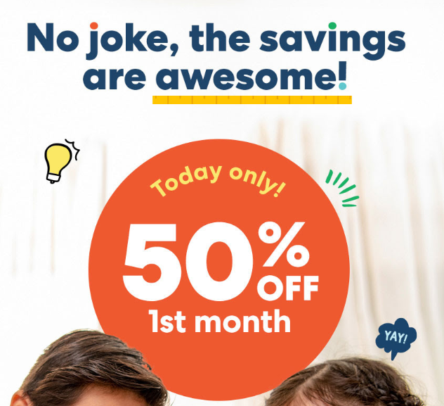
Similar to Vinomofo, KiwiCo employs the same tactics in their April Fools email, including a huge discount and a time limit.
This all starts from their subject line:

Immediately, this creates a sense of urgency in the customer that you're about to lose out on a great deal.
Once opening the email, you see one large visual image with an April Fool's themed text on top: "No joke, the savings are awesome." And the huge “50% OFF 1st month” text.
What's great about that?
It is as simple as it can be, with a clear call to action. It only takes a few seconds to understand what the email is about and take action. And if you’re a parent and you feel like it’s time to treat your kids, you might consider taking action on this.
Plus, the use of a visual image was great here:

The image immediately conveys the idea of fun, creativity, and playfulness. Moreover, there is a value proposition here because it isn't just a random toy; it is a science project that requires your children to think and that is valuable from a parent's perspective.
The discount code "FOOL" is worth noting too, as it brings extra relevance to the April Fool theme.

It gets customers to go to the checkout page and enter the discount code, which is one step closer to a purchase.
It visually illustrates that you're receiving a 50% OFF discount for your first month. Customers may be hesitant to trust large discounts, which is why showing the discount visually at checkout can work wonders.
With this email, KiwiCo managed to create a sense of urgency and excitement around their product while also communicating the April Fool's Day theme.
5. Framebridge: Real Things We've Actually Framed
Framebridge is a company that makes custom frames. In their April Fools email, they listed some funny (and bizarre) things they have framed.
Part of their strategy is not to sell straight away with huge discounts, but rather build loyal brand advocates who keep coming back for more and stay loyal.
This directly reflects in their minimalistic April Fools email, which listed 10 things they’ve framed during their years: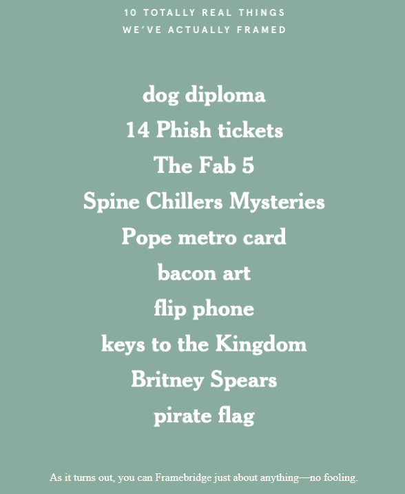
Framebridge doesn’t offer any discounts or limited-time offers on their April Fools email, which is part of their long-term strategy of building loyal customers.
To create authenticity and part of the April Fool's theme, they included a call to action button for their Instagram page, where they showed some of these bizarre framings visually.
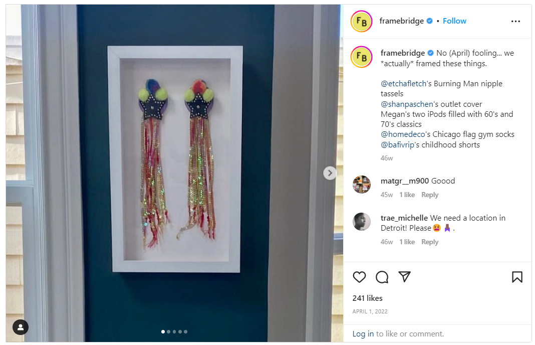
They even tag their customers, who have framed these things! It's small things like this that increase transparency between a company and a customer.
Framebridge's April Fool email is a great example of how a company can use humor to increase engagement and brand visibility, without immediately going for discounts or promotions.
If you can't go for totally real, you could always opt for almost real. Every April Fool's Day, Malouf drops a video that rides the wave of innovation, aiming to engage and delight customers, while showcasing in-house video team's skills to partners in the industry. It's all about being disruptive and having a blast with imaginative, "almost-real" concepts that make you wonder, "Could this be true?"
6. Paperchase: Open for joy and jokes
Paperchase is a brand that specializes in stationery, cards, and gifts, and their April Fools email is a wonderful example of how you can combine jokes and sell your products at the same time.
Their goal was not to trick their customers, but rather bring joy into their day.
How did they do this?
For each one of their main categories, they created jokes related to the category. Here's what it looks like:

The jokes aren’t necessarily the most humorous, but that’s part of their strategy.
They even say it themselves: “They're so good (bad) it's not even funny.”

Under each joke, they include a call to action for customers to shop the category.

This cleverly combines the idea of fun and a simple call to action, which can positively influence customers to buy from their store.
7. Mancrates: Happy Hour! No Foolin’!
Like Mancrates, some companies don't actually intend to fool their customers, rather use April Fools as an opportunity to build transparency with customers and increase their sales with things like limited-time offers.
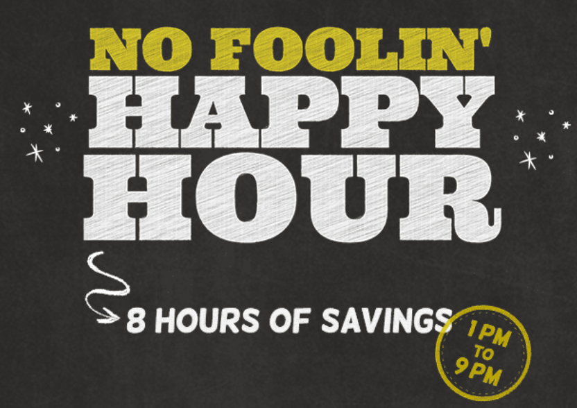
A lot of companies offer 24-hour limited-time offers, but Mancrates puts a different twist on their April Fools email with an “8 Hours Of Savings” campaign.
They start this with a limited-time offer on their headline “Today Only: Happy Hour! No Foolin’!” which makes people interested and click on the email.

The use of emojis is also beneficial here, as it makes you stand out in the email inbox.
Once you click on the email, Mancrates is clear about the savings, and that they don’t want to fool you:
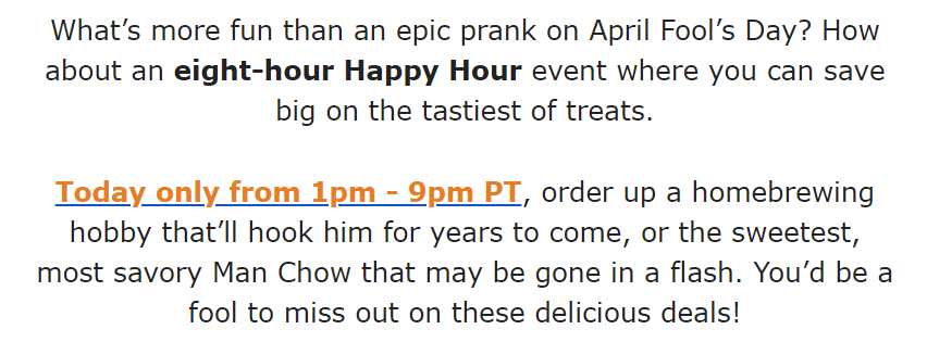
Following that, they explain what their eight-hour campaign is all about, with a bit of April Fools-themed text.
After this, Mancrates goes on and shows you visually what products their eight-hour sale includes.
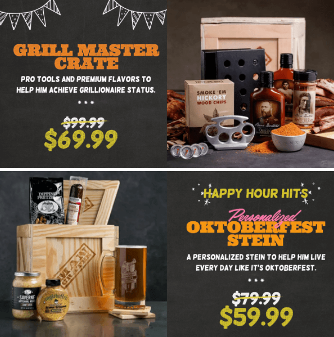
I think the visuals and images in the email are extremely well thought-out and match the brand's style well. If you look at the colors and the style on the email, they are exactly the same as on Mancrate’s website.
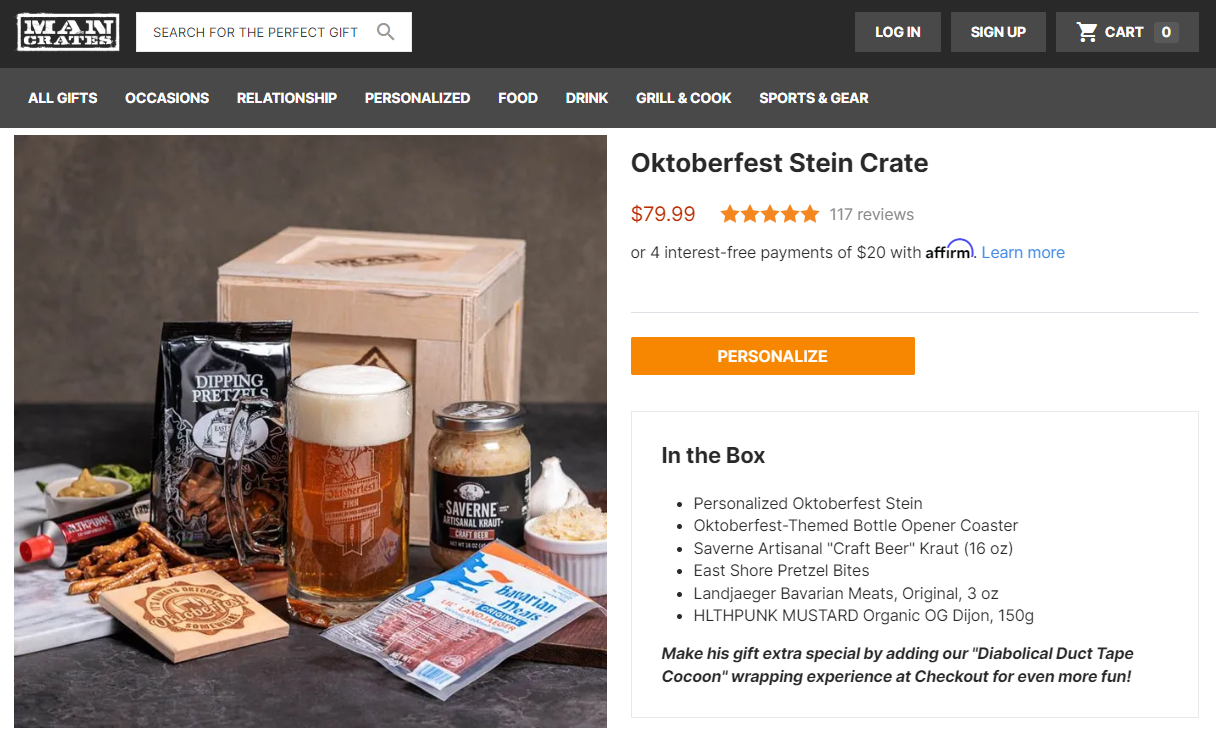
Having consistent messaging and design across all platforms can increase revenue by up to 10-20 percent, which is exactly what Mancrates is doing with its April Fools email campaign.
Far From a Fool’s Game
Looking for April Fools email examples is just one step in creating a successful April Fools email campaign.
Turns out, you have to also design and send out the emails....
Drip makes it possible for you to do that all in one place. Choose from our pre-built templates, then customize everything to fit your brand. Select who you want to target with our powerful segmentation tools and set your email to send automatically at any time.
And with our detailed analytics reports, you can track how well your April Fools campaign performs.
No foolin’.
Remember to take advantage of our 14-day trial and get access to pre-built workflows you can customize with our point-and-click workflow builder.
